Esri is committed to creating accessible technology and working to improve our products for people with disabilities and situational limitations. With this, it’s important that we explore and understand what it means for a dashboard to be accessible, and what you as an author can do to help.
To explore the very large topic of designing an accessible dashboard to meet local requirements, this blog series is divided into several topics. This first part will cover keyboard navigation concepts.
ArcGIS Dashboards introduction and structure
A dashboard is a presentation of your data that allows you to monitor events, make decisions, inform others, and understand trends. Dashboards are designed to display multiple visualizations, such as charts, lists, and tables, that work together and offer a comprehensive view of your data. Dashboards are supported on both desktop and mobile devices and will occupy 100% of the screen.
The dashboard layout is comprised of an optional fixed panel at the top and along one side, with the remaining area customizable to the type, size, and number of data visualizations and other content.

Dashboards can be static or interactive through weblinks or actions used to filter data visualizations such as charts, tables, and maps. The map can also be repositioned through actions, for example, centered on a selected feature or features.
Now that we understand what can be interactive in a dashboard, we can look at how to navigate this using only a keyboard.
Keyboard navigation
Keyboard navigation is an important feature as it is the foundation for many assistive technologies as well as it supports having multiple options for navigating. The standard keys used for navigation are Tab, Shift+Tab, Enter, Escape (Esc) and the Arrow keys. They are used as follows with a dashboard.
- Tab – move focus forward between panels, elements and interactive features such as buttons
- Shift+Tab – moves focus in the opposite direction
- Enter – activates a link or button and makes a selection
- Arrow keys – moves between data points, categories or values within an element or selector
Focus state
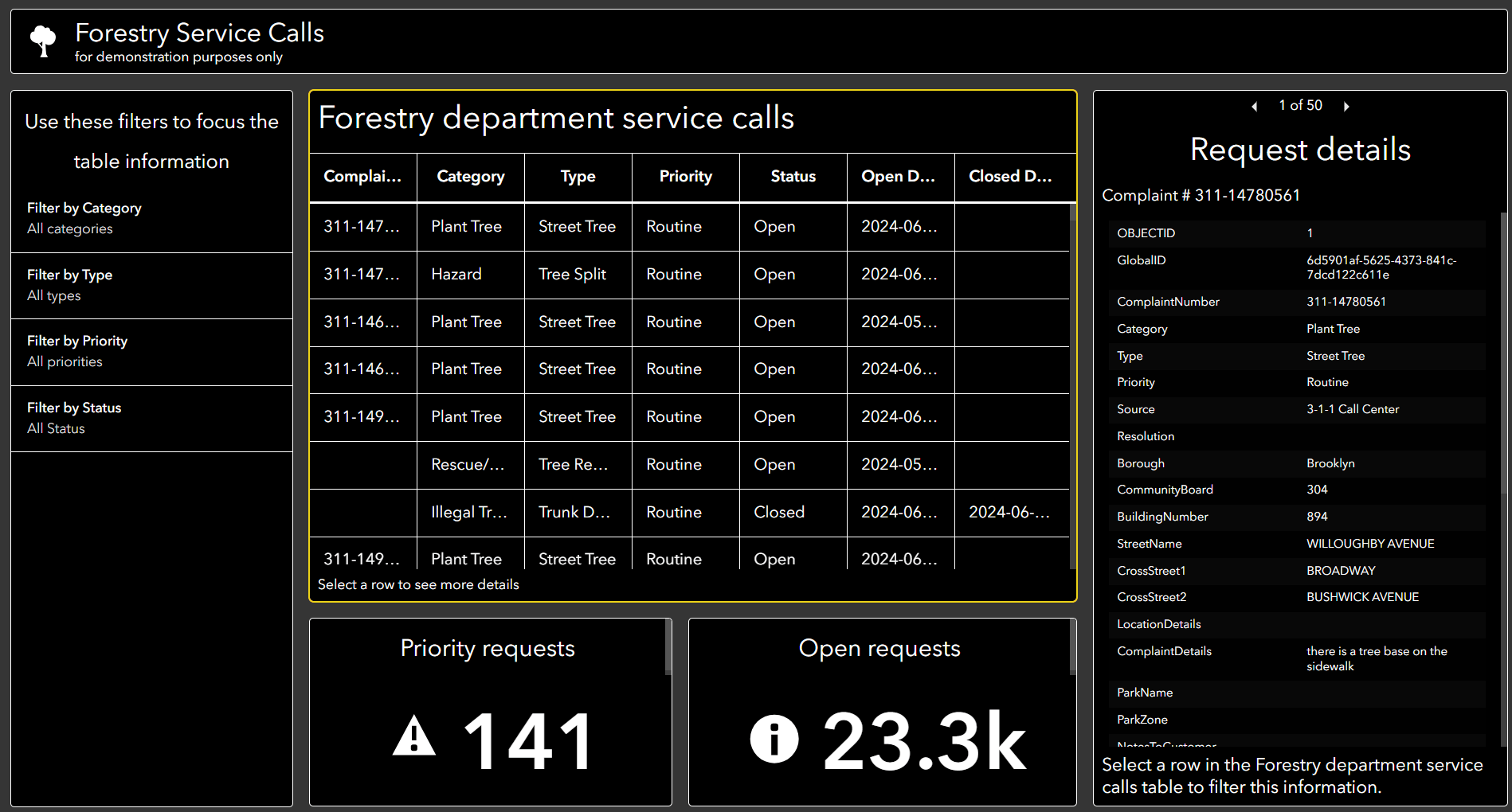
When navigating a dashboard using a keyboard, the keyboard focus indicates the current area on the page. Typically, the focus is shown as a border that highlights the area. This allows the user to see which area they can interact with using the keyboard. In the example dashboard, the yellow border shows the keyboard focus.
Navigation levels
To improve the overall efficiency and experience when navigating, dashboards have two levels of navigation – top level between panels and elements, and a secondary level within these areas.
Top level navigation
When the dashboard is first opened, pressing the Tab key will generally move the focus following a top to bottom and left to right flow, though the header, sidebar, all elements and the dashboard reset button if present.
When a dashboard includes a splash screen, the focus will be on the first interactive item, whether this is a link to another site or the button to dismiss the window. If there are multiple links, using the Tab key will move between them and the Enter key to select.
Let’s explore how top-level navigation functions in this dashboard example including the tab focus order when the dashboard incorporates a header, sidebar, and various elements. You can create your own copy to follow along.
Since this dashboard features a splash screen, the initial focus will be on the first interactive item, which is the link. Press Enter to open the link in a new tab. Otherwise, use the Tab key to highlight the Dismiss option. Press Enter to dismiss the splash screen.

Following the dismissal of the splash screen, pressing the Tab key focuses on the header then on the sidebar. From there, it moves to the table followed by the indicators below it, and finally to the details element on the right.

Second level navigation
The second level of keyboard navigation is within a panel, element or window. Using the Tab key, focus can quickly be placed on the area of interest and then pressing the Enter key will move focus into the area. From there, the Tab, Arrow and Enter keys can be used to move focus throughout the interactive areas such as the data points, next and previous feature buttons, weblinks or option to download data. Continuing to press Tab will move focus out of the area to the next area or eventually outside the dashboard.
To explore second-level navigation, move through the example dashboard using the Tab key to reach the sidebar, which contains selectors for filtering the table. To filter by category, use Tab to navigate to this filter and then press Enter.

Inside the dropdown, use Tab to move to All Categories. Use the up and down arrow keys to navigate between categories and press Enter to select a category.
To reset the filter, use Tab to navigate to the Reset button and press Enter.
To interact with the table element, press Enter to enter the table. Use the up and down arrow keys to move between rows. Press Enter again to select a row which will update the details element with more information.
Use the Enter key to access the details element to better understand the complaints. Then, use Tab + Enter to move between each complaint.
Recap – Use the Tab key to quickly move between panels and elements. Use the Enter key on the panel or element of interest, and then use the Tab and Arrow keys to navigate to the data or category. Press Enter to make your selection.
Putting It All Together
To effectively apply these techniques, practice navigating through your dashboard using the methods described. Focus on how the Tab, Enter, and Arrow keys work together to ensure users can easily access and interact with different elements. Testing these interactions will help ensure a seamless experience for all users.
We hope you apply the techniques discussed in this blog to create dashboards prioritizing accessibility. Your dashboard implementation can make a significant impact in fostering inclusive user experiences.
Share your feedback or questions on enhancing accessibility in dashboards and look for future parts of this series that will cover improvements with other assistive technologies such as a screen reader.
Find more accessibility related resources on the Esri Accessibility Resources site.


Article Discussion: