ArcGIS Dashboards now offers dual-axis charts, making comparing trends and relationships between different metrics easier. This is especially useful when the data has different value ranges, which would make it difficult to represent them effectively on a single axis. Dual-axis charts allow you to compare two different series of data with different scales or measurement units, helping you uncover relationships, patterns, and trends between two variables that might not be comparable on a single axis. Additionally, dual-axis charts conserve screen real estate and reduce clutter in your dashboard.
Example: Price Trends of French Wine
This example dashboard examines key metrics such as wine price, consumption, and production, while also considering environmental factors like temperature anomalies, which influence both wine quality and price. The goal is to understand how temperature changes impact wine prices.
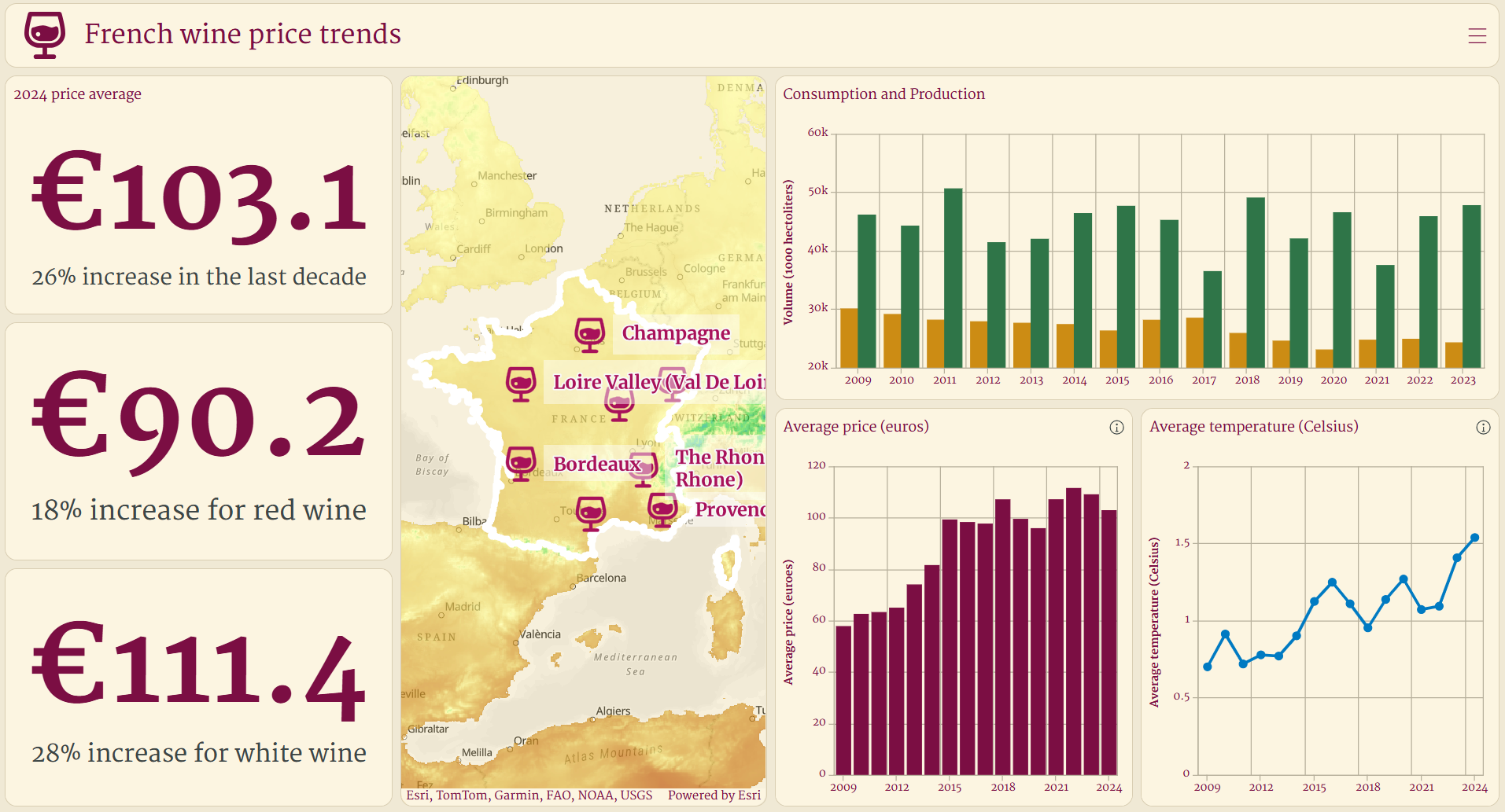
The dashboard currently displays two separate serial charts, taking up a lot of screen space and making comparisons difficult. For average temperature and price, displaying these metrics side by side in separate charts makes direct comparison difficult and takes up unnecessary space in the dashboard without providing clear insights.
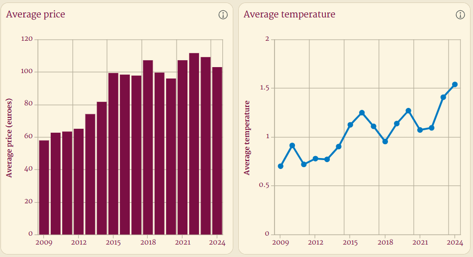
Plotting both of these metrics on a single value axis also makes it hard to interpret the data given the difference in value ranges between average price and average temperature.
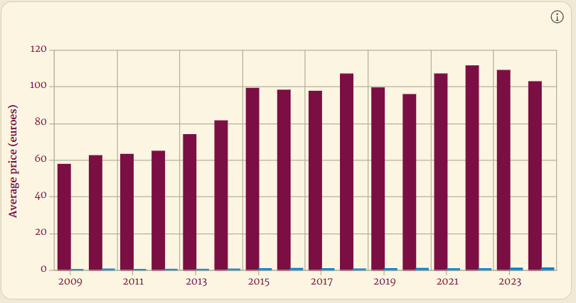
Rather than looking at the two charts side by side or on a single value axis, with a dual-axis chart, you can represent both the price of wine and temperature anomalies on the same chart, making it easier to draw insights about the relationship between the two.
Create Dual-axis Charts in ArcGIS Dashboards
Here is how to create the dual axis chart:
1. In the Data tab, select the Features option and add two or more series. For this dual-axis, chart, we add average price and temperature.
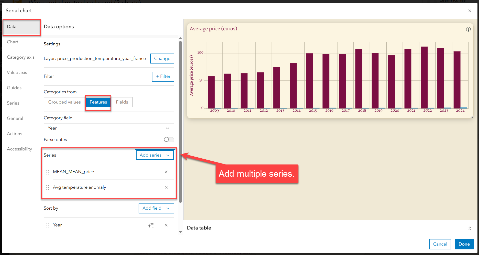
2. Navigate to the Value Axis tab in your chart configuration.
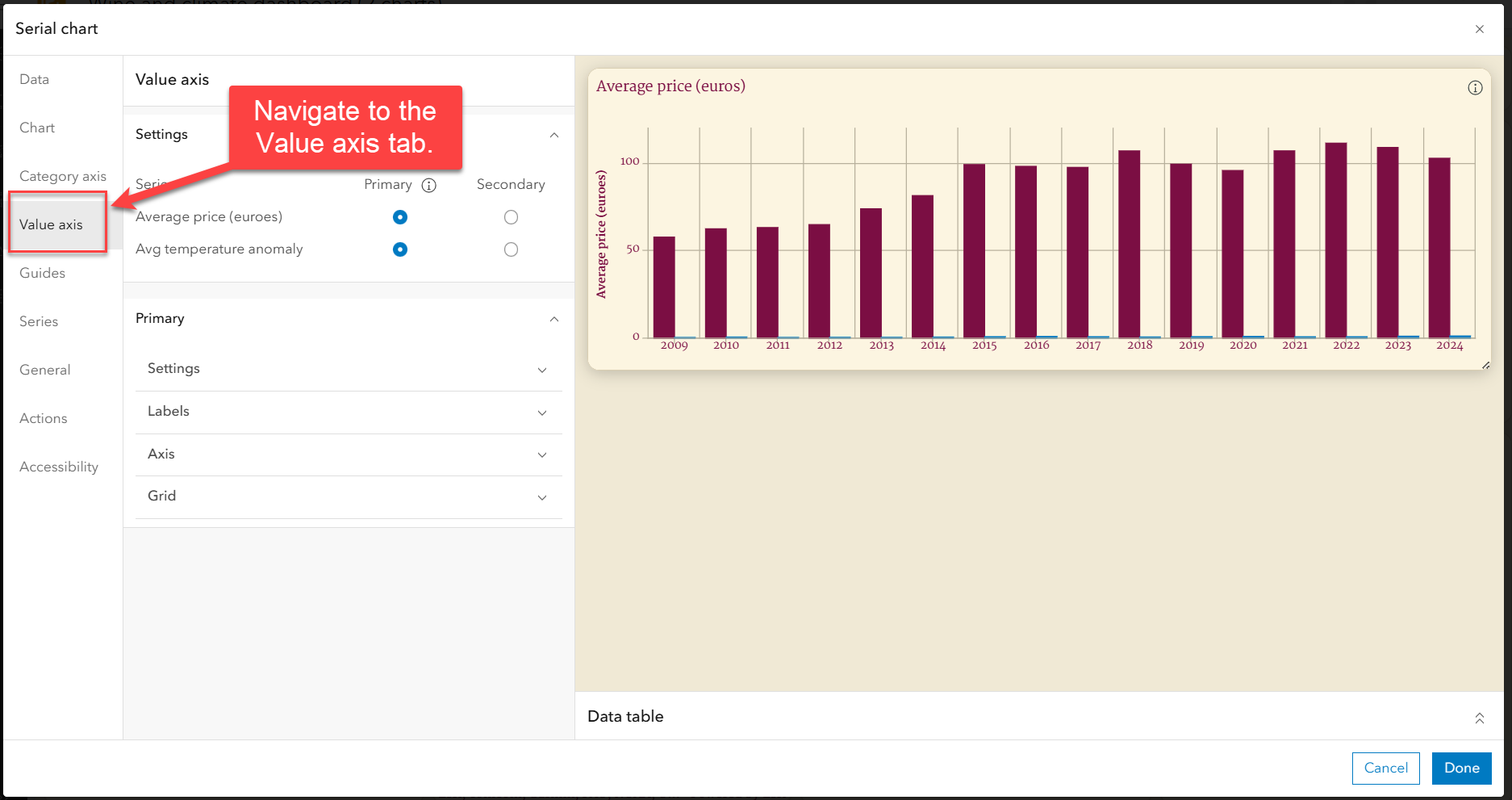
3. Assign one or more series to the secondary axis. For this dual-axis chart, we will add average temperature to the secondary axis and add an axis title.
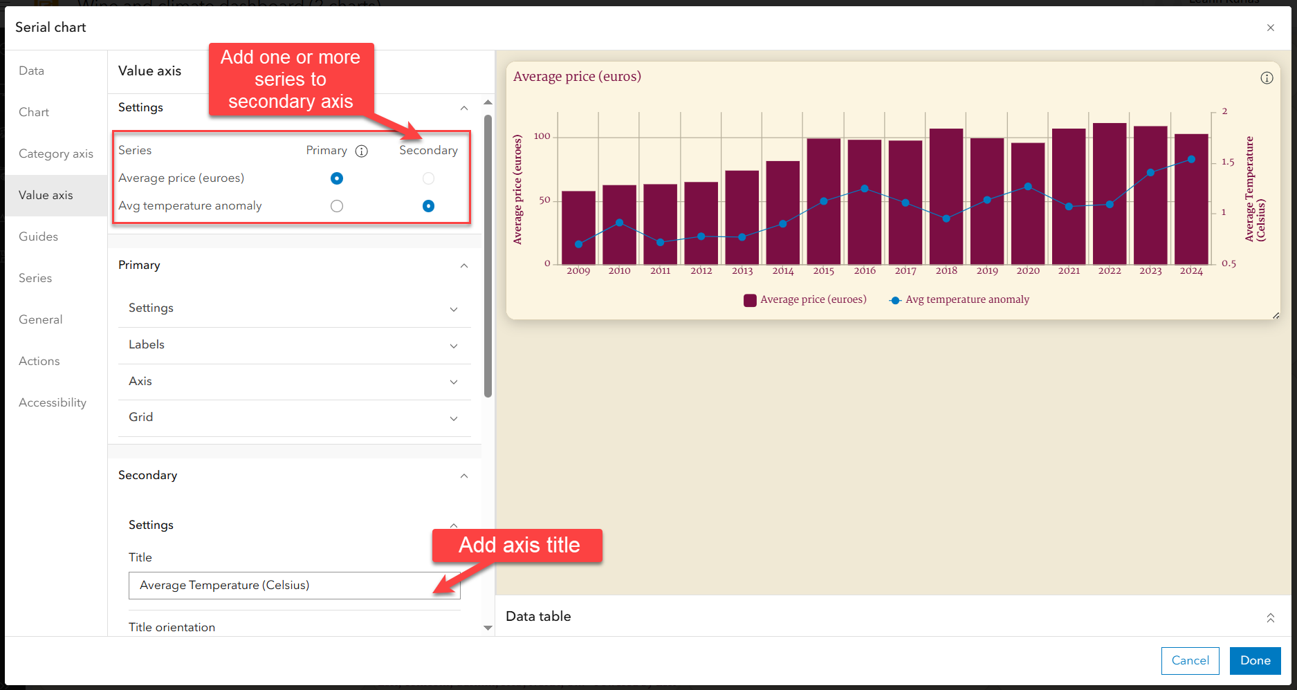
Once the series is assigned, the secondary value axis showing average temperature becomes visible on the chart.
Tip: Add axis titles and a legend to your dual-axis chart for better clarity. This helps viewers quickly understand the data and its context.
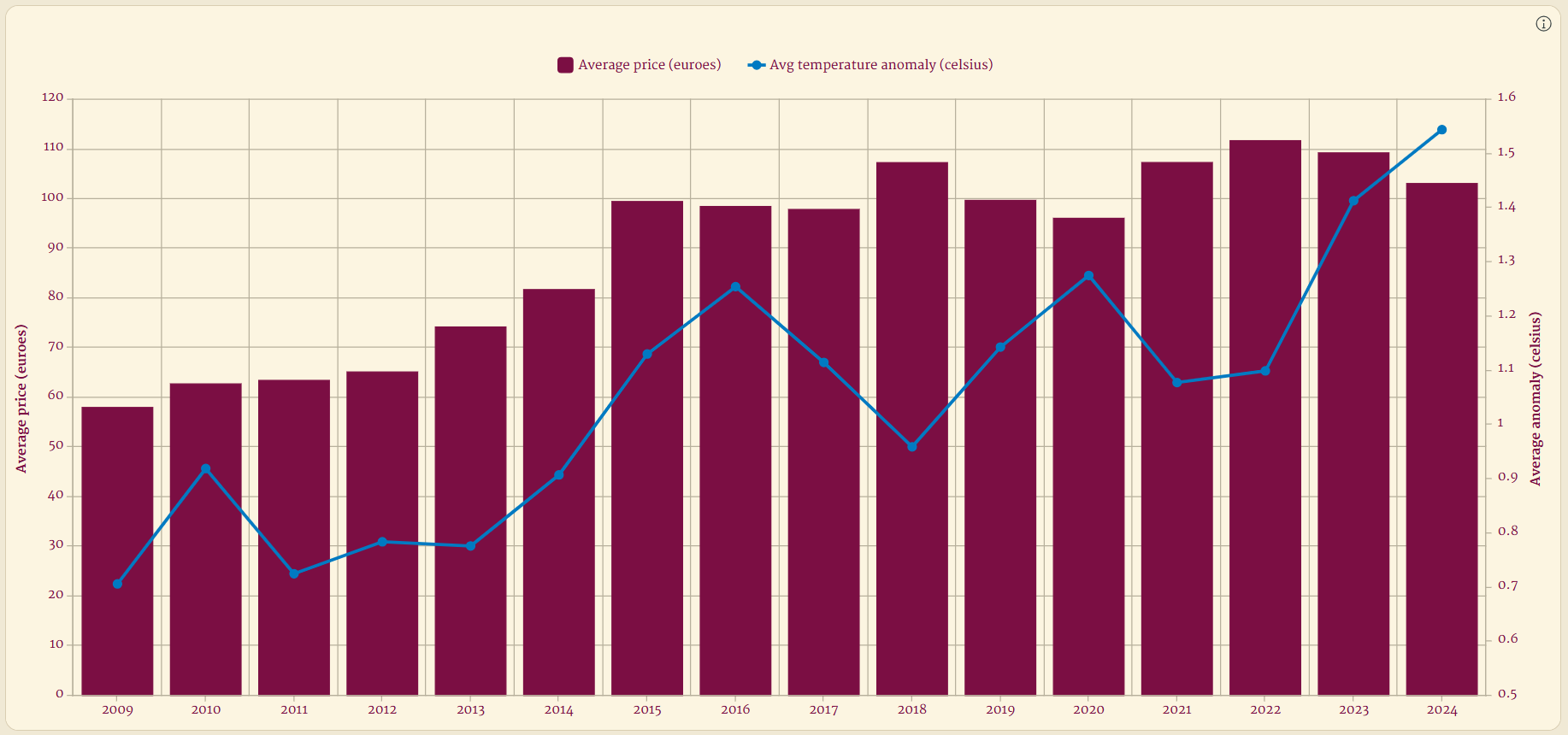
Here is the final dashboard, now improved with a dual-axis chart.
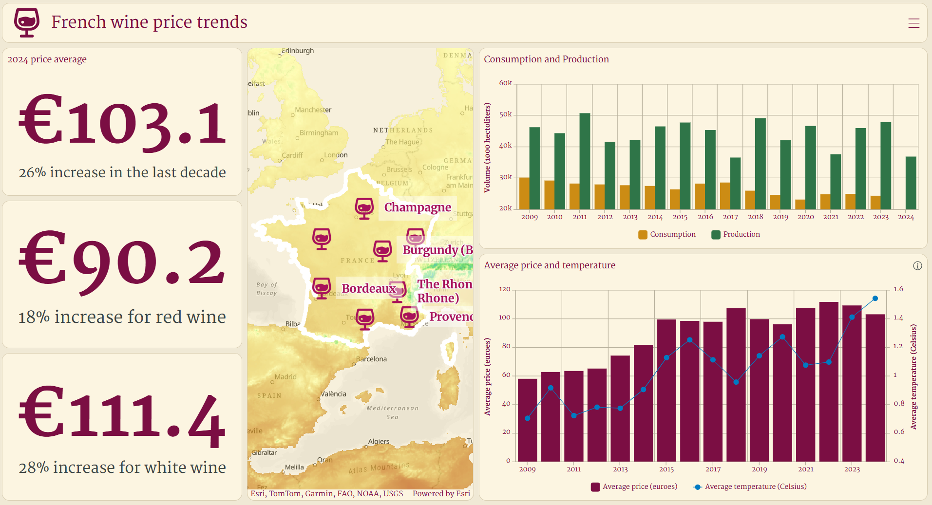
Dual-axis charts provide a powerful way to communicate relationships between metrics while maximizing your dashboard’s real estate. Explore the use of dual-axis charts in your next dashboard!


Article Discussion: