The BetterBusBuffers toolbox mentioned in this post is now deprecated because it has been replaced by the Calculate Transit Service Frequency tool, available starting in ArcGIS Pro 2.9. You can use this newer tool to perform analyses like those described below.
Suppose there’s a bus stop right outside Jerry’s house. It’s very easy and convenient for Jerry to walk out his front door to the bus stop to wait for a bus. Suppose there’s a bus stop right outside Tom’s house, too. But, whereas a bus visits Jerry’s stop every 10 minutes, Tom’s stop only gets a bus once every hour. Although it’s equally easy for Jerry and Tom to get to a bus stop, Jerry is almost certainly better served by the transit system because he has a lot more opportunities to actually get on the bus and travel away. He’s less likely to be late for work if he misses his bus, and he doesn’t have to plan his errands quite so carefully.
Is Tom’s neighborhood underserved by the public transit system? Are there disparities in how well Jerry’s and Tom’s respective demographic or socioeconomic groups are served? Is Jerry’s house worth more than Tom’s because of its better transit service? Is Tom more likely to drive his car to work than Jerry?
Previously, we discussed how to find out the area served by your transit system (the area within a short walking distance of transit stops) and the demographic characteristics of the people in that area. In this post, we’ll discuss a measure of how well those people are served by transit. You can use this information to answer questions like the ones posed above.
Shortcut, in case you don’t read all the way to the end: Download the free BetterBusBuffers toolbox to make transit frequency maps like the ones shown below.
Recall how we calculated the area served by a transit system. We created Service Areas showing the area within a quarter mile walk of all the transit stops:
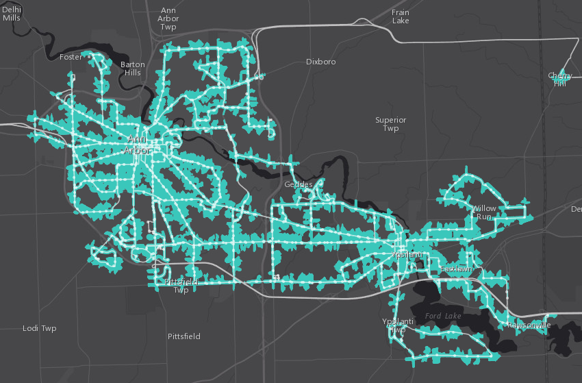
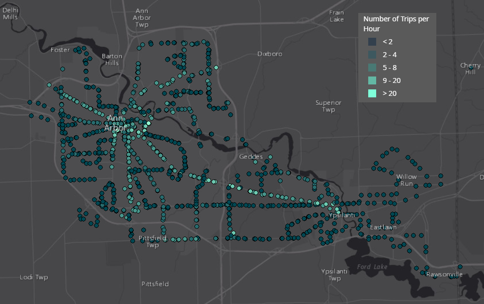
This is informative, but merely having access to a transit stop isn’t useful until a bus or train stops there and picks you up. Consequently, we would like to know how often each stop is visited. This is where the true power of GTFS data comes in. The GTFS data contains the transit schedules, so we can use those schedules to count the number of times each stop is visited during a time window.
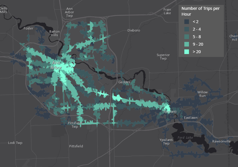
Using this same information, we can calculate the frequency of service available in our entire service area and show that frequency in a map using a color scale. You can see in the image below that in the outskirts of Ann Arbor and in most of Ypsilanti, transit customers have fewer than two transit trips available during morning rush hour. On the other hand, if you’re in downtown Ann Arbor or Ypsilanti, you have access to more than 20 trips per hour.
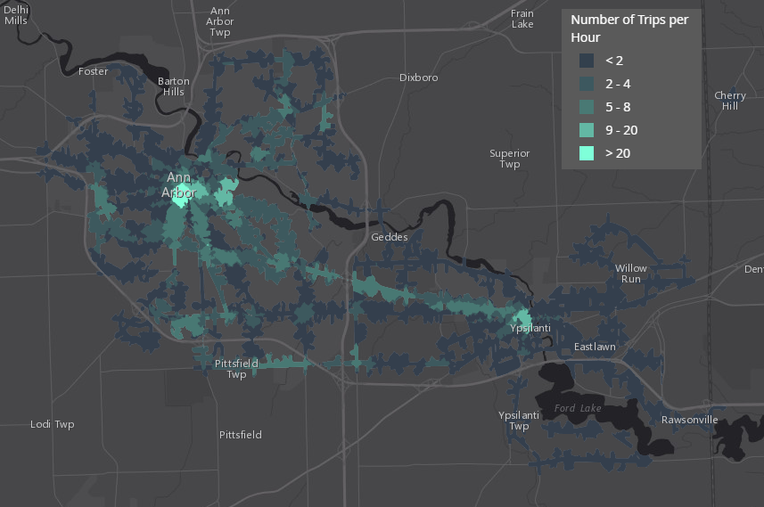
The time of day matters. So far, we’ve been looking at a weekday morning rush hour. However, not all trips occur during rush hour. People might want to do their shopping on a weekend, for example, but on the whole, there isn’t as much service available during the daytime on Saturday:
You might want to consider the frequency of transit service available at specific points of interest. For example, you could find out how many trips per hour are available at your health clinics, your schools, or a couple of apartments you’re thinking about renting. You could even take this point-of-interest analysis to the extreme and calculate the transit frequency available to each individual parcel in your city, as demonstrated in the image below.
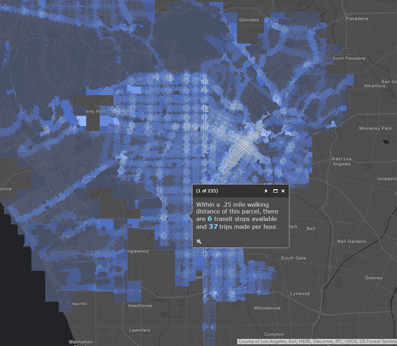
You can use the BetterBusBuffers toolbox in ArcMap or ArcGIS Pro to make maps like ones shown here. This free, downloadable set of tools allows you to calculate the number of transit trips available at a stop, point of interest, or area of town during the time window of your choice. To use the tool, you need a valid GTFS dataset, and you may also need a network dataset and a Network Analyst license, depending on which of the BetterBusBuffers tools you want to run. The toolbox comes with a detailed description of the requirements, step-by-step instructions, and advice on how to interpret the output, so be sure to check out the User’s Guide.
Note: Some areas or points of interest have access to more than one stop. The BetterBusBuffers tool counts the unique trips at all stops within the designated walk distance. In the maps shown above, a traveler in the bright green area in downtown Ann Arbor has access to more than 20 trips within a quarter-mile walk distance, even if those trips are at different stops.
Not all transit access is created equal. Some areas of town enjoy more frequent transit service than others, and this may vary by time of day or day of the week. This, in turn, might impact the area’s (or point of interest’s) desirability or be correlated to the area’s socioeconomic characteristics. Give this some thought, and factor it into your next analysis.
Keep watching the Esri blog for more posts about public transit analysis. We’ll be back soon to share more ideas and tools with you.
Article Discussion: