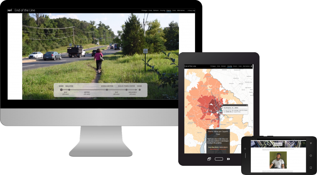
A story about commuters using the Washington, D.C. public transit system was a novel direction for Story Maps. Although the Story Maps team has done a cartobiography in the past about Mary Edwards Walker, End of the Line is a slightly different experiment wherein the data situates the narrative while serving an ancillary rather than leading role.
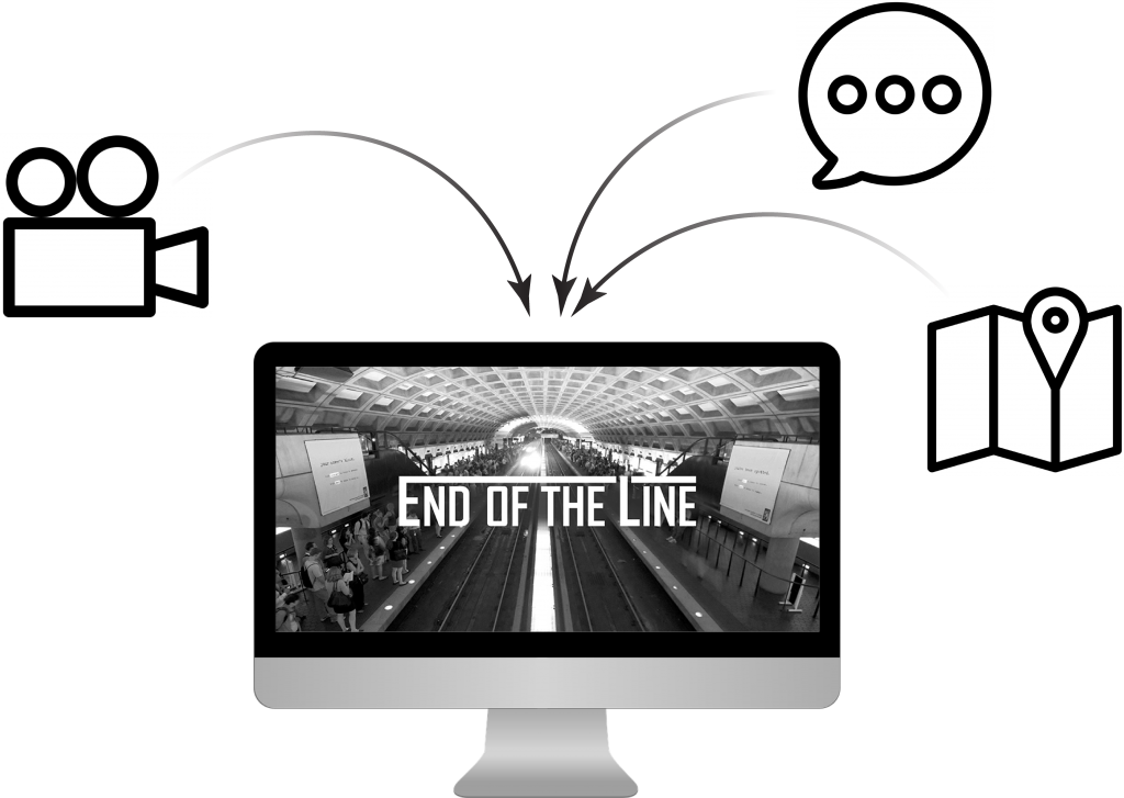
End of the Line combines video, personal narratives, and data to focus and contextualize its subject
The upshot is that End of the Line forwards the personal narratives of its two subjects; it humanizes an otherwise large and impersonal topic: public transit. Meanwhile, the consistent use of videos and interviews contextualized by data makes for a rich multimedia experience that ensures the personal biographies emerge front and center. We chose this approach because:
- the topic is fundamentally geographic;
- many cities are facing similar—and similarly vast—problems with their public transit systems; and
- by focusing on transit’s human elements, we could expand upon and personalize a discussion which is often dominated by talk of policy and finance.
The result: A Story Map Cascade that follows the narrative threads of Raheem and Sharon, and uses those threads to “reveal” pieces of data along the way: Washington, D.C. transit networks, Zillow home values, LEHD job locations, and Esri Demographics income levels. In the process, the story creates a rhythm as it cycles between personal accounts and maps.
Creating a rhythm of personal narratives, multimedia, and maps makes a story engaging and memorable
This approach allows two useful turns in the storytelling and user experience:
- The personal narratives form a plot line that feels authentic and that readers can recognize—there’s no need to make up a story because the plot is inbuilt by real people relating real experiences;
- A diversity of multimedia engages our readers—they don’t just glance over the information, but are better enabled to retain it.
The Participants
A story that leans on personal narratives requires compelling characters—finding participants that fit the topic is essential. This does not mean that we needed to identify the most extroverted or charismatic person in the room. On the contrary, sometimes the most compelling or insightful storyteller can be the quietest.
To get started we reached out to two community organizing nonprofits, Americans for Transit and Metro IAF, to help us identify participants. Working in the Washington, D.C. area on the topic of public transit, these organizations served as our local experts—they saved us time by already having a list of local contacts on hand, and improved the quality of our story by knowing the best-suited participants.
When we connected with a potential participant, we looked for those who were interested, honest, self-reflective, and convincing when they related their experiences. As such, sending introductory emails and conducting preliminary phone calls were essential before holding a full in-person interview.
The Videos
To fully understand our subjects’ stories, we shadowed both Raheem and Sharon on one of their commutes, recording video and audio along the way. Each of these rides was followed by a sit-down interview in which we talked through details of the commute. From there, snippets of the conversation were sorted by the broad conversation topics that came across in the interviews: the state of the metro system, commuting logistics, cost of living, lack of transit alternatives, and a desire for a more community-focused system. These topics became the foundation on which the video elements of the story were built.
Story Maps content producer and videographer, Hannah, captures a detail shot during filming
Ultimately, these videos provided a punchy warm-up for the reader, introducing them to the issues in a personal, relatable manner before diving deeper into the data in subsequent sections.
The Maps
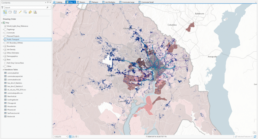
In emphasizing personal narratives, it was important to subdue the visual weight of the maps and data:
- Esri’s World Hillshade image service (set to mostly transparent) and a National Hydrography Dataset (NHD) Washington, D.C. waterbodies layer provided enough reference to orient the user, but not overwhelm in color or detail.
- At the same time, in talking about transit, we needed to show the regional transportation infrastructure. Here, the World Light Gray Reference layer from Esri’s Light Gray Canvas vector tile basemap (also mostly transparent) added sufficient detail.
- To highlight the main data under discussion, we settled on a palette of blues, purples, and oranges—all inspired by colors familiar to any D.C. Metro rider.
Resources
- Don’t miss the original story, End of the Line: Public Transit in Washington, D.C., built using the Story Map Cascade app.
- The Esri Story Maps teams’ cartobiography about Mary Edwards Walker.
- Americans for Transit website
- Metro IAF website


Commenting is not enabled for this article.