The 4.12 version of the ArcGIS API for JavaScript (ArcGIS JS API) added 11 widgets to the codebase to give web app developers out-of-the-box tools for gathering user input and exploring numeric attribute data from a FeatureLayer, CSVLayer, or GeoJSONLayer.
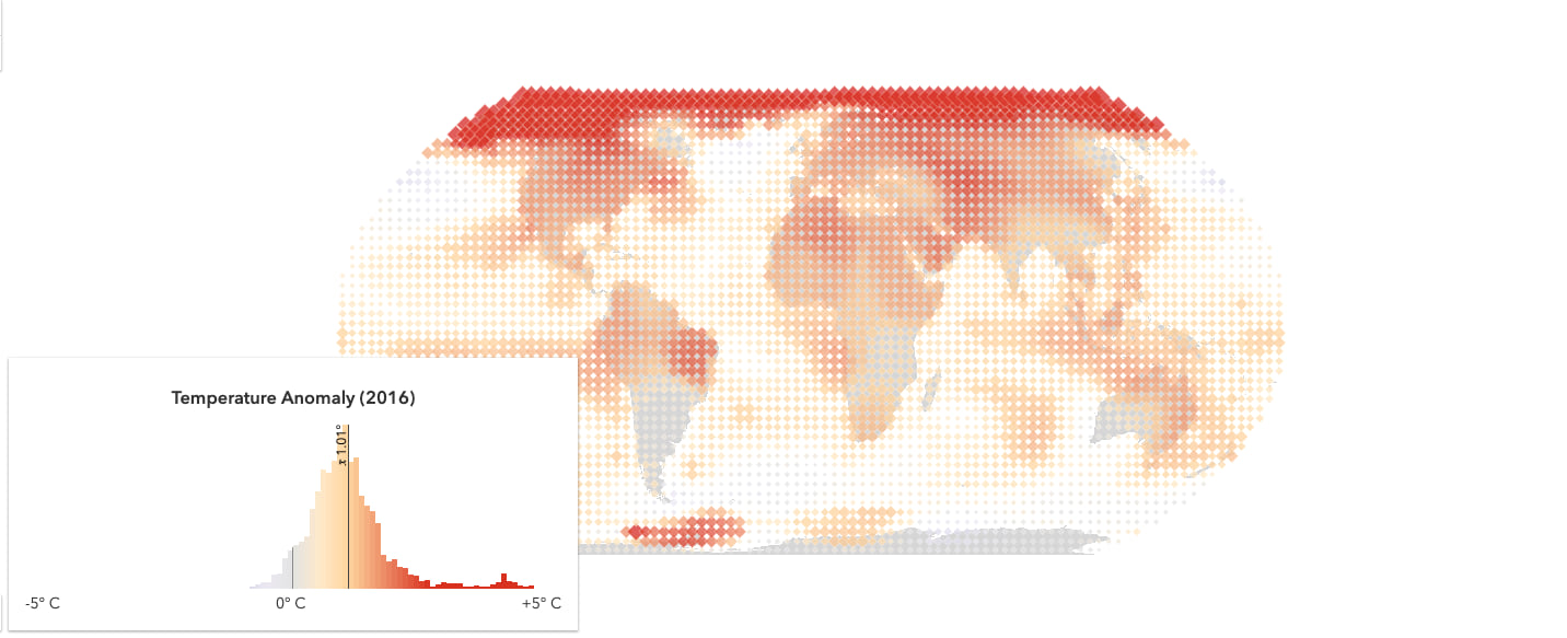
Click the image below to open an app that showcases the behavior and UI of each of these widgets.
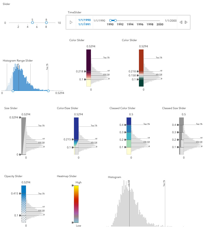
The following list contains links to the documentation for each of these widgets. Each reference page contains a brief description, a reference image with annotations, and code snippets demonstrating how to work with the widgets.
- Histogram
- Slider
- TimeSlider
- HistogramRangeSlider
- ColorSlider
- SizeSlider
- ClassedColorSlider
- ClassedSizeSlider
- ColorSizeSlider
- OpacitySlider
- HeatmapSlider
The remainder of this post will explore how to work with the Slider, Histogram, and HistogramRangeSlider widgets.
Slider
You may have noticed that 10 of these widgets are sliders. The most basic and potentially most widely-used of these is esri/widgets/Slider. In fact, all other sliders are built on top of the Slider widget view with their own view models.
The Slider API is designed to get you started with a simple slider that can easily be configured for a variety of applications. The API allows you to toggle the visibility of min/max values, toggle between a horizontal or vertical layout, format labels, configure ticks, steps, and customize the style and behavior of the widget’s elements.
The sections below contain several CodePens to encourage you to experiment with the various ways you can configure the Slider widget.
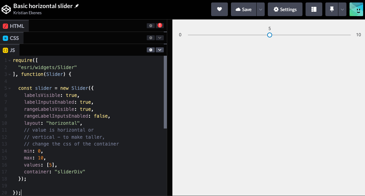
Create a basic slider
To add a simple slider with a single thumb to your app, set the container, the min and max values, and the value of the thumb.
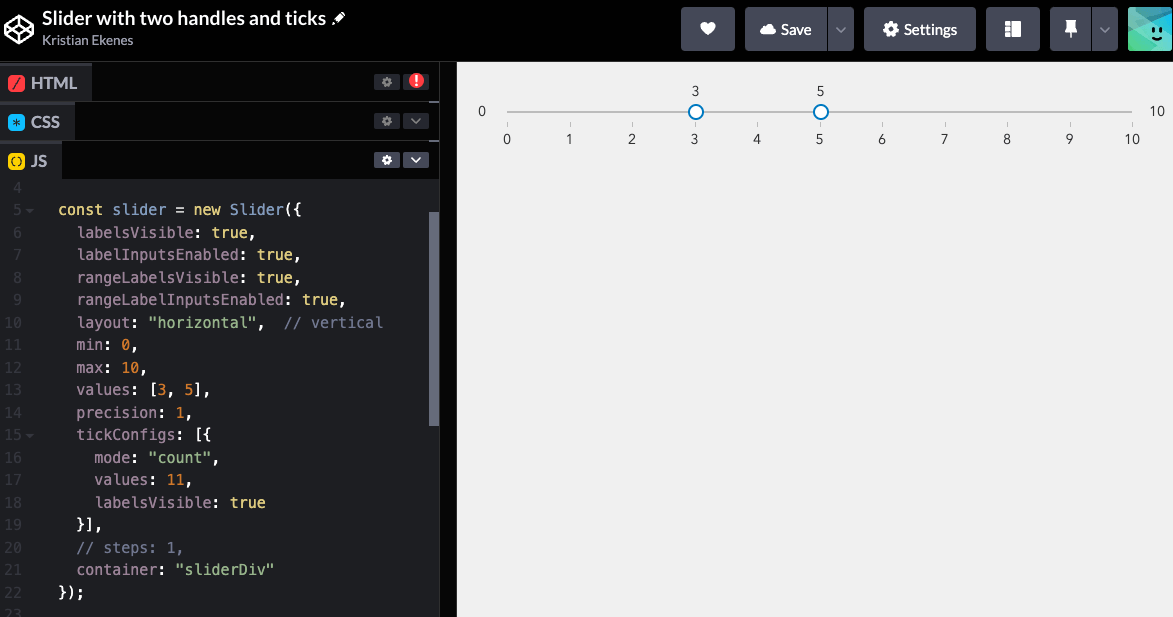
Multiple thumbs and ticks
Include more values to the values array to add additional thumbs to the slider. Notice you can drag the segments between thumbs by clicking the track and dragging. The tickConfigs property allows you to control rendering of ticks on the slider.
Customize tick styles and behavior
You can customize the CSS of the ticks by adding classes to the tick and label elements in the tickCreatedFunction. I also added an event listener to the ticks representing whole numbers. Click one in the app below to snap the thumb to the clicked value.
Steps
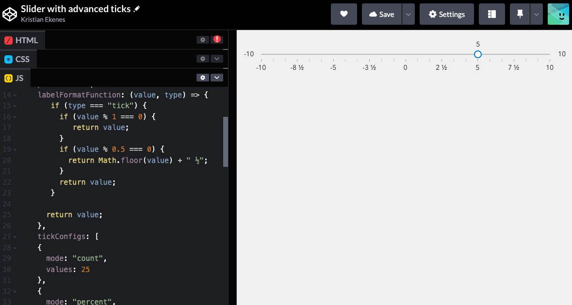
You can also set step values with either a single value, which is used to determine the interval for each step, or an array of values, which determine exact positions on the track for snapping thumbs.
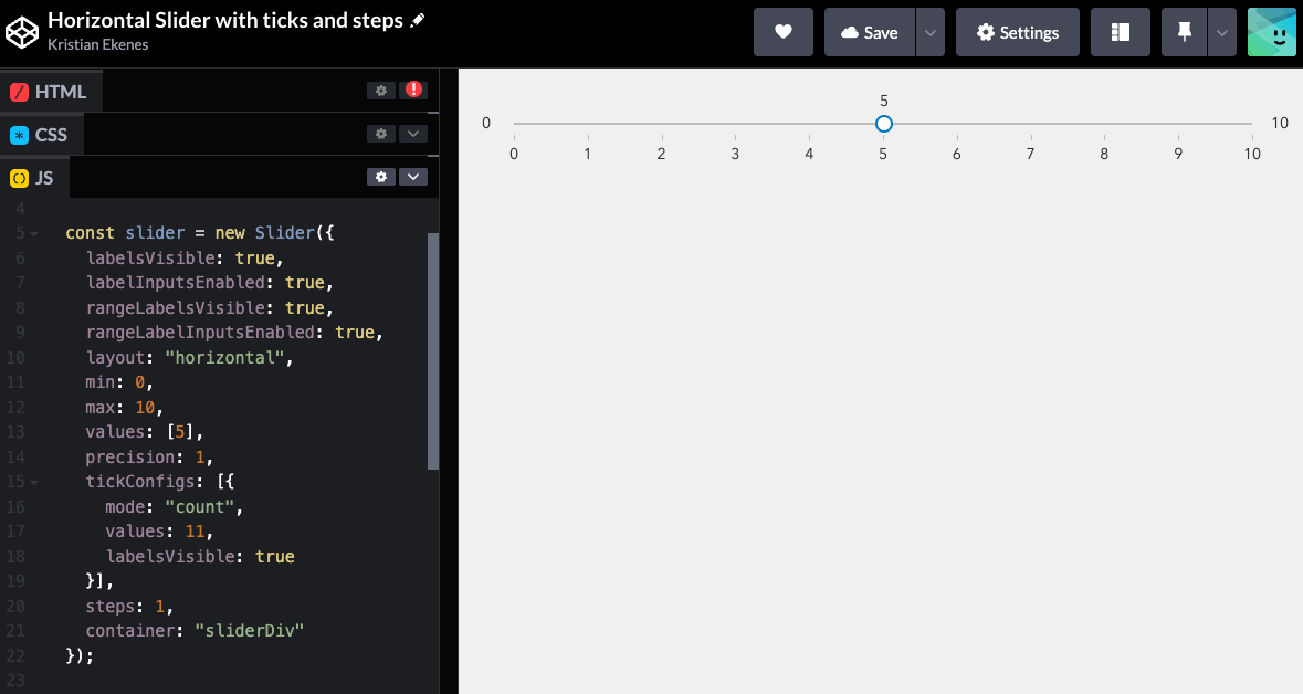
The labelFormatFunction property allows you to customize the labels of slider values without altering the values themselves.
Histogram
The Histogram widget provides a simple UI for displaying data in a histogram. This API allows you to specify an array of bins, each with a minimum and maximum bound along with a count. You can also add an average line or any other data line to indicate meaningful values in the dataset.
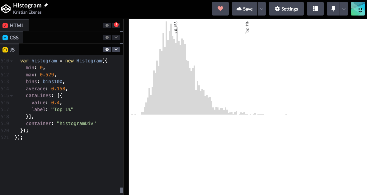
You also have access to each data line element and bar element for customizing the style of each bar including adding events for data exploration if desired.
HistogramRangeSlider
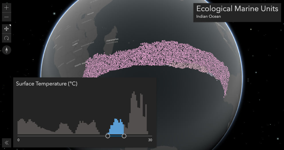
The HistogramRangeSlider combines the Histogram widget with the Slider into a cohesive widget. This widget was specifically designed for filtering applications. It includes a rangeType property for determining how the histogram renders as the user slides the thumbs. The rangeType also tells the generateWhereClause method how it should construct the SQL where clause for filtering features in the view.
In addition, we expose excludedBarColor and includedBarColor as options for easily changing the style of the histogram bars.
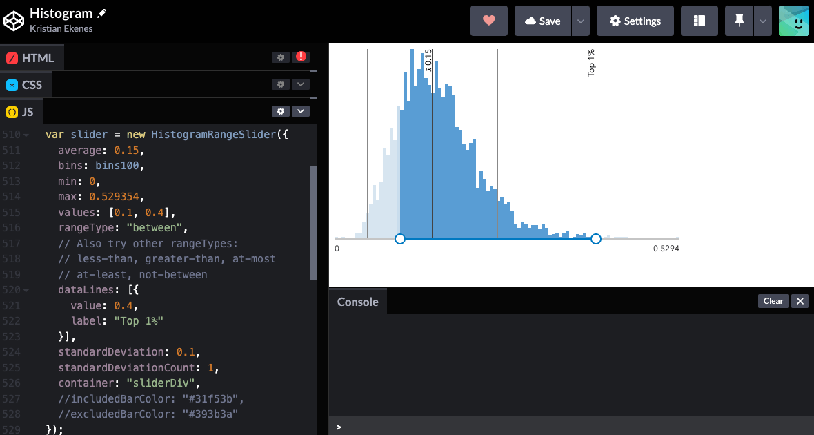
The HistogramRangeSlider sample in the JS API documentation demonstrates how to use the slider for filtering features in a FeatureLayer. Click the image below to explore this sample in more detail.
More examples
The following samples in the JS API documentation demonstrate how to use these widgets in various scenarios.
- Histogram widget
- HistogramRangeSlider
- Update a renderer’s attribute
- Generate continuous color visualization
- Generate data-driven continuous size visualization
- Customize ColorSlider Histogram
I encourage you to try out these widgets in your own apps! Don’t hesitate to reach out and provide feedback.


Commenting is not enabled for this article.