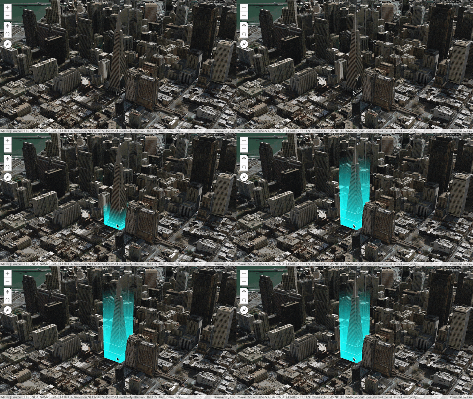
When a user selects a feature in a web scene it is necessary to provide some visual cues. In this blog we’ll look into three visual styles that you can use to highlight selected features in a web scene. ArcGIS API for JavaScript provides out-of-the-box functionality for the first two styles. We’ll use the highlight options on the SceneView to set a halo and/or a fill on the selected feature. The last style uses the client side 3D geometry to build a bounding box around the feature. Here we’ll mainly show examples of highlighting buildings, but you can apply these styles to any other 3D features.
Style 1 – Use color to tint the feature
The most simple thing that we can do when a user selects a feature is to apply a color on top of it. Traditionally at Esri, the default highlight color is cyan because it’s very bright and it’s not commonly used in basemaps or thematic data styling. Even though cyan is a default color for highlights, ArcGIS API for JavaScript allows us to change it. Let’s look at the following map displaying buildings of San Francisco. When you hover over a building, it applies an orange tint over the building. Try it out!
How does it work?
We set options like color and opacity globally on the view:
const view = new SceneView({
  container: "viewDiv",
  map: map,
  highlightOptions: {
    color: new Color([255, 153, 0]),
    fillOpacity: 0.6,
    haloOpacity: 0
  }
});
To detect what feature is currently under the mouse cursor we’ll listen for pointer-move events on the view. On each pointer move we run a hitTest against the view to retrieve the features in the buildings layer that are currently under the mouse.
You can look at the code in this codepen: https://codepen.io/ralucanicola/pen/xxdGaVO.
Style 2 – Display a halo around the feature
When the features already have textures or a color representing attribute values, we might not want to apply another color on top of it. The best way to highlight in this case is by adding a halo around the selected feature.
How does it work?
This style is similar to Style 1, using the default highlight and setting the options on the view. We specify opacity: 0 for the fillOpacity. We leave the haloColor and the haloOpacity to the default values. Notice that we also set shadow highlight options to color the shadow of the selected building.
Here are the highlight options for this style:
const view = new SceneView({
  container: "viewDiv",
  map: map,
  environment: {
    lighting: {
      directShadowsEnabled: true
    }
  },
  highlightOptions: {
    fillOpacity: 0.1,
    shadowColor: new Color("cyan"),
    shadowOpacity: 0.3
  }
});
In this app we listen for events on click to detect the feature that was selected by the user. Here is the code for the application: https://codepen.io/ralucanicola/pen/dyWGGpX.
Style 3 – Display the bounding box of the feature
This type of feature highlight is not very common in the GIS world, but you can see it sometimes in games (often coupled with animations and glow effects). It’s a style that works nicely for some web maps, but it should probably not be the default in a general mapping application.
How does it work?
For this style we use the Mesh geometry to create the bounding box around the selected building. When the user clicks on the building, we query the layer view for the 3D extent and the associated feature layer for the footprint. Using this information we build a volume around the building. By setting the bottom vertices colors to be fully opaque and the top vertex colors to be fully transparent, we can get a nice smooth transition in opacity from top to bottom.
Here is the code if you want to go into the details of how we built it: https://codepen.io/arnofiva/pen/jOmrPzj.

If the scene layer doesn’t have an associated feature layer, then we can use the extent of the building. The extent is always aligned north though, so this might cause some misalignment of the 3D bounding box with the building itself. Here is an example that uses just the extent of the building: https://codepen.io/ralucanicola/pen/xxdZZmE.
On a final note, have a look at the animations that our colleague Hugo added to the bounding box: https://codepen.io/ralucanicola/pen/XWRXjOm.
There are many more styles out there for feature selection. We’d love to hear what you like to use!
Raluca and Arno


Article Discussion: