Banner and card by Arturo David on Pexels
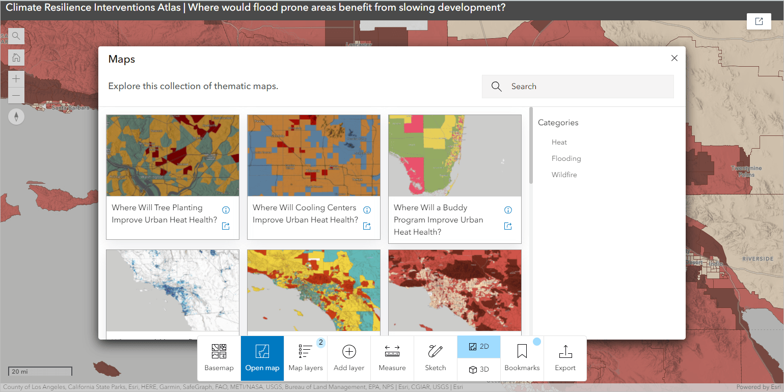
Atlas (Beta) is a new Instant Apps template that highlights a collection of curated maps and layers with simple map exploration tools, making it a powerful tool for introducing web maps and basic spatial data exploration to non-GIS audiences, creating interactive map books, and more.
Because the Atlas app is, essentially, a showcase of maps, the most important aspect of configuring the app is curating the content behind it. In addition to sharing relevant content to the group powering your atlas, you’ll want to ensure that your maps show good cartography and design practices.
How you curate the data behind your Atlas app depends largely on how you intend for your audience to use it. In general, there are four main areas to focus on in the curation process: identifying your audience, finding the correct information, making sure it’s presented well, and sharing it in a way that allows your audience to successfully interact with it.

Step 1: Determine who your audience is
A great Atlas app sets your audience up for success by displaying only relevant information presented with accurate cartography. To create a great Atlas app, start by asking a few questions:
- Who is your audience?
- What is the primary level of GIS skill and comfort the people visiting this page will have? What topics are they most interested in?
- What questions do you want them to be able to answer?
- What primary information or data do you want this audience to find or take away from their experience with your app?
To answer these questions, think about who you want to share your app with, where you plan to share it, and those people’s primary motivation for interacting with your Atlas app.
Step 2: Curate data
Keeping that information about your intended audience in mind, you’re ready to start curating content for your atlas. The Atlas app pulls maps and layers from an ArcGIS Online group, giving you a wide variety of options to choose from. With the wealth of data in your organization and in ArcGIS Online more broadly, you’ll need to make intentional choices that ensure the best possible experience for your audience.
What should you include?
Before starting to add data to a group, consider what story you want to tell with your Atlas. Are you trying to highlight a specific topic or theme, such as access to healthcare in your city? Or are you trying to make a large amount of data accessible, such as indicators for the United Nations’ Sustainable Development Goals? Deciding on the breadth of the data curation you’re undertaking is an important first step in curation because it will inform choices you make throughout the rest of your project. As you go through the process of selecting data for your atlas, use your desired story and scope to decide whether to include items.
Content is available from multiple sources and can be added from your organization, the Living Atlas, and ArcGIS Online. Depending on your audience and goals, it’s likely best to start with the content that you own, then fill in supporting data from public sources as needed. This strategy ensures that your content is the focal point of the app and that the content experience is cohesive.

What format should you include it in?
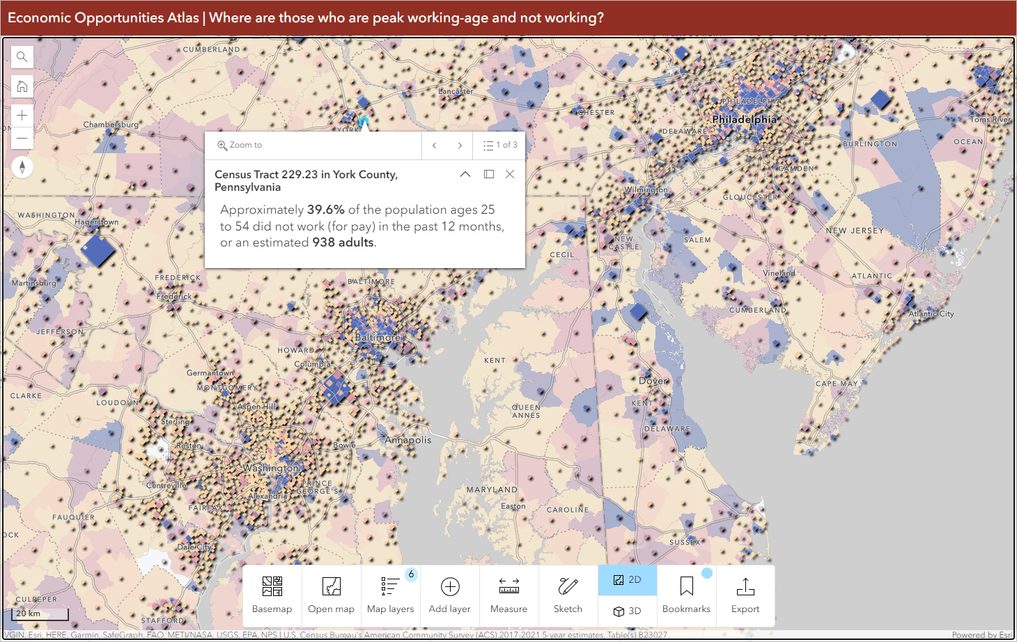
Atlas can display both maps and layers. For the best Atlas experience, web maps with strong cartographic presentation including configured pop-ups are preferable. By design, Atlas has minimal symbology and styling options- primarily, swipe and transparency- which mean that creating good web maps for your audience to explore is of great importance. Especially for beginner audiences, interacting with a single map containing all the data needed increases the likelihood of success. This group is likely less familiar with the concept of searching for and adding contextual layers to a map, so it’s best to present any layers you intend for them to use.
How much should you include?
Your atlas should include enough data that your audience can successfully answer their questions or fulfill their goals with your app without being overwhelming or unnecessarily complicating their ability to find content. Where this balance lies depends on your audience.
Step 3: Polish data for sharing
Now that you’ve curated the data for your atlas, you’ll want to think about how your audience will interact with it. In addition to polishing up web maps to include configured pop-ups, human-readable legends, and good cartography, you can configure content categories, thumbnails and item descriptions to help your audience find and add the content they want.
Finishing maps
The maps shared in your Atlas should adhere to the best practices of web mapping in order to provide the strongest experience for your audience. In addition to making cartographically accurate and aesthetically pleasing maps, pay attention to details such as field names, pop-ups, and legend appearances.
For reference, see the following blog articles for best practices on cartography and sharing web maps:
- Mapping with purpose
- Ten tips for tidying web maps
- Cartography checklists
- Best practices for sharing

Enhancing search
Wherever possible (on content your organization owns), make sure that you’ve updated the item details page. For reference, see the following blog articles for best practices on item details:
- Make your work easy to find, understand, and use by others
- Improving Content Quality
- Content Categories Four Ways: An Introduction to Organizing and Finding Content by Theme
- Content categories
Step 4: Share your Atlas app
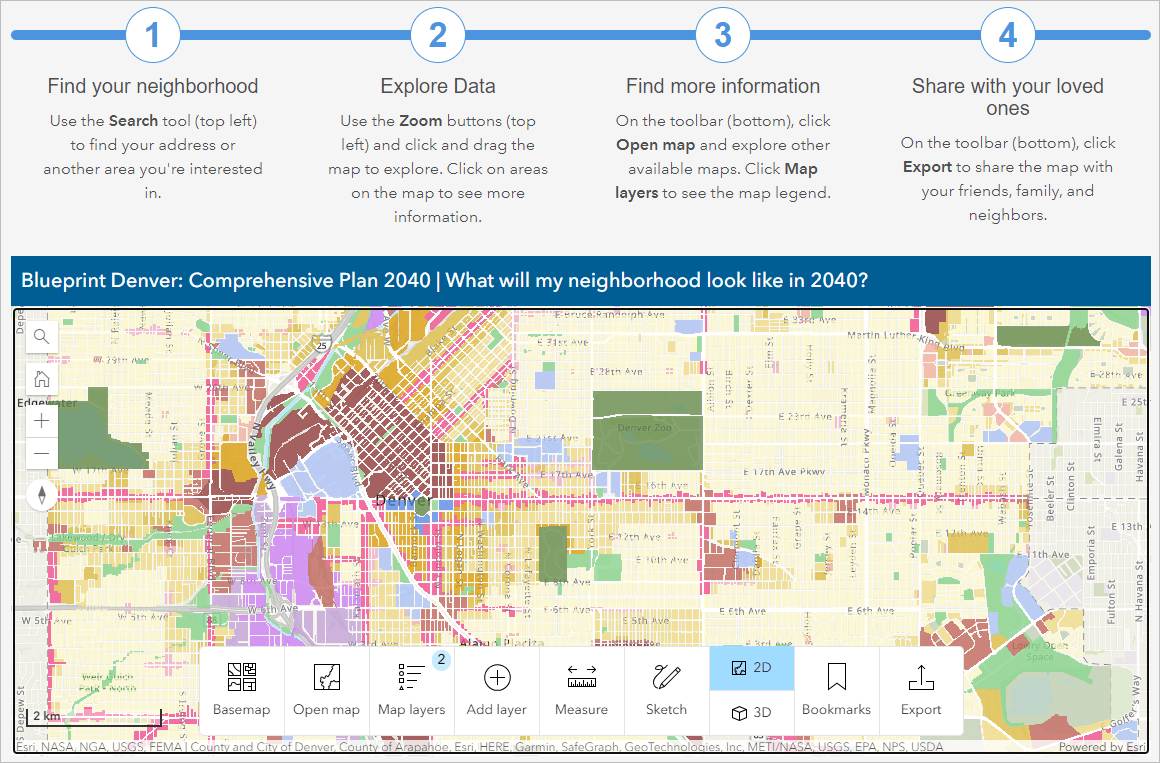
Now that you’ve configured your atlas to set your audience up for success, you want to share it in a way that will help them interact with it. Like any app you create in Instant Apps, Atlas can be shared as a standalone app, but you’ll want to consider a sharing strategy that will ensure your audience interacts with the app how you intended. A good way to ensure this is to embed the atlas within a website, such as a Hub or StoryMap where you can provide helpful guidance or tips for your audience who may be interacting with digital maps for the first time. You can also customize the app’s header to point to a URL where you may share usage guides or documentation.
Hopefully you started thinking about this during the curation process- it’s now time to put these plans into motion.
Determining the sharing location
Where you’re sharing your app may or may not be pre-determined. For example, if you built this app specifically for your company’s internal resources page or for your city’s open data portal, then you can embed it directly there. If you don’t have a pre-determined location for your app, consider building a webpage for it with tools like StoryMaps, Hub, or Experience Builder to inform your users how to interact with the app, provide helpful links to your other content, and so on.
Adding context to your atlas
Now that you know where you’re sharing the app, you know how much context you can add to it. For example, do you want your audience to browse through pre-made maps or to jump right into the Layers tab to find data? You likely don’t need much additional instruction, but consider what instructions or directions you can provide to help people use the app.


Article Discussion: