A unique way we can maximize the capability of Insights is by using the Insights scripting environment. After setting up a kernel gateway connection, the console will allow you to access Python and R, pull in data from external sources, such as APIs, and use that data for further analysis within Insights.
To demonstrate some capabilities of the scripting environment, we are going to use a Twitter API called Tweepy to pull some tweets from a specific Twitter handle and then visualize that data in the Insights workbook.
Let’s dive into the scripting environment
To access the API, you must set up a developer account with Twitter which will give you some keys and tokens to access the API.
I’ve added comments throughout each of the code snippets to help you understand what each part of the code is doing.
You’ll need to first import any necessary packages into your environment. In this case we need to use: tweepy, pandas, and regex.
# Import any necessary packages
import tweepy
import pandas as pd
import re
Next, you will create an API object.
# Enter required access keys and tokens to pull from Tweepy
api_key = 'Enter API key'
api_key_secret = 'Enter API key secret'
access_token = 'Enter access token'
access_token_secret = 'Enter access token secret'
bearer_token = 'Enter bearer token'
# Twitter authentication
auth = tweepy.OAuthHandler(api_key, api_key_secret)
auth.set_access_token(access_token, access_token_secret)# Creating an API object
api = tweepy.API(auth)Next, we are going to access Tweepy and pull some tweets from a fictional food truck business called @SoCaliBBQ!
# Specify which twitter user handle you would like to pull tweets from
new_tweets = tweepy.Cursor(api.user_timeline, screen_name="socalibbq", tweet_mode='extended').items(1000)

list = []
for tweet in new_tweets:
text = tweet._json["full_text"]

refined_tweet = {'text' : text,
'favorite_count' : tweet.favorite_count,
'retweet_count' : tweet.retweet_count,
'created_at' : tweet.created_at,
'coordinates' : tweet.coordinates,
'geo' : tweet.geo}

list.append(refined_tweet)

df = pd.DataFrame(list)
Remember that Regex (re) package you imported earlier? We’ll need that now to properly extract specific parts of each Tweet.
# Extract date from when tweet was posted
df['createdat_str'] = df['created_at'].astype(str)
df['Date'] = df['createdat_str'].str.extract(r'(\d{4}-\d{2}-\d{2})')
df = df.drop(columns=['coordinates', 'geo', 'createdat_str'])

# Rename fields
df = df.rename(columns={'favorite_count': "Likes", 'retweet_count': 'Retweets', 'created_at': 'Tweet_Date'})
df.head()
# Extract address
df_address = df['text'].str.extract(r'(\d+)(.*)(Ave|Blvd|St|Dr|Pl|Way|Rd|Lane)')
# Create separate columns for address elements
df_address['Street_Num'] = df_address[0]
df_address['Street'] = df_address[1] + " " + df_address[2]
df_address = df_address.drop(columns=[0,1,2]) # Drop source columns
# Join back to original table
df = pd.concat([df, df_address], axis=1, join="inner")
df.head()# Extract zipcode and put those values in a new column
df['ZIP'] = df['text'].str.extract(r'(, \d{5})')
df['ZIP'] = df['ZIP'].str.replace(', ','') # cleanup ',' and ' ' characters
df.head()# Regex extract the name of the truck
df_trucks = df['text'].str.extract(r'(socali|#)(.*)( Truck|Truck)', expand=True)
# Join regex extracted table to original df and clean up columns
df = pd.concat([df, df_trucks], axis=1, join="inner")
df = df.drop(columns= [0,2])
df = df.rename(columns={1: "Truck"})
# use df.head() to see first 5 lines of output# Regex extract meal type
df['Meal'] = df['text'].str.extract(r'(nites|lunch|nite|nights|night)')
# Create some consistency by replacing various spellings of 'night' and chage to 'dinner'
df = df.replace({'Meal': r'(nites|nite|nights|night)'}, {'Meal':'dinner'}, regex=True)
df.head()# Extract serving time range from tweet contents
df_Time = df['text'].str.extract(r'(\d+.M)-(\d+.M)')
# Concatenate the two extracted times into a range
df_Time['time_range'] = df_Time[0] + '-' + df_Time[1]
# Create a column to hold the first hour of the serving range
df_Time['start_hour'] = df_Time[0].str.extract(r'(\d+)')
# Create a column to hold half hour measures where present in start time
df_Time['start_min'] = df_Time[0].str.extract(r'\d+(30)')
# Extract the AM/PM indicator of the start time
df_Time['start'] = df_Time[0].str.extract(r'(.M)')
# Create a column to hold the second hour of the serving range
df_Time['end_hour'] = df_Time[1].str.extract(r'(\d+)')
# Create a column to hold half hour measures where present in end time
df_Time['end_min'] = df_Time[1].str.extract(r'\d+(30)')
# Extract the AM/PM indicator of the end time
df_Time['end'] = df_Time[1].str.extract(r'(.M)')
# Replace/remove the half hour measures from the start/end hours so only whole measures remain
df_Time['start_hour'] = df_Time['start_hour'].str.replace('30','')
df_Time['end_hour'] = df_Time['end_hour'].str.replace('30','')
# Fill null half hours with '00'
fills = {'start_min': '00', 'end_min': '00'}
df_Time = df_Time.fillna(value=fills)
# Cleanup columns
df_Time = df_Time.drop(columns=[0,1])
df = pd.concat([df, df_Time], axis=1, join="inner")
df.head()# Cleanup the rest of the code and output final data to a named .csv file
df = df.rename(columns={'text': 'Tweet', 'time_range': 'Serving_Time'})
df['Start_Time'] = (df['Date'] + " " + df['start_hour'] + ":" + df['start_min'] + ' ' + df['start']).where(cond= df['start_hour']!='')
df['End_Time'] = (df['Date'] + " " + df['end_hour'] + ":" + df['end_min'] + df['end']).where(cond= df['end_hour']!='')
df = df.drop(columns=['start_hour', 'start', 'start_min', 'end', 'end_hour', 'end_min'])
df.to_csv("socalibbq_tweets.csv")You can either upload the newly generated “socalibbq_tweets.csv” to your Insights workbook, or you can directly add the new df as a layer in your workbook’s data pane by using the following command:
%insights_return(df)Congratulations! You’ve not only pulled data from a Twitter API but also added that as a new dataset directly into Insights. You should see your new layer in the data pane. Rename it from layer to SoCaliBBQ Tweets.
Data exploration
Now that we’ve compiled some data, let’s explore it in the Insights workbook. Since these Tweets have a spatial component, it’ll be useful to see what the data distribution looks like on a map.
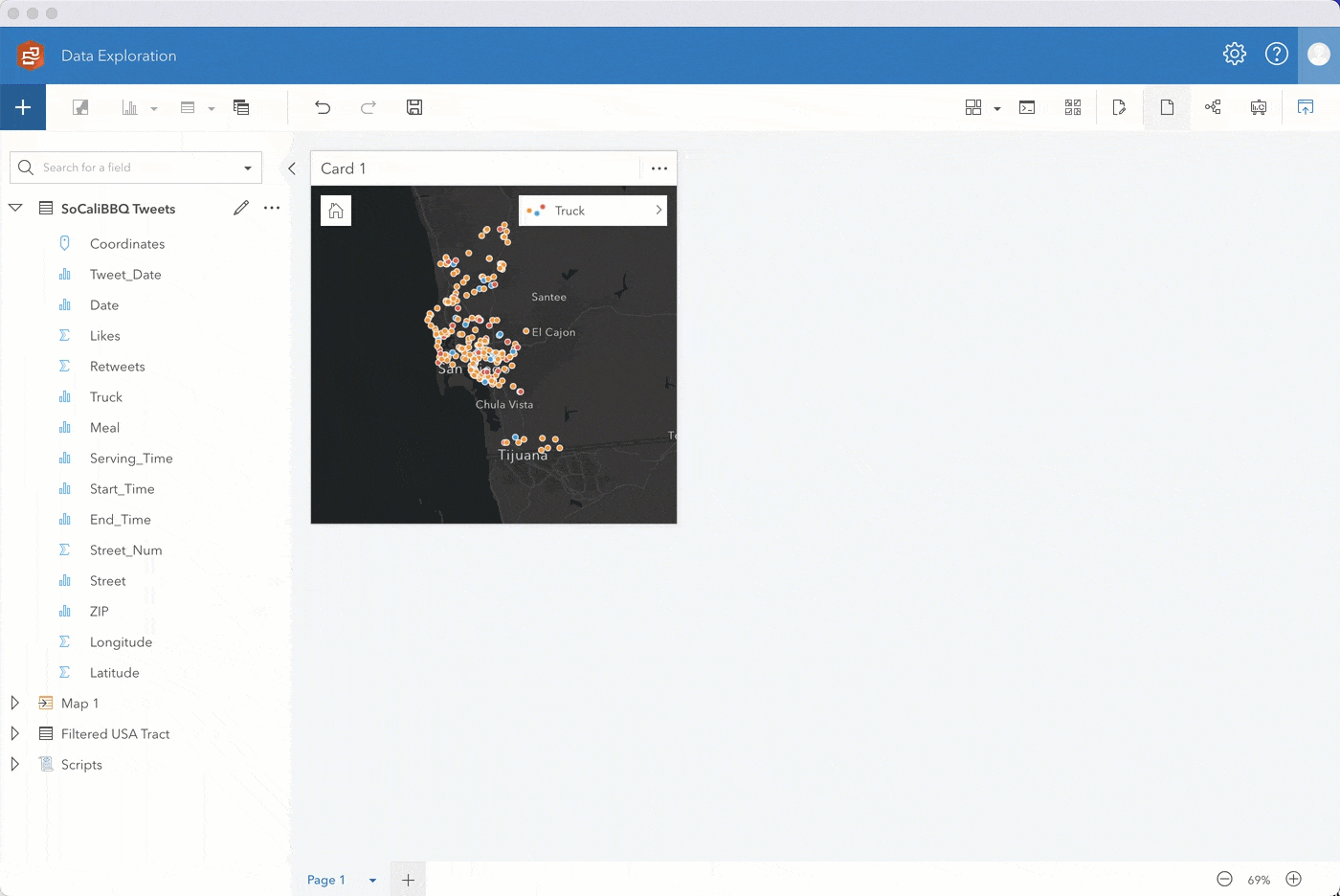
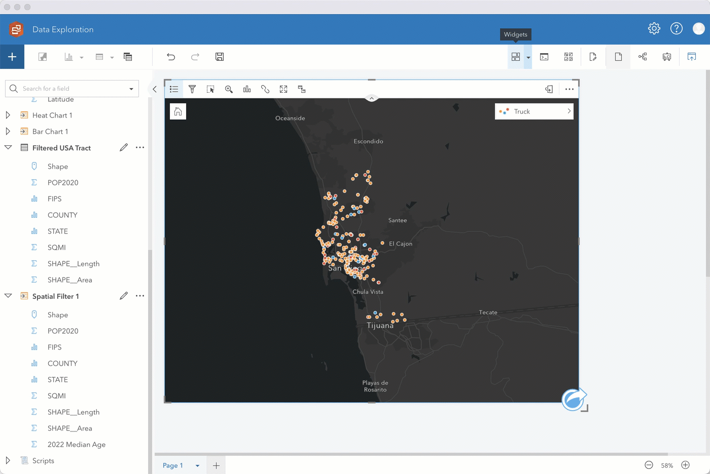
Step 1. Enable location on SoCaliBBQ by coordinates using 4326 – GCS WGS 1984 for the coordinate system. Keep Repeat identical features unchecked, click run, and drag the location field to a map.
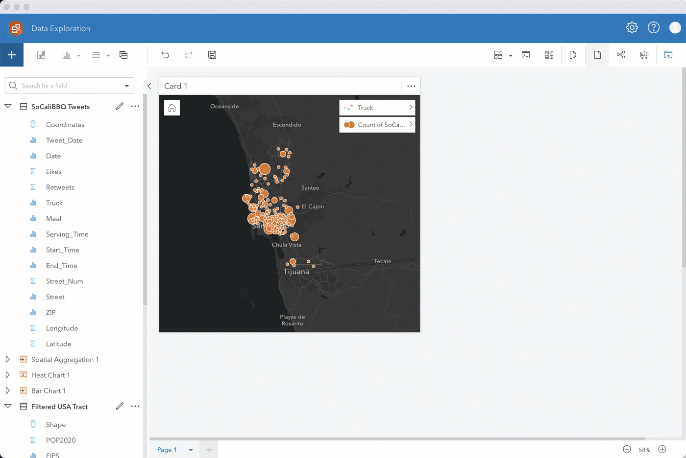
Initially, you’ll see the data styled by Counts and amounts (Size). Change the Style by field to Truck. The map automatically changes to unique symbols. Expand the legend to see which food truck has the highest occurrence. Looks like it’s the blue truck!
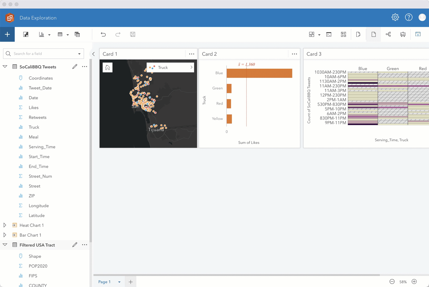
Step 2. After playing around with the different basemaps and map aesthetics, let’s go ahead and select the fields Likes and Truck, and drag them to the chart drop zone. Drop the fields when you’re hovering over the bar chart option.
With just a couple actions, you now have a neat bar chart clearly showing that Tweets about the blue food truck have the most likes. This likely means that the blue truck is selling more food to customers in comparison to other trucks.
You can also create a heat chart by dragging over the selected Serving_Time and Truck fields, which will show you popular serving times for each truck.
Step 3. Following similar steps, you can identify which streets likely get the most food truck visits by selecting the Likes and Streets fields and dragging them to a bar chart.
Go ahead and sort the chart in descending order. Then for ease of analysis, filter to show the top 5 addresses. If you enable cross filters on your map card, you can filter the map to show only the data you select on your bar chart.
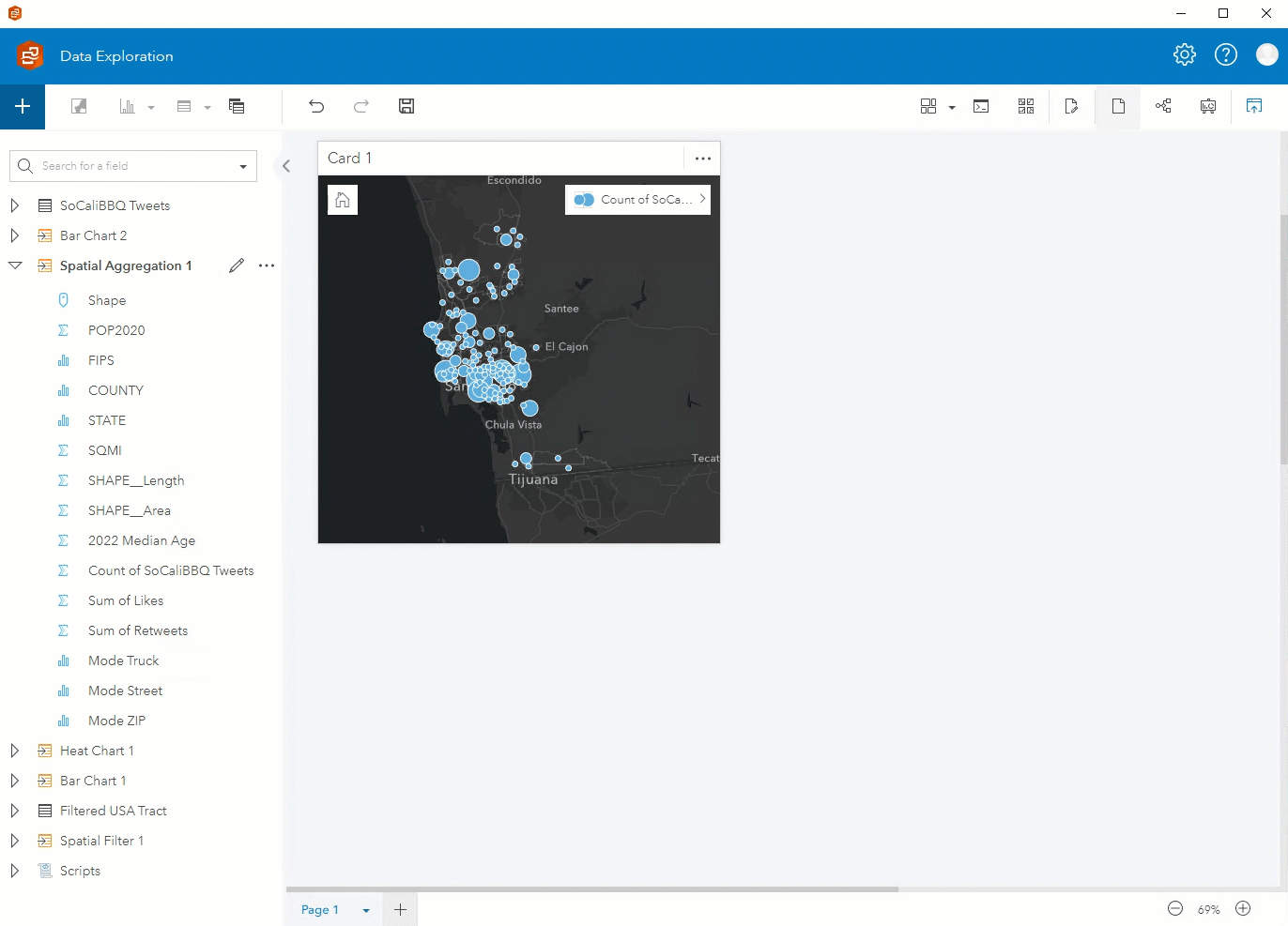
Step 4. To get an idea of the average age of residents in each food truck Census tract, we are first going to use a boundaries layer USA_Tract and spatially filter it by the food truck locations.
We then enrich the Filtered USA Tract layer with census data showing median age from 2022 by tract.
Step 5. After enriching the filtered tract with data showing median age, drag that layer onto your original map and perform a spatial aggregation to summarize the Tweets by your new Spatial Filter 1 layer. Through additional options you can also add various statistics such as the sum of Likes to summarize the data by.
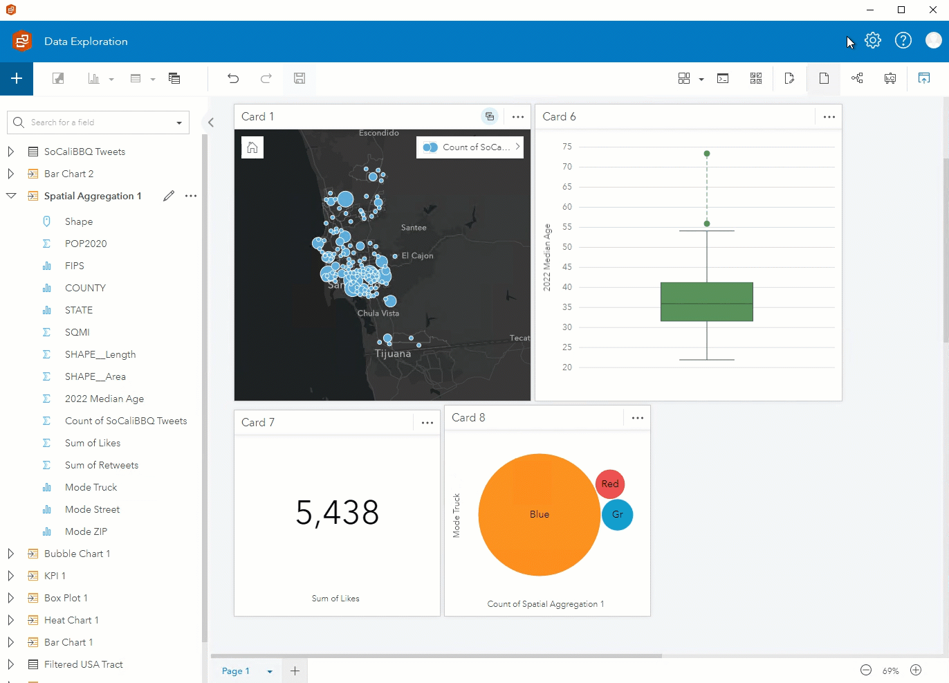
Step 6. You can visualize different components of the data using the fields from the new Spatial Aggregation 1 layer. In addition to a map showing the count of Tweets, you can create a box plot showing the median age, a KPI card showing the sum of likes, and a bubble chart showing the mode of truck.
Step 7. After putting the final touches on your page, you can publish your report and share it publicly or with your organization!
You could either stop at this point or continue to answer more questions. Some possible avenues for exploration:
- Where would introducing a new food truck make the business more profitable?
- Which streets would be more lucrative for food trucks based on demographics from areas where the food trucks are likely more visited?
Exploratory spatial analysis made simple
As you’ve seen, the scripting console has made it very easy to pull in data from external sources and then visualize it within Insights! We’ve walked through several different data exploration methods, but there are many more ways to conduct advanced analysis.
Download our free trial of ArcGIS Insights, pull in your desired data, and explore for yourself!

Article Discussion: