All charts in Insights have a default sort order, while many of these charts also offer you the option to change the sort order. With so many sorting options it can be difficult to know how to choose the right one. This blog will use usage data for electric vehicle charging stations in Ottawa, Canada to demonstrate sorting options.
Deciding on a sort order for your charts really comes down to what is going to be best for your audience. Your choice of sort order should be based on what you would like to communicate and emphasize to your audience. On the charts that allow changing the sort order, there are up to five possible sort options.
Ascending: Low to high by numeric variable
Descending: High to low by numeric variable
A to Z: Sort alphabetically A to Z by string variable
Z to A: Sort alphabetically Z to A by string variable
Manual: Sort by clicking and dragging
The following table summarizes the sort options for charts where users can change the sort order:

Sort ascending
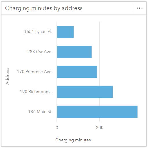
Ascending order is best for charts where you want to emphasize the lower numeric values on the chart. For example, perhaps you want to bring attention to the stations with the lowest number of charging minutes and ask some questions. Why are the charging minutes so low at these addresses? Are the stations in a hard to access location? Are there just fewer people with electric vehicles in these areas?
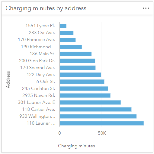
You can also filter charts to show the top or bottom n values which can further highlight your data. Sorting in ascending order can be complemented by filtering by the bottom n values. Here the five stations with the lowest charging minutes are displayed to bring the most attention to these specific stations.
Sort descending
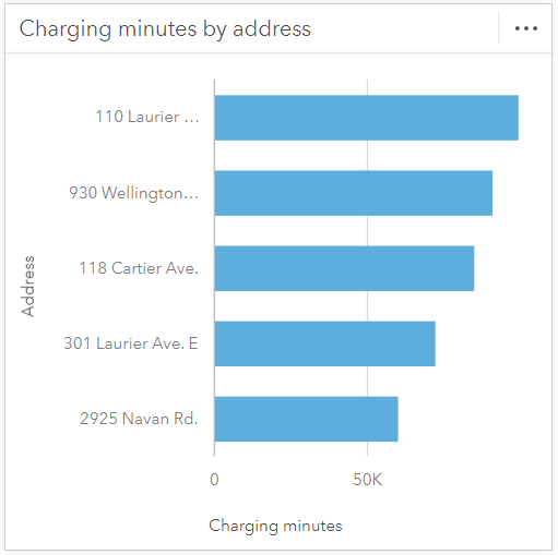
Descending order is best for charts where you want to highlight the highest numeric values. For example, maybe you want to discuss the charging stations with the highest number of charging minutes. Why do these stations have such high charging minutes? What is different at these stations compared to those with fewer charging minutes and can you apply our findings to increase charging minutes at low charging minute stations?
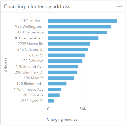
Sorting in descending order can be further supplemented by filtering by the top n values. Here the five stations with the highest charging minutes are displayed to focus on these specific stations.
Sort alphabetically
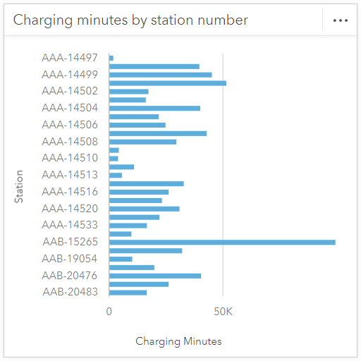
Alphabetical sort orders (A to Z and Z to A) are best when you want users to be able to find a label value quickly. For example, if you look at charging minutes by station number, it would be very difficult for users to pick out the station number if they were not sorted alphabetically as the station numbers are very similar.
Sort manually
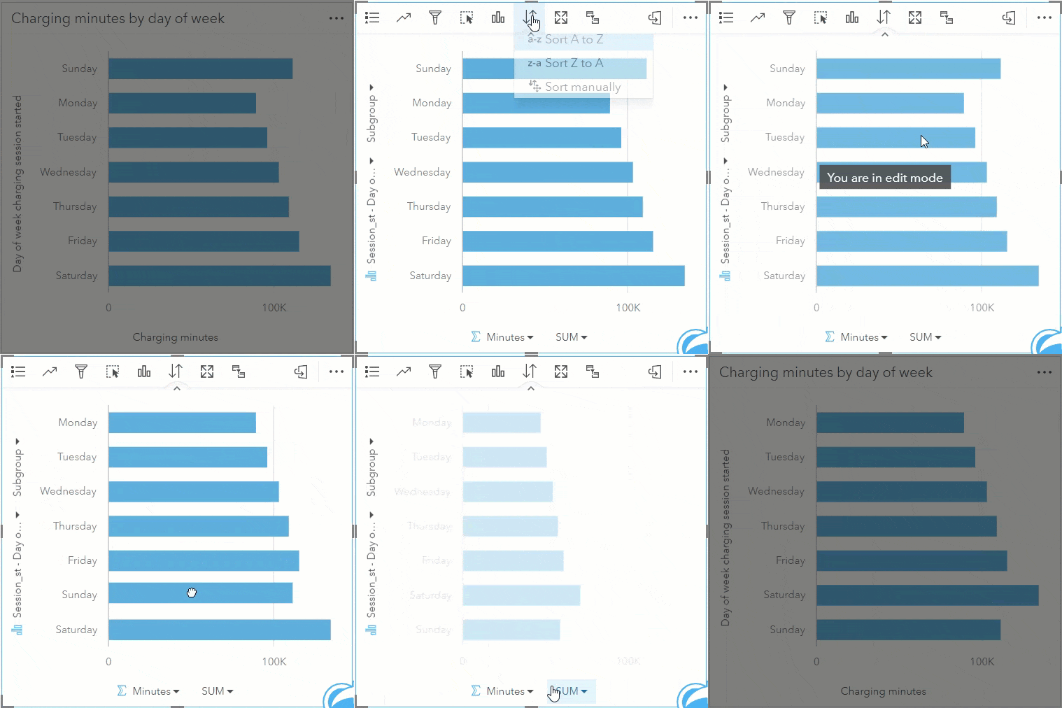
A manual sort order is best for when you’d like to order the chart into a specific order. For example, if you’re interested in which days of the week are busiest for charging, you may want to manually sort the chart to change the start day of the week.
Conclusion
As you can see, changing the sort order on your charts can have a significant impact on its ability to convey the proper information. Remember to change the sort order based on your audience and the information you would like to convey to them. Happy Sorting!
Data attribution
The electric vehicle charging station usage data for this blog was obtained from the City of Ottawa Open Ottawa website. This blog contains information licensed under the Open Government Licence – City of Ottawa.

Article Discussion: