Welcome to the third and final instalment in this tutorial series. If you want to start at the beginning, try Make a map. If you want to start in the middle, try Make an app. But you can also start right here if you like, where I’ll show you how finish this web map experience about pink lakes around the world.
Today I’ll show you how to configure the list widget in ArcGIS Experience Builder, which allows you to give a guided tour of your map’s features and customize it however you like.
As before, If you need more instructions on any of the steps below, I recommend trying this lesson: Design a layout for a thematic map in ArcGIS Experience Builder. It goes through a very similar process in more detail.
Add a list widget
1. Open your Pink Lakes experience from the last tutorial. If you don’t have one, you can catch up with the following steps:
- Open Experience Builder.
- Click Create new.
- Click ArcGIS Online and search for b932826985a14dfaa4a8708f549f6bf9.
- On the Pink Lakes Template card, click Create.
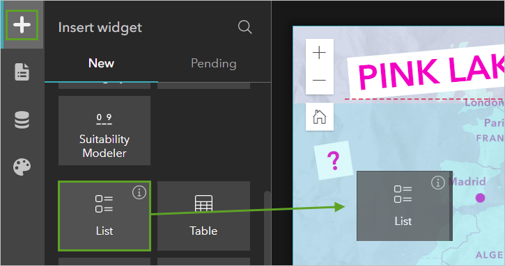
2. In the Insert widget pane, click List and drag it onto the map.
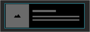
3. In the List 1 pane, choose the second template.
4. Click Start.
5. Click Select data. The Select data pane lists the map already present in the experience: Pink Lakes.
6. Expand the Pink Lakes map and click the PinkLakes layer.
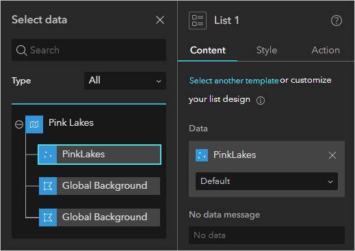
Now your list has access to the PinkLakes data, and you can populate the list with attributes from this layer.
Add content to the list
1. On the list, click the image. In the Image 2 pane, click Dynamic.
2. For URL, click the Attribute button and click Attribute.
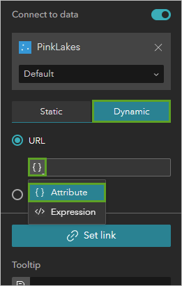
3. In the Attribute pane, click the Picture field.
On the canvas, pictures appear for the first few list items.
4. On the list, delete the top piece of text.
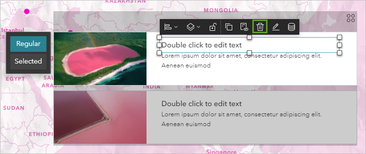
5. Double-click the bottom piece of text to edit it. On the toolbar above the text, click the Dynamic content button.
6. In the Dynamic content window, click Name. Press Enter, then click Notes.
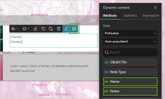
Now your list contains a picture and text to describe each lake.
Manage actions
Actions in Experience Builder allow people to interact with your data through the app. There’s an action on your list by default, but it’s not the one you want.
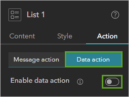
1. Select the list. In the List 1 pane, click the Action tab. Click the Data action tab and turn off Enable data action.
You’ll add an action that zooms to each lake on the map when they are clicked in the list.
2. Click the Message action tab and click Add a trigger. In the Select a trigger pane, click Record selection changes.
3. Click Map 1 and click Zoom to.
4. Click Custom and type 20,000.
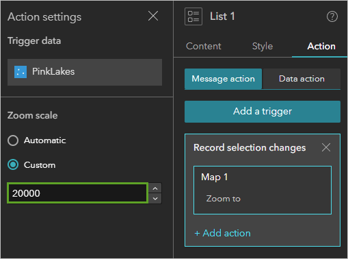
I settled on this scale by trial and error. It’s a “best fit” scale for viewing the different lakes in my map.
5. On the top ribbon, click the Live view button. Explore the experience you have so far. You should be able to do the following:
- Scroll through the list.
- Pan and zoom on the map.
- Click features on the map and view their pop-ups.
- Click features on the list to zoom to places on the map.
Style the list
You’ve already learned some skills for changing the size, position, and color of elements in the last tutorial. You’ll apply some of those skills, and more, to make the list look good.
1. Turn off live view.

1. Change the list’s rotation to 5 degrees.
2. Drag the corners of the list to change its size and shape. Reposition it on the map. Size and position the text boxes as well.
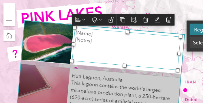
4. Change the text’s color to pink.
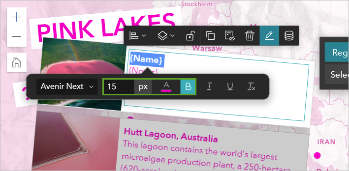
5. Highlight just the {Name} part of the text and make it Bold and 15 px.
6. In the List 1 pane, on the Content tab, expand the States section.
7. Change Border to 0 px. Next to Selected, click the On button.
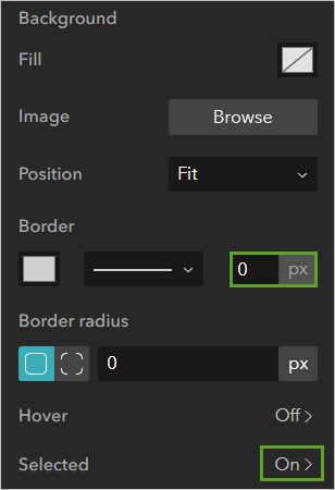
Here you can change how list items appear once they are selected.
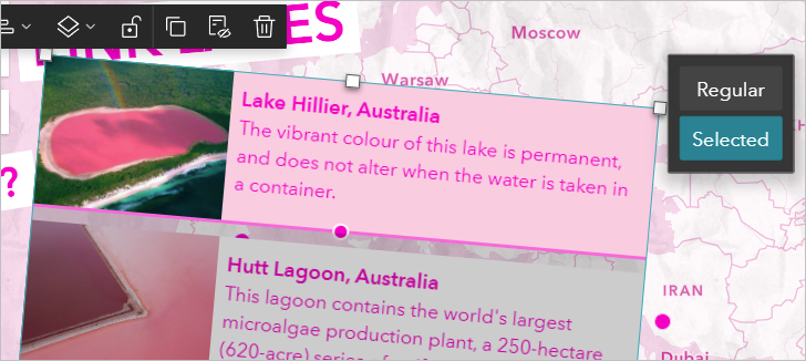
8. Change Background Fill to a pale pink color. Change the border to 0 px.
9. At the top of the List 1 pane, click the ← Selected button to return to the other properties.
You’ll also make the list items pink when someone hovers over them.
10. Under States, next to Hover, click Off.
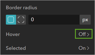
11. Turn on Enable hover.
12. Change the Background Fill to a pale pink, and change the Border to 0 pt.
Continue to adjust styling properties for the list until it suits your taste. Add, change, or remove elements to suit your taste.
To test your experience, on the top ribbon, click Save and then click Preview. When your experience is complete, click Publish.

ArcGIS Experience Builder offers cartographers important and powerful customization tools for making web maps and sharing geographic stories. This example of an all-pink map is something frivolous and fun, but I hope it gave you some ideas and skills to apply to your own mapping projects.
You can view my completed web experience here. You can examine all of its properties in this template.


Article Discussion: