ArcGIS Experience Builder enables you to deliver responsive web experiences without writing any code. You can create apps that contain 2D and 3D maps, text, and media. Experiences can focus on one type of content or can combine and link many types of content to create a complete experience and destination for your audience.
To create an experience, drag, position, and configure widgets such as maps, images, text, and tools. You can add triggers and actions to make widgets work together, within a single page or across multiple pages. Start an experience using an existing template or create one from scratch. You can save your work as a new reusable template.
ArcGIS Experience Builder is built into ArcGIS Online, so you can leverage all of your existing content. Using the Experience Builder Developer Edition, developers in your organization can extend Experience Builder with their own widgets, templates, and themes.
Key features:
- Build single and multipage apps (mapcentric or not) for display on a fixed or scrolling screen.
- Interact with 2D and 3D content in one app.
- Add interconnected tools with drag-and-drop widgets.
- Brand apps with themes.
- Deploy responsive apps to any device.
- Design custom app templates.
- Create, deploy, and manage apps in a single place.
Build an experience
Building any experience follows these general steps.
Step 1 – Start building your app using an existing template or start from scratch.
Step 2 – Edit widgets already in the template or add widgets to your app, such as maps, images, text boxes, and lists. Organize widgets on a single page or across multiple pages.
Step 3 – Connect to data sources that widgets in your app use. You can connect to web maps, web scenes, hosted feature layers, and ArcGIS Server feature layers. Use triggers and actions to connect widgets.
Step 4 – Customize the look and feel of your app with themes. Set colors that make your experience pop and add your own branding.
Step 5 – View and interact with your completed app using live view. using different screen sizes to ensure the content is adapted properly. When finished, publish and share the experience with your audience.
Experience gallery
The Experience gallery displays all of the experiences you have created, are shared with you, or you’ve favorited. Use the gallery to view, edit, or change your experience, view templates, or create a new experience.
After you sign in using your ArcGIS account, the gallery appears and shows your experiences. The Gallery allows you to:
A – View your experiences.
B – Search for experiences using keywords.
C – Filter by ownership and sharing
D – Select a group
E – Choose sorting method
F – Toggle between card and list view
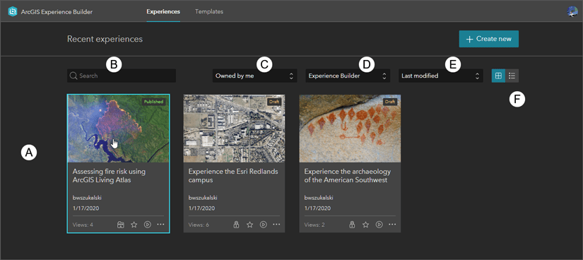
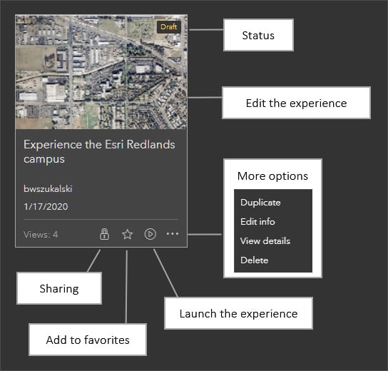
You can view experiences in card or list view. The card and list views offer additional tools and options, which are described in the image below using the card view.
Each item in the gallery has a status label (Draft or Published), thumbnail, and details such as name, owner, date modified, and number of views. Click the thumbnail to edit the experience and click icons to update its share status, add the item to your favorites, and launch the experience in a browser.
More options allows you to duplicate the item in your content, edit its item details, view the item page, or delete the item.
Template gallery
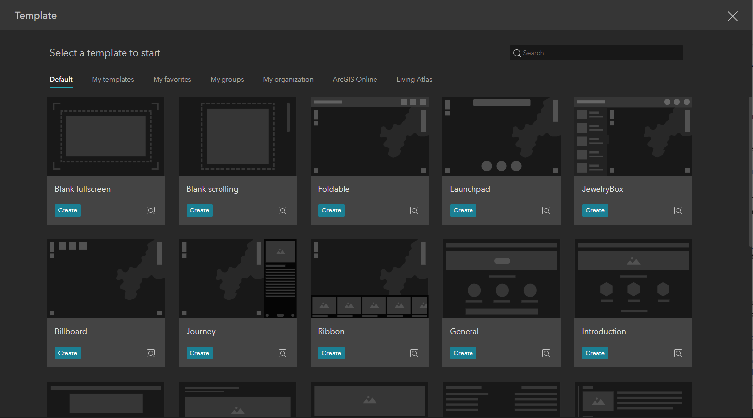
From the Experience Gallery click Create new to open the template gallery.

The template gallery contains the default templates, as well as templates that you’ve created, those shared with you, and public templates, including those found in ArcGIS Online and ArcGIS Living Atlas.
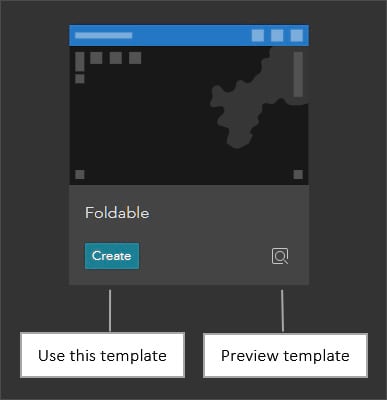
Hover over any template to learn more about it.
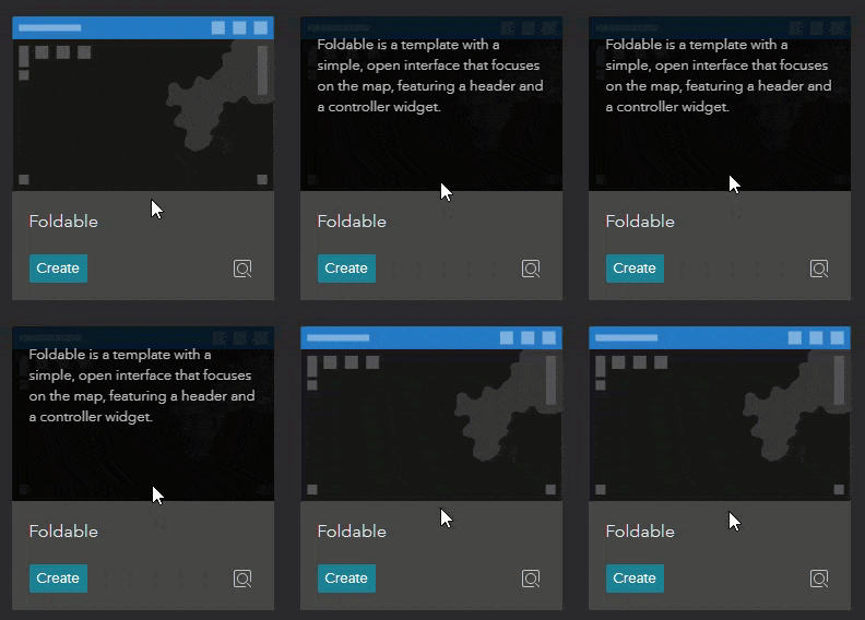
Preview the template, or click Create to use the template to create an app.
Builder interface
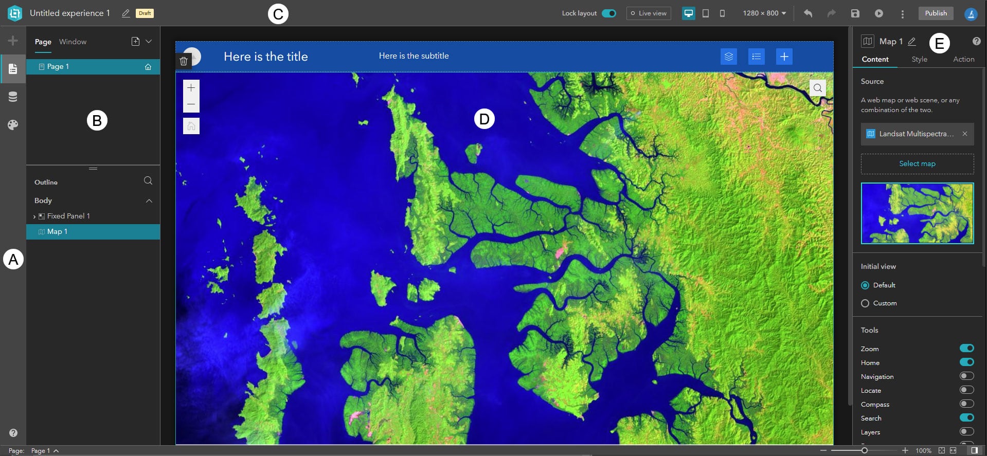
When you click Create, or open an existing web experience for editing, the builder opens with the tools and options that you use to create or edit your experience. These include:
A – The side bar allows you to open the widget, page, data, and theme panels.
B – The left panel displays your pages and page outlines in searchable structured list. The outline contains an expandable list of all widgets in your app.
C – The builder toolbar displays tools that you use to lock the layout, preview your experience, save, undo/redo, publish, and more.
D – The canvas is where you design and build your app by adding and moving widgets around the canvas.
E – The configuration panel displays the settings for the selected widget or page.
Pages
A page is the foundation of your app layout. It has three main elements that can contain content: the header, footer, and body. Your app can have one or more pages.
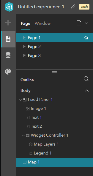
Each page has an outline, which lists all its widgets and how they’re grouped. An outline shows content in the header and footer (if enabled for the page) and body (the overall container within the page).
Shown below, Page 1 in our app contains a fixed panel widget containing an image widget, two text widgets, a widget controller, and a map. The widget controller is itself a widget, and contains a map layers widget and legend widget.
Widgets
Widgets are the main building blocks for your experience. In Experience Builder there are two types of widgets, basic and layout.
Basic widgets are functional widgets which behave as app tools.
Layout widgets are containers that help organize widgets on the page.
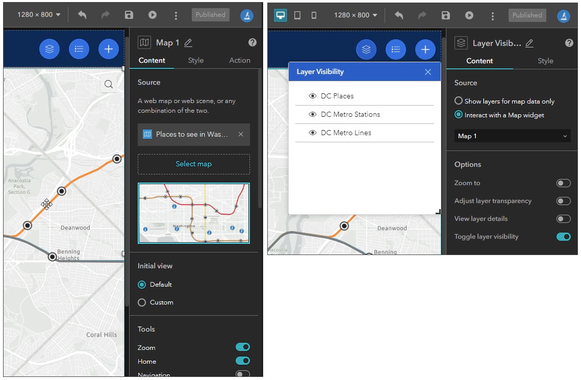
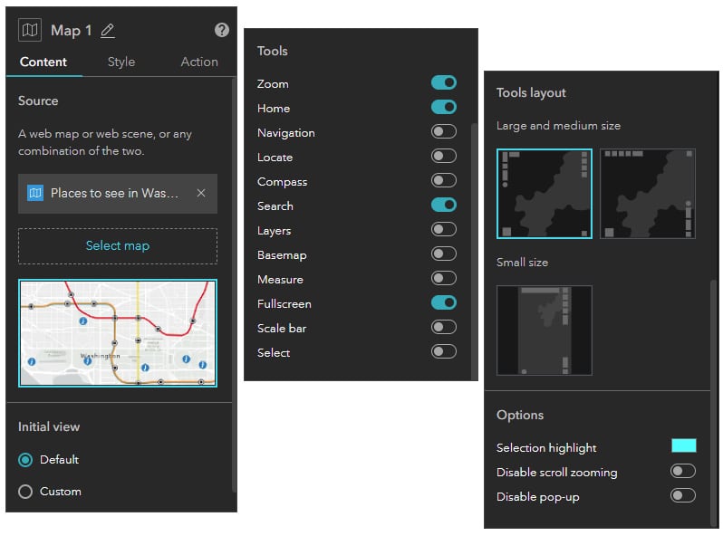
When you select a widget, the configuration panel displays the current settings. Each widget is different and will have different settings. In the example below, the Map widget and its properties are shown on the left, the List widget and its properties are shown on the right.
The configuration panel will display Content, Style, and Action tabs as applicable for the selected widget, with unique settings for each.
Content
Content is what’s in a widget; the text string in a text widget, the layers in a map layers widget, or the map in a map widget. Shown below, the Content tab in a map widget shows the map that the widget contains, along with properties you can toggle and set.
Style
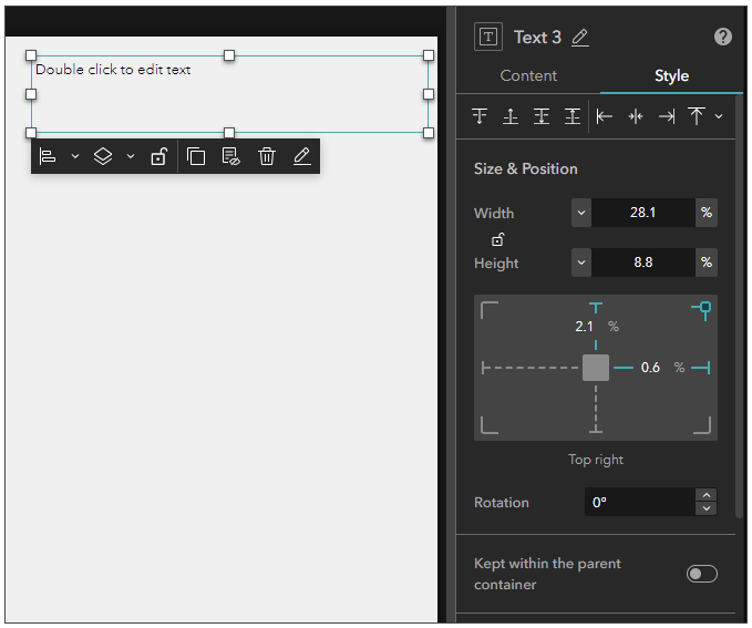
The Style tab enables you to change the widget appearance. The example below shows the style properties available for a Text widget.
Toolbar
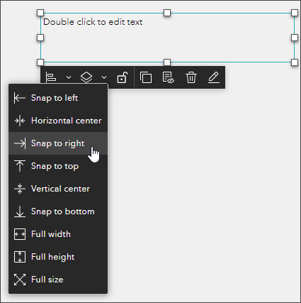
Each widget also has a widget toolbar that provides quick access to commonly used tools, such as alignment, display order, and so forth.
Triggers and Actions
Triggers and actions are important capabilities in Experience Builder. You can use them to connect two or more widgets, so when something happens in one widget it causes something to happen in another widget.
Click the Action tab to use Add a trigger.
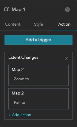
In the example shown below, a map widget supports two triggers; when the map extent changes and when the selection changes.

These triggers are used to trigger an action in another widget. For example, you can synchronize two maps such that when the extent of one map changes, the second map will also change to match. The example below shows the use of triggers and actions used to synchronize two maps. For more information, see Add action triggers to widgets.
More information
For more information see
- ArcGIS Experience Builder
- What is ArcGIS Experience Builder?
- Widgets overview
- Create your first web experience
This article was originally published on February 8, 2020, and has been updated.

Commenting is not enabled for this article.