In my last post, I showed you a Mars rover tracking app. In this post, I’ll show you how to make its in-app tutorial in the out-of-the-box version of Experience Builder.
If you add a similar tutorial to your Experience Builder project, give credit to Bruno Sousa and the Rice University CRC Spatial Studies Lab.
- Background
- Create an app from a template
- Make a button look like a map tool
- Anchor a window
- Add section views
- Add animations
- Save and preview
- More information
Background
Users of all kinds of apps benefit from instructions. Back on Earth, imagine you’re a planner for a mid-sized city. Your city is redesigning an intersection long considered to be confusing and dangerous for pedestrians, bicyclists, and drivers. As part of your mission to represent the community’s desires and needs, there will be a 45-day public comment period for the plans.
You decide to make an app for users to visualize and give feedback on the proposed redesign. You’ll include the measure tool so users can better understand distances and areas, and you want to include instructions for the tool that are specific to your app.
You’ll use the following materials for this exercise:
- 3D Cambridge (Template)
- Cambridge Citywide 3D Scene (Web scene)
- measure-tool-images.zip (Esri icons and GIFs)
All GIS data used comes from the City of Cambridge, Massachusetts. The city provides data for developers and for public consumption.
View and download more 3D data from the City of Cambridge.
Create an app from a template
1. Start Experience Builder.
Sign-in to ArcGIS or create a free trial account. Go to experience.arcgis.com.
2. Click Create new in the top right corner.

3. Select a template from the template gallery.
Browse to the ArcGIS Online tab. Search for 3D Cambridge and click Create.

This is a fixed page template with a Map widget displaying a web scene from the City of Cambridge.
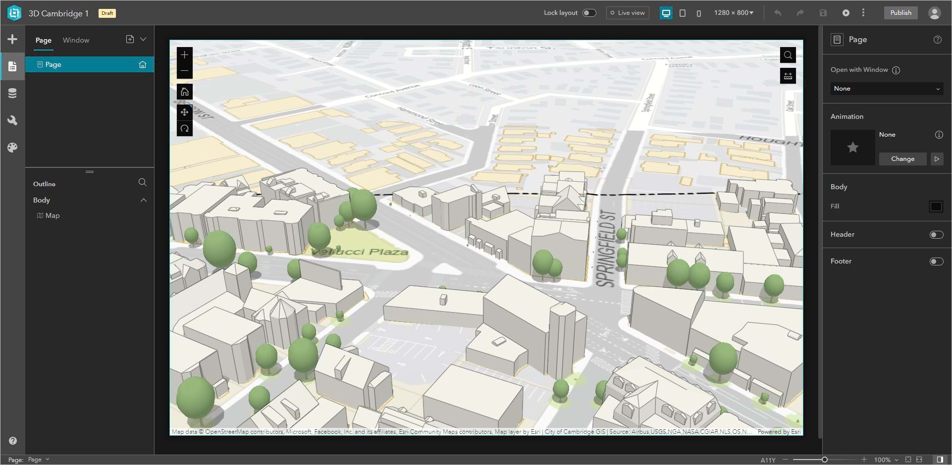
The Map widget has several tools, which you can turn on and off in the widget’s Content settings.
Importantly, Sousa’s measure tool tutorial blends in with the other map tools. It’s the same size, same color, and turns orange and displays a ToolTip when the pointer hovers over it.
Make a button look like a map tool
1. Add a Button widget.
From the Insert tab, drag a Button widget onto the map. Close the Quick style menu.
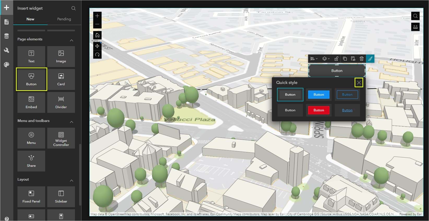
2. Resize the button.
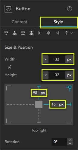
If necessary, click the Button widget to open its settings panel on the right. Click the Style tab.
Under Size & Position, change the width and height units to px and set both as 32px.
On the position graph, I set my button to be 98px from the top and 15px from the right.
3. Set the ToolTip and icon.
Switch to the Button widget’s Content settings. Under Tooltip, write Measure Tool Tutorial. Under Text, delete the word Button.
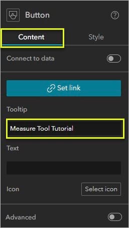
Click Select icon. You could use any of these icons or upload your own image. But since you want a question mark, you can just type one under Text. That will allow you to change the question mark’s style, size, and color in the widget’s advanced settings.
Close the Select icon menu. Under Text, type ?.
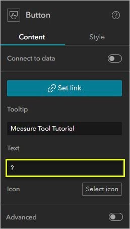
Turn on Advanced.
For both Default and Hover, make the text size 20px.
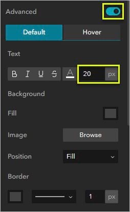
Next, you’ll match the colors of your button to match the rest of the map tools.
4. Find the theme colors.
The map tool colors are controlled by the app’s theme. On the left panel, click the Theme tab. If necessary, select the Dark theme and click Customize and Advanced color setting.
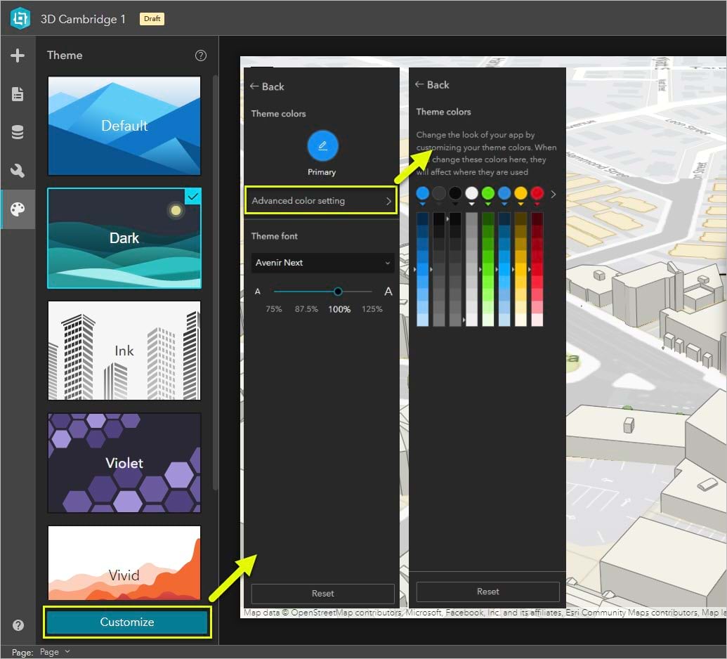
The third color (Light) affects the map tools. The fourth color (Dark) affects the tool icons in their default state. The first color (Primary) affects the icons in their hover state.
You can change them, but currently these are the three HEX colors:
- Tools – #0b0b0b
- Default icons – #f0f0f0
- Hover icons – #0c91f0
Now that you know these exact colors, click the Button widget and return to its Content settings.
5. Match the colors.
Under Advanced and under Background, click the Fill color swatch. Under Theme colors, choose the third swatch. Do this for both Default and Hover.
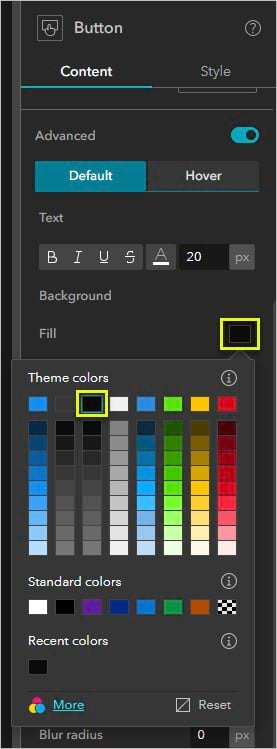
For the default text, choose the fourth theme color. For the hover text, choose the first theme color.
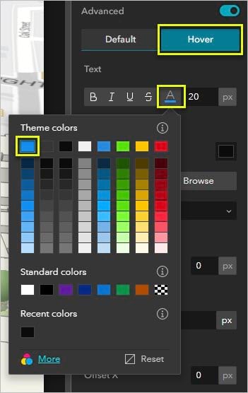
Now you have a button that looks and behaves like the Map widget tools.
Anchor a window
The main part of the tutorial is made up of a Section, Views Navigation, Text, and Image widget, all contained in a window.
1. Add a window.
On the Page tab, click Window and click Add window. Choose Simple as the template. Delete the Image and Text widgets until you’re left with a blank window.
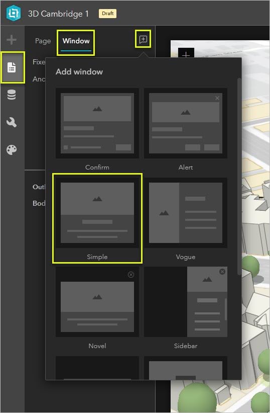
2. Anchor the window to the button.
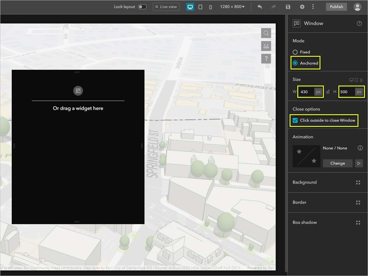
In the window’s settings, choose Anchored mode. Under Size, make the width 430px and the height 500px.
If necessary, check Click outside to close Window.
Click Page and return to the Button widget’s settings. Click Set link, select your window, and click OK.
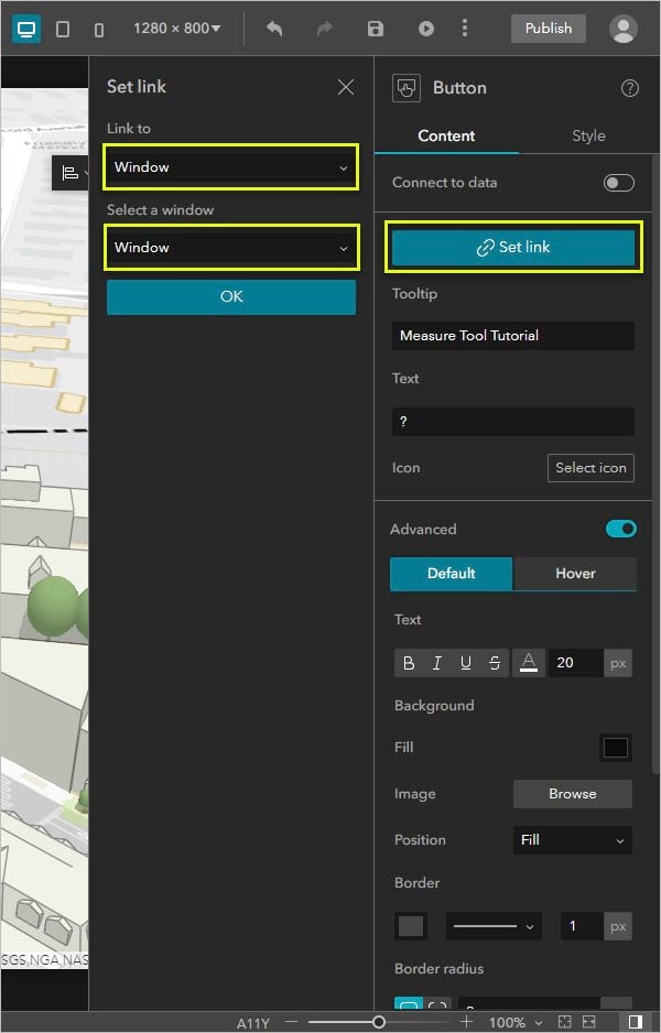
You can test your link by turning on Live view.
Add section views
Now you’ll add the tutorial content.
1. Add a Section widget.
Return to editing the window (make sure Live view is turned off). From the Insert tab, add a Section widget. Make it full size and drag up its bottom edge slightly to leave space for the Views Navigation widget, which will allow users to browse through the tutorial.
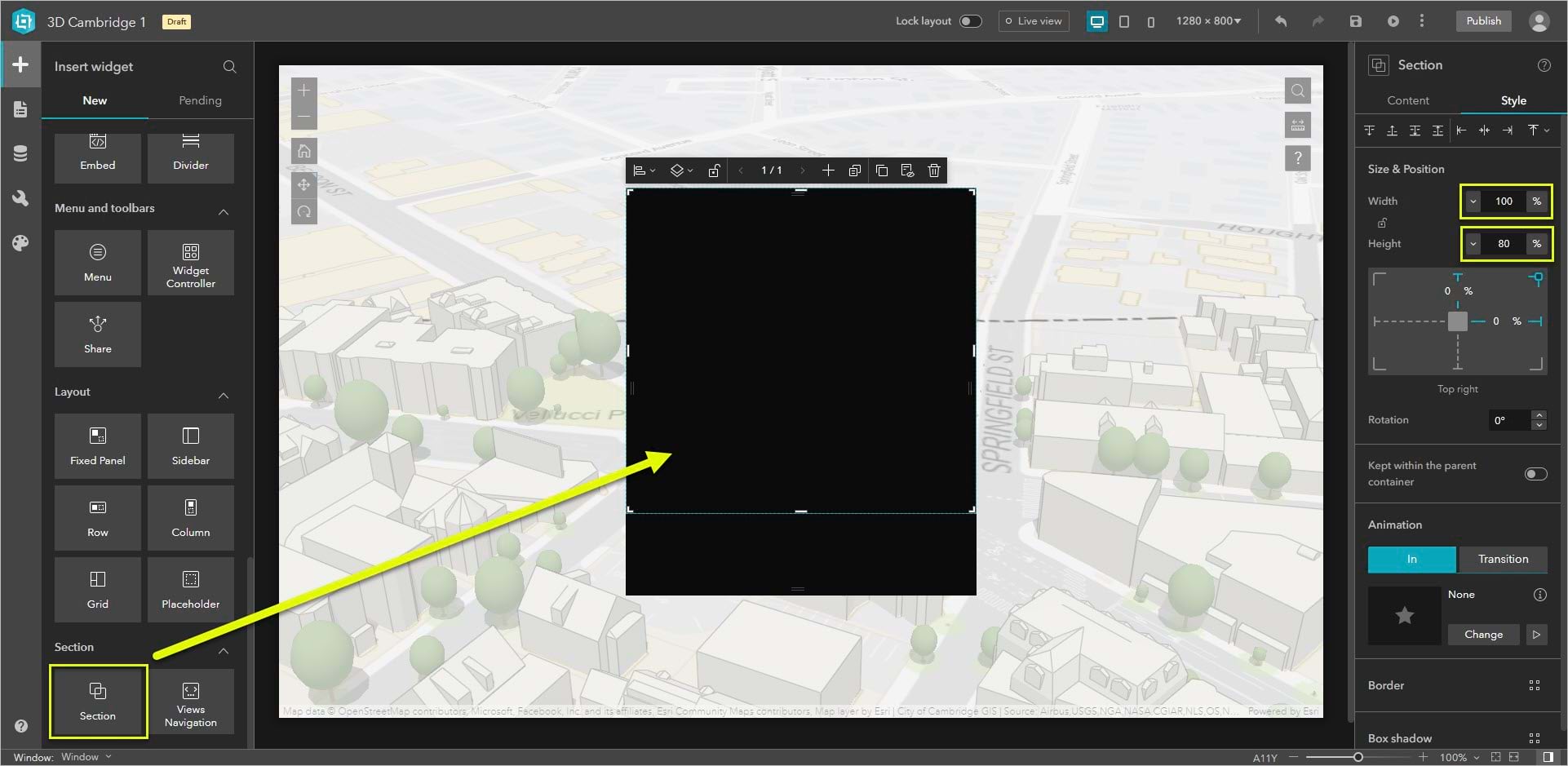
2. Add a Views Navigation widget.
Drag a Views Navigation widget into the empty space below the Section widget.
In the Quick style window that appears when you place the widget, choose a paging style. The Mars 2020 app uses Arrow 2.
Be sure that the Views Navigation widget is located outside of the Section widget.
My widget’s dimensions are width 25% and height 12%.
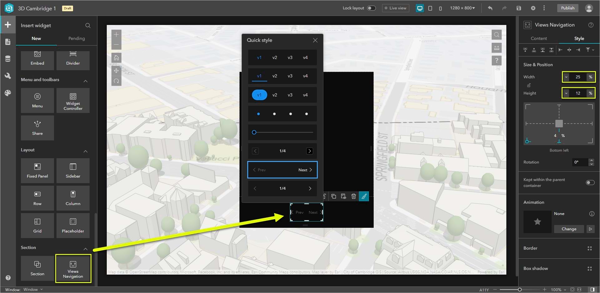
3. Set up the first view.
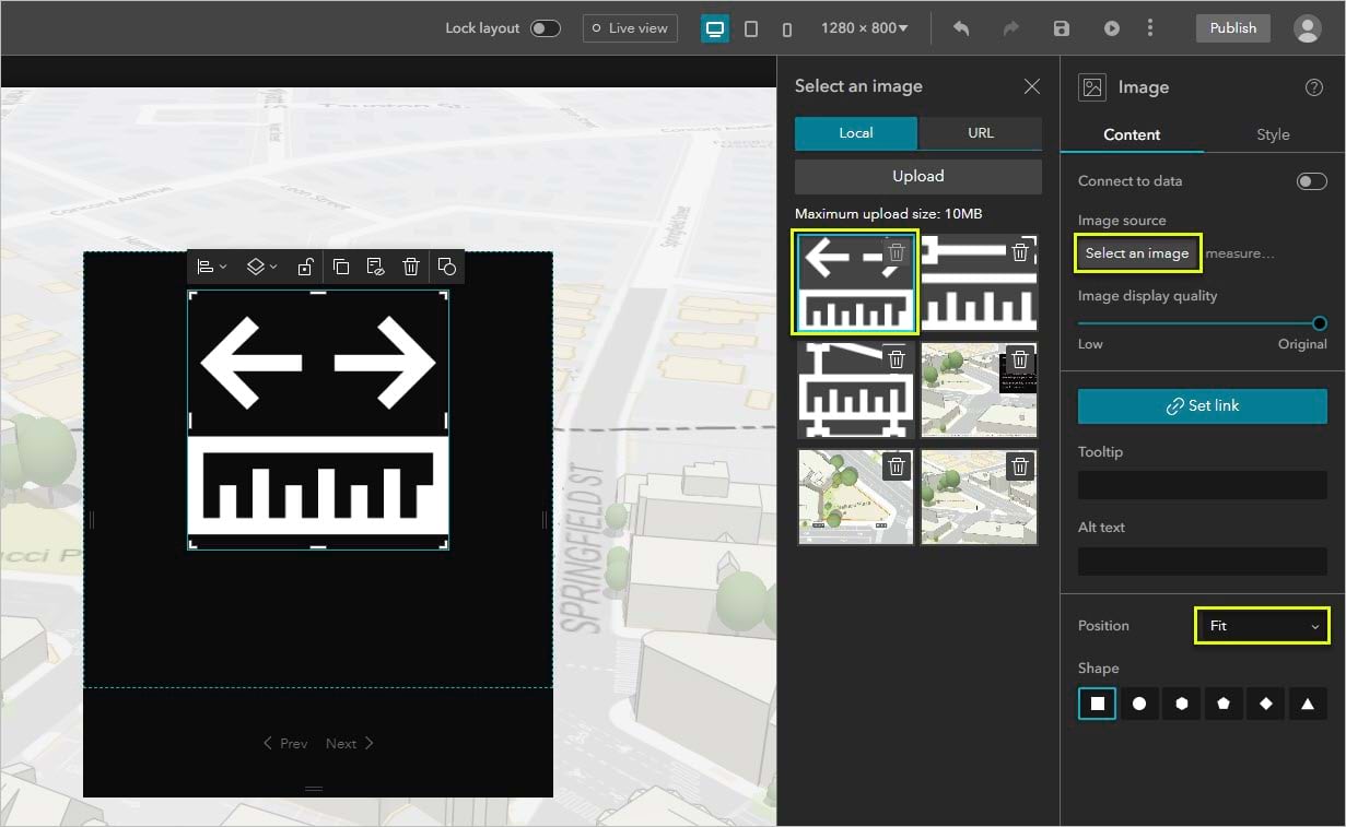
All the images you’ll need (three Esri measure tool icons and three GIFs) are in this .zip file. They are also already available in the template.
Return to the Section widget’s settings and select View.
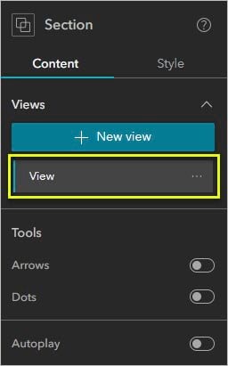
Add an Image widget and center it horizontally.
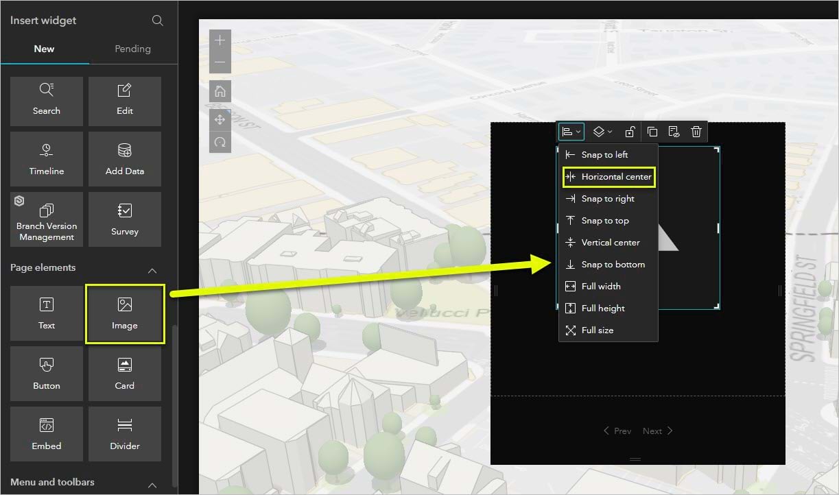
Click Select an image and choose measure_tool.png. Change Position to Fit so the edges of the .png image aren’t cut off.
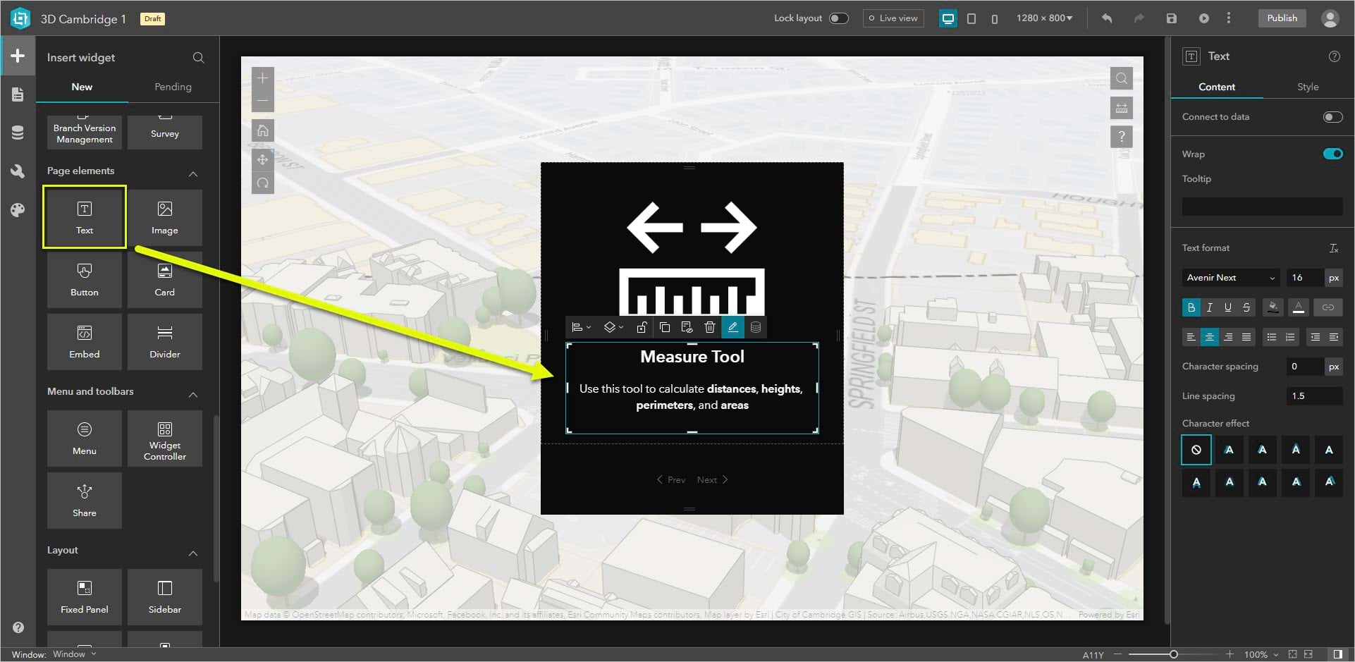
Add a Text widget under the Image widget. Write Measure Tool in bold size 24 font and Use this tool to calculate distances, heights, perimeters, and areas in size 16 font.
4. Set up the second, third, and fourth views.
The other three views will all be formatted the same, so to save time and ensure things stay in the same place you’ll make one and duplicate it twice.
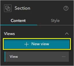
Select the Section widget. Click +New view.
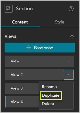
Duplicate View 2 twice.
Add two Image widgets, one for the .gif and one for the .png in the corner. Add a text widget below the Image widget.
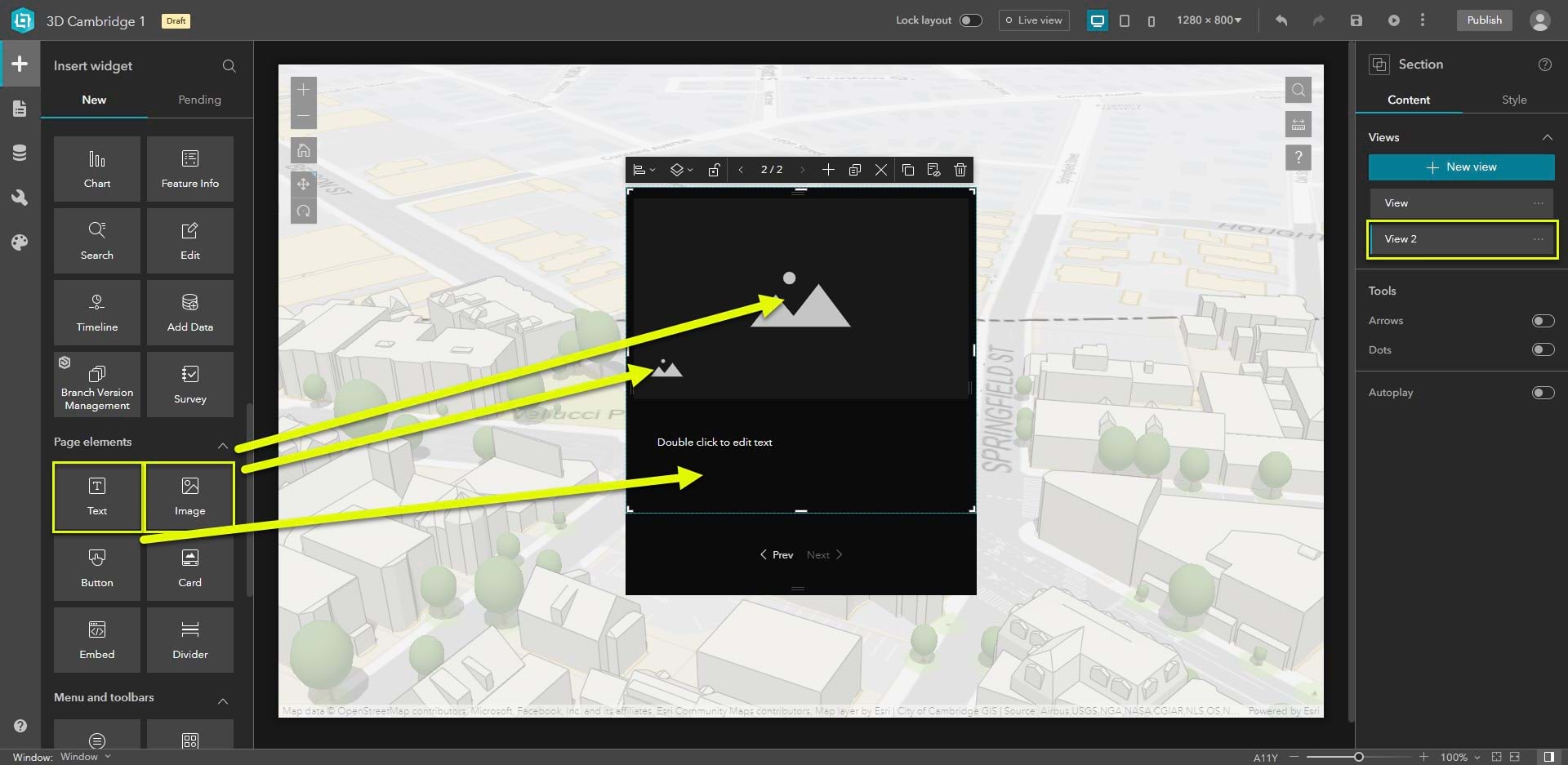
The following is a list of the images and text for Views 2-4:
View 2
GIF: measure-distance.gif
Icon: measure_distance.png
Title: Measuring distances
Text: Click once to start measuring and click a second time to stop. You can see the measurements above the line and on the widget window.
View 3
GIF: measure-height.gif
Icon: measure_distance.png
Title: Measuring heights
Text: Using the same steps you can measure the height of any feature on the map. Use the contour lines as a guide to find the highest and lowest points.
View 4
GIF: measure-area.gif
Icon: measure_area.png
Title: Measuring area
Text: To measure an area on the map, click the map once for every vertex of the area you want to measure. Double-click or click on the first vertex to complete the area.
Add animations
As a final touch, you’ll add an animation to make the transitions between views look smooth.
1. Add an animation.
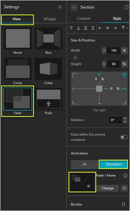
Select the Section widget. In the widget’s Style tab under Animation, click Transition then click the animation thumbnail.
Choose Fade for the view transition.
Save and preview
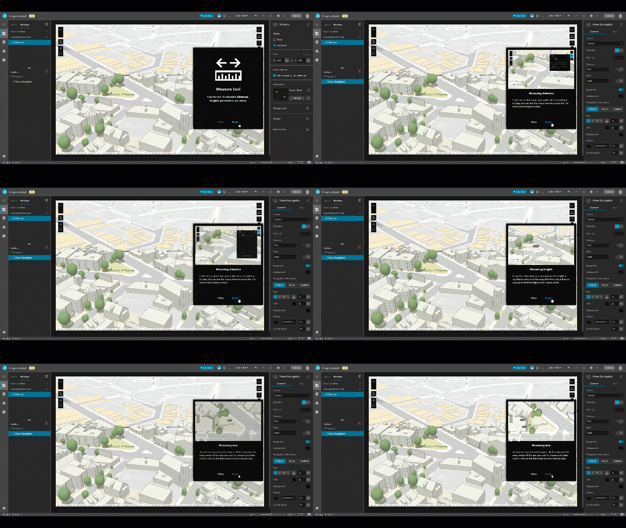
Click Live view to test out your tutorial or click Preview to open the app in a new window.
More information
To learn more about 3D GIS projects in Cambridge, Massachusetts, visit Cambridge GIS.
For more information about Experience Builder, see the following resources:


Article Discussion: