The ArcGIS Runtime rendering team has been working hard over the last couple of releases to overhaul how selected features and graphics are highlighted in the MapView and SceneView. You may have noticed at 100.4 that deprecation notices were added to some selection-related API properties. With the release of 100.5, you’ll see some further changes in the API, as well as some aesthetic and behavioral changes to how the selection highlight is rendered.
We know that any change of this kind has the potential to impact existing use cases and applications, and we didn’t do this lightly, but these changes were needed to bring consistency, and enable some exciting new functionality in future releases.
So if you’re interested in why selection highlighting has changed, and more importantly what the changes are, read on…
Why change it?
In ArcGIS Runtime, selection highlighting has always been synonymous with a “halo” (technically a Gaussian blur) around the symbol. The halo dates from the first releases of ArcGIS Runtime when we only supported 2D rendering and simple symbology. It was easy to implement and looked pretty neat.
But the implementation also made it difficult to apply the effect consistently as other rendering modes and symbology types were introduced – e.g. static (software) rendering and 3D symbology (world-space markers, models, scene layer meshes). Furthermore, not only was there variation within Runtime, selection highlighting was also inconsistent with the rest of the ArcGIS platform.
As we considered our plans for Runtime, we realized we needed to update our approach to rendering selections. These were our major drivers:
- Lay the groundwork for exciting features we’ll be introducing (starting with Reference Scale and Annotations).
- Improve visual consistency with other parts of the ArcGIS platform.
- Expand Dynamic mode (GPU) rendering to include capabilities which are currently limited to static (CPU) mode. This makes for more compelling interactive maps, and on mobile devices will improve battery life.
What has changed?
Depending on your use cases, you either might not notice much change, or it might look quite different. Under the hood selection highlighting at 100.5 has been re-engineered from scratch, and none of the previous implementation remains. We set ourselves the following design objectives to meet the above goals:
- Consistent…
- …within Runtime.
- …within the platform.
- Future-proof.
- A single GPU-based implementation, common to 2D and 3D, and all symbology types.
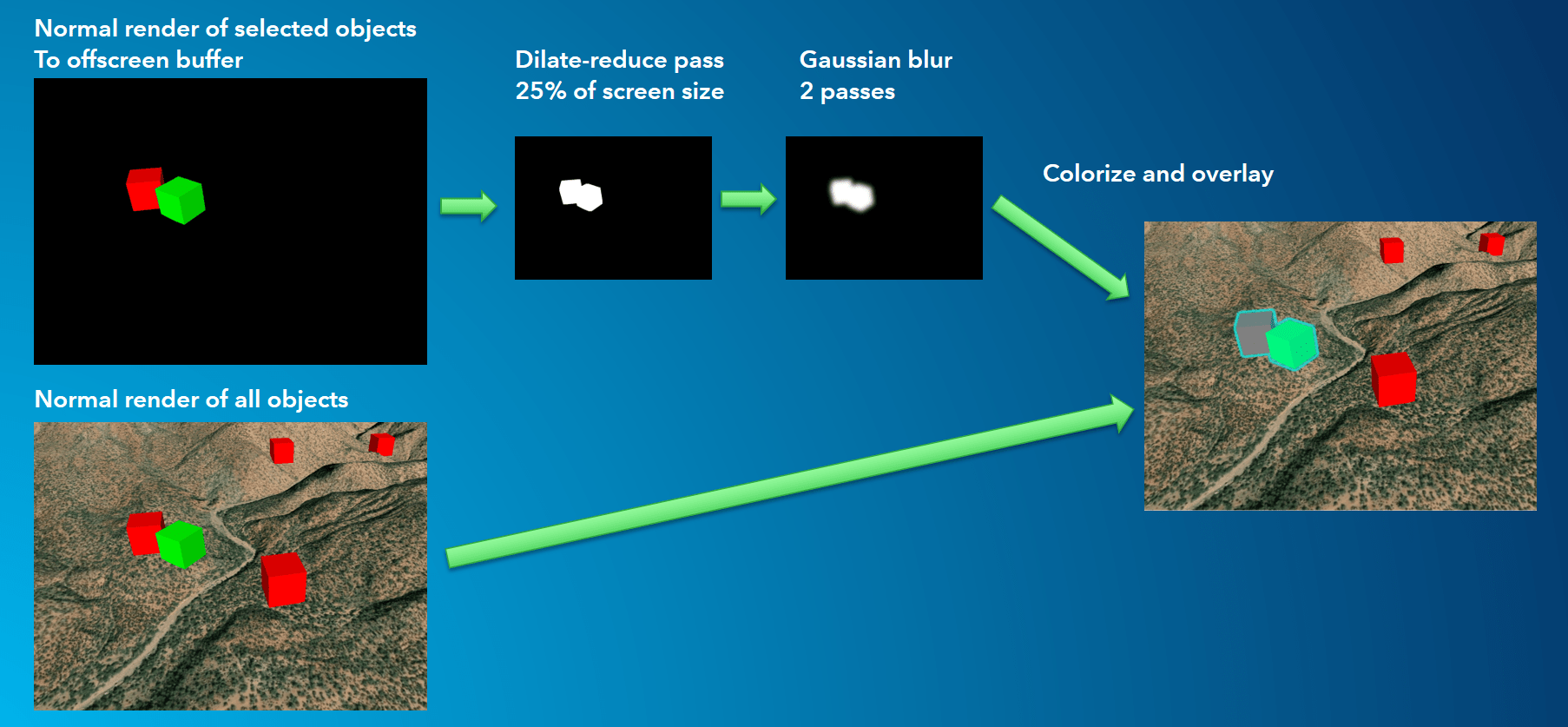
We settled on a GPU screen-space solution, which runs on pixels after the GPU primitives have been projected to screen space. An overview of the process is shown below. The example uses 3D markers in a SceneView, but the process can easily be applied to all 2D and 3D symbology.

Figure 1: Overview of how selection highlighting is rendered at 100.5. The blur passes run on a smaller image to reduce GPU workload on mobile devices.
What does it look like?
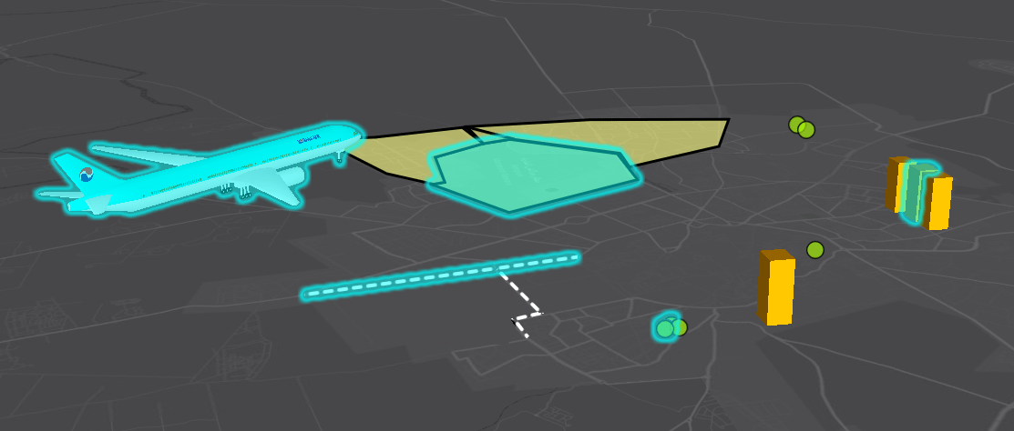
This image shows some 3D symbology examples. You can see that the highlight is unioned where there is an overlapping selection, and that the highlight is drawn as an overlay (i.e. the gaussian blur extends in screen space, independently of depth culling).

Figure 2: SceneView (3D) symbology examples
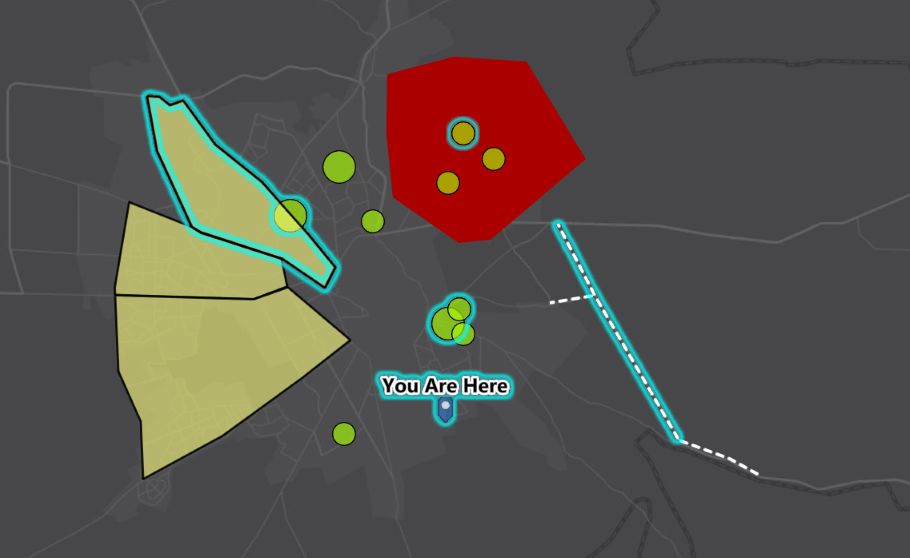
We alter 2D highlighting only slightly by removing the translucent tint to bring it closer to the legacy behavior.
This image shows some simple examples. You can clearly see that the highlight is unioned where there is an overlapping selection, and that the highlight is drawn as an overlay. The obvious difference between this and 3D is that there is no tint.

Figure 3: MapView (2D) symbology examples
We did this by rendering only the outlines of polygon features to the offscreen buffer. We also added an additional pass to substract the original symbol from the blur (in the case of polygons, this means just the outline symbol). The overall effect is to make 2D highlighting look visually similar to 100.4 while sharing the new GPU pipeline with 3D selection highlighting. Where you have a selected item or items that don’t overlap any other selected items, 100.5 will look almost identical to 100.4.
API Impacts
FeatureLayer SelectionWidth
At 100.4 this property was marked deprecated. At 100.5, partly due to limitations on some of the GPU hardware we support, you’ll still find the property in the API but it has no effect. Instead, the width of the Gaussian blur is determined from the effective DPI of the device it is running on, the effect being to produce a similar physical width irrespective of device DPI.
FeatureLayer SelectionColor, GraphicsOverlay SelectionColor
At 100.4 these properties were marked deprecated, and we introduced the new GeoView SelectionProperties API. At 100.5, selectionColor on a layer or graphics overlay is no longer supported in SceneViews. The properties remain, but have no effect. However, for MapViews, we were again aware that removing these properties completely could have an impact on established use cases, and so we have retained the capability to specify a color per layer, although see below for notes on how this affects performance. Although the capability is still there, it is based on the new highlight implementation and hence the behavioral changes noted above still apply.
MapView Per-layer Selection Color
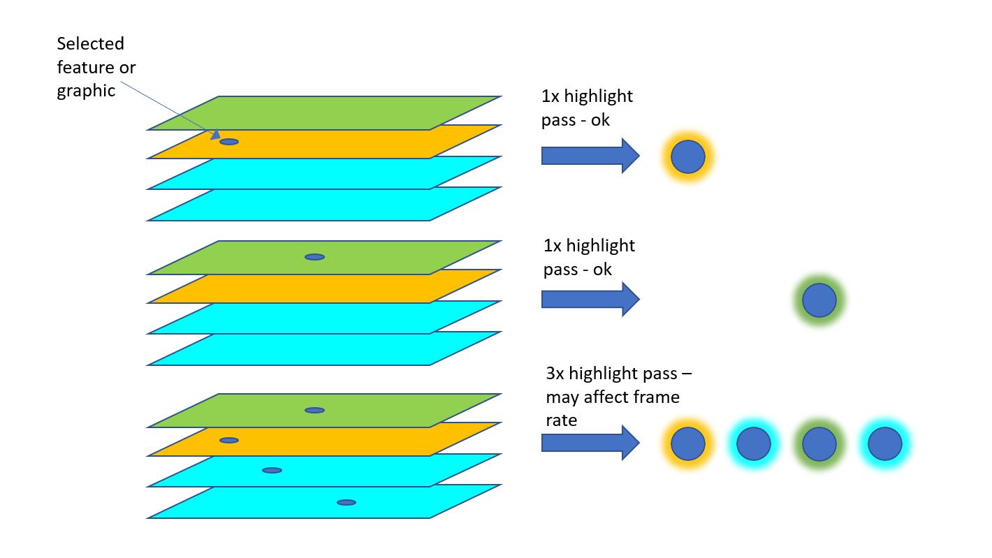
The use of per-layer selection color is strongly discouraged in 100.5 because each layer that has a selection and a different selection color requires a separate (and relatively expensive) render-dilate-blur pass as discussed above and shown in Figure 1. Depending on the use case, this could adversely affect rendering frame rates and the user experience. This is illustrated in Figure 4. Note: just setting a selection color on a layer does not incur a cost, the layer needs to have a selection as well.

Figure 4: Per-layer selection color highlight passes.
Bear in mind that the GeoView SelectionProperties color can be changed at any time, with zero cost, so if your use case involves only a selection from a single layer at any time, changing this may be a viable alternative to using multiple per-layer selection colors.
Note: In 100.5, per-layer selection color can only be used if you do not use the GeoView SelectionProperties API (for simplicity’s sake I’ll just discuss layers, but this applies to overlays too). As soon as the SelectionProperties API is used, the GeoView color takes precedence and the per-layer color properties have no effect.
Anything else?
Re-engineering the solution was also an opportunity to holistically address some long standing bugs and inconsistencies. For example, “invisible” symbology: a feature or graphic that is explicitly made invisible can’t be selected (or identified), however if the feature is visible but the symbol has “null” style (for simple line or polygon symbols), or has 100% transparency (zero alpha value) it should be able to be highlighted. This was patchy at 100.4, but now works across the board.

Commenting is not enabled for this article.