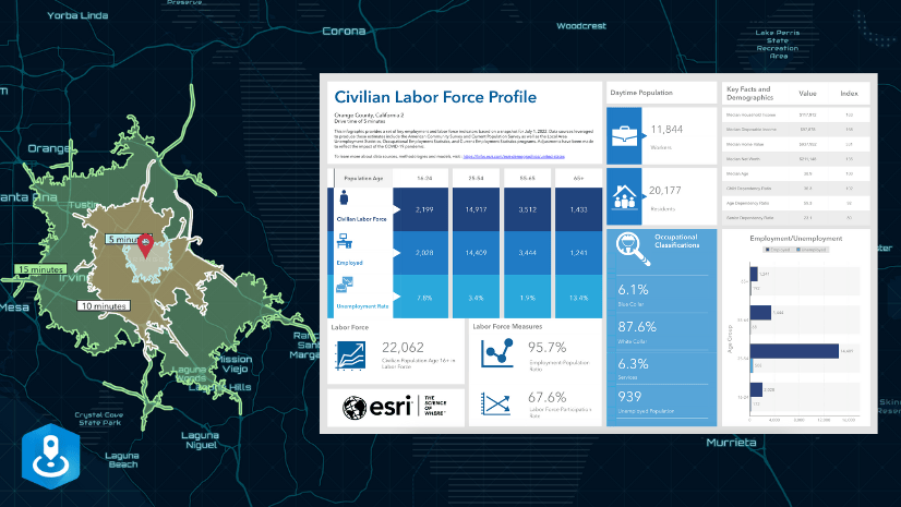
ArcGIS Experience Builder allows you to create responsive web apps using a wide variety of widgets that can interact with one another. With the latest update of Experience Builder and ArcGIS Business Analyst, you can now also include the Business Analyst widget in your web experiences. The Business Analyst widget gives app authors the ability to include infographics that display demographics, Tapestry segments, market potential, and business information specific to a location.
Since there is so much customization possible with Experience Builder, it can sometimes be time-consuming to create a well-designed app. Thankfully, Experience Builder has a large template gallery to kick start the process of creating experiences – now, with Business Analyst curated templates.
What are templates?
Templates are pre-configured layouts and experiences that you can modify to meet your exact requirements. Experience Builder provides a variety of default preset layouts as templates, allowing you to drag and drop widgets into the layout. Other templates are pre-configured experiences with widgets and interactions already set up that are shared with you.
The Business Analyst team has created several pre-configured templates designed to highlight the Business Analyst infographics.
How do I find the templates?
You can find the curated Business Analyst templates when you create a new web experience. Here’s how:
- Open ArcGIS Experience Builder from your ArcGIS Online organization.
- Click + Create new.
- On the Select a template to start page, click the ArcGIS Online tab.
- In the search field, type
Business AnalystorCommunity Analyst.
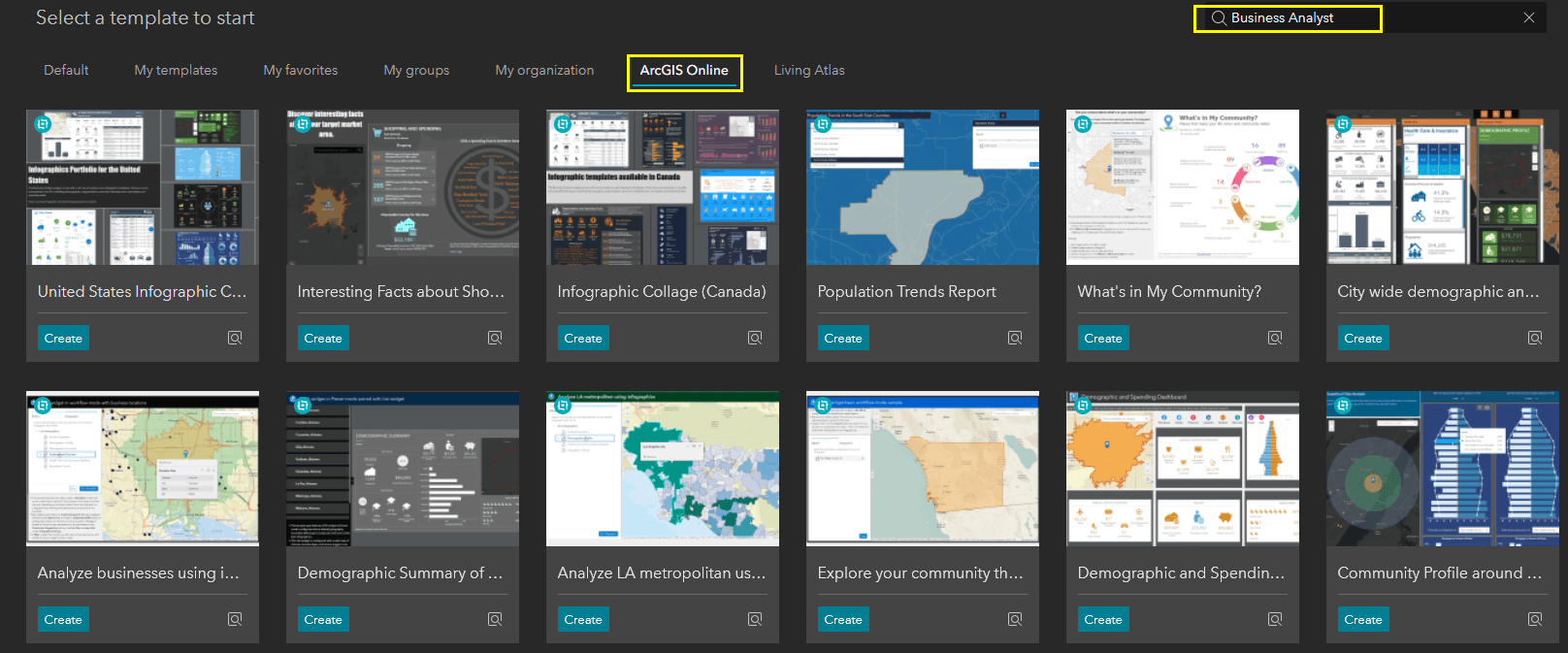
There you have it – all the curated templates, ready to be used and customized. Templates created by the Business Analyst team have a Created by ESRI logo.
For any template, you can use the Preview button to launch the web experience so you can see how it’s designed, test the widget interactions, and decide if it’s the best one for you. Each template includes a window that appears on launch with some information on the template, including which mode it’s using (Workflow or Preset), the intended use of the app, and the specific configuration of the widgets used.
I’ve picked a template – now what?
Now you make it yours! Once you have chosen the best template for your web experience, you can customize it with your own data and theming – or just leave it as is.
As an example, if you wanted to create your own “What’s in My Community” web experience, you can click Create on that template, and you will be taken to the builder. From there, you can leave everything as is or make any changes you want.
I suggest at least removing the window that pops up with the template information. Before you do, note the valuable information included. You can remove the window by going to the Window tab in the Page pane and choosing Delete from the Window options menu.
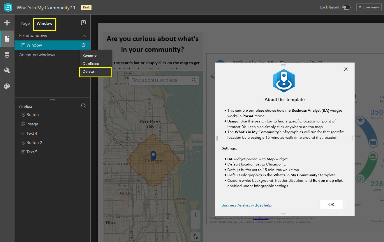
Now, maybe like me, you live in Canada and want to use this application for finding what’s in your Canadian neighborhood. Since there is a What’s in my Neighbourhood? infographic, you can change the Business Analyst widget’s location and infographics settings to reflect this.
- Select the Business Analyst widget to open its configuration options.
- In the Location settings section, choose Canada from the Country or region drop-down menu.
- Optionally, you can choose a default location for the infographic.
- In the Infographics section, choose What’s in my Neighbourhood.
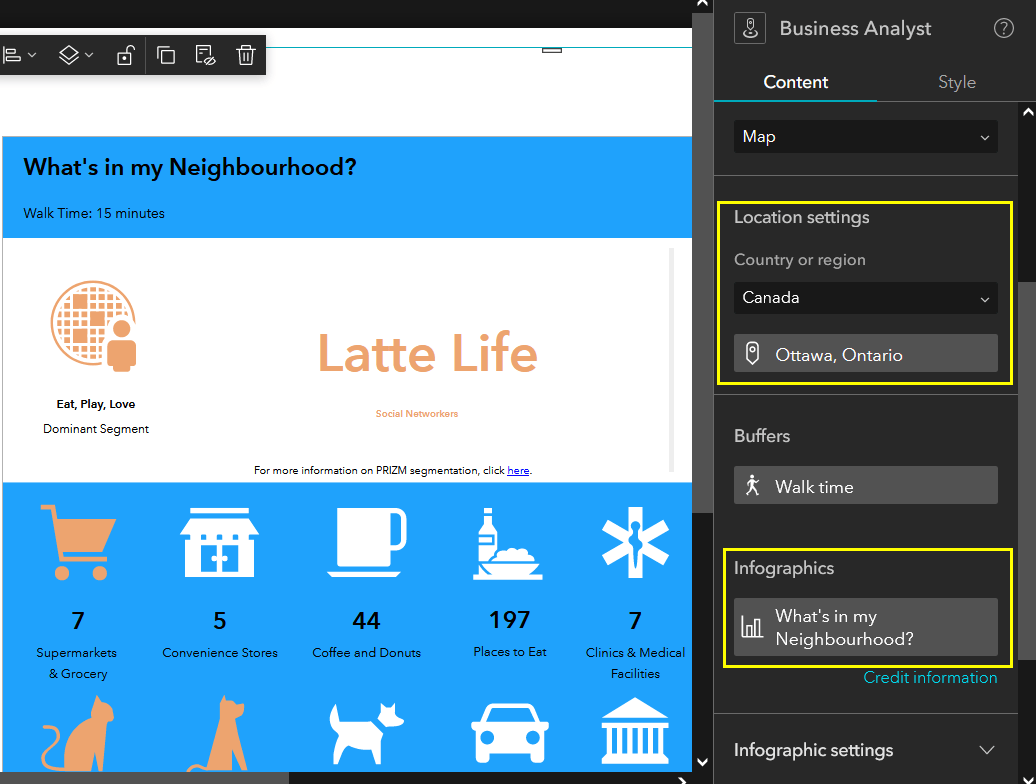
Now this same template is set up to be a web experience tailored for Canadian neighborhoods. Note that not every infographic is available for every country.
Since the infographic is connected to the map widget (where users can search for a location), you should also change the initial view of the map to reflect your new area.
You can also do things like change the app’s theme, text font, or even add more widgets. When you’re happy with the web experience, click Save and then click Publish. The What’s in My Community template is now your own custom web experience that you can share with others.
What templates are available?
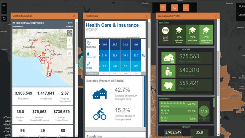
We have a curated set of templates for you to choose from. They include:
- Demographic Summary of Arizona Counties
- Key Demographic with Map (light)
- What’s in My Community?
- City wide demographic and health analysis
- Key Demographic Facts with Map
- Population Trends Report
- Demographic and Spending Dashboard
- Analyze businesses using infographics
- Analyze LA metropolitan using infographics
- Explore your community through infographics
- Health Care and Insurance Analysis
- Community Profile around Superfund sites
- Interesting Facts about Shopping and Spending
- Infographic Collage (Canada)
- United States Infographic Collage
We are always continuing to build and curate new templates and infographics – so expect to see more ready-to-use templates for your next experience.

Article Discussion: