With ArcGIS Business Analyst, you can use demographic, consumer, and business data to create presentation-ready maps and analyses. Two of the best ways to share Business Analyst results are to create an infographic or create a dashboard. Luckily, you don’t have to choose between these two formats—ArcGIS Business Analyst and ArcGIS Dashboards have long partnered on an in-app integration.
Many Business Analyst users are familiar with the basics of sharing infographics in dashboards. This article takes you a step further, providing guidance for creating a custom infographic and editing a dashboard made through Business Analyst. By leveraging the design and configuration options of both platforms, you can create a sleek dashboard displaying your custom infographic. Here’s a quick overview of how you can customize both infographics and dashboards to share information in an interactive, compelling way.
Create a custom infographic
Business Analyst includes many interesting and insightful infographics, and more importantly, a wealth of data that powers them. Sometimes, the standard infographic templates are almost perfect, but might not include some of the variables that help tell your story.
For this example, we are working on a project to show the use of public transportation in the Chicago area, to understand how people are getting around. We’ve discovered a standard infographic template – Commute Profile – that’s almost exactly what we need to tell this story. It includes information on how workers get to and from work, and the different modes of transportation, commute times, and more.
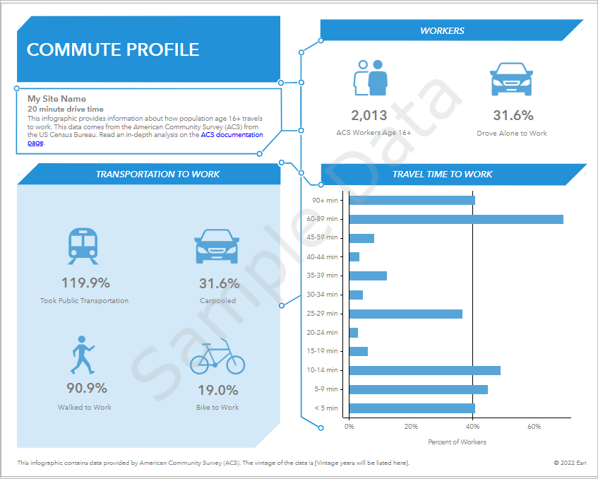
For our project, since we are focused on public transportation usage, we can take this template and customize it to “zoom in” on that topic.
On the Reports tab in Business Analyst, we can build custom infographics using templates of existing infographics. From there, we’ll choose the Commute Profile template and swap out some of the variables and panels.

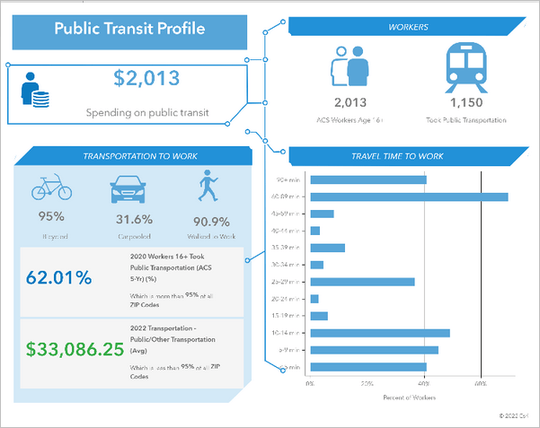
Starting at the top, we’ll replace the site summary panel with an infographic panel showing aggregate spending on public transit in the site area selected. In the builder, we hover over the panel and click Edit to modify its contents.
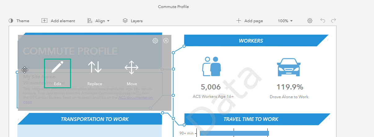
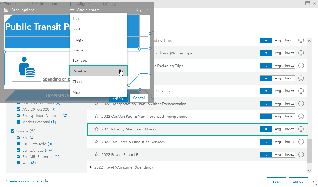
In the panel’s contents, we’ll change the title and remove some of the text fields and replace them with a variable and an icon. For this panel, we will display the 2022 Intracity Mass Transit Fares variable, part of the Consumer Spending dataset.
Next, since our focus is public transportation, we want the variable in the “Workers” section (currently showing the percentage of people who drove alone to work) to instead show people who took public transportation. Again, we can hover over the panel and click Edit, and this time we want to keep the panel layout, so we’ll just replace the variable.
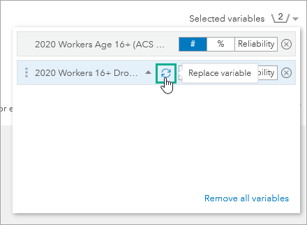
We sub in the 2020 Workers 16+ Took Public Transportation variable, from the American Community Survey dataset. Then, to reflect this change, we swap out the old icon for one that represents public transportation.
Lastly, the “Transportation to work” panel needs to be edited, since it also includes the public transportation variable, and we don’t need to repeat information we’ve covered elsewhere in the infographic. Instead, we’ll remove it and add a new panel. In the panel’s edit window, we can remove the variable, leaving us with just the three variables (carpooled, walked to work, and biked to work) and shrink them to all fit nicely at the top. Then, we add a new Interesting Facts panel below it.
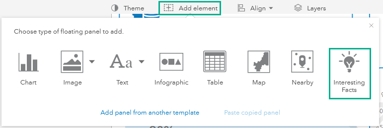
We’ll build our Interesting Facts panel to be based on variables that relate to public transportation. An Interesting Facts panel highlights “outlier” data, displaying variables that are distinctive to the site compared to others. In this case, the interesting facts panel displays transportation-related variables for which the site falls in the top 5% or bottom 5% of all areas.
Create a dashboard
Now that we have an infographic more aligned with what we want to present about public transportation usage, we can go through the Business Analyst workflow to create a dashboard.
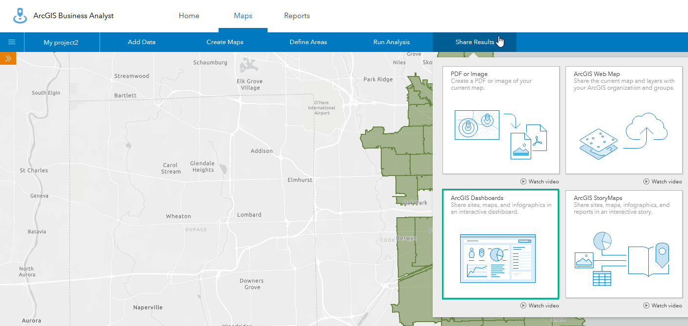
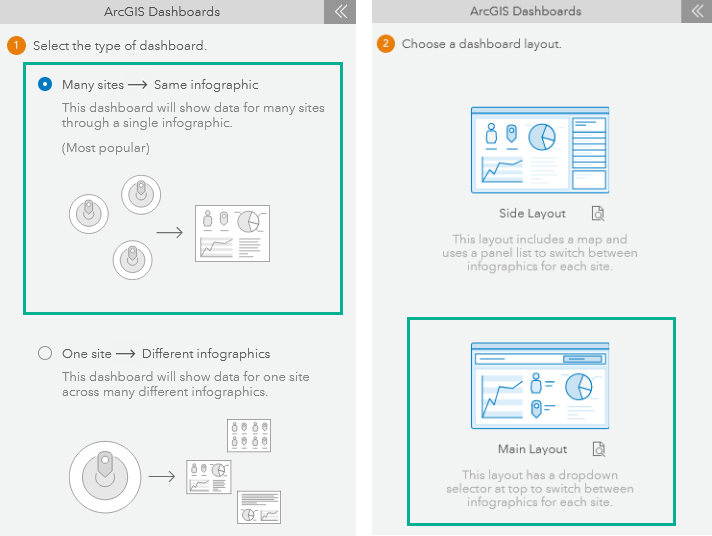
For this project, we want to see the data for each ZIP Code, so we have already added sites for those areas in and around Chicago using the Select Geography workflow for creating sites. Going through the Business Analyst dashboard creation workflow, we choose Many sites as the dashboard type, and for the dashboard layout, the Main Layout.
With the layout chosen, we can select all the sites we want to include (in this case, the ZIP Codes), then choose our custom infographic, give our dashboard a name, and click Create.
Just like that, we have a dashboard.
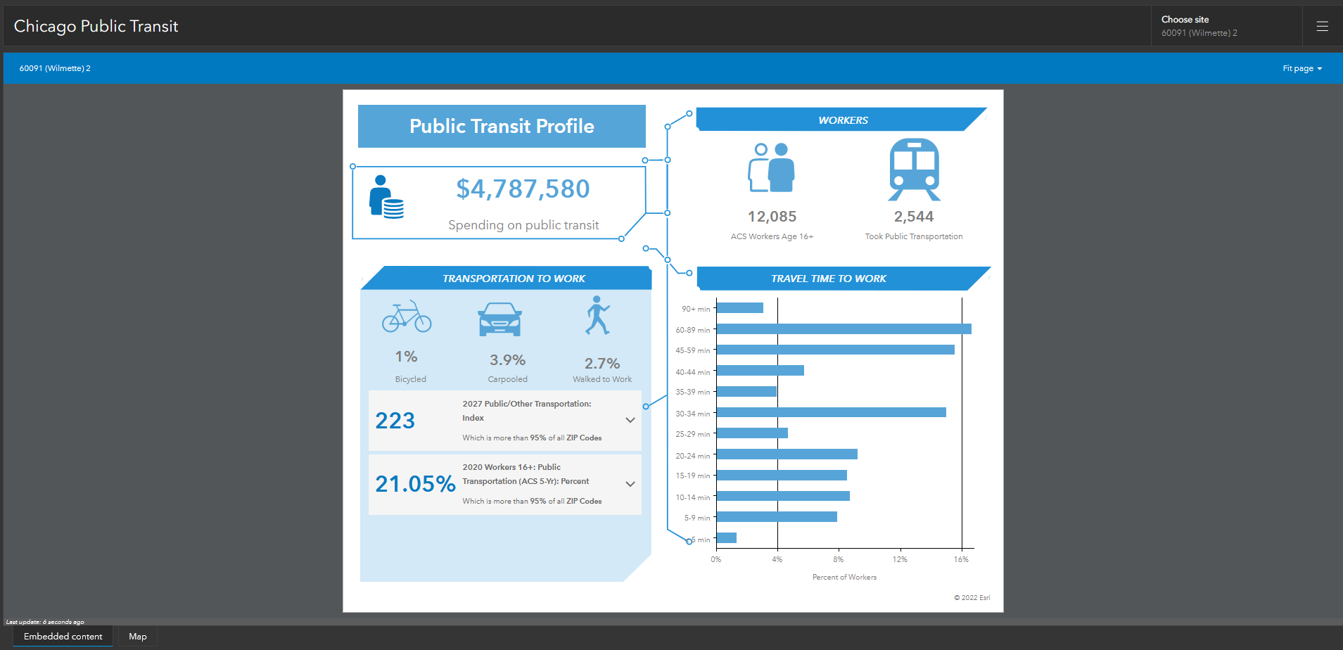
This dashboard on its own is ready to share. However, we don’t have to take it at face value. We can edit our map and dashboard to include more visualizations and data that help tell a larger story about public transportation in Chicago.
Add more data to your map
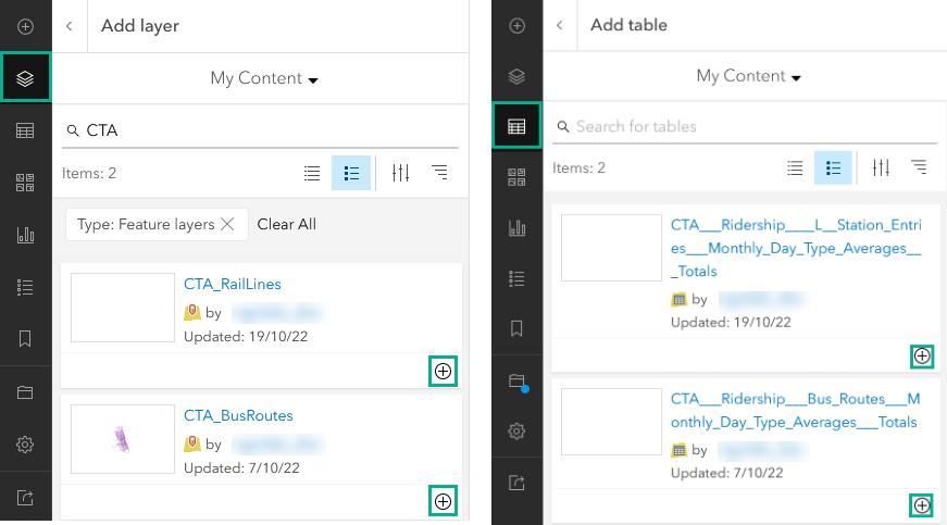
As part of this project to understand public transit use in the area, we have layers from the Chicago Transit Authority, including transit routes (bus and train), and tables showing the monthly ridership for each route. This data can complement the infographics we have in our dashboard to help tell a larger, regional story of ridership. We can add this data to the map in our dashboard that was created in Business Analyst.
In Map Viewer, we’ll open the map of sites created with Business Analyst and edit it to include this data and match our dashboard aesthetically.
The map already has our sites that were created in Business Analyst, so now we want to add the transit route layers. The transit routes layers are feature layers with line geometries representing individual bus and train routes. Since the layers only contain the locations and names of the routes, we’ll also add associated tables that include ridership stats for each route. The tables include ridership data that is not stored in the feature layers themselves. Later, we’ll use the tables’ data in our dashboard to power our added visualizations.
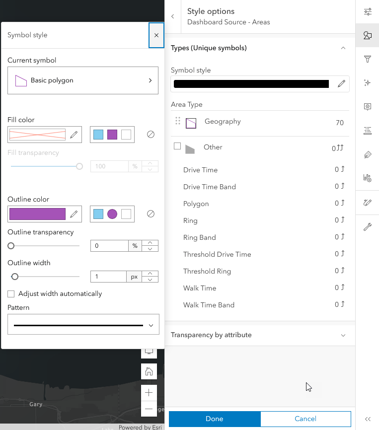
For the map’s look, since the dashboard we created is in the dark theme, we want to use a dark basemap to match. Additionally, we’ll change our layer styling for the sites so that they are transparent fill, just displaying the outline of each ZIP Code.
Customize your dashboard
Now that the map is styled and we’ve added additional data to it, we can edit our dashboard to visualize more. In Business Analyst, we click Edit Dashboard from the window that appears when the dashboard is created. Alternatively, we can open ArcGIS Dashboards and access our dashboard from there.
The first thing we want to do is expose the map that we updated. With the Main layout, the map is stacked behind the embedded contents element, in its own tab, and is only displayed when the Map tab is selected. With the map revealed, we can drag the map element to the side of the infographic so that it’s no longer stacked behind.
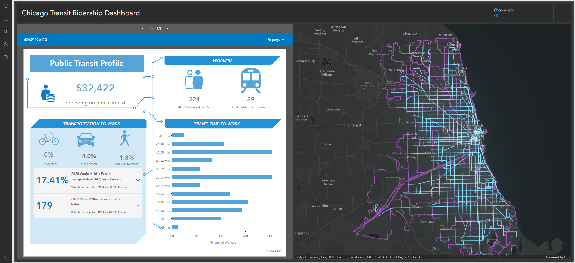
Next, we can include trends and key information that we don’t have in our infographic already. We can visualize average ridership over time for both bus and train routes, and ridership averages by day for each route, by adding other dashboard elements.
For ridership over time, we’ll add a serial chart in the right of the map.
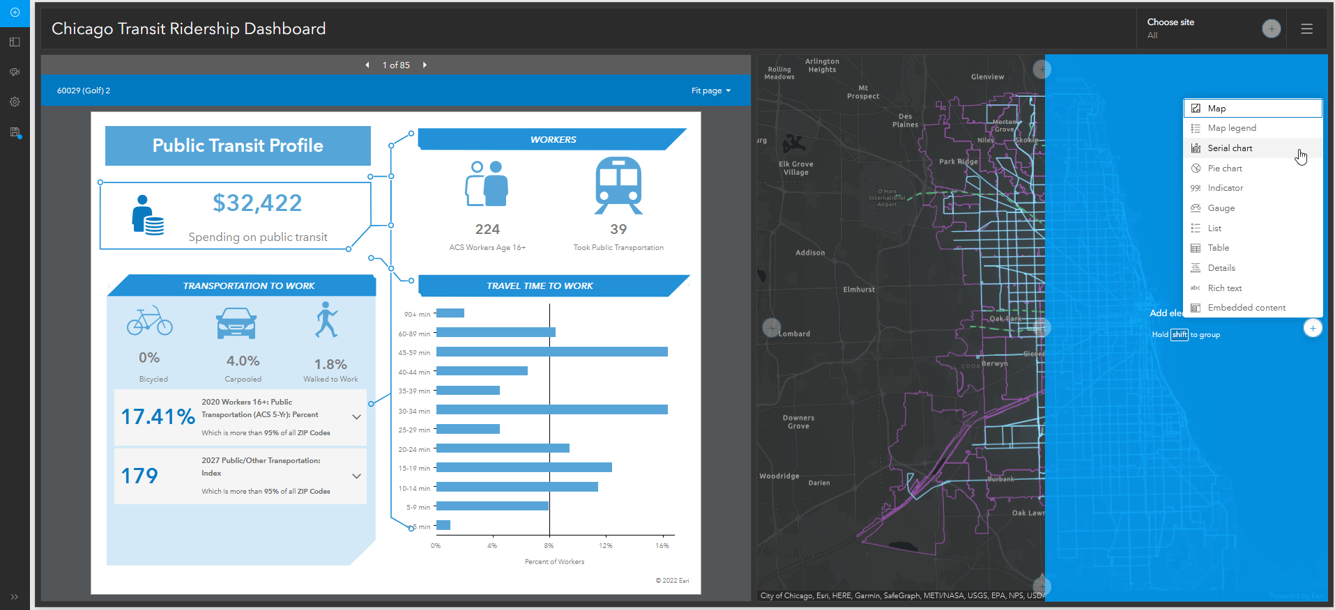
The chart shows total ridership of all bus routes per month (using the bus ridership table as its data source). Then, we’ll add an identical serial chart, but this time showing total ridership of all train routes per month (using the train ridership table as its data source). We can stack the serial charts, so viewers can switch between bus and train information using the tabs.
For ridership averages by day, we’ll add a grouped value table showing the average bus rides and a second one for the average train rides. We’ll add them above the charts and stack them again.
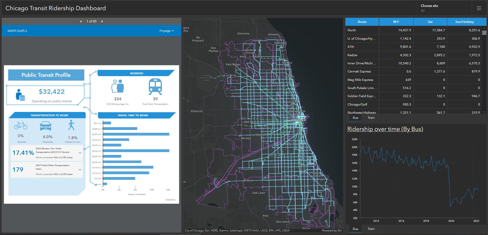
With those extra visualizations, we’ve gone from that first boilerplate dashboard to one that highlights the public transit profile of each ZIP Code and visualizes trends and statistics. We can use this dashboard to better understand where and when public transit is most used, and how much the people of the Chicago area rely on it to get places. This information can help inform decisions, like adding more buses to more popular routes so wait times are shortened or looking at ways to increase ridership in areas where public transit isn’t used as often.
The data and customizable infographics of Business Analyst, combined with the visualizations in ArcGIS Dashboards work together to unlock trends, insights, and key information that present data in new ways and help inform decisions.


Commenting is not enabled for this article.