ArcGIS Business Analyst includes many tools to assist in decision-making, especially when it comes to choosing a location for a business or service facility. You might use Business Analyst Web App to perform a smart map search or suitability analysis that will identify the top locations for your enterprise, and even rank them to pick the best one.
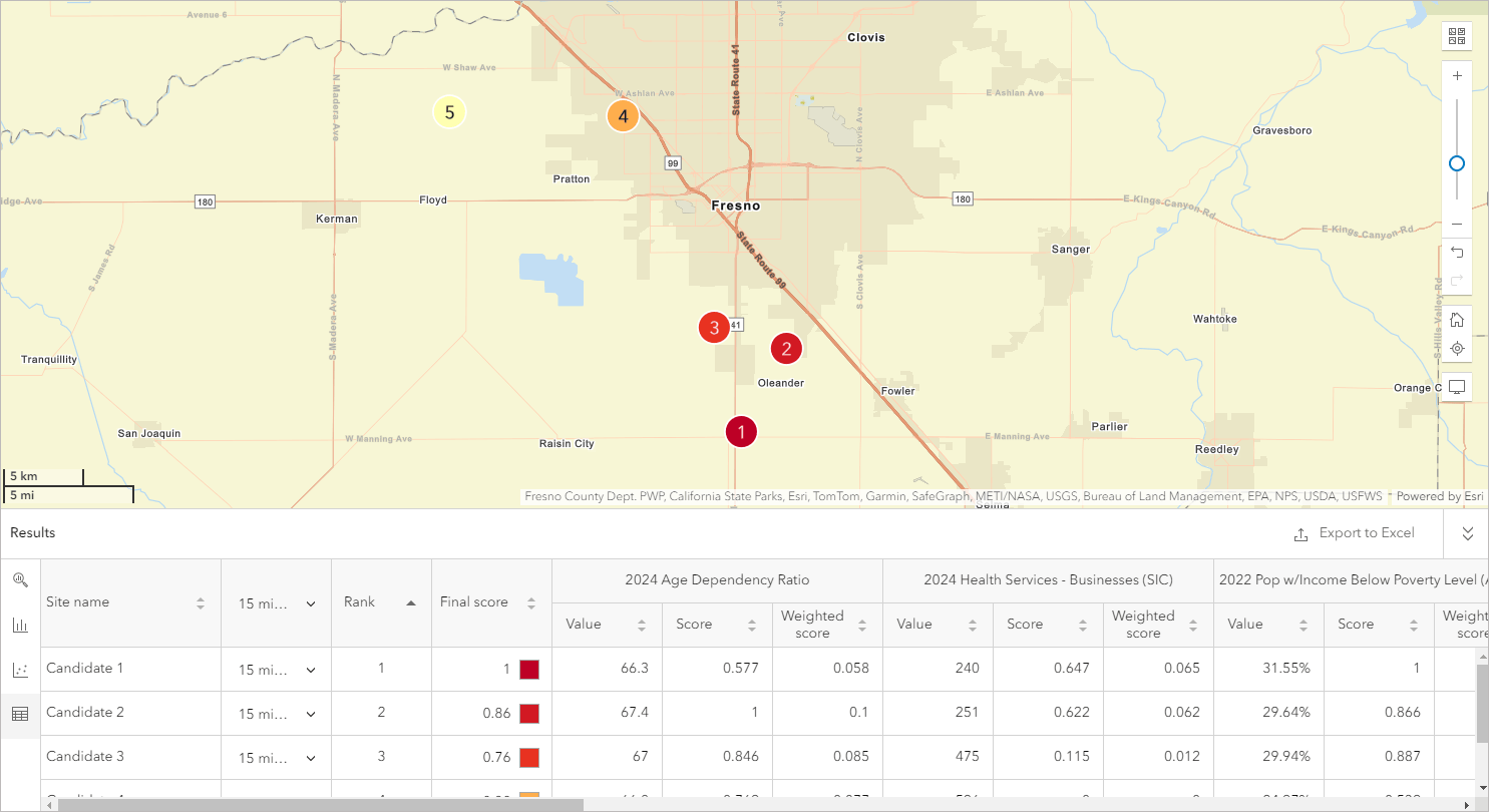
But how do you go from “here’s my best guess based on local demographics” to modeling sales potential of the new location and gauging its impact on existing locations? How can you land on a solid confirmation of your choice, supported by business data?
One approach is to bring your analysis into Business Analyst Pro and use the Huff model to project demand and potential sales of your new location. This model allows you to attach specific, data-driven probability to a candidate location and present real-world statistics to stakeholders. The model creates probability rates that indicate the likelihood that consumers will choose this new location over the other existing locations. These rates are created for all areas of the market, defined by the extent of the Sales Potential features parameter in the tool.
Huff model demo at UC 2024
If you attended or livestreamed Business Analyst sessions at this year’s User Conference, you likely encountered the Huff model in the “ArcGIS Business Analyst: An Overview” demonstration. The session walked through the process of siting an urgent care center in Fresno County, California. Below, you can follow along with the demo using step-by-step instructions.
Set up sales data
The goal of a Huff model analysis is to learn the probability that people in your region will visit your location, based on how far the new facility is from them as well as how attractive the facility is (more on attractiveness later). At the end, you’ll have percentages that indicate the likelihood of customers visiting. However, you’ll also be able to extrapolate other useful information from this probability. That information can be anything quantitative: potential revenue, number of visits, etc. In Huff model parlance, this is the “Sales Potential Field.” As long as you have that numeric data, you can use the Huff model results to estimate it.
In the demo, we used a custom variable we’d prepared beforehand—total urgent care revenue for all the block groups in Fresno. That way, when we calculated the percentage of customers that would visit a new urgent care location, we could also extrapolate to understand how much revenue the customers would bring to the new facility.
Enrich areas of interest
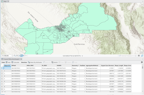
With our sales potential variable in hand, we’re now ready to sketch in the contours of our area of interest, Fresno County. What is the urgent care revenue in each block group of the county? Let’s add it to the map by mapping the block groups and enriching them with the variable. For this, we’ll use the Generate Standards Geography Trade Areas geoprocessing tool.
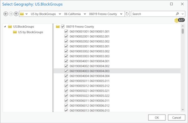
Open the tool from the Trade Areas toolset (or simply search the name), then choose Block Groups as the geography level. Under Geography IDs List, click the folder to browse all block groups in the U.S. (Make your way along the following folder path: US by BlockGroups > California > Fresno County, then select all. You’ll have 637 block groups.)
Name the layer something logical, like FresnoBGs. Now we’ll open the Enrich Layer tool and use it to append the urgent care revenue variable to these block groups. Once you’ve opened the tool, set the input features to your FresnoBGs layer and click the Add button next to Variables.
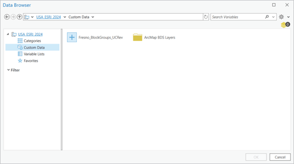
In the data browser, navigate to the variable you want to use for sales potential or whatever numeric attribute you’re interested in, such as customer visits.
When you click Run, a layer that looks very similar to your block group layer is created—but open the attribute table and you’ll find that each block group now also includes the sales potential variable as well.
Add locations
Now we need to map the locations for the analysis, which means both the candidate location we’re assessing and the existing locations we’re comparing it to. In the urgent care demo, this meant bringing in the top candidate site we’d found in the exploratory suitability analysis we’d done in Business Analyst Web App, accomplished using the Add sites from Business Analyst Web App workflow.

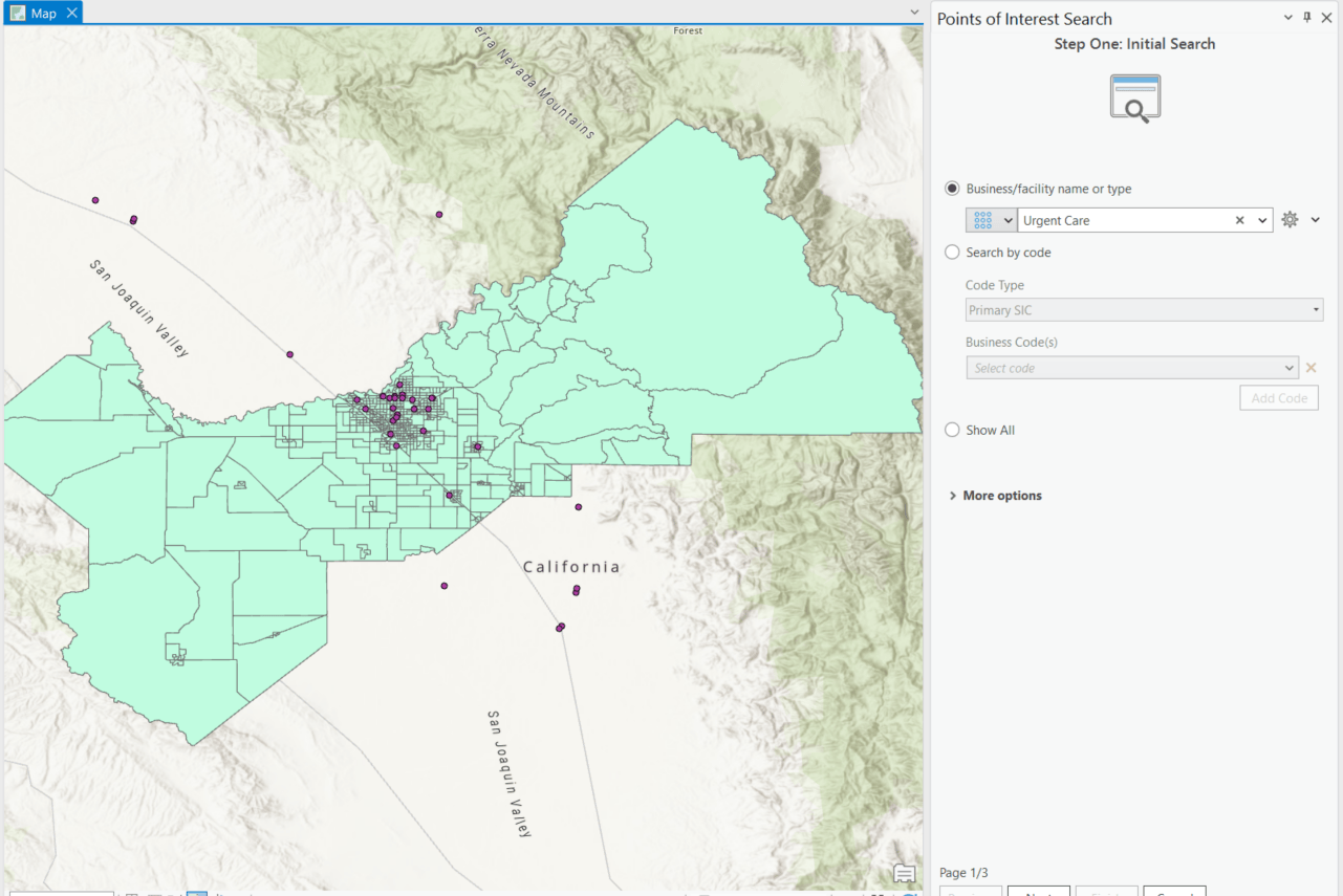
Then, to map all the urgent care centers in Fresno County, we performed a points of interest search using the keyword “Urgent Care.”
Set up Huff model
Now for the main event! We’ve put everything on the map, so we just need to tell the Huff model which information goes where. There are many fields in the Huff model pane, but don’t worry, we’ll walk through it together.
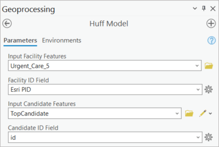
First: Input Facility Features and Input Candidate Features. Yep, you guessed it, those correspond to the existing facilities we mapped using points of interest search, and the candidate location we added from the web app. We’ll pick ID fields for each of them as well:
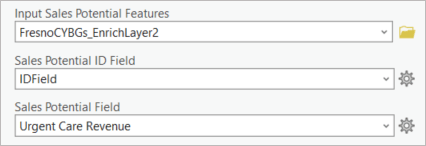
Next we’ll deal with the variable we’re using to define the sales potential. Remember, this can be any numeric variable you have determined is a good estimate for measuring the location’s success. (It’s called “sales potential” here because sales figures are so frequently used to estimate success.) In the demo, we’ve used the custom urgent care revenue variable.
For Input Sales Potential Features, we selected the features with that variable attached—aka the enriched block group layer. We picked an ID field for it as well. Then we identify Sales Potential Field as that urgent care revenue variable within the enriched layer:
Now we get to the special sauce ingredients that make the Huff model unique: attractiveness and distance! You’ll select an attractiveness variable that exists in both the existing locations’ and candidate site’s attribute tables. This variable is used to compare the candidate location to all others.
An attractiveness exponent value is also set. This value indicates the importance of the attractiveness variable when comparing locations to find the best one to visit. Larger exponent values will increasingly amplify differences. A distance exponent is also set to further assist the model in comparing locations to visit. This value is negative by default, since greater distance results in a lower likelihood of visiting a location.
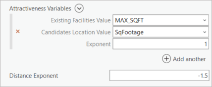
Similarly, we’ll let the Distance Exponent value remain -1.5, also the default. The relationship between these two is instructive, and the reason for these default values: generally, distance’s negative influence is a little more important than the positive influence of attractiveness.
It’s finally time: we click Run!
Interpret the Huff model results
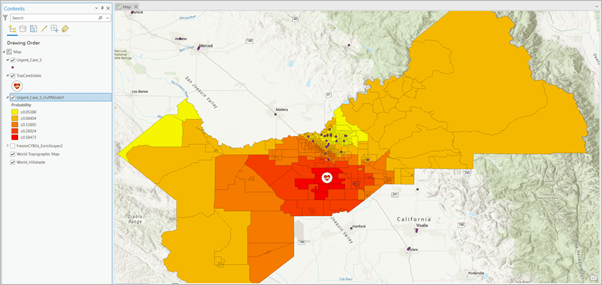
The tool creates a layer that symbolizes the probability that customers in each respective block group will visit the new urgent care location. At first glance, the results look sort of predictable: the block groups closest to the candidate location are the most likely to patronize it, at a rate of 55% likelihood.
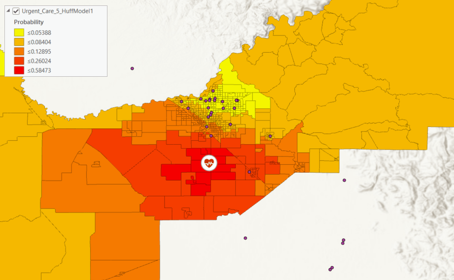
But a glance at the cluster of urgent care centers immediately to the north of the candidate location shows the impact of shorter distances. The rest of the map would indicate these block groups would be shaded in shades of dark and medium orange, but instead these fairly nearby block groups have a very low likelihood of patronizing the new facility.
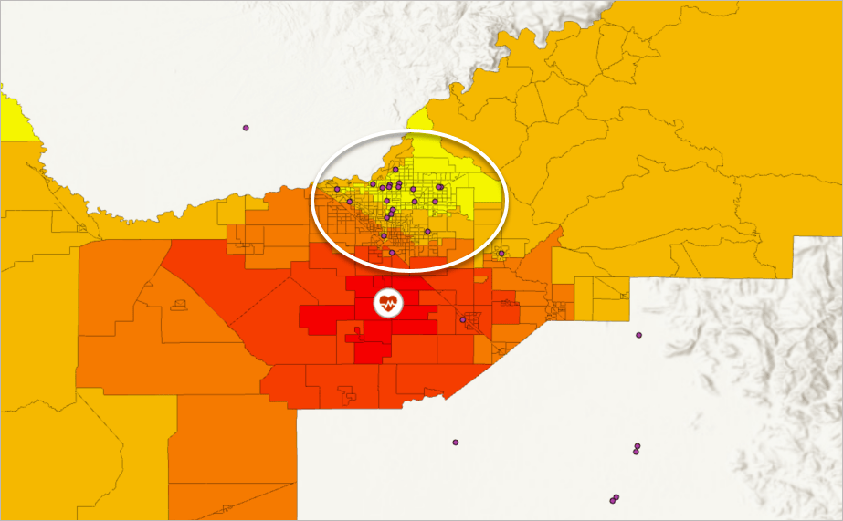
At first glance, the results of the Huff model indicate that we are meeting our objective of relieving overcrowding of existing locations while avoiding cannibalization and also providing better access to the residents of the rural western side of the county.



Article Discussion: