Business Analyst infographics visualize key indicators and information using charts, graphics, tables, images, and text. Infographics can be created from a set of ready-to-use templates, or you can build your own templates to create custom data visualizations.
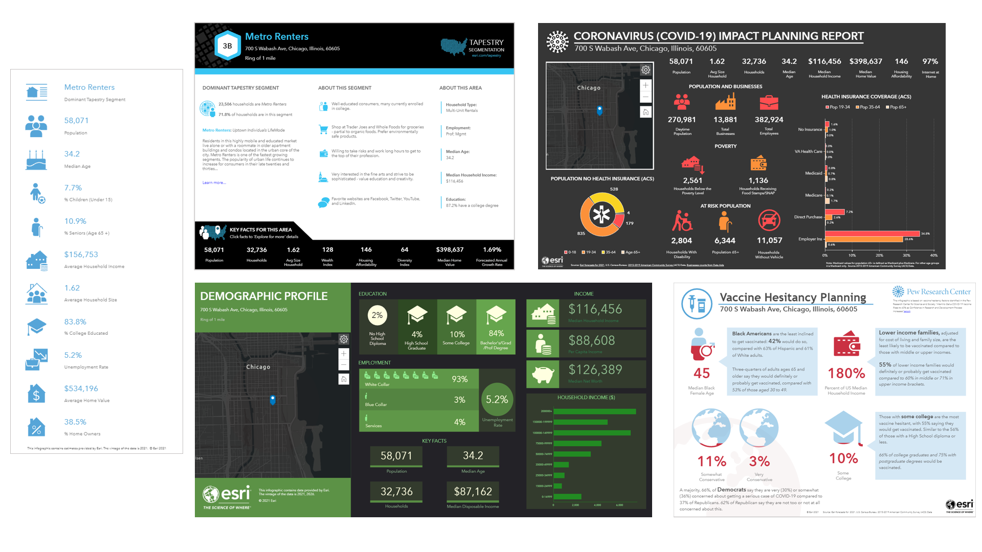
The infographic builder in Business Analyst allows you to style all infographic components to make them more engaging and dynamic. Let’s walk through an example of infographic design with Joe, a real estate agent.
Meet Joe
Joe regularly uses the ArcGIS Business Analyst Web Application for locating his listings and analyzing the demographics around the properties, along with business, lifestyle, spending, and Census data. Using the Business Analyst Web App’s map-based analytics, he determines the proper audience for each of his listings. One of Joe’s main workflows is running reports or infographics to get a basic overview of the location.
He feels that if the infographic report is designed his way, he’ll have a better understanding of the data. He was thinking of modifying an existing infographics template, but was hesitant to do so, since he’s quite comfortable running the pre-made reports that come with the Web App. But then, after giving it more thought, he decided to explore the options for editing his favorite infographic, Quick Facts.
Joe found the Quick Facts infographic template in the template gallery (this is not in Shared templates unless someone in his organization shared it with him). But any user can get it by clicking the Add template button and browsing the gallery. He’s decided that he is going to modify it according to his preferences.
- First, he saves the template and renames it for his personal use.
- The template then appears in his My templates section.
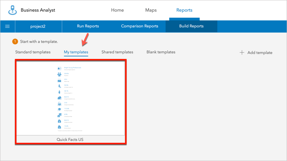
- He clicks on the report to open it and enable editing.
Customize the infographic template
Now that Joe has saved his own copy of the template, he can modify it to his heart’s content. When he opens the report, he sees the Quick Facts template he is familiar with:
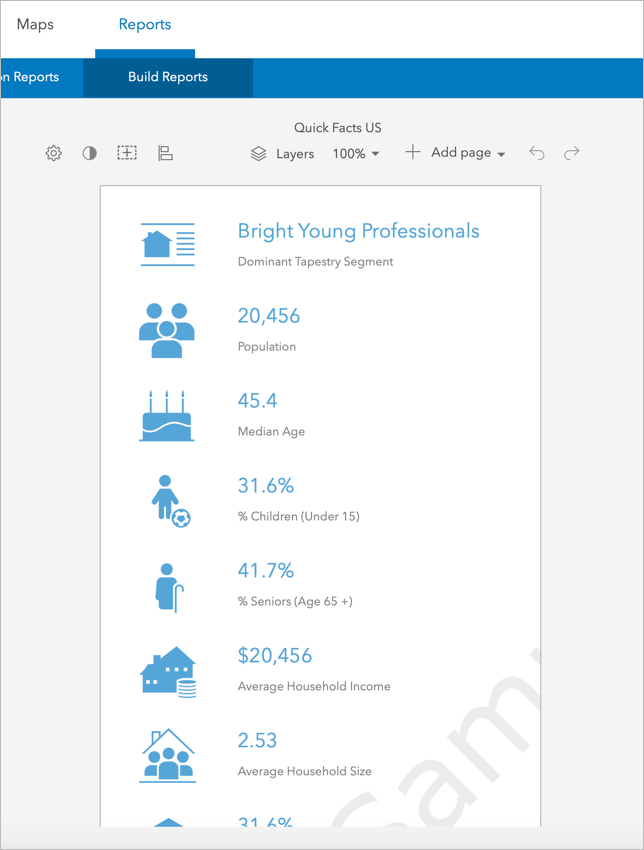
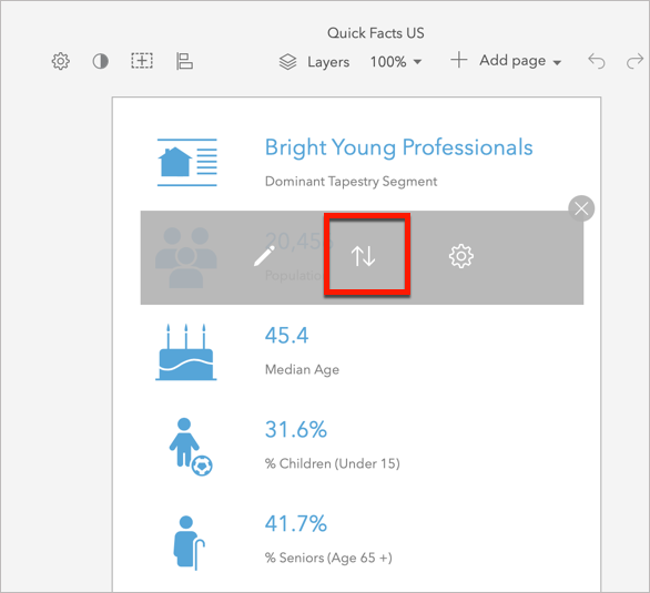
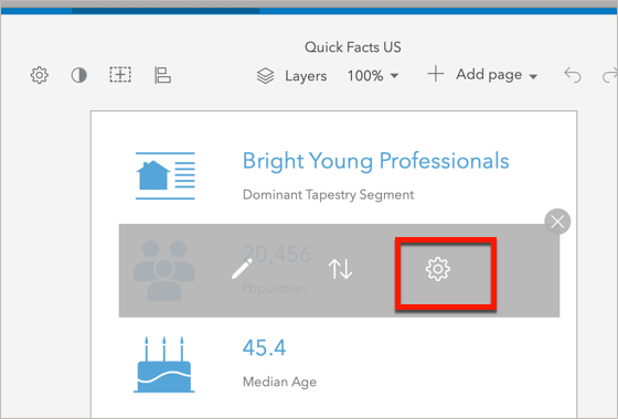
The template contains panels that display images and variable counts. But now, when he hovers over one of the panels, he sees the following options:
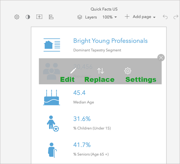
- Edit – Modify elements within the panel
- Replace – Choose a different panel
- Settings – Modify the entire panel
Edit panel
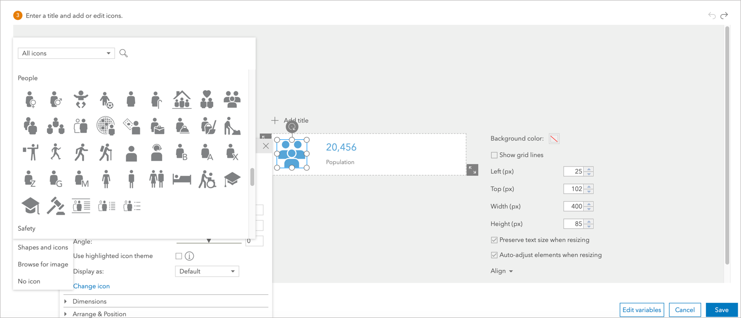
When Joe clicks the Edit button, he can edit the panel and its alignment. This panel contains an icon, a variable, and a description. He can modify any of these elements, including the text and number styling, the size of the element, and its position in the panel.
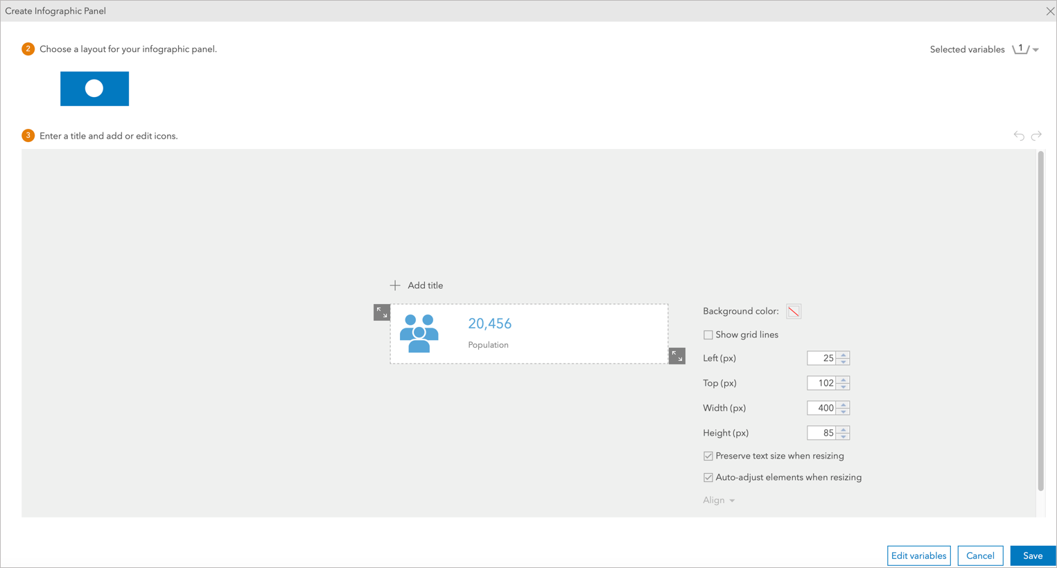
He also has an option to change the icon displayed from the icon gallery and change the text font and size as needed.
Replace panel
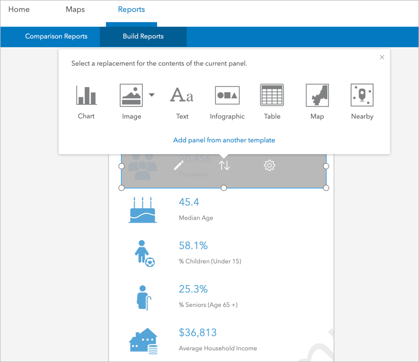
With the help of the Replace button, Joe can replace the whole panel with another.
He can either replace the panel with one from the replacement menu—such as a chart, image, or text box—or with a panel from another infographic template.
Panel settings
If Joe clicks the Settings button, he can modify the entire panel.
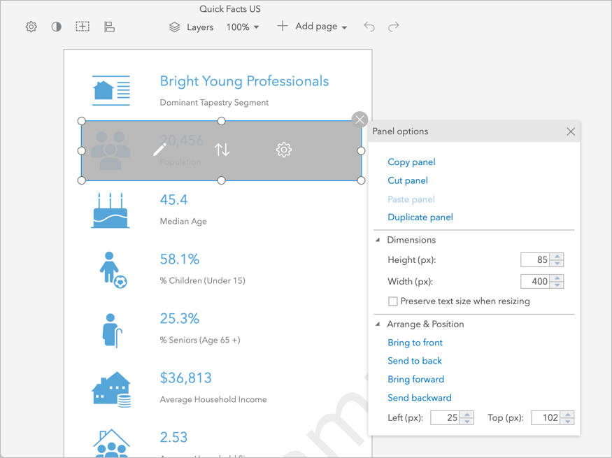
He can copy, cut, or duplicate the panel, or change its size and position in the template.
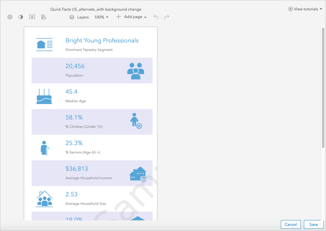
Joe decides to change the background color for alternating panels to make it easier to read, as well as changing the position of icons within the alternating panels. After he makes his changes, here is his final version:
He hits Save to save all his changes.
Joe now feels accomplished that the infographic report he just designed, gives him a clear picture and in turn he now has a better understanding of the data. He’ll be sure to use these edit functionalities on other infographic templates as needed.

Article Discussion: