Hello 2025! The first release of ArcGIS Business Analyst of the new year is here, and we are thrilled to announce the latest updates and enhancements to ArcGIS Business Analyst Web App and ArcGIS Business Analyst Mobile App.
ArcGIS Business Analyst is Esri’s location-based market intelligence tool designed to help you make smarter decisions for market planning, site selection, and customer segmentation. You can identify under-performing markets, pinpoint the right growth sites, locate your target audience, and share the market research across your organization. If you’d like to learn more or want to try ArcGIS Business Analyst Web App, sign up for a 21-day free trial.
The February 2025 release includes loads of enhancements to your favorite workflows. Make sure to read on to get all the details on how you can incorporate ArcGIS Business Analyst Web App in your daily mapping framework.
- Data updates and enhancements
- Important data changes
- Updates to infographics and reports
- Business Analyst Assistant (Beta) updates
- Enhancement to geography comparisons
- Improvements to the benchmark comparison workflow
- Enhancements to the data browser
- ArcGIS Experience Builder: Business Analyst widget improvements
Please note that this release does not include updates to ArcGIS Community Analyst. Community Analyst is being deprecated entirely, and the final release update was in November 2024. The data within Community Analyst will be updated but no other updates and enhancements will be made. We highly recommend that users migrate to Business Analyst Web App for the latest updates and enhancements. For more information, please read our Deprecation Notice for ArcGIS Community Analyst: Transition to ArcGIS Business Analyst Web App blog article or visit our Migrate to ArcGIS Business Analyst page.
Data updates and enhancements
ArcGIS Business Analyst includes over 15,000 variable options from more than 170 countries, and we are constantly updating our data. All Business Analyst users have access to the data within Business Analyst, including Advanced Demographics sourced from a number of data providers, and Standard Demographics sourced from Michael Bauer GmbH. Here are the latest data updates:
Advanced Demographics updates:
- India: Added 117 new variables, including new categories for spending and segmentation. To improve the overall data detail in urban areas, we have remodeled the village and wards geographic areas into a single consistent layer.
- Japan: Includes approximately 350 variables within 1km and 500m meshes, also known as a grid.
- Germany: Includes 28 new spending variables.
- Thailand: We have revised the new demographic models and data inputs.
- New Zealand:Includes new geography levels and six new attributes.
Standard Demographics updates:
- Western Europe: 25 countries have been updated to the 2025 vintage.
- Asia: Updates have been made to 39 countries to align with other global data released in 2024.
Points of interest (POI) data:
The following POI data sources have been updated:
- Data Axle for U.S. and Canada (November 2024)
- SafeGraph for U.S., Canada, and Puerto Rico (December 2024)
- New global open-source data from Foursquare (January 2025)
Other data updates:
- USA Traffic data from Kalibrate (Q4 2024)
Important data changes
As you are aware, data is constantly evolving and changing. To ensure we are continuously providing the most up-to-date data, we have made the following data changes.
Global POI data changes:
With the February 2025 release, we will be transitioning to the Foursquare Open-Source Places data as our global POI data source. We understand that this change may be disruptive due to the reduced number of attributes and changes to categories. This release is aligned with Foursquare’s strategy to improve their data through crowdsourced assessment. Esri has made several significant improvements to data filtering that have resulted in a reduction in the number of POIs available.
While there are minimal impacts on your workflows, some are unavoidable. To make this transition smoother, we would like to notify our users of the below:
- We recommend that users rebuild saved searches and infographics that used previous Foursquare data.
- Saved POI search layers that were created with Foursquare search results prior to the February 2025 release can still be viewed on the map, but the option to open and edit the POI search layer is no longer available.
- All Foursquare-based POI searches that use data from the February release are editable.
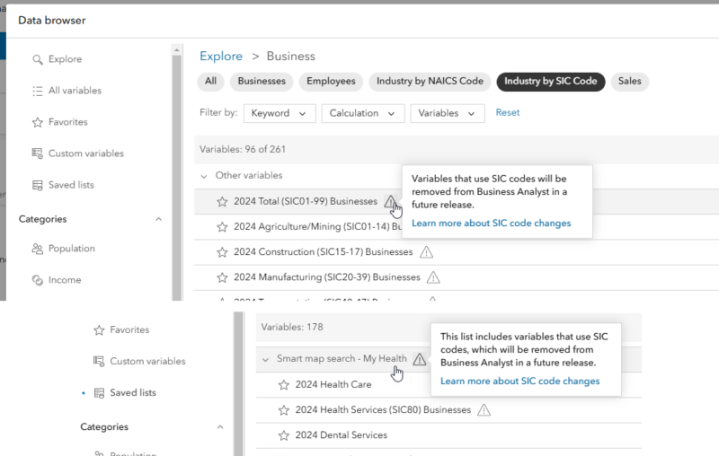
Data changes to SIC codes:
To provide ample awareness, the Business Analyst team would like to notify its users that in 2026, we will transition to NAICS codes as a replacement for the legacy SIC (Standard Industrial Classification) code system in Data Axle datasets. This change impacts Esri Business Summary dataset variables and several Business Analyst workflows. This change will allow users to adopt a common, consistent global system to search for POIs independent of source, vendor, and geography.
To ensure a smooth transition to the NAICS code system, we have started implementing several changes within Business Analyst Web App. To learn more, read our SIC codes transition in Business Analyst blog article. If you have any specific questions, please feel free to reach out to us at businessanalyst@esri.com.
Updates to infographics and reports
Infographics and reports are one of the most popular tools in Business Analyst that allows you to visualize and analyze key information about your sites. With this release, we have made several key improvements that we are excited to share with you.
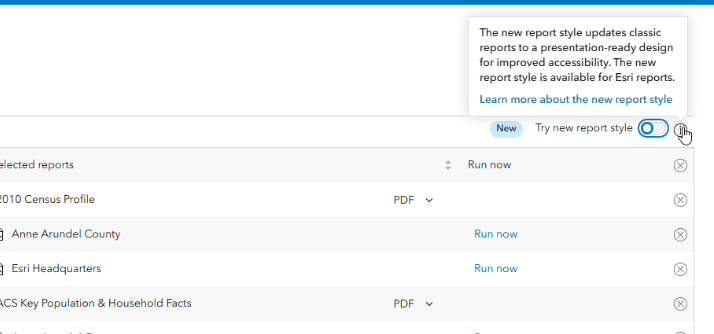
Introducing the new report style:
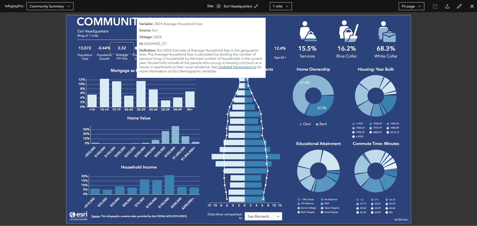
Say hello to a new, modernized version of classic reports! Simply click the toggle button in the Run classic reports interface to switch to using new versions of these reports. Once you switch to the new report style, you will notice an improved design for better accessibility and interactivity. That’s not all: the new report can be easily shared through other ArcGIS Online applications and can be published in digital formats, wow! Learn more about the benefits of the new report style in the blog article What are tabular infographics in ArcGIS Business Analyst Web App.

Enhanced editing experience:
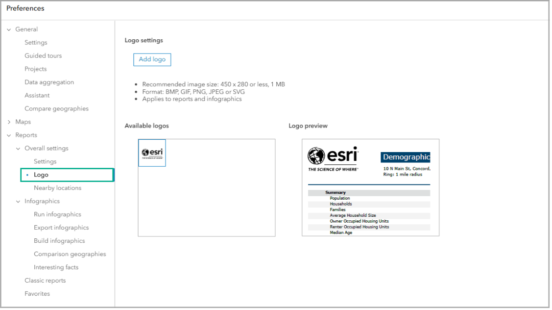
Now you can use SVGs for your logo (in addition to BMP, GIS, and PNG formats) in reports and infographics.
To set your organization’s logo, on the app header, click My preferences. Expand the Reports section, expand the Overall settings section, and click Logo.
That’s not all! Have you ever created an infographic and wanted to seamlessly add your organization’s logo to it? Well now you can! Simply click Add element in the infographic builder and click Image then choose Logo. The logo that you set in your preferences is automatically added to your infographic; no more browsing your desktop’s files!
Improved infographic accessibility:
To ensure accessibility to all our users, infographics have received a number of enhancements. With this release, we have added support for keyboard tabbing in infographics and infographic templates, which allows you to easily navigate through content using your keyboard. For Business Analyst Web App Advanced users, we have made enhancements in the infographics builder to allow for the configuration of alt image text.
New gallery infographic templates:
With this release, say hello to three new gallery infographic templates
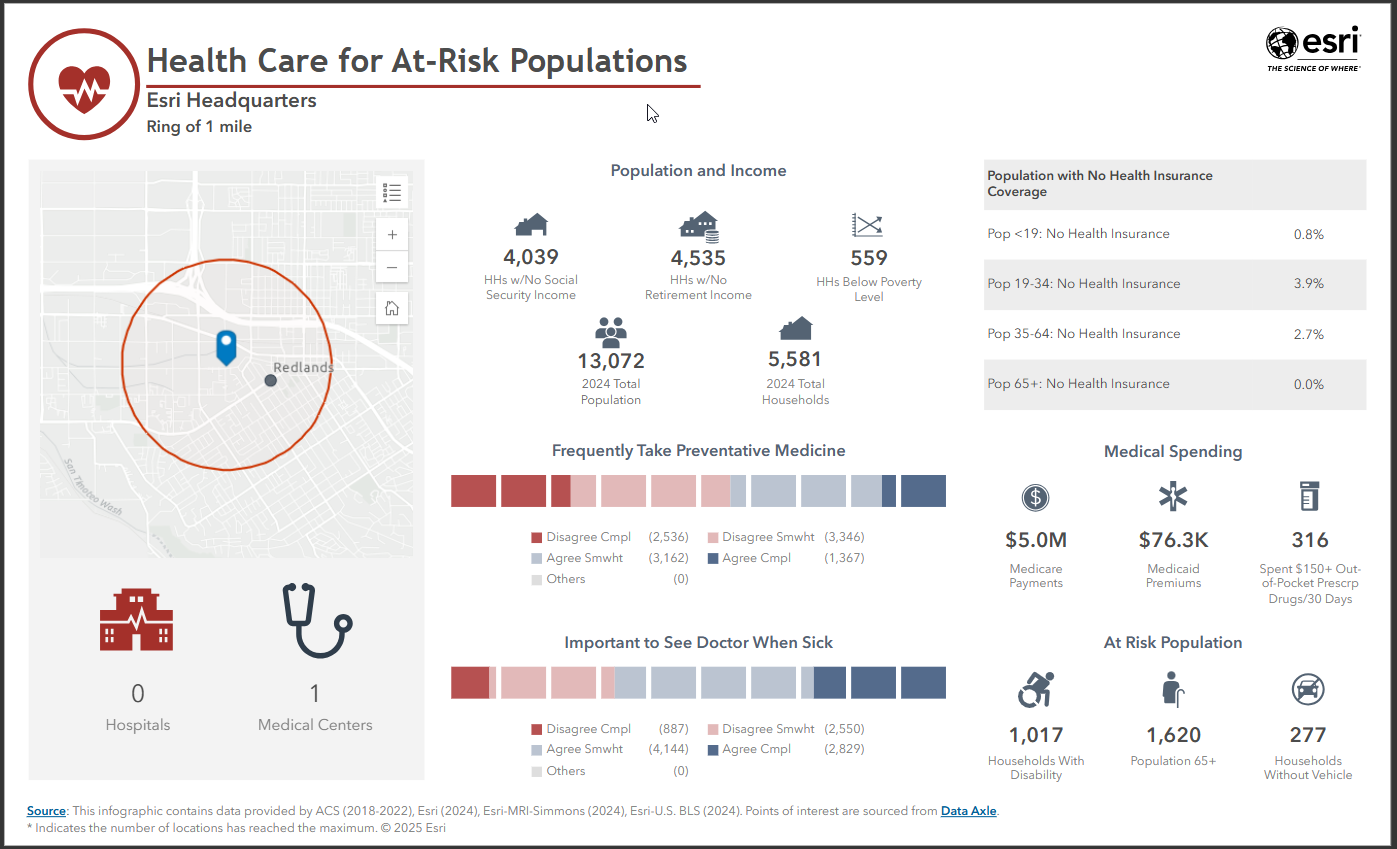
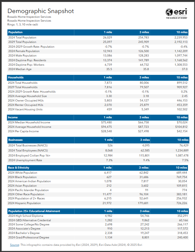
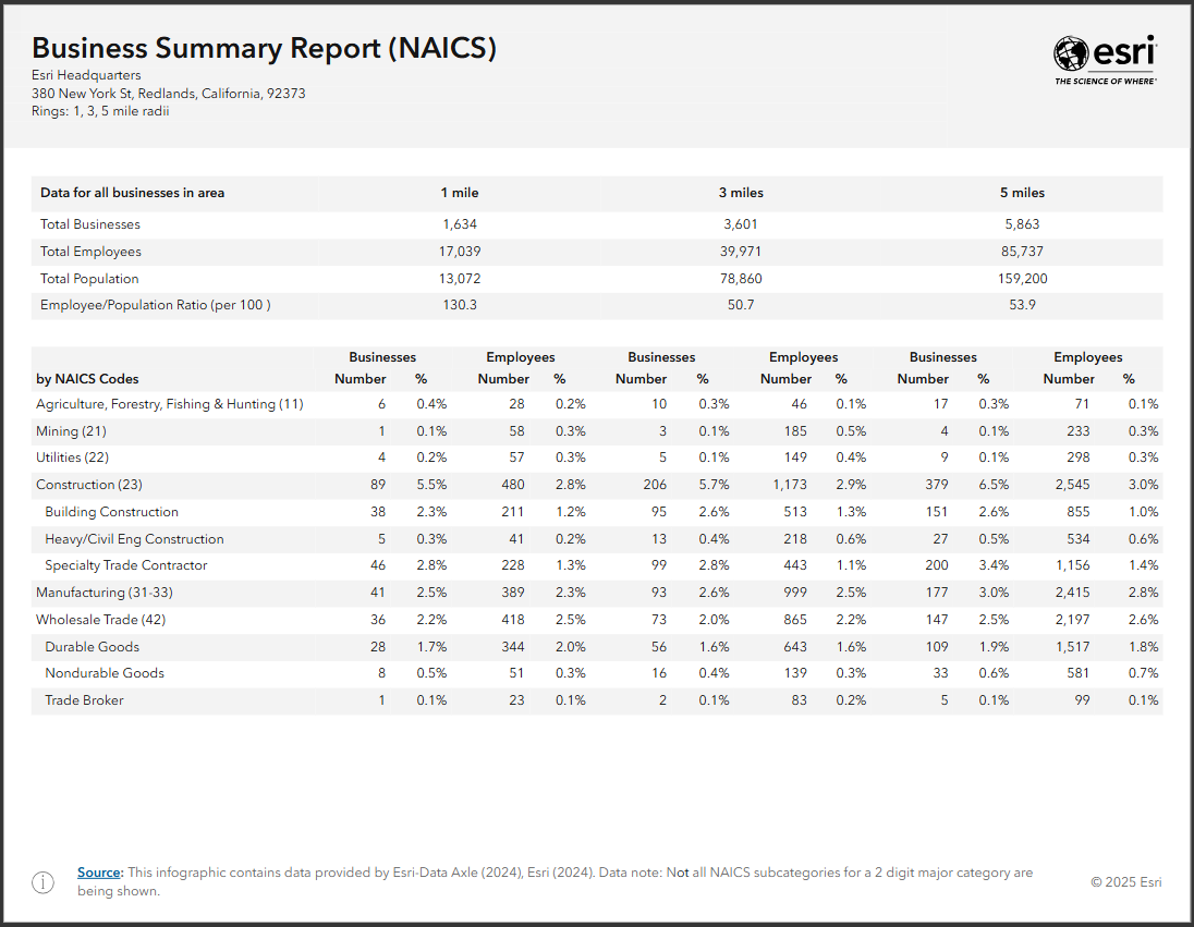
- Health Care for At-Risk Populations
- Demographic Snapshot
- Business Summary Report – NAICS
Health Care for At-Risk Populations
This new infographic template is an updated and redesigned version on the original Vaccine Hesitancy template. With this updated version, you will notice more generic health language to make the template more current.
Demographic Snapshot
This one-page template is ideal for commercial real estate users as it includes variables on population, households, income, race and ethnicity, educational attainment, and businesses.
Business Summary Report – NAICS
This new template uses only NAICS codes and provides an update to the existing Business Summary Report template. This template is provided in preparation for the removal of SIC codes in 2026.
Revisions to Foursquare-based infographic templates:
As we mentioned above regarding the global POI data changes, with this release Standard and gallery templates that use Foursquare data, including What’s in My Community, Nearby Restaurants, and Emergency Information, have been updated to use the new data and category system.
Business Analyst Assistant (Beta) updates
To say that Business Analyst Assistant (Beta) is a favorite among users is an understatement. This AI productivity tool guides you through your workflows by providing intelligent suggestions, responding to prompts and search queries, lending a helping hand by offering useful tips and resources.
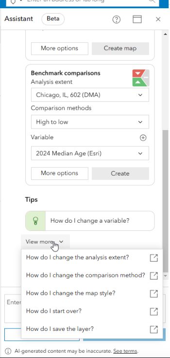
Business Analyst Assistant (Beta) is like having a cross between a personal assistant and a sage mentor – conveniently located right in the app to boost your productivity and even teach you something new. The assistant can recommend a variety of workflows, the newest of which is recommending benchmark comparisons.
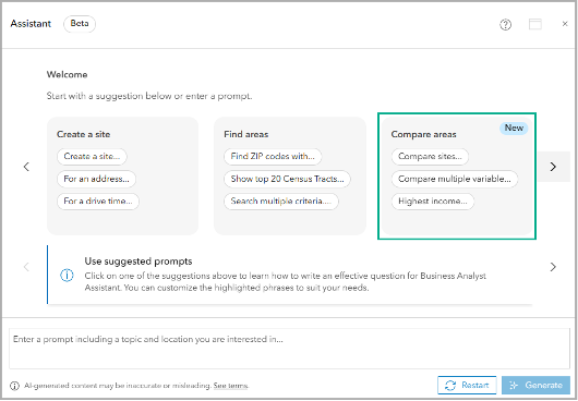
For example, under the new Compare areas prompt section, you can click the prompt Highest income and use the suggestion to generate the assistant’s recommendations, including running benchmark comparisons. The assistant will even prompt you with Tips to help with your benchmark comparison workflow.
We are excited to integrate benchmark comparisons into the assistant’s recommendations and we hope it leads to more users leveraging the analysis method in their daily workflows. To learn more details about working with benchmark comparisons in Business Analyst Web App and to explore key differences in iterations of the workflow in other Business Analyst offerings, read the blog article Considerations for working with benchmark comparisons in Business Analyst Pro vs. Business Analyst Web App.
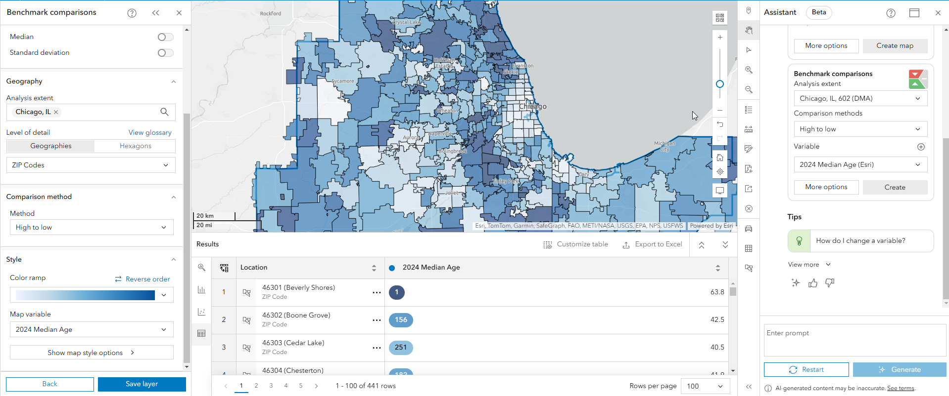
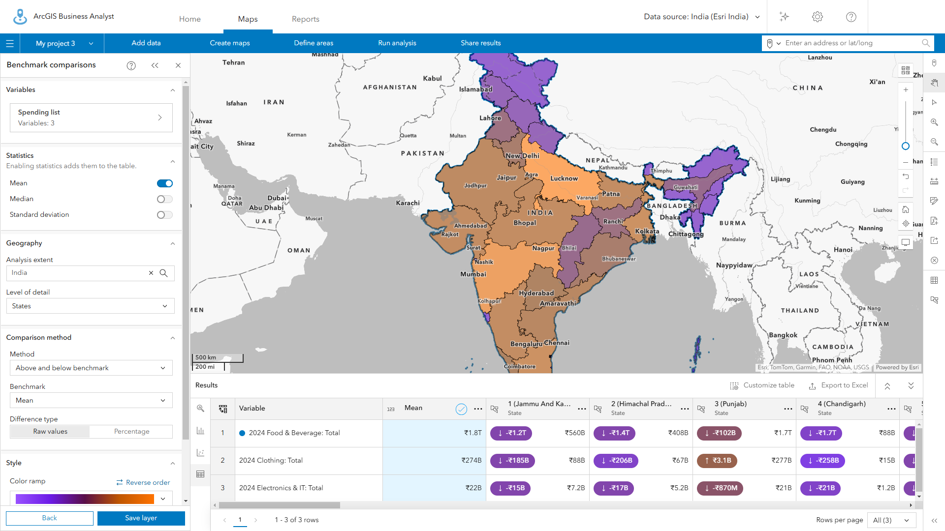
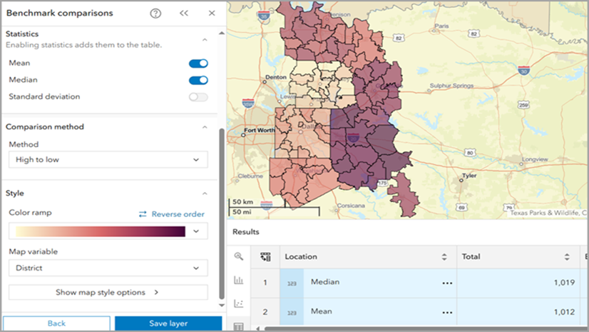
Improved benchmark comparisons performance
On the subject of benchmark comparisons, you may recall that the new benchmark comparisons replaced the comparison reports workflow in the November 2024 release. The benchmark comparisons workflow compares sites using criteria and benchmark values that you define. The intuitive workflow guides you through each step: select sites, select criteria, set the benchmark, choose a comparison method, and view and refine your results.
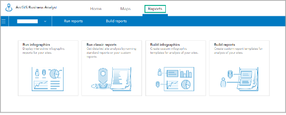
You’ll see this switch to the benchmark comparisons reflected in the user interface experience when you click the Reports tab: the Comparison reports option is now removed.
This switch from comparison reports to benchmark comparisons offers enhanced analysis and visualization capabilities and a streamlined workflow. With this latest release, you can expect improved performance when working with a large number of features and variables in your workflow. These updates give benchmark comparisons the power and processing capabilities to handle your most complex analysis.
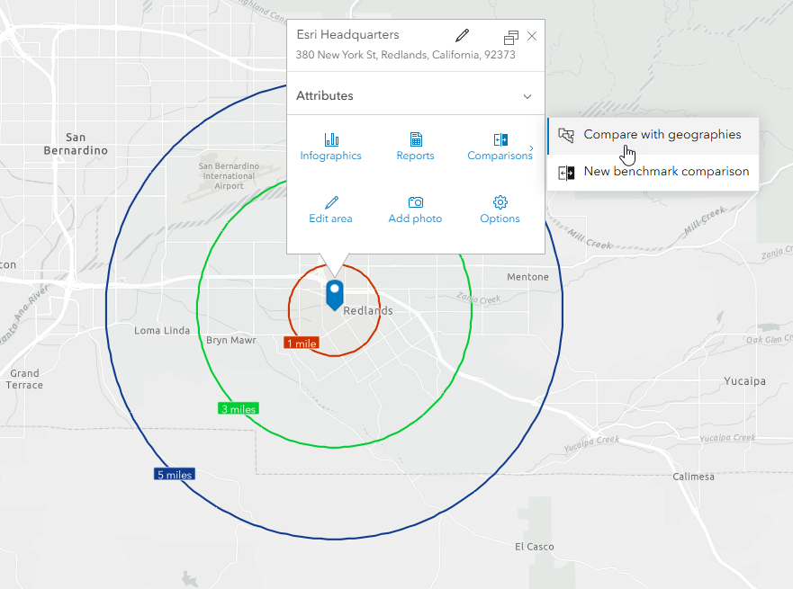
Enhancements to geography comparison
You can compare geographies in a site’s pop-up menu or through the benchmark comparisons workflow. Enhancements have been made to include new customization options, which allow users to set preferences for the geography levels and variables used by default. To do so, simply navigate to the app header, click My preferences and expand the General section and click Compare geographies. From there, select your preferred geography levels and variables to use as default in your geography comparison analysis.
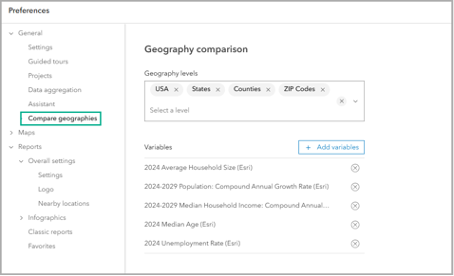
From there, you can launch Geography comparison with your preferred variables right from the site menu.
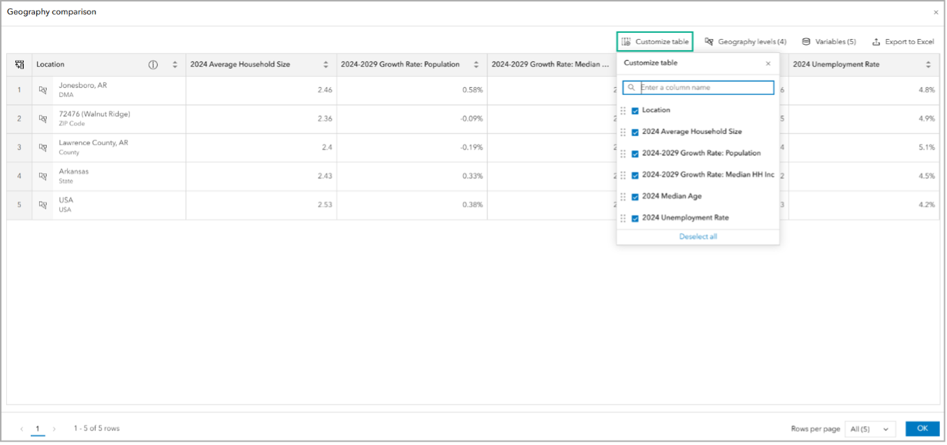
Take your customization even further with the new Customize table option. In the Geography comparison window, click Customize table to modify the columns. Drag the name of a column to change its order in the table and uncheck the check box next to the column name to deselect it from the table. (You may be familiar with this customization from the points of interest (POI) search Results pane table.)
Enhancements to the data browser
More customization options are available in the data browser thanks to the latest updates. Data is sort of the lifeblood of Business Analyst, and the data browser is an in-app interface that categorizes and displays all the data variables available. Now, the default sort order of custom data variables in the data browser has been updated to show the most recent variables. Additionally, new sorting options are available to optimize how you can browse for custom data variables. If you are new to adding custom data to your projects or want a little practice, explore the tutorial: Set up custom data for infographics.
ArcGIS Experience Builder Business Analyst widget enhancements & improvements
The Business Analyst widget in ArcGIS Experience Builder is a popular and well-loved tool that provides users with the ability to view additional information about any point or polygon feature on a map through the creation of reports and infographics. This update brings several bug fixes and minor enhancements to make your workflows run smoothly.
Additional resources
We’re so happy to share the first 2025 release updates of ArcGIS Business Analyst Web App with you! Below, we’ve added resources to help you with your ArcGIS Business Analyst journey:
- Business Analyst product overview page
- Review pricing and purchase Business Analyst
- Join our LinkedIn Business Analyst User Group
- Join our Business Analyst Esri Community
- Follow our weekly #BATipsandTricks posts on social media
- Read more Business Analyst blog articles on ArcGIS Blog
- Watch Business Analyst Web App videos
- Watch Business Analyst Mobile App videos
- Visit the Business Analyst Resources page
- Visit the Community Analyst Resources page


Article Discussion: