ArcGIS Business Analyst Web App allows you to create classic reports and infographics for sites and areas of interest. Classic reports are used to understand the demographics of sites and areas using detailed tables, and in some cases charts or maps. These straightforward, simplified classic reports can be exported as PDFs or Excel documents. Classic reports are popular but have some limitations in design and usability. Fortunately, these limitations can be addressed by leveraging infographic capabilities.
Infographics are an updated way to create reports for your sites with greater flexibility. Infographic capabilities include interactive on-screen viewing, a range of modern design elements, interoperability with Business Analyst Mobile App, and many other responsive capabilities. Using these elevated capabilities, you can recreate your favorite classic reports as infographics that focus on data tables. Say hello to the new tabular infographic styling!
What is tabular infographic styling?
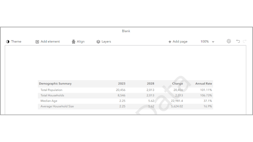
The new tabular infographic styling provides presentation-ready data tables. You can use tabular infographic styling in the Run infographics interface as well as in the Run reports interface. If you’re interested in using tabular infographic styling in Esri classic reports, click the Try new report style toggle button. For more information, see New report style in ArcGIS Business Analyst Web App.

What are the design advantages of tabular infographic styling?
Tabular infographic styling supports theming and modern design options. For instance, infographics provide additional styling options and interactive elements. The styling options include changing the theme of the entire template so you can quickly adapt the template to your organization’s branding. Tabular infographics are designed to display larger font sizes and high color contrast to meet accessibility standards. This improves readability for a variety of audiences. The default color scheme is designed to be print-friendly.
What are the design guidelines for tabular infographic styling?
The design guidelines for tabular infographic styling are based on design and accessibility standards. It uses an established hierarchy for color and font.


| 1 | Report title | Choose a font that is legible and offers contrast with the background color. We recommend bolding the title. |
| 2 | Subtitles | Choose a subtitle font that is consistent with the report title font. We recommend a minimum 12-point font size for readability. |
| 3 | Header background | Use a light background color so that the text is visible and meets color contrast standards. |
| 4 | Logo | The logo is customizable. The height of the logo is determined by the image you upload. For instance, the Esri logo pictured has a height of 64 pixels. |
| 5 | Page padding | Use page padding to create a margin between elements and the edge of the page. We use 24 pixels between elements and from the edge of the page. |
| 6 | Table header background | Use a table header background that is light and offers contrast with the table header text color. |
| 7 | Table header text | Choose a font that is legible and consistent with the font used in the title and subtitles. We recommend bolding the table header text and using a minimum 12-point font size for readability. |
| 8 | Table row background | Use a table row background that is light and offers contrast with the table row text. Banding is recommended for visual distinction between rows. |
| 9 | Table row text | Choose a font that is legible and consistent with the font used throughout the tabular infographic. We recommend a minimum 12-point font size for readability. |
| 10 | Footer | The footer can use dynamic fields to populate the source, vintage, and copyright information. Choose a font that is legible and consistent. We recommend a minimum 12-point font size for readability. |
How do tabular infographics leverage additional capabilities?
Tabular infographics take your favorite classic report templates to the next level using capabilities unique to infographic templates. For instance, you can run a tabular infographic for multiple sites and immediately see a side-by-side comparison of data for your sites. This stack mode is also available in ArcGIS Business Analyst Mobile App and the Business Analyst widget in Experience Builder. While you can run classic reports for multiple sites, the information is stored in multiple PDFs and is not immediately available in the comparative way that tabular infographics are.

Another way that tabular infographics leverage infographic-specific capabilities is through providing more options to preview and export templates. You can use the Run infographics workflow to view the tabular infographic prior to exporting it. This visibility can save credits since you can preview the work prior to exporting it. There are also additional options for outputs when exporting infographics compared to classic reports, including as an image or HTML.
Tabular infographics also support interactive experiences, allowing you to explore variables in infographic panels to get more demographic information. For example, this enhancement can be used to click a value and show a chart to provide more context to the data. Interactive experiences are exportable. You can choose whether or not to export interactive experiences along with the main template. Another way to interact with the data is to use ToolTips. In the Executive Summary tabular infographic, hover over the value of a variable to see the ToolTip as a pop-up panel with the variable’s definition.

Where can I find tabular infographics?
Tabular infographics are currently available in the infographics gallery. You can find the gallery in ArcGIS Business Analyst Web App Advanced on the Gallery tab of the infographic builder. The offerings in the gallery currently include some popular classic reports formatted as tabular infographics.

You can also filter the templates in the gallery by category. Click the Filter button to choose which categories to show. For instance, to only show tabular infographics, use the Hide others button for the Tabular category.

How do I create a tabular infographic?
You can open and customize any of the tabular infographic templates in the gallery. Customization could look like changing just a few variables or even all the variables in the template. Add your own data using the data browser or copy data from an existing classic report. You can also change the theming to match your organization’s brand and add your logo. For a step-by-step guide, see Build tabular infographics and convert classic reports to the new style in ArcGIS Business Analyst Web App.
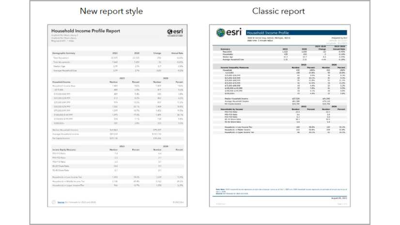
How can I run classic reports using the tabular infographic style?
As part of the February 2025 release, existing Esri classic reports can be run with the tabular infographic style.
To access the new report style, start by running a report. On the Reports tab, click Run reports and click Run classic reports. Select your sites and choose the classic Esri reports that you want to run. Then, click the Try new report style toggle button to enable the new report style. You can run the new report style for Esri reports in the United States and Western European countries.

Your report runs with a new, modern design style. The new report style is only available for Esri reports. For more information, see New report style in ArcGIS Business Analyst Web App.
Classic reports will remain available in Business Analyst Web App throughout the transition to tabular infographics. Moving forward, development efforts will be focused on infographics.
How would you use tabular infographics?
We welcome your feedback! How are you using tabular infographics? Are there any functionalities in classic reports that you need implemented in tabular infographics? Please use the feedback option at the bottom of this blog article or post on Esri Community.


Article Discussion: