Educational policy analysts and school administrators rely on data-driven insights to identify performance gaps and ensure students have access to the resources they need. SAT scores serve as a critical measure of college readiness, yet disparities across school districts can reveal deeper socioeconomic challenges. Understanding these differences is essential for shaping policy decisions, setting realistic improvement goals, and effectively allocating resources.
This is where benchmark comparisons workflow in ArcGIS Business Analyst Web App becomes invaluable.
How can benchmark comparisons help?
This analysis focuses on school districts in Richardson, Texas, using data from the Texas Education Agency (TEA). By establishing a benchmark—the highest-performing school district—we can assess disparities, identify trends, and support data-driven decision-making in education.
To conduct a benchmark analysis in ArcGIS Business Analyst using a custom dataset, follow these four steps:
- Prepare the data
- Set up custom data in Business Analyst
- Run benchmark comparisons
- Compare school districts and assess performance gaps
Step 1: Prepare the data
The foundation of our benchmark comparison is a well-structured dataset that combines geographic boundaries with SAT performance data. This ensures accurate spatial and statistical analysis in ArcGIS Business Analyst Web App.
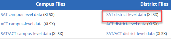
- Get SAT data: Retrieve SAT scores for the Class of 2023 from the TEA SAT/ACT data page. The dataset contains district-level SAT scores. Refer to the Class of 2023 SAT/ACT Glossary of Terms for definitions used in the dataset.
-
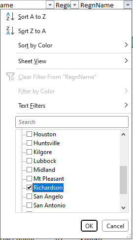
- Filter the data: Use Excel to keep only Richardson school districts and include all students.
- Get school district boundary data: To match this data to school district boundaries in Business Analyst, we need GEOID data.
-
- Download Texas school district boundary data from the Texas Education Directory Open Data site. This dataset includes school district boundaries and GEOID identifiers essential for mapping in Business Analyst.
- Join the data: Next, join the SAT performance data with school district datasets in Excel. Refer to this step-by-step guide if you need help joining tables in Excel using Power Query.
Step 2: Set up data in Business Analyst
The next step is to import this data into Business Analyst and set it up as custom data by defining geographic boundaries and key variables needed for analysis. This allows us to visualize school district boundaries and compare their SAT performance effectively using Benchmark comparisons.
-
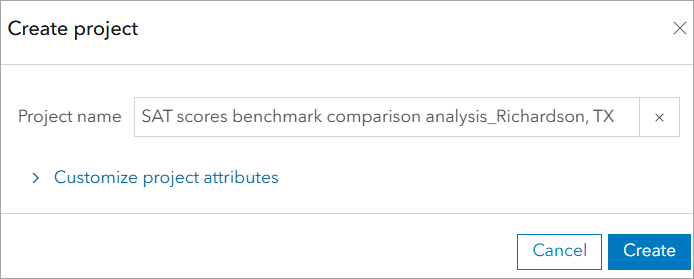
- Begin by creating a new project in Business Analyst Web App.
To set up custom data:
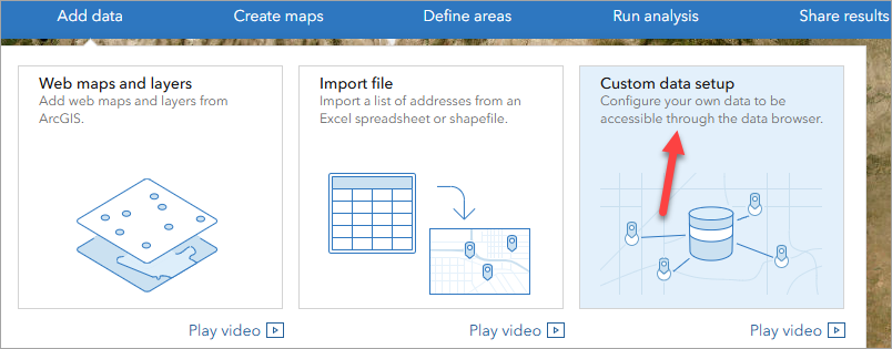
- Navigate to Add data > Custom data setup.
-
- In the left pane, click Start setup to begin a new custom data setup.
- Import the data
- In the Select data source window, browse for the custom dataset.
- Import the data into Business Analyst.
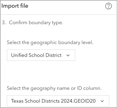
- Match fields to geographic boundaries: To accurately map the SAT performance data to the correct school districts, we need to match our dataset’s geographic identifiers with the appropriate boundary level in Business Analyst. This ensures that each school district is correctly linked to its SAT data for analysis.
-
- Specify the geographic boundary level: Select Unified School Districts as the appropriate boundary level.
- Specify the geography ID field: Use a unique identifier such as GEOID to correctly link the data to mapped school districts.
- Define custom variables: With school district boundaries established, we now define and configure key variables needed for analysis.
-
- Select key variables: Drag and drop the following variable onto the category table:
- “Total” – Average total SAT scores for each school district.
- Select key variables: Drag and drop the following variable onto the category table:
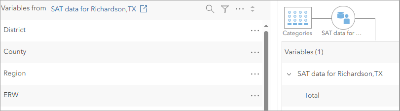
- Save the custom data for use in benchmark comparisons
Step 3: Run benchmark comparisons
With school district boundaries and custom variables set up, we can now perform a benchmark comparison to rank school districts based on SAT scores and identify performance gaps.
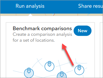
- Navigate to Run analysis > Benchmark comparisons
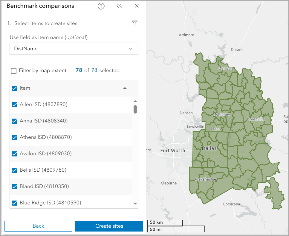
- Select locations
- Select school districts for analysis by choosing the layer created in Step 2. You can do this by selecting features directly on the map.
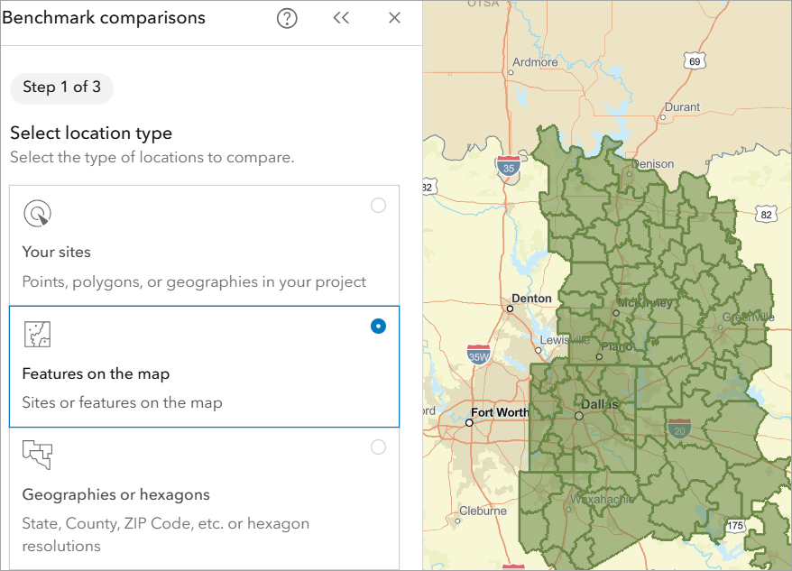
This creates 78 sites, one for each school district in Richardson.
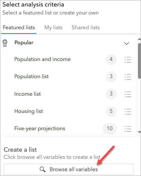
- Select comparison criteria
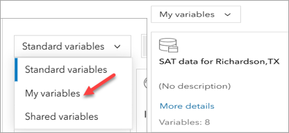
- Click Browse all variables to open the data browser and use the drop-down menu to select My variables (i.e., SAT scores).
- Enhance analysis with Esri demographic variables: Adding demographic data helps uncover deeper insights into SAT performance disparities. These variables highlight socioeconomic conditions that may impact test scores, such as education levels, digital access, and transportation.
-
-
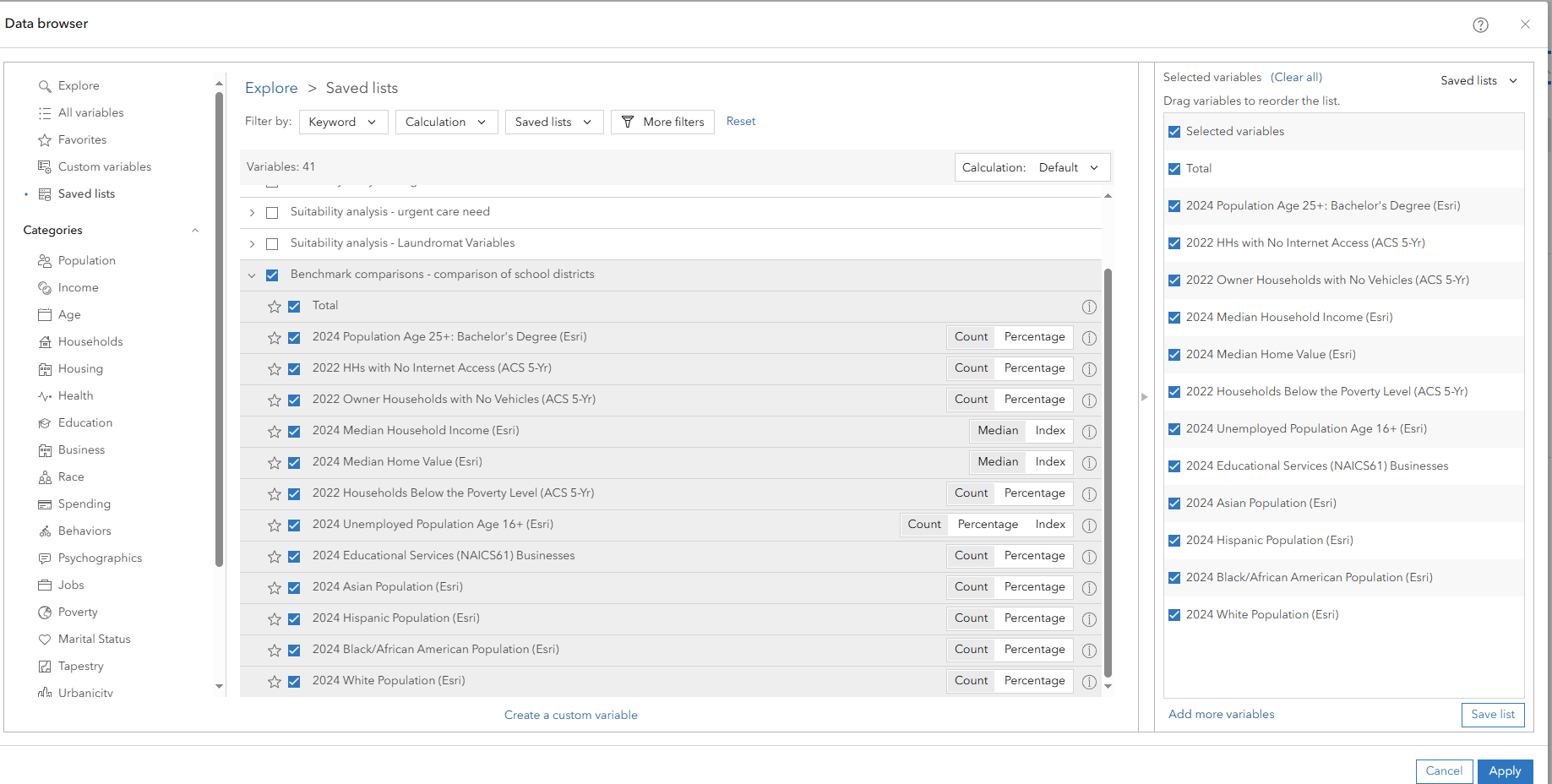
Click Browse all variables once more, then use the drop-down menu to select Standard variables. Consider adding the following variables to gain a broader understanding of potential SAT performance disparities:
- 2024 Population Age 25+ with a Bachelor’s Degree (%) – Higher education levels correlate with better SAT scores.
- 2022 Households with No Internet Access (%) – Limited internet access may reduce study opportunities.
- 2022 Owner Households with No Vehicles (%) – Lack of transportation can hinder access to tutoring programs.
- 2024 Median Household Income – Income levels often impact educational resources available to students.
- 2024 Median Home Value – Higher home values can indicate better-funded school districts.
- 2022 Households Below the Poverty Level (%) – Socioeconomic barriers can influence test performance.
- 2024 Unemployed Population Age 16+ (%) – Economic conditions may affect academic priorities.
- Click Apply to finalize the selections.
-
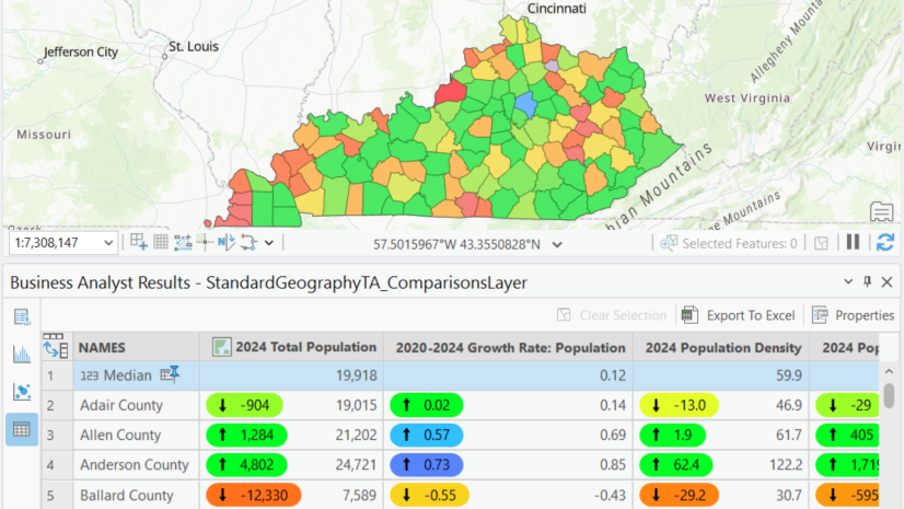
Step 4: Compare school districts and assess performance gaps
The final step is to compare school districts and analyze performance gaps using a benchmarked location. With the data fully prepared and configured, we can now rank school districts by SAT performance and identify the highest-performing district as a benchmark. To effectively assess performance gaps, we will analyze the data using three key methods:
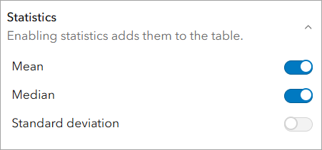
- Explore the SAT Score Distribution: To understand how districts compare, we first establish a reference point for SAT performance across the Richardson region. We do this by identifying the mean and median SAT scores.
-
- Locate the Statistics section in the workflow pane.
- Turn on the Mean and Median switches to add them to the data table. Once they are added, you have the option of using mean or median as the benchmark.
-
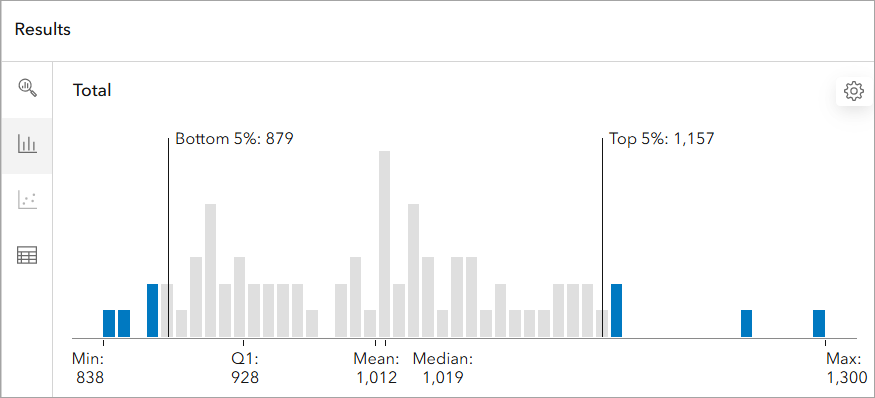
- In the Results pane, navigate to the Histogram tab to view how SAT scores are distributed across Richardson school districts.
- The Histogram highlights performance disparities, with most districts clustering around the mean SAT score of 1,012. The districts in the bottom 5% fall below 879, indicating potential areas for targeted support, while the top 5% exceed 1,157, representing the highest-achieving districts.
- Rank School Districts by SAT Performance
-
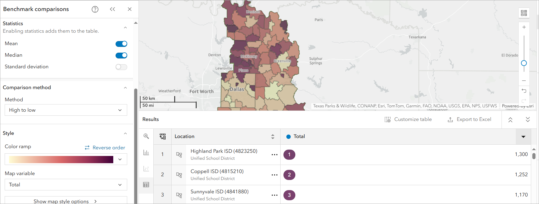
- Use the ‘High to Low’ comparison method to compare SAT scores across districts.
- In the Results pane, open the Table tab to view rankings from highest to lowest.
- Results show that Highland Park ISD emerges as the highest-performing district (SAT score: 1300), while Terrell ISD is the lowest-performing (SAT score: 838). This ranking provides a clear snapshot of disparities, helping to identify districts that may require additional academic resources.
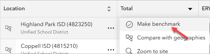
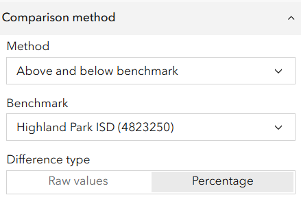
- Compare Each District to the Benchmark: To quantify performance gaps, we compare each district’s SAT score to the highest-performing district.
-
- In the Table tab, click the ellipses next to Highland Park ISD and select Make benchmark.
-
- By default, differences are displayed as raw values.
-
- Change the Difference type to Percentage for a more insightful comparison. Comparing school districts based on percentage differences may help identify districts needing additional support. The data table below reflects these differences.
-
- For example, Celina ISD shows a 297.9% increase in households with no internet access, compared to Highland Park ISD, which has the highest SAT performance and only 1.41% of households without internet access. This highlights a potential digital divide impacting student resources.
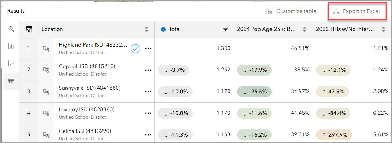
Finally, you can also export the benchmark comparisons table to Excel for further analysis or to share insights with stakeholders.
Key insights: socioeconomic factors & SAT performance
By analyzing SAT performance alongside some selected Esri demographic variables, we uncover key patterns that help explain disparities. Below are key insights based on these selected variables:
-
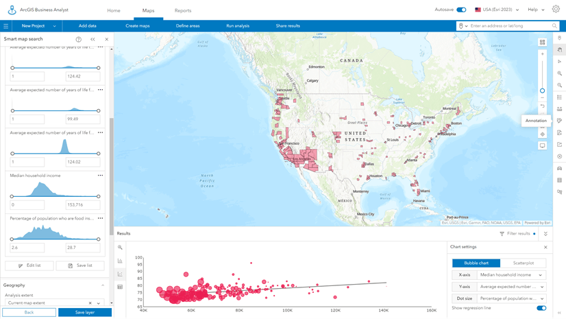
Higher SAT scores correlate with higher education levels.
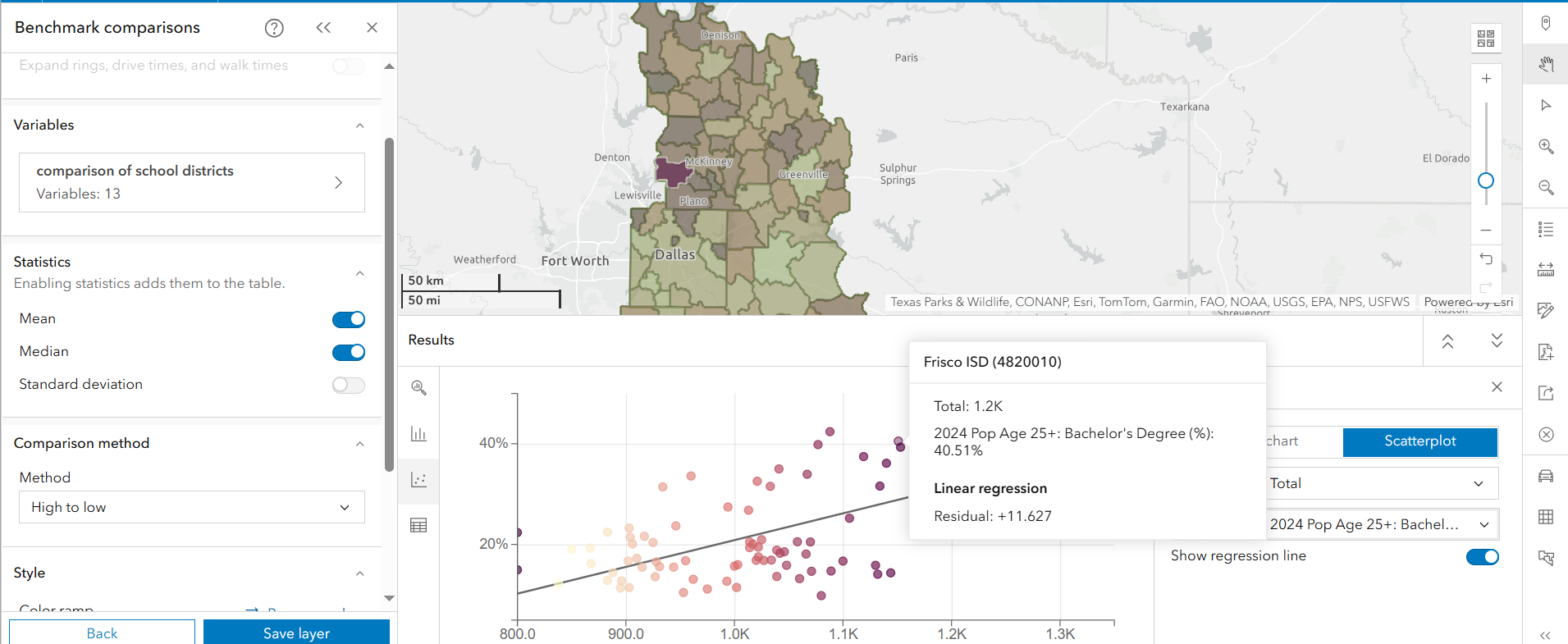
- In the Results pane, navigate to the Bubble Chart tab and select Scatterplot.
- X-Axis: SAT Total Score
- Y-Axis: % of Population Age 25+ with a Bachelor’s Degree
- Click on Frisco ISD in the scatterplot to view its location on the map.
- Districts with a higher percentage of adults holding bachelor’s degrees tend to have higher SAT scores. This suggests that parental education levels may impact student preparedness and access to academic support.
-
Limited internet access may be linked to lower SAT performance.
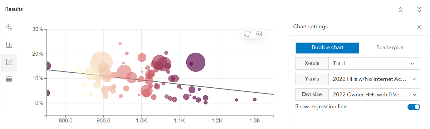
- In the Bubble Chart, set:
- X-Axis: SAT Total Score
- Y-Axis: % of Households with No Internet Access
- Dot Size: % of Households with No Vehicle
- Results show that districts with a higher percentage of households without internet often have lower SAT scores. This indicates that digital access and technology resources might impact students’ ability to prepare for the SAT, access study materials, and participate in online learning opportunities.
- In the Bubble Chart, set:
-
Lack of transportation is a potential barrier.
- In the Bubble Chart, observe dot sizes to analyze transportation access.
- Results indicate that districts with a higher percentage of households without vehicles tend to have lower SAT scores. This could reflect limited access to tutoring programs, school resources, and college preparation workshops, which may disproportionately affect students in lower-income communities.
Conclusion: What This Benchmark Comparisons Analysis Reveals
This benchmark comparisons analysis using ArcGIS Business Analyst highlights SAT performance disparities across Richardson, Texas. The findings show that districts with lower SAT scores often have barriers related to digital access, parental education levels, and transportation availability. These findings underscore the need for targeted interventions to support underperforming districts, such as increasing access to online study tools, providing school-funded test prep programs, and improving transportation resources, may help close the achievement gap.

Article Discussion: