In a previous article, I introduced advanced customer-derived trade areas in ArcGIS Business Analyst Pro. This article combines those techniques and methods with other analytical capabilities specifically using HDBSCAN for clustering and filtering customers, and using hexbin geographics and centroids to create modeled trade areas for proposed locations and estimate market opportunity. I’ll build on and show you how to apply the different Method parameters in the areas and use analysis to better define core customer groups and reduce the impact of dispersed customers in trade area creation.
I’ll also introduce weights and cut-offs to show how customer attributes and behaviors can be modeled and used in understanding location performance and fit with community demographics.
The impact of dispersed and isolated customers
Customer-derived trade areas depict an enclosed shape around a proportion of customers based on either their distribution or an attribute weight such as sales or another condition of interest. As a result, the shape can be strongly influenced by geographically isolated features, which create spikes, or locations with a high score for an attribute that can contribute disproportionally to the trade area volume.
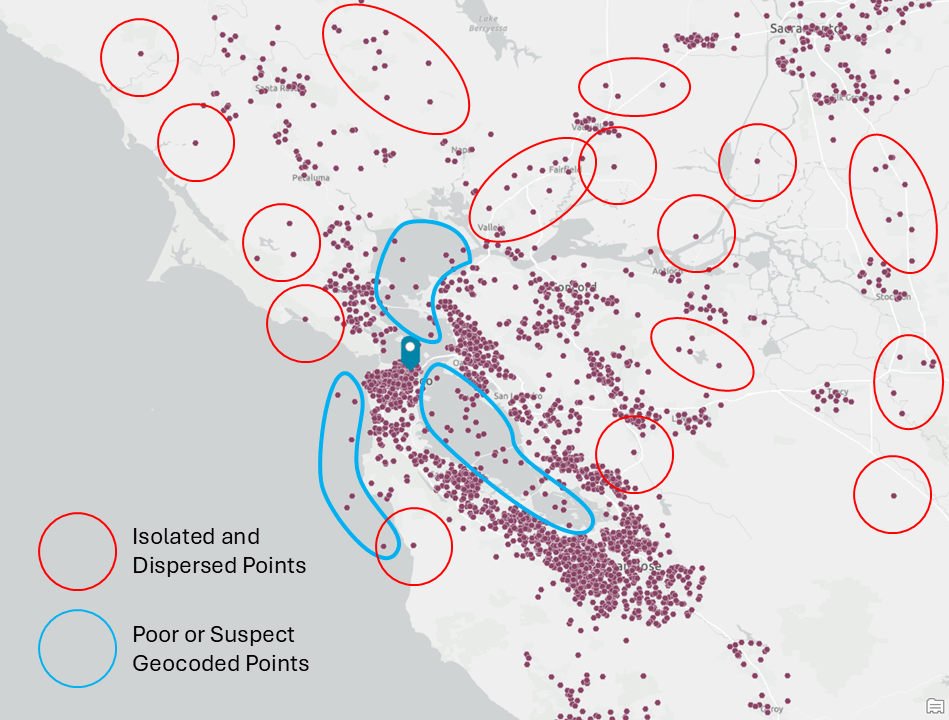
In the example above, there are customer locations in the Pacific Ocean and in water features. These are outlined in blue and are likely the result of poor geocoding or other errors at the time of capture. Isolated or dispersed points, highlighted in red, are also evident and may lead to spikes or the enclosed trade area “growing” towards these points rather than including the clusters nearby.
As you look at the map above, you will see other examples I have not highlighted. When you review the customer-derived trade area below, which uses the simple method, you can see how potentially erroneous and dispersed points have impacted the shape.
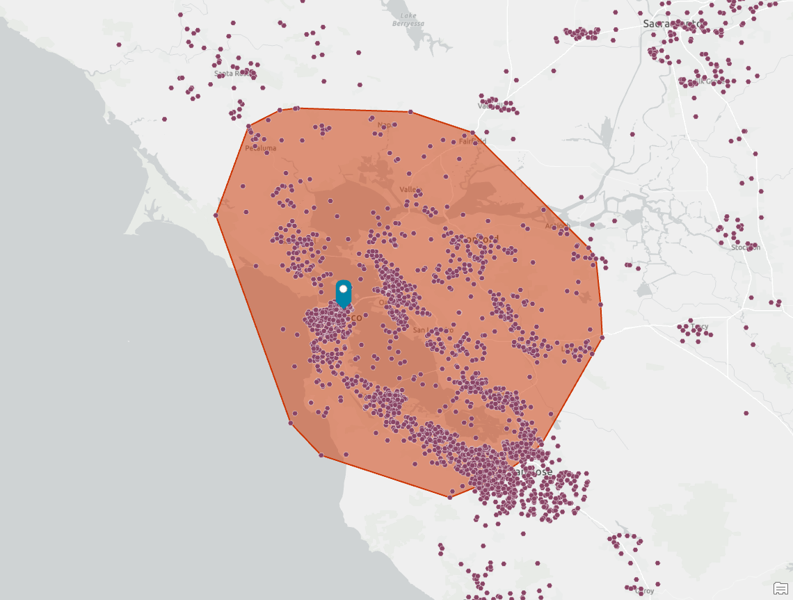
For some organizations, capturing the cluster is the most important driver. While we can be selective and easily filter out outlying customers based on their attributes, analytical techniques can help us constrain and enforce different rules that will influence how the trade area is constructed. For the example above, we might want to include more points around San Jose in the south and fewer to the north and east, to better reflect the distribution and density of the customer points.
Modifying candidate customer locations with cluster analysis
ArcGIS Pro has some powerful density-based clustering tools in the Spatial Statistics extension, including Density-based Clustering.
These tools find clusters of point features within surrounding noise based on their spatial distribution. Of the three clustering method options, I tend to use the Self-adjusting (HDBSCAN) option because it finds clusters of points with varying densities based on cluster probability or stability. It uses varying distances that are based on point distributions, rather than a predetermined distance that DBSCAN requires. This makes HDBSCAN more appropriate for clusters like those shown in the San Franciso examples in the article, when clusters may occur in outlying communities as well in dense urban areas. The Defined distance (DBSCAN) option finds clusters of points that are in close proximity based on a specified search distance and may be a better technique for analysis within urban areas.
What I also like about these clustering tools is that they calculate the probability that the point belongs in an assigned cluster (group) and provides an outlier code marking that the point may be an outlier within its own cluster. There are scenarios where this is very useful (but it’s outside of the focus of this article).
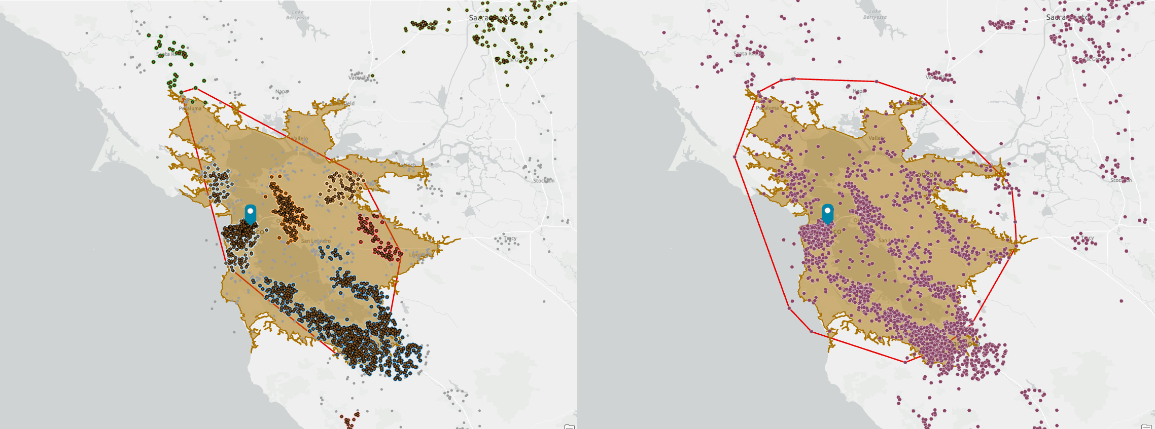
In the two screenshots below, I have run HDBSCAN on the original set of customer locations and have created a set of clusters which are represented in different colors in the first screenshot. These now form my customer locations for my secondary analysis.
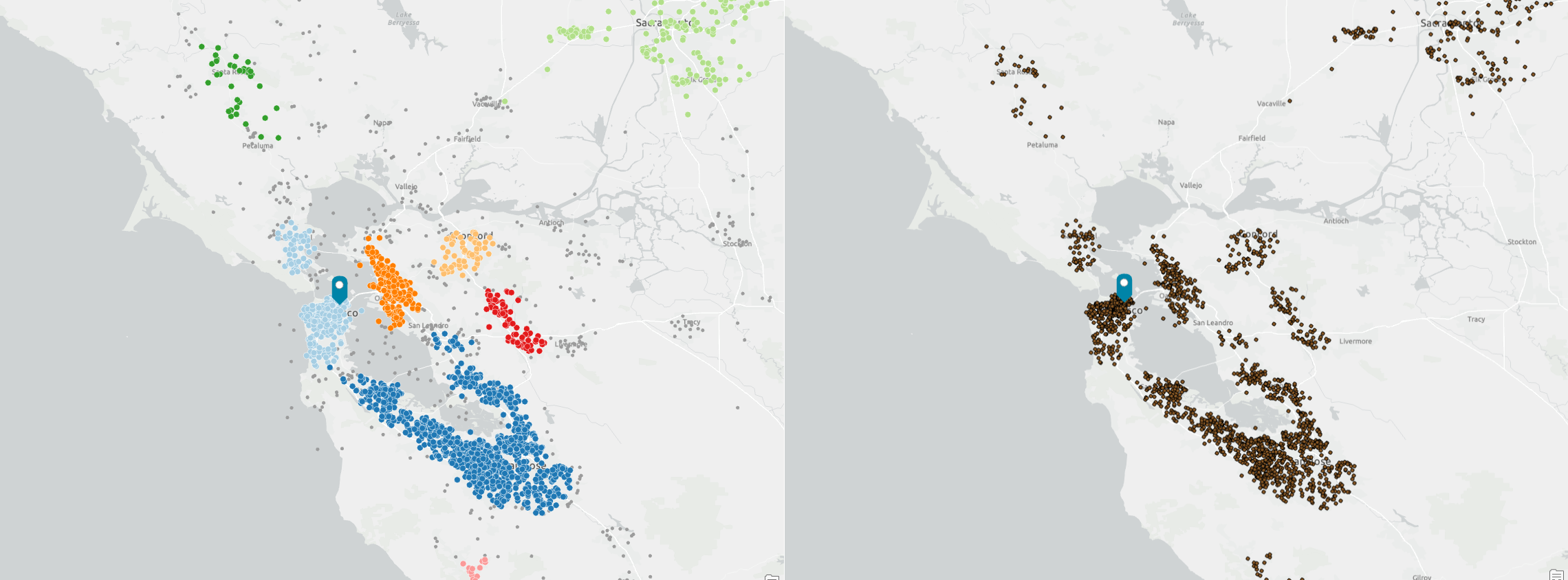
You will note that HDBSCAN performs very well but I also have a small number of isolated points near Vacaville and north of Petaluma. I could further filter these outliers or edit out the remaining locations in the water. However, because I am concentrating my analysis on the San Francisco Bay area, the initial output of HDBSCAN is of sufficient quality to use in the next steps of my analysis.
Running customer-derived trade areas on the clustered customer set
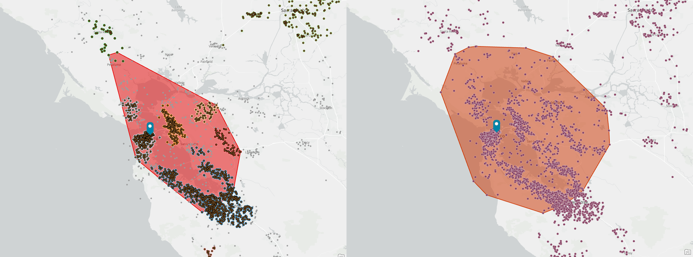
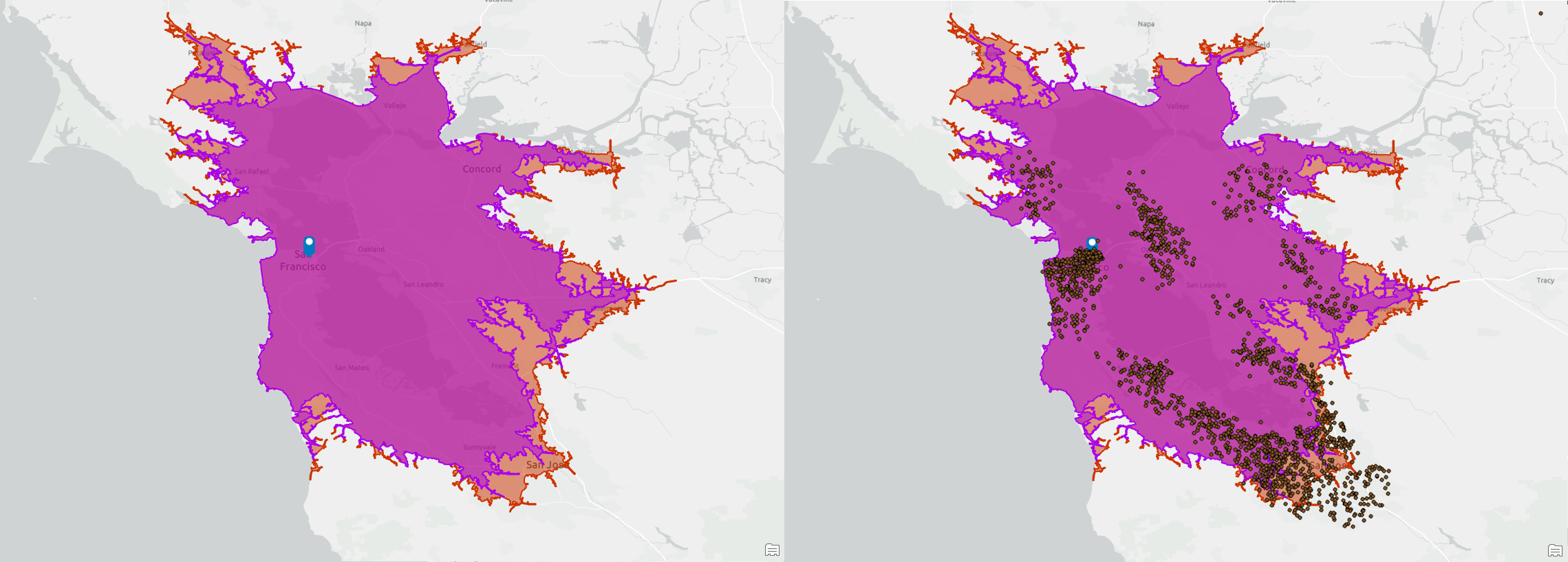
In this section, I will compare the results of using the new clustered customer point set (highlighted in each screenshot) against the original set of locations featured in the previous article. In each example we use the same parameters – 65% of customers – to create an enclosing hull.
Simple
With the clustered points, the simple method creates a tighter shape that is aligned more with the north-south orientation of the San Francisco Bay. Fewer points are included around Petaluma in the north and it would be easy to modify the shape by hand, or input data to remove these four points and create a shape that more tightly conforms to the five major clusters around the Bay.
In the South Bay area around San Jose, the customer-derived trade area (CDTA) includes the same points as the original unfiltered points, suggesting that HDBSCAN has performed well and that this is a good representative subset of customers.
Amoeba
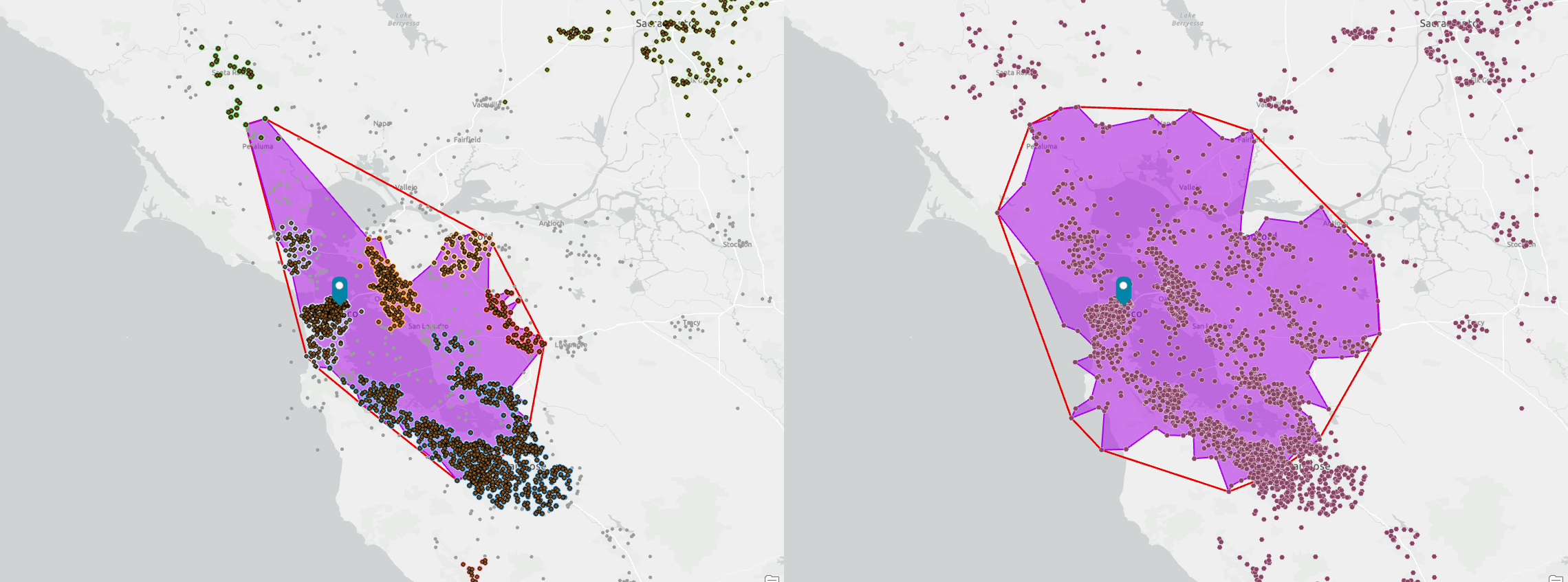
When using amoeba, the CDTA better captures the cluster of points in Berkeley and Richmond, but now excludes San Pablo Bay as an arm extends north from the city of San Francisco. Filtering out the four points south of Petaluma would create an even tighter amoeba enclosing the customers north of the Golden Gate Bridge and around San Rafael. I prefer the amoeba created using the clustered points compared to the simple shape and when modified, it would form a very intuitive shape that feels like someone has hand drawn a shape around those core customer points.
Detailed
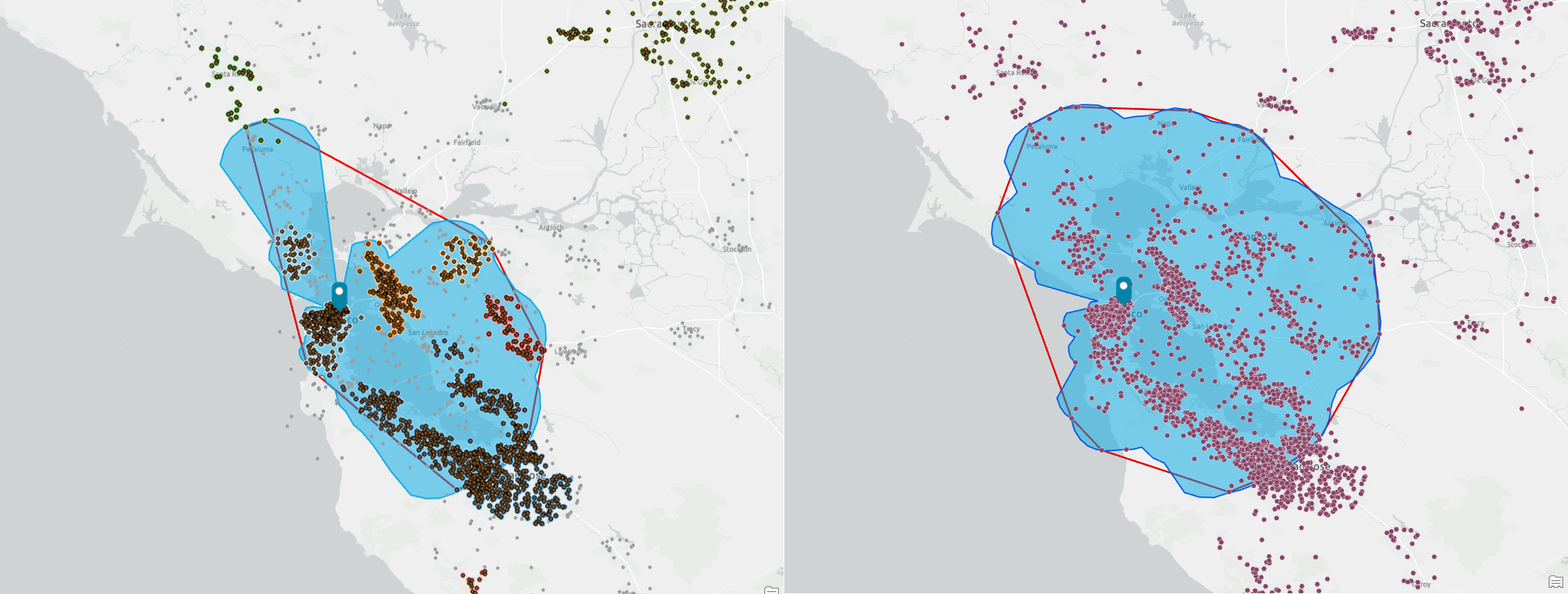
The detailed method is essentially a spikier version of amoeba and the same comments apply as discussed above. Of all the CDTA shapes, this is the one that would be the easiest to modify to remove the influence of the four outlying customers near Petaluma. Note how well this fits within the CDTA simple shape (shown in red) and how much simpler it is compared to the original trade area calculated before using the clustered customers.
Detailed with smoothing
The application of smoothing automatically removes those outlying customers and creates a shape that can be easily communicated and understood. Of all the methods used with the clustered customers, this is the one that I feel best summarizes their distribution and that of all customers too.
Using the clustered customers, the shape is more aligned and representative of the customer points. It also excludes San Pablo Bay and wraps tightly around customers in San Rafael.
Threshold rings
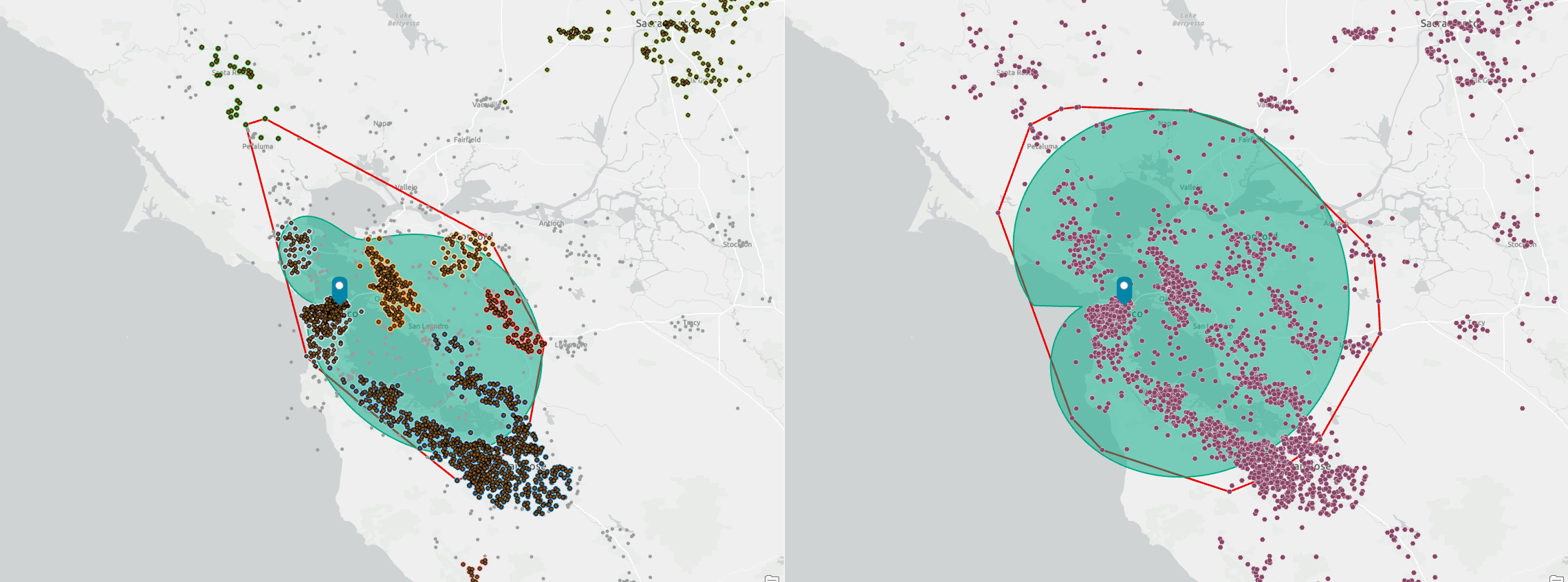
The result of threshold rings is identical between the clustered customer set and the original points. This is because, while HDBSCAN has removed dispersed points, the proportion of points in the new clustered dataset and their geographic dispersion is similar to the original set of customer locations. In particular, the cluster along the southern shore of the Bay and towards San Jose has not been significantly impacted by the HDBSCAN process. In fact, less than 5% of the points in this area were removed.
The point forms the sixty-fifth percentile in both datasets and is 38.43 miles from the store in San Jose.
Threshold drive times
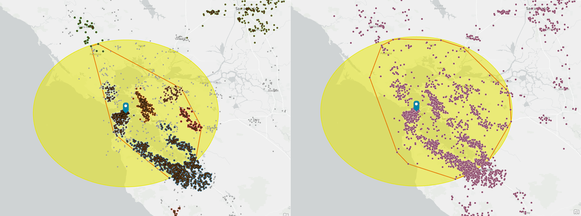
Like threshold rings, threshold drive times are aligned, because there is a common point, again in San Jose, which is at the same drive time of 61 minutes. Consequently, both datasets generate the same result with the threshold methods.
What I like about this method is how clusters help explain the result. The biggest proportion of points are in the south, so as the drive time expands, more points are added from this clustered set of candidates than from other locations. When the cut-off is reached, at 58 minutes, a drive time is created around the store in all directions. You can now see the reach of the store and potentially how a set of sparse points might influence the trade area. However, with this dataset and the threshold methods I am using, there are no impacts.
The impact of removing the Petaluma cluster
As I’ve discussed, some customers are far from the store, beyond an hour’s drive time, and influence our results. The Petaluma cluster is the closest to the store and tends to “drag” CTDA towards it. What’s the impact of excluding this cluster? When we reduce the number of total customers, how does it impact the CTDAs and particularly threshold drive times?
The screenshots above compare the original clustered customers and the new CTDA without customers near Petaluma. There are 2,303 customers in the clustered set and 2,237 without Petaluma customers—a loss of approximately 3% of customers. The impact of this is that the 65% threshold is now reached in 56 minutes of customers or approximately 10% less time. As a result, the drive-time CDTA is much smaller in some areas. Noticeable differences in the number of customers included are once again around San Jose, which is most impacted by the difference in drive time and has the most customers in a cluster.
The impact of weights and cut-offs
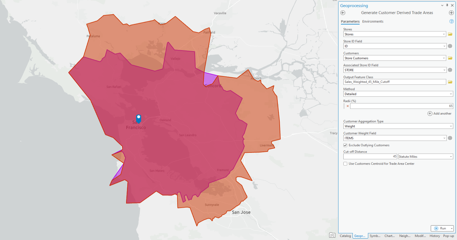
Customer-derived trade areas can also use attribute weights rather than customer counts to define the trade area. In the example below, the orange CDTA was created using 65% of all the sold items, which represents 5,084 items from 1,933 customers. The maximum distance to the furthest customers is 41.5 miles.
If we use a cut-off limit of 45 miles, which would exclude any customers beyond that distance, 65% of items represents 3,618 items from 1,386 customers. I chose 45 miles in my example to add a ten percent time buffer to the threshold that CDTA has identified as my “core” set of customers. From my initial CDTA analysis, I know that 65% of the items bought by customers are within 41.5 miles, so if I add 10% or 4 miles, I have a cut-off at 45 miles. This is the maximum distance I will assume that my “core” customers will travel for the goods and services offered by this store.
Once I have established the cut-off distance, representing the core group of customers, I can then use weighted customer aggregation with different radii to identify patterns in the distribution of this core customer group.
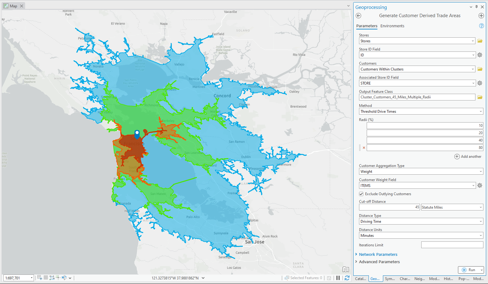
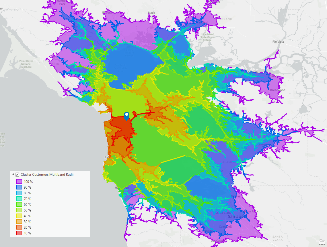
In the example below, I have used the 45-mile cut-off with four different radii – 10, 20, 40 and 80 percent of items purchased. These are values I often use for customer purchases to analyze things like the 80-20 rule (20 percent of customers make 80 percent of purchases), geometric changes in distances, and the impact of outliers in customer distributions.
This results in a set of drive times at 20, 35, 38, and 57 minutes. You can see that when these CDTAs grow away from the store and beyond 38 minutes or 40 percent of items, the CDTA grows significantly.
We can use an understanding of the growth and correlation between items and distance to further refine our analysis. Below I have included two graphs of how the items purchased distribution changes with distance. Up to 40% the distance is greater than the purchased items, and beyond that the reverse is true. From the second graph, we now understand how the relationship between items and distance varies beyond 40 miles and is relatively flat until the last 90% of purchases.
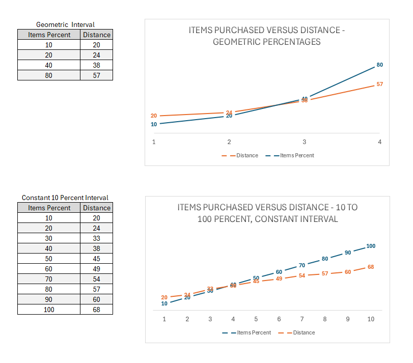
This type of distance-to-engagement modeling can be performed to better understand how customers interact with individuals or a set of locations. They provide detailed insights into things such as composition and purchasing behaviors, store accessibility, alignment with underlying market opportunity, community need, and much more.
The screenshot below shows each of the items purchased bands and the accompanying drive-time trade areas for the San Francisco store.
Wrapping things up
Customer-derived trade areas are incredibly flexible, powerful, and informative tools. I’ve explored scenarios that describe best practices for filtering and refining the customer list using ArcGIS Pro density-based clustering. These techniques can help you refine your CDTAs based on a better understanding of the variation of your customers both geographically and demographically.
These insights help create more relevant and practical CDTAs that are more fit for purpose and informative, offering better pathways to gain insights and act based on understanding rather than guesswork. It also helps you better engage with executives and stakeholders who want a big-picture overview and know that you are acting with sound reasoning and science-based knowledge.
In a future article, I will discuss applications of continuous hexagonal surfaces and proximity surfaces to support predictive modeling and expanding your toolbox for trade area creation beyond the existing options.

Article Discussion: