Veterans Day pays tribute to all American veterans, living or dead, who served in war or peacetime. Using data from The Department of Veterans Affairs Open Data Portal, we created a custom infographic to illustrate veteran information by state. This information can be used to assess the demographics of veterans and better tailor health care resources in the State. Custom data (meaning data from outside of Business Analyst) can be displayed in infographics in ArcGIS Business Analyst and used to visualize key indicators and information for sites.
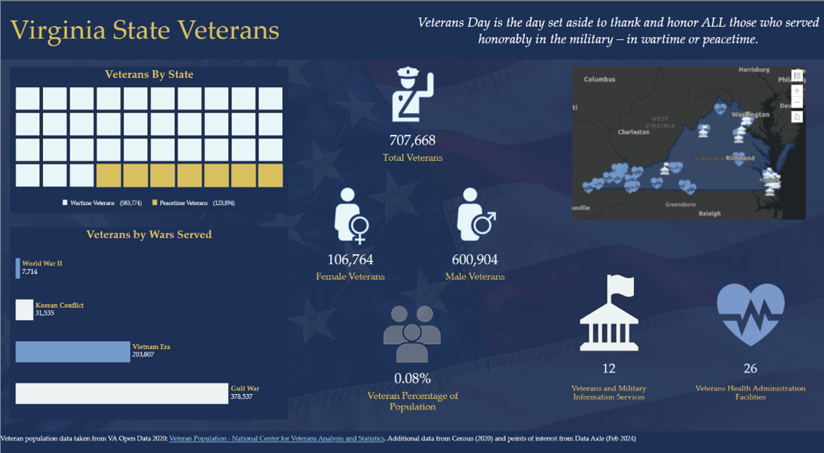
Using data available through the Department of Veterans Affairs Open Data Portal, we can show various data points related to veterans at the state level. Once we decide which data to incorporate, we can select several ways to visualize and interpret that data through the chart options available in the infographic builder.
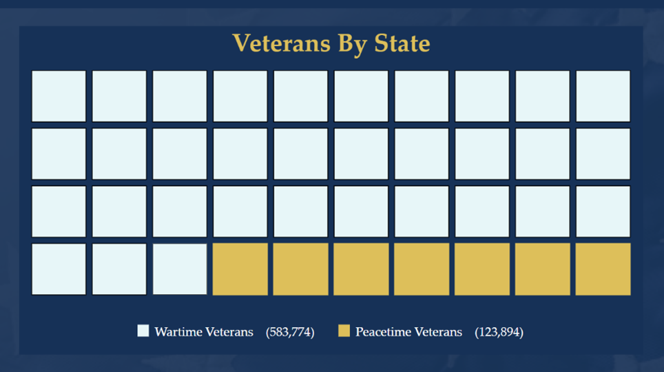
Military service is classified by either wartime or peacetime. The waffle chart on the left column of the infographic divides the veterans by state between these wartime or peacetime designations. Wartime veterans were active-duty during periods of wartime designated by congress, and peacetime veterans were active-duty anytime between those designated wartime periods.
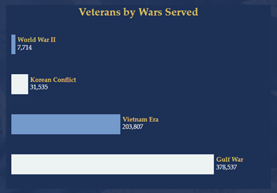
To further explore the waffle chart data, the bar chart directly below it then breaks down those who served during a wartime period by the congressionally designated wartimes: World War II, Korean Conflict, Vietnam Era, and/or the Gulf War. For the State of Virginia, for example, most veterans were on active duty during the Gulf War. This information is important to know because veterans who served during wartime periods may face challenges related to that service. Knowing this information can help tailor health services offered to veterans, as they may have faced different environmental exposures, political and cultural experiences, and/or emotional distress.
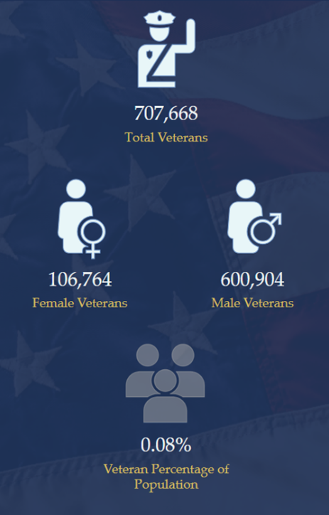
The center of the infographic provides general veterans statistics, such as the total veteran population, female veteran population, male veteran population, and the percentage of the state population that are veterans. It’s important to understand female veteran population, as they have additional health access needs, such as gynecology providers and obstetricians.
Lastly, we have a map with points of interest showing resource locations available to veterans. These include general veteran and military services and Veterans Health Administration locations within the state. For this panel, data points were used from both the Department of Veterans Affairs Open Data Portal and POIs found in Business Analyst’s points of interest data.
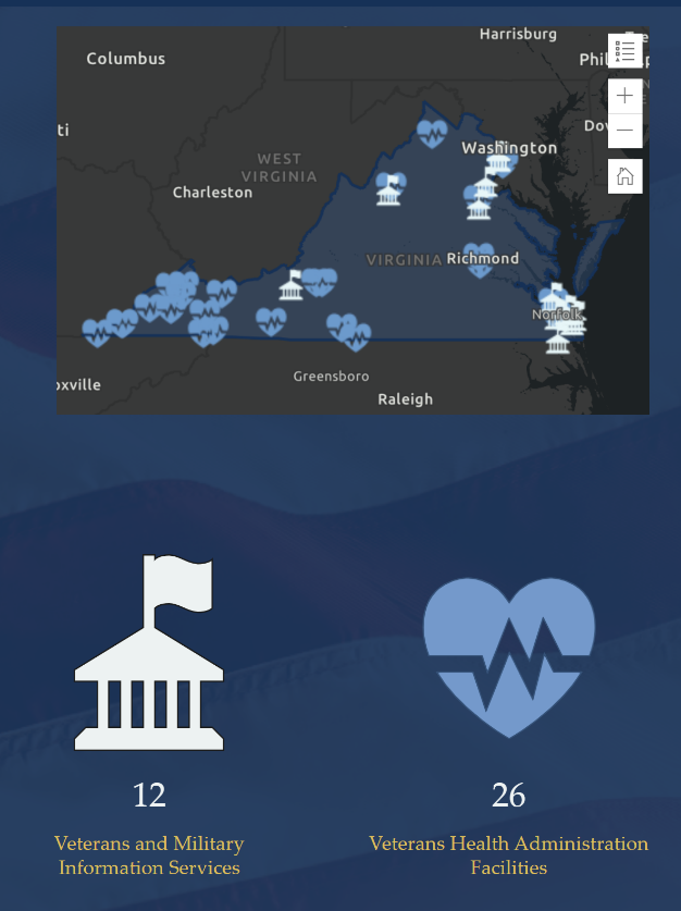
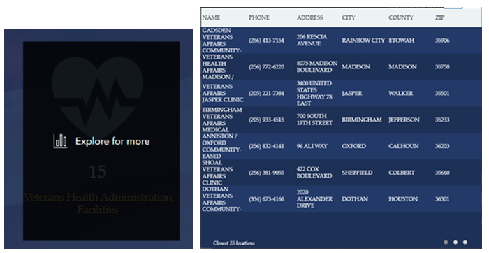
You can hover over the Veterans and Military Information Services or the Veterans Health Administration Facilities panel to explore more information about those points of interest, including the name of the facility. For the Veterans Health Administration Facilities points, additional information regarding the address and phone numbers is given as well. This is a good resource for veterans who may not know of resources around, and available, to them, but also for the community to know where they can show support for veterans.
Who can use this infographic?
This infographic is widely applicable to many. The first group of users we had in mind when making this infographic was veterans themselves. It’s a way to show appreciation towards their service and acknowledge them. In addition, it provides resource locations for them to seek care if they need it and could highlight options, they may not have known they had.
This infographic can also be used by State Veterans Affairs organizations to understand and visualize veteran populations by state and available resources, and to highlight veterans in an easy-to-comprehend way for the public. The data being represented in this format also provides a quick context that can inform decision-making for resources and services provided for veterans in each state.
Using custom data to build infographics
While this infographic uses custom data to focus on Veterans Day, custom data can be used in infographics for any topic of interest within any industry. Adding custom data to ArcGIS Business Analyst is simple and allows you to use your own organizational data the same way you use Esri Demographics data. It can be used in mapping, analytics, infographics, and reporting workflows. Let’s walk through how we did it for this infographic.
We took the data from the Veterans Affairs Open Data Portal and put it into an Excel spreadsheet organized by state name. This information can easily be put into ArcGIS Business Analyst by using the custom data setup workflow.
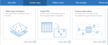
The custom data setup workflow allows you to add data and use it along with Esri Demographics data within ArcGIS Business Analyst Web App. We imported the Excel file and set the boundary type to be State, since this was the level of detail for the Veterans Affairs data.
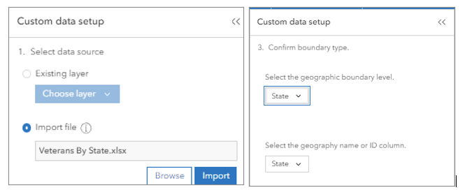
Next, we set up how our data will be displayed and aggregated. How you configure your data variables will depend on the specifics of your data.
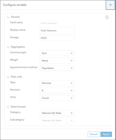
Once the data was set up, the next step was to create the custom infographic template in the infographic builder. If this is your first time customizing an infographic, we recommend starting using an existing infographic template.
Accessing custom data for use in infographics is the same as using variables from Esri Demographics data. Instead of looking at the Standard variables, we can look at My variables.
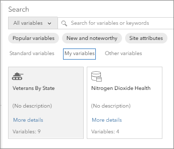
We selected the Veterans by State variable category to see the individual variables we configured when setting up our custom data.
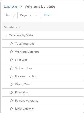
We started with a blank template and added in the infographic panels, colors, and images that were meaningful to the purpose of this infographic: to display information related to veterans within the state.
Using custom data to create custom infographics can be a powerful and compelling way to share data and information. This blog article described a use case using data from the Department of Veteran’s Affairs, but the applications of custom infographics reach far beyond. Nonprofit organizations can use their data to create a custom infographic to help apply for grants, or a commercial real estate business can create a portfolio of their assets highlighting specific information through infographics.
Data visualization and interpretation are important, and custom infographics can help your organization convey meaningful, and sometimes complex, information to the right audience.
For more infographics design considerations, check out this blog series:


Article Discussion: