ArcGIS Business Analyst Pro has a lot of capabilities and using the more advanced options often requires a nuanced understanding of the geoprocessing tool, its methodology and results, coupled with awareness of how the input data influences the results. Even experienced users can be intimidated by choice and sometimes the documentation does not do the software justice.
This article provides more detailed insights into how your choice for the Method parameter in the Generate Customer Derived Trade Areas tool will influence the trade area’s shape, size, and degree of conformity to the underlying customer point layer.
The basics
A customer-derived trade area (CDTA) is an enclosed shape, technically a convex hull, around a proportion of customers based on either their distribution or an attribute weight such as sales, number of visits, or other condition of interest. For example, retailers use CDTAs to identify a “true trade area” based on customers from their Customer Relationship Management system (CRM) or detected store visits based on human movement data. Healthcare organizations can identify CDTAs to look at patients who might need specialized care, based on demand for pediatric or geriatric medicine. Warehousing operations use CDTAs to identify market areas based on demand for goods or services, using spending or potential.
Business Analyst Pro’s Generate Customer Derived Trade Areas tool can base its calculations on both actual customers or predictive populations using centroids or other point-based datasets.
The methods
When using the tool, there are six methods that each create a specific type of customer-derived trade area.
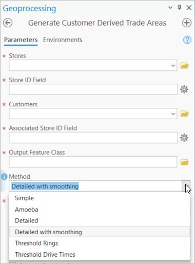
While each method can use raw counts of customers or a weight based on customer attributes, each generates a unique form of trade area. These vary from a simple multi-sided, irregular polygon with around a dozen points to a simplified cubic spline. Other methods generate a smooth, organic amoeba while the most complex, a drive time, can contain thousands of individual vertex points.
Simple
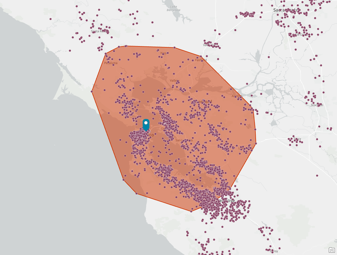
A generalized trade area using the outermost points connected via straight lines generated as a minimal convex hull with no indentations. In the following screenshots, I will include the simple method outline to compare the differences in the methods.
Amoeba
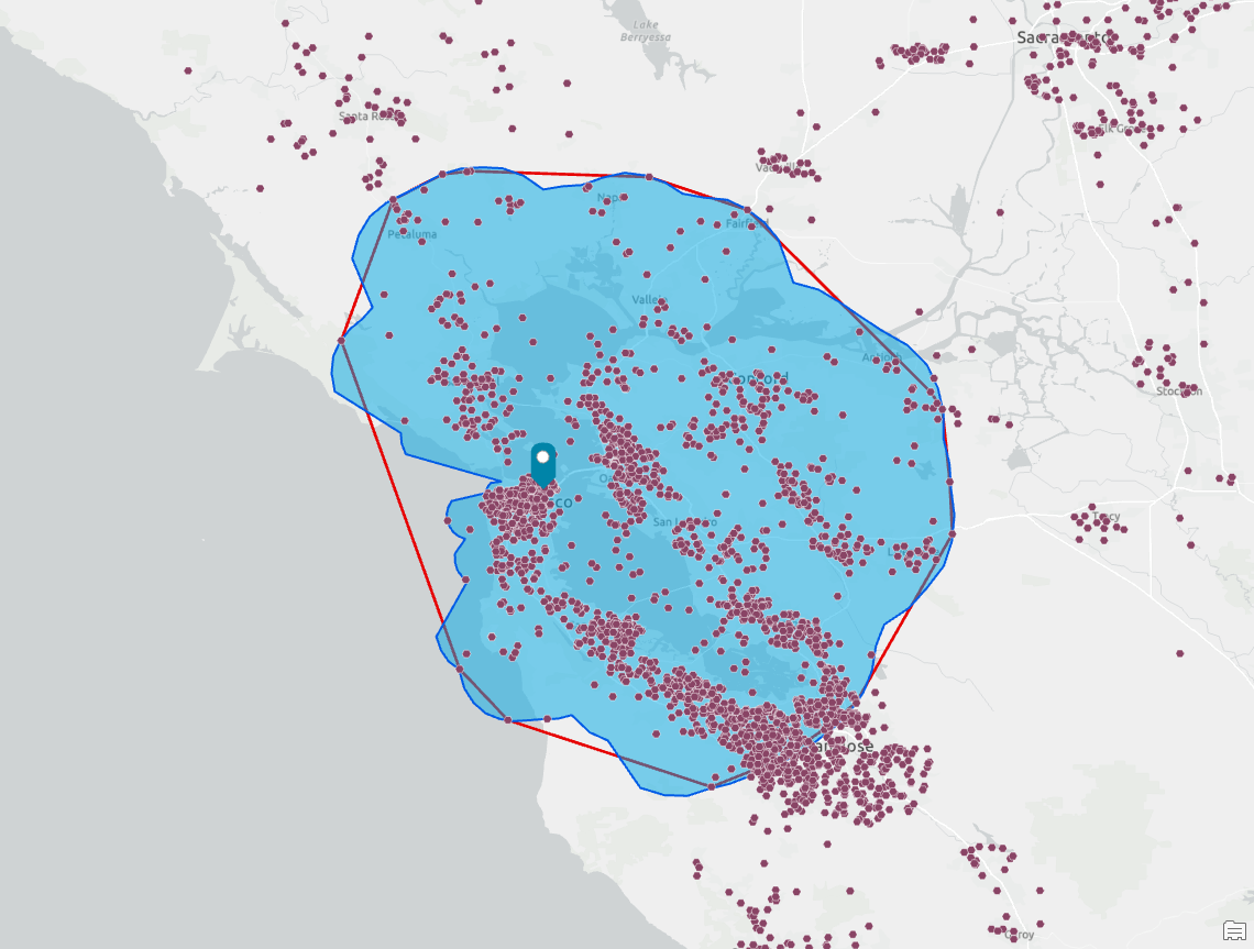
A trade area fit to an expanded set of maximal points connected using natural curvature. This can include indentations and extensions.
Detailed
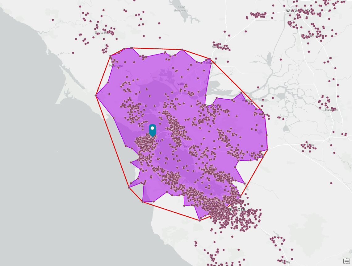
A detailed set of boundaries, typically 2-5 times the number of points used in the simple trade area, using straight lines which can include indentations and may create triangular spikes.
Detailed with smoothing
This is the default method, which fits a cubic spline version of the detailed trade area using smoothed curves. A small subset of points from the detailed trade area is connected using low-degree polynomials. This method considers the shape and pattern of the customer distribution, which may result in the highest level of simplification but the most pleasing smoothed shape.
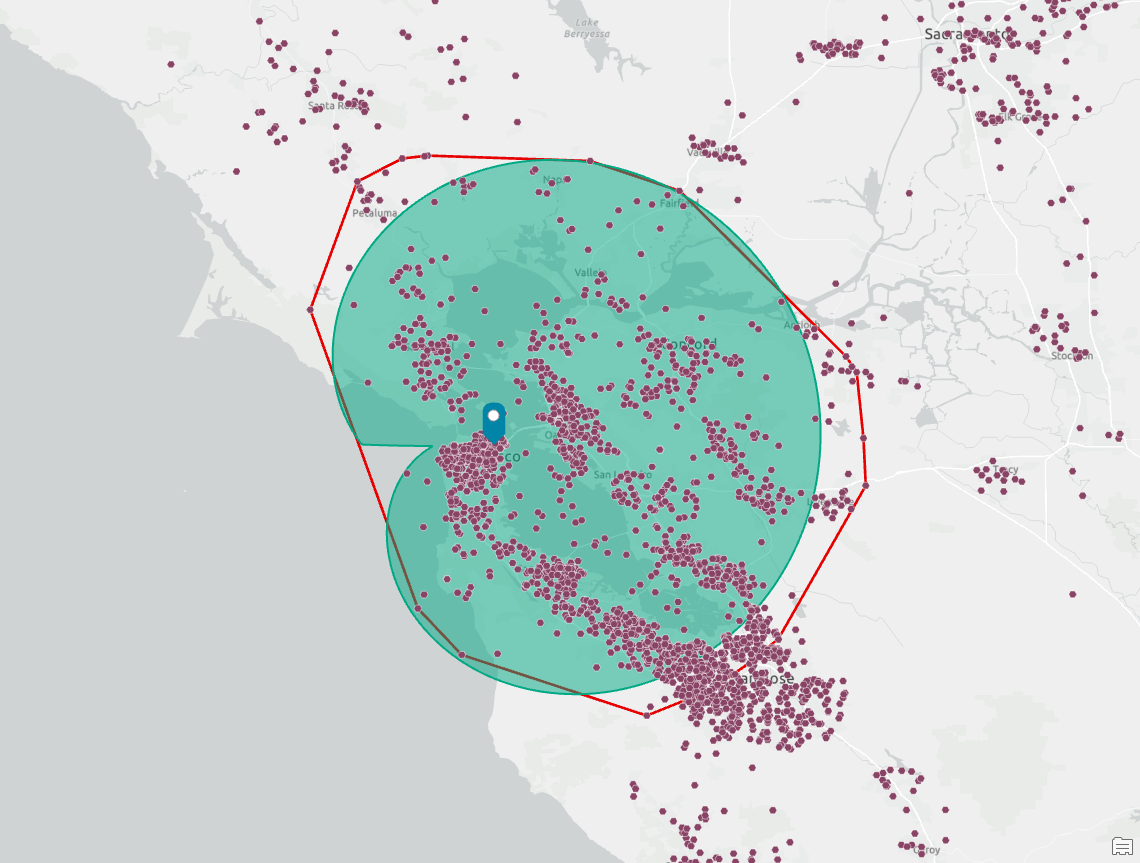
Threshold Rings
Creates concentric rings that expand out from the chosen store(s) until each ring contains the specified threshold of customers. This is the minimum-sized circle that will include the desired number of customers.
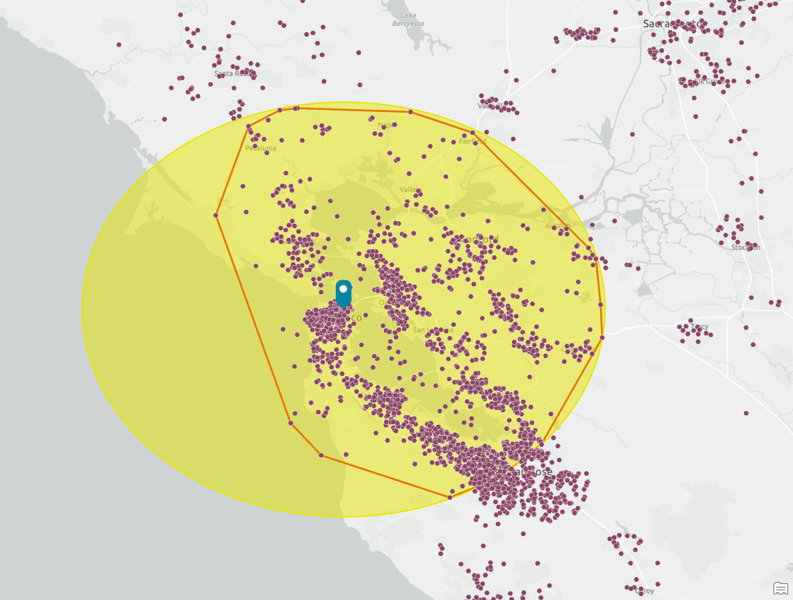
Threshold Drive Times
The most complex and computationally expensive option, that expands out from stores along network routes until each trade area contains the specified threshold of customers. Drive times can use distance- or time-based parameters and supports a range of methods from walking to trucking.
The nuances
I often get asked “Which method is best?” and “Why is detailed with smoothing the default?
Like so much in GIS, the answer to which method is best is: it depends. The detailed with smoothing method is the default because it generates a very simple enclosure that is like a modified ring, which has historically been how many organizations begin the process of understanding true trade areas. Where the ring deforms, and how it deforms, highlights the distribution of customers in a similar way to how you would physically draw them using pen and paper.
The other methods emphasize different distribution characteristics. Threshold rings allow the user to summarize the maximum distance(s) customers are from the destination. It provides a way to understand desirability and/or accessibility. For example, the travel distance may be quite different for the same percentage of customers based on whether the location and customers are in urban, suburban, or rural settings.
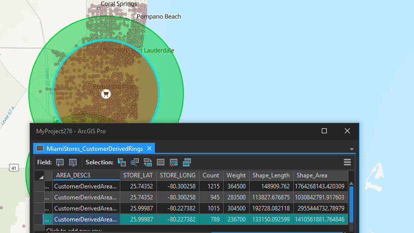
In the example below, I created rings for the top ten percent of customers for each store. You can see how the customer-derived trade areas vary in size, so much so that the area of the largest is almost fifty time bigger than the smallest.
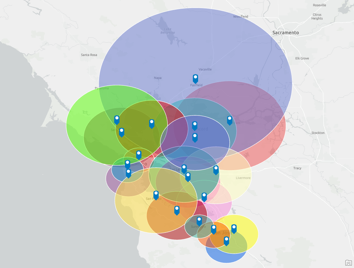
Simple and threshold rings work as a good standard to describe the trade areas in general terms. I meet many executives who want to hear realistic and straightforward summaries like “Fifty percent of our customers live within 10 miles of our stores” or “We cover ninety percent of our market potential within 15 miles.” As geographers, spatial and data scientists, or GIS professionals, we know that the truth is more nuanced, but for many executive-level discussions this simple summary is appropriate.
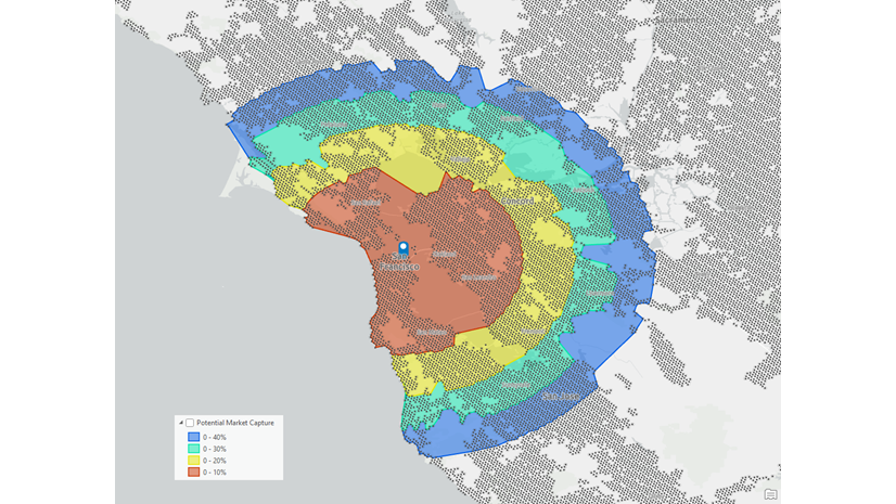
Threshold drive times, which was a new method introduced in 2022, expand on the executive summarization. Now analysts can have a detailed understanding of how far customers drive, or the time it takes customers to drive, to the destination. Using the urban, suburban, and rural scenarios above, an analyst could identify different trade areas for different location types and have detailed understanding of how the physical geography impacts trade areas. This is especially useful in future location planning because rather than using hypothetical distances or drive times, the analyst can use actual measured and modeled metrics.
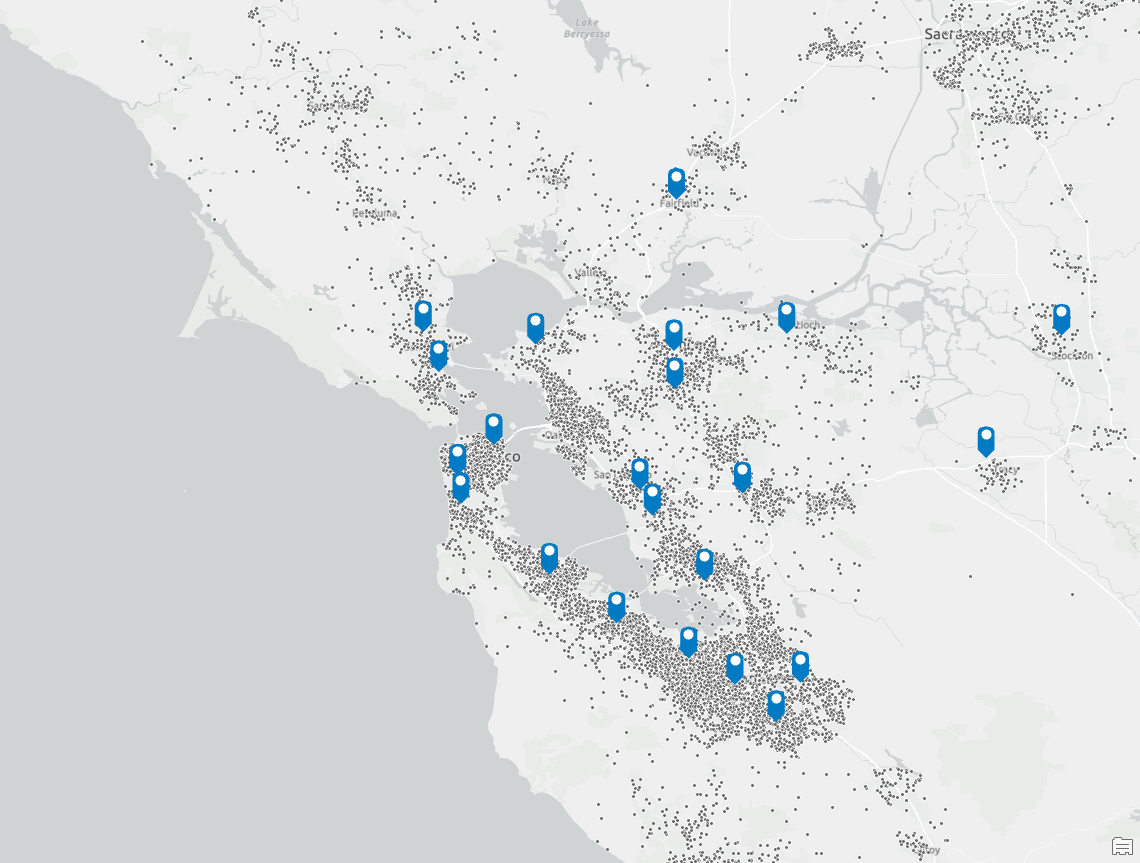
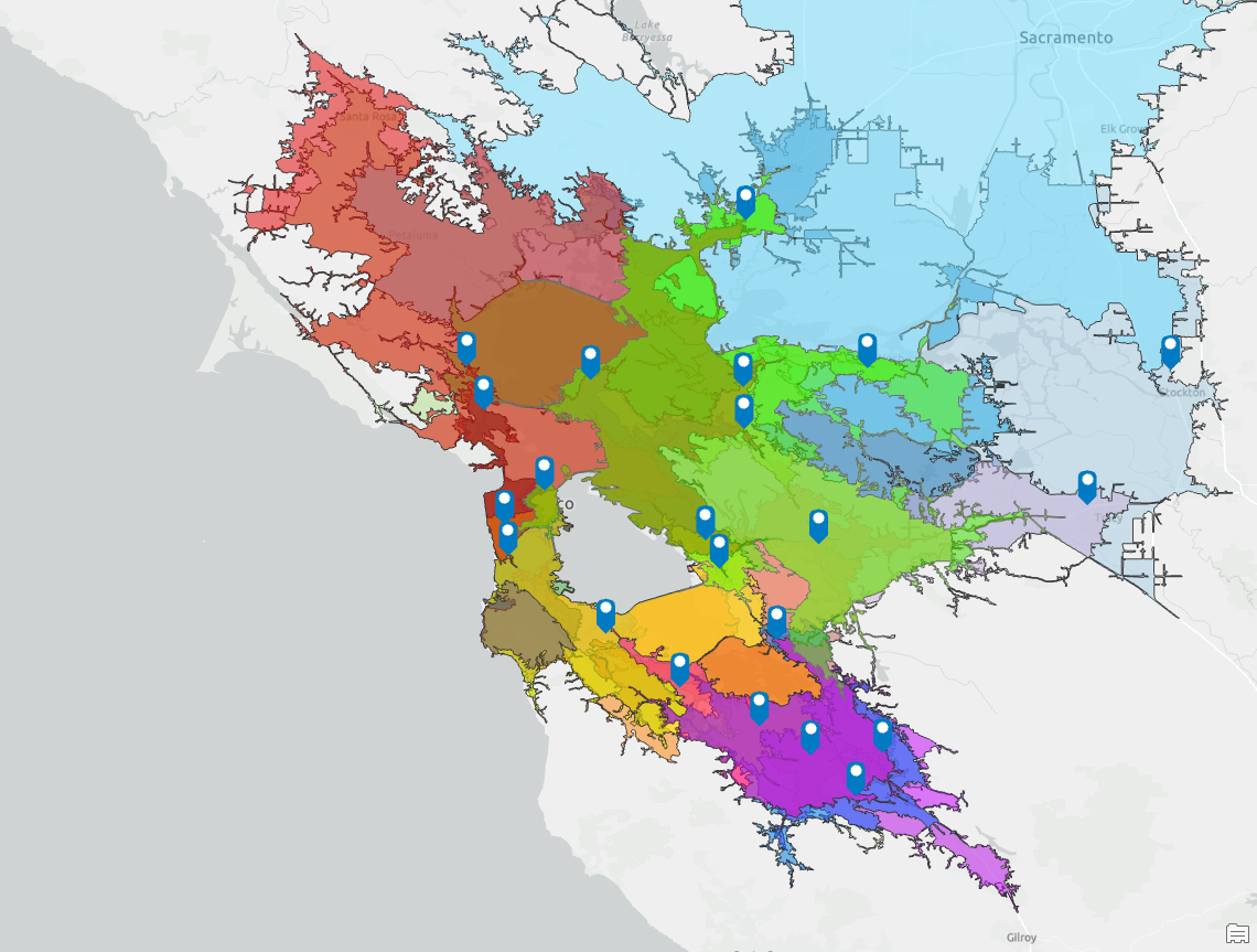
In the example above, I created drive times for 25 percent of customers based on spending. These are again highly variable in size and many trade areas overlap other store trade areas because of customer preferences for their favorite store. Many stores are cannibalizing sales from others and the store distribution needs significant optimization and restructuring to better serve customers.
Threshold drive times can also be used to identify changes in customer behavior over time. If an organization monitors customer behavior on a monthly or quarterly basis, changes to who is visiting the location, how much they spend, or how they interact with the location, threshold drive times can be used to visualize those changes down to the neighborhood level.
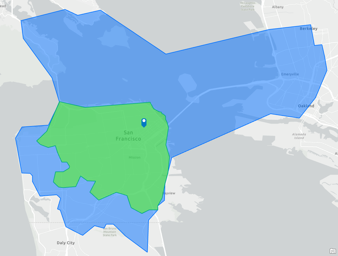
Working with clients, I’ve helped them create seasonal and event-based threshold drive times, such as the example above which shows the typical fall season trade area and how it changes with Black Friday events, drawing a bigger set of customers from different and distant neighborhoods.
Customers who apply these types of analysis gain an improved understanding of where customers come from across spring, summer, and fall or what happens during the holiday season or when sales promotions are happening. These trade areas can also help marketing departments better target their messages.
In healthcare, I’ve worked with hospitals and urgent care to understand seasonal variations in visits and patient symptoms from the flu to pediatric and geriatric care. Restaurants have benefitted from the insights of understanding the impact and importance of out-of-town visitors or tourists to their trade. These techniques combine well with human movement data and support of sales forecasting and network optimization best practices as well.
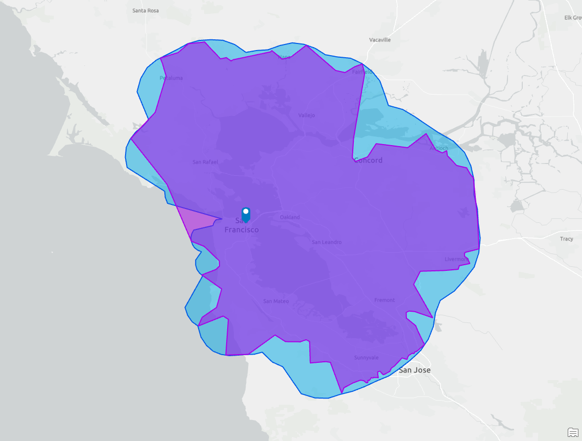
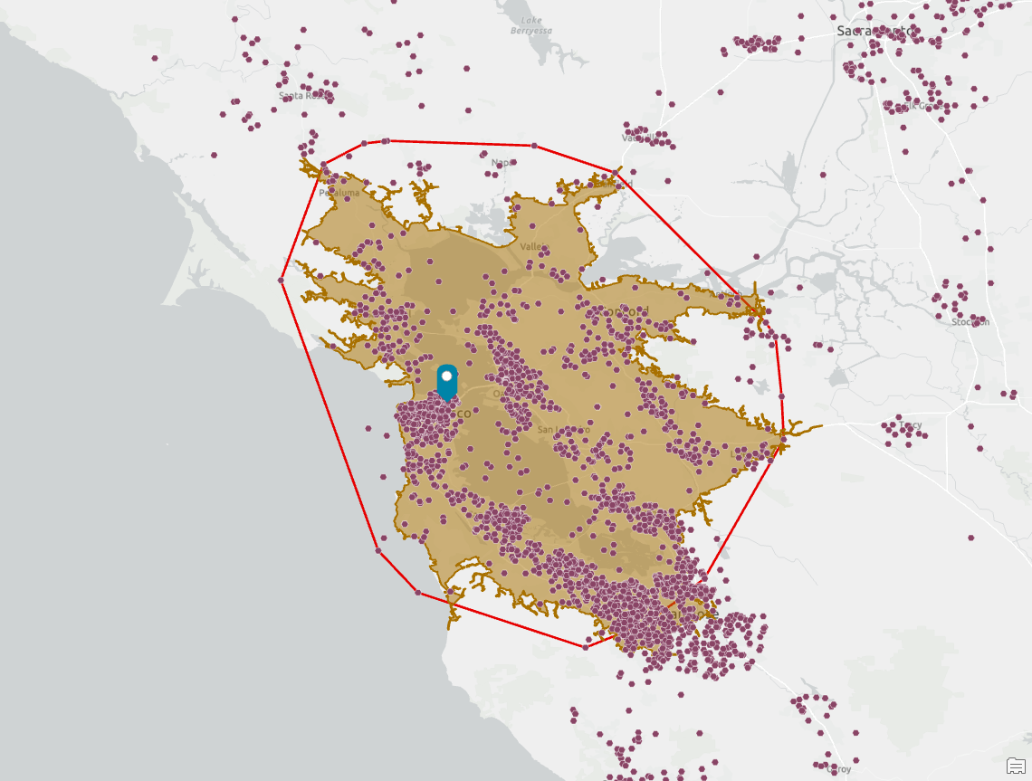
Amoeba and detailed are sibling techniques with both forms of trade area calculation using a more complex exterior boundary-fitting technique using either straight lines (detailed) or curves (amoeba). In the example above, I have overlaid both methods to compare the result using the same set of customers are trade area calculation parameters. You can see how amoeba tends to create more complex shapes but are aesthetically pleasing, while detailed is “spikier.” Both are very effective visualizations and analysis techniques
Detailed is my go-to technique because I can then understand how the underlying geography of people, roads, demographics, and customers interact. In the example below, you can see how the trade area captures and encloses a cluster of customers in Livermore and avoids the wilderness reserve but spikes to capture the lone customer near the reservoir. Understanding these variations might also mean that I remove this customer from my dataset or assess the quality of geocoding because it, like some other customer locations, appears to be of lower quality and may negatively affect my analysis.
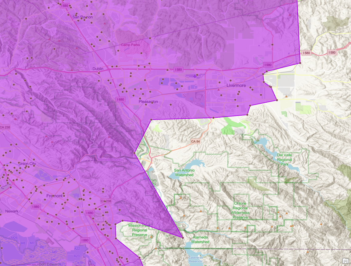
What does all this mean? In many cases I will use the trade area techniques to assess the quality of my input data and customer characteristics including location accuracy. I may recreate the same trade area using amoeba because of the more stylized representation that helps accentuate and explain customer dispersion patterns and reduce the influence of outlying points. What I show will depend on the audience and the other analysis I will perform in subsequent steps.
The weights and measures
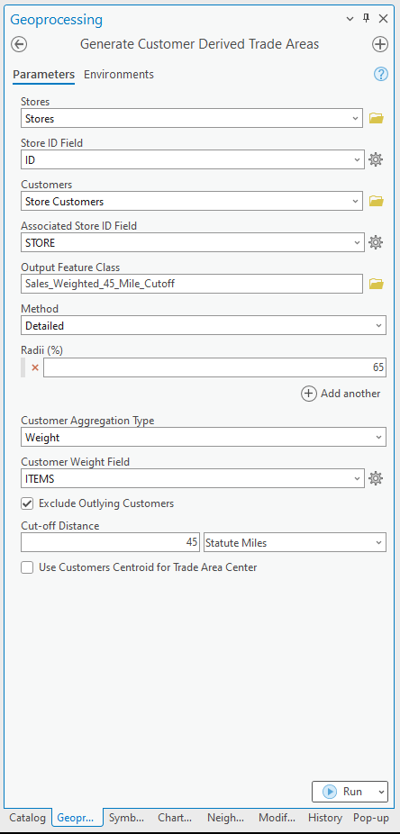
Customer-derived trade areas can also be customized using customer-specific attributes like how much they spend, how many times they purchase or visit, as well as other attributes that may represent a score or level of importance for a customer. Retail applications are obvious – sales, lifetime value, number of visits, etc. – but other industries and sectors can benefit from using weights. I recently worked with a healthcare provider to create more realistic trade areas around locations based on diseases and patient care demands.
In banking, I’ve helped companies better locate operational centers to support new business formats for commercial lending or improve ATM visibility and usage. The opportunities are extensive. For commercial and personal lending, customers were assigned different types based on their account type and service needs. These were combined into a composite score, which helped estimate the volume of services needed and match to potential capacity. For ATMs, the weight was transaction volume – withdrawals, not spending.
In the example geoprocessing tool interface, I have configured the customer-derived trade areas analysis to weight by the number of items purchased, a measure of shopping volume, for the same group of customers. This is a different metric that may result in different trade areas compared to just the count of customers.
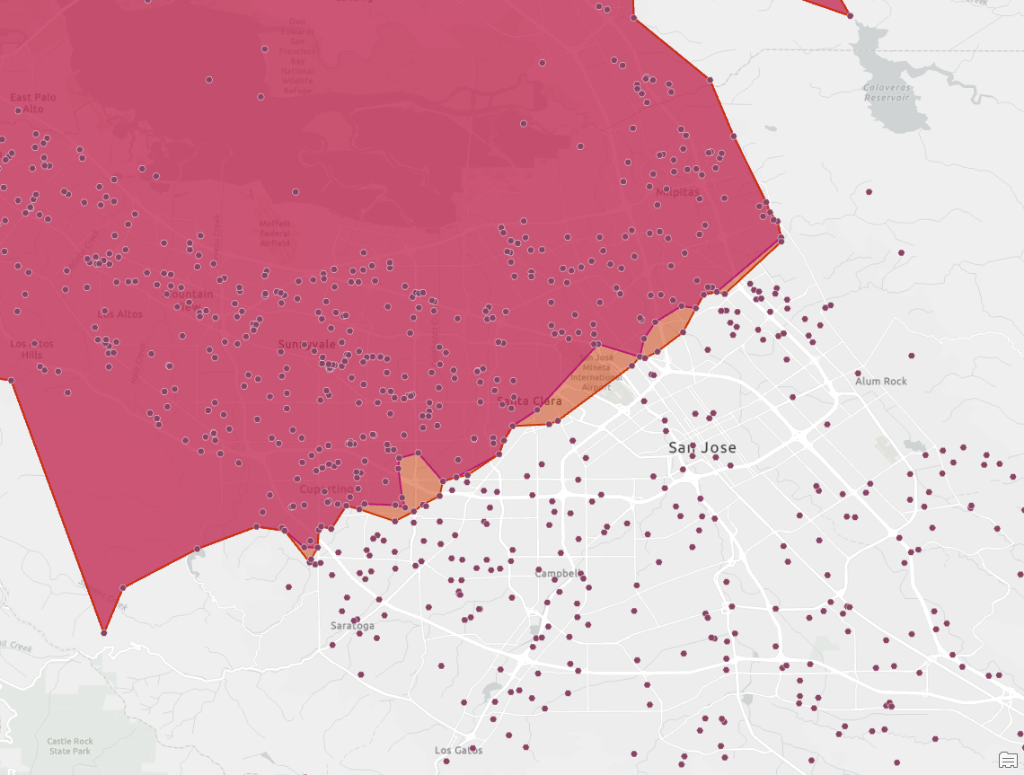
Using a metric like items purchased, visits, or spending often exposes areas where there are pockets of different behaviors. This zoomed-in view of the South Bay area encompasses an additional set of customers due to variations in the average number of items purchased. Customers closer to the store are purchasing fewer items than average in this area so the trade area extends further to cover 65% of item sales. How these different weights impact trade areas can be quite subtle, like the example below, or very revealing where behavioral or opportunity differences are more marked.
Cut-off distances can also be used with customer-derived trade areas to exclude customers at a particular distance or where their influence is less important. For example, if a retailer knows that customers travel on average 7 minutes to the store, they may use this as a measure of core versus casual customers.
An analyst for the retailer would use the Exclude Outlying Customers parameter to use a cut-off distance of 7 minutes, in the same way I used a 45-mile drive time in the example below to understand the nearest customers to my example store.
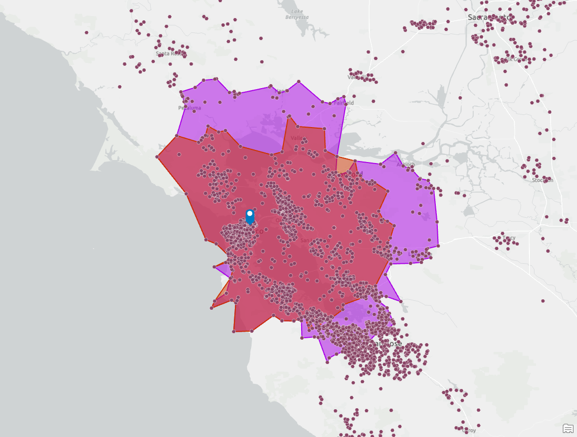
Cut-off distances allow users to better understand customer distributions with a common set of distance or weight thresholds, so it provides for a more consistent and reusable approach to understanding customer distributions within areas and across geographies. For example, a bank could model the efficiency of their ATMs using their core customers and a 5-mile cut-off, thereby excluding more distant customers that may be “leaking” from nearby towns. A transit modeler working on the potential for a new rail stop can use cut-off distances based on a 10-minute walk time where “customers” are nearby business points and the weight the number of employees. This can generate a trade area for potential ridership statistics for the new rail station.
The wrap-up
This has been an initial introduction into advanced customer-derived trade areas, in which I’ve tried to discuss and explain the various techniques and applications using a range of industries and real-world scenarios. In part two, I’ll dive deeper into how to use customer clustering tools to refine and preselect customer points based on distribution and proximity.


Article Discussion: