By Aileen Buckley, Mapping Center Lead
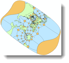
Tissot’s indicatrix was first developed by French mathematician Nicolas Auguste Tissot in 1859 as a tool to characterize the distortion due to projecting a spherical representation of the earth onto a flat surface, i.e., a map projection.
This graphic tool helps you see what type of distortion occurs in the size, shape, and orientation of ellipses that would be circles were they located on the earth’s surface. When a circle is projected onto a flat surface through the map projection process, the result is an ellipse whose semi-minor and semi-major axes indicate the two principal directions (often but not always north-south and east-west) along which scale is maximal and minimal at that point on the map.
A single ellipse is called an “indicatrix”, and it shows the distortion at the point where it is centered. Because scale distortion varies across a map, usually Tissot’s indicatrices (the plural of indicatrix) are repeated across a map at regular intervals to illustrate the spatial pattern of distortion. It is common to place them at the intersections of parallels and meridians. In the above example, indicatrices are placed at the intersections of the 30 degree parallels and meridians that make up the graticule between 60 degrees north and south.
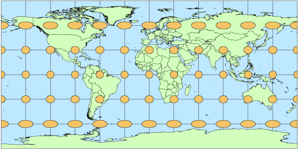
Figure 1. Tissot’s indicatrices are used to show the pattern of distortion due to the use of this WGS84 geographic (Plate Carree) projection.
Tissot’s indicatrix is a valuable tool in understanding and teaching about map projections, both to illustrate linear, angular, and areal distortion and to show graphically the calculations of the magnitude of distortion at each point.
On maps that use a conformal projection, in which each point preserves angles projected from the geometric model, the Tissot’s indicatrices are all circles. Because it is not possible to preserve angles and shapes at the same time, the apparent sizes of the ellipses will vary across the map.
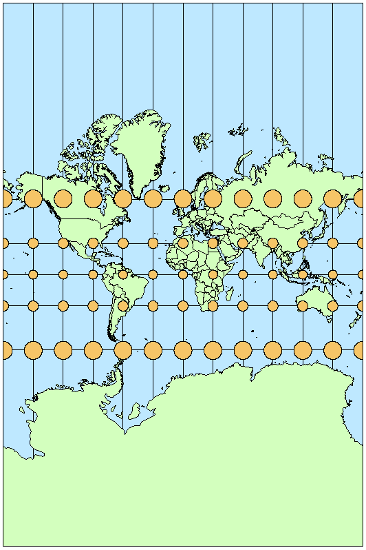
Figure 2. On this map with the Mercator projection, all indicatrices are circles because a conformal projection is used.
On maps that use an equal area projection, in which the property of equivalence is preserved, the relative sizes of the indicatrices are retained (figure 3). But equal area projections cannot also be conformal, so the ellipses will be distorted in shape and orientation across the map.
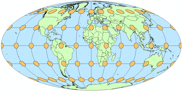
Figure 3. On this map with the Mollweide projection, all indicatrices are apparently equal in size because an equal area projection is used.
For other map projections, such as compromise projections, which are neither equal area nor conformal, the area, shape, and orientation of the indicatrices may vary across the map (figure 4).
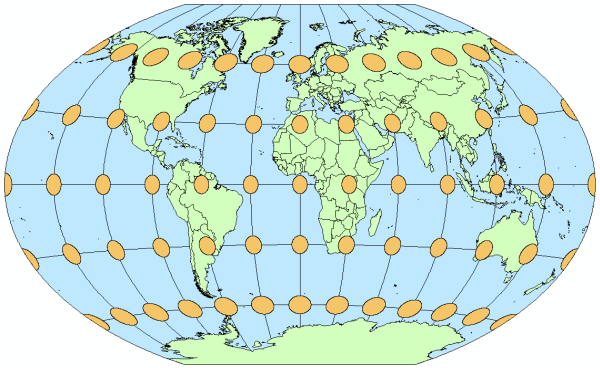
Figure 4. On this map with the Winkel Tripel projection, the indicatrices vary in size, shape, and orientation because a compromise projection is used.
You can download this map template to see for yourself how different map projections produce different patterns of distortion. Simply open the map document and change the map projection of the data frame. To use a different projection, right click the data frame name (“Layers”) in the Table of Contents, click Properties, and then click the Coordinate System tab. Opening the Predefined > Projected Coordinate Systems > World folder, you can select from a wide variety of map projections and modify them as you wish. Watch the indicatrices to see how the patterns of distortion change with each modification you make.
By the way, can anyone guess which map projection was used to make the thumbnail for this blog entry?
Thanks to Jon Kimerling, Professor Emeritus at Oregon State University and primary author of Map Use, Sixth Edition, and Melita Kennedy, Senior Product Engineer for Map Projections and Transformations, for their help with this blog entry.

Article Discussion: