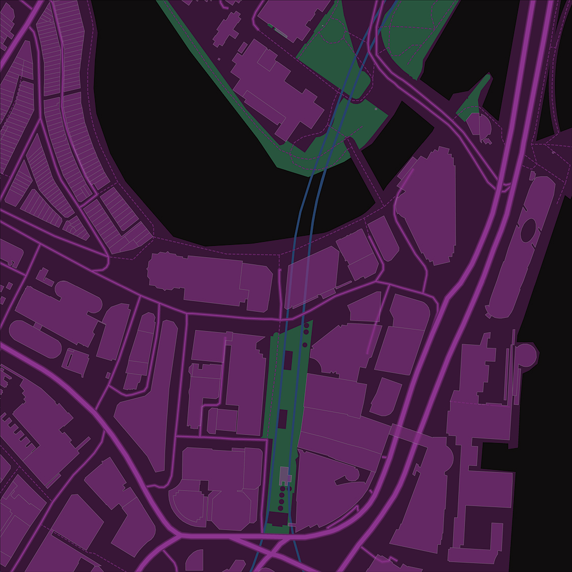
Let’s say you have a wicked sci-fi map. But you want to take it to another level? What about animation? What should you think about when adding an animation?
Animations and camera angles are tricky. What I learned quickly is:
Simpler = Better
Especially if you are new to it.
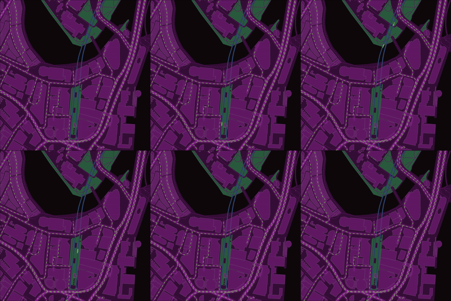
Take this map, I wanted the roads to come alive with traffic. I wanted all sorts of lines moving, and for there to be stops and flows in the traffic. It was too much. After a couple of failed attempts, I simplified the animation.

I prepped all the work in ArcGIS Pro and then using this handy tool took it over to Adobe. I didn’t have to do it that way because when doing animations there are so many workflows. Here are a few links that will hopefully get you started.
For this map, the goal was to animate the transit and simulate traffic. I ended up making a very simple dashed line for the roads. For the rail, I made some circular shapes with a little distortion trailing them. That was it. Two very simple animations. But I think they do a good job adding movement to the map. I am not joking when I said, I went simple.

I now feel ready to try something one step more complicated and I really can’t wait to start adding more movement to more maps.
Until we meet again

Commenting is not enabled for this article.