(Author: Sudhir Raj Shrestha, Sarah Black)
Background
Are you working with complex scientific multidimensional datasets? Would you like to explore and learn how to use powerful tools and capabilities to help solve your problems? Many workflows can help with your analytical needs, but you may be wondering where to start. In this post, we will walk you through how to incorporate a multidimensional scientific data workflow (ingest, visualize, analyze, and share) within ArcGIS and which of Esri’s latest multidimensional geoprocessing tools you can use. You will also learn a simple way to build and share your analytical science products using NetCDF, HDF, and GRIB (curated by NOAA and NASA).
One effect of climate change is changes in precipitation patterns. As sea surface temperatures increase, these patterns change and areas around the globe experience either an increase or decrease in their annual precipitation. Current studies indicate that the Sahara Desert is expanding due to decreased precipitation over the region. At the same time, South America is experiencing a slight increase in precipitation in past and severe storms . Much of the world’s freshwater supply is replenished through precipitation, so it is vital that we understand the changes already occurring. In this brief investigation, we will use multidimensional NOAA data showing monthly global precipitation from 1900 to 2017 to analyze and predict precipitation trends around the globe. We will also take a closer look at the Sahara desert and Amazon rainforest regions. If you wish to follow along, you can download the data here. We will use the ArcPy to ingest the data and analyze it in ArcGIS Notebooks and ArcGIS Pro.
The first step is to ingest the data so you can visualize it in ArcGIS Pro. We will do this using the ArcPy GP tools. The ArcGIS Notebook code shown here creates a raster object from a multidimensional raster dataset and applies the stretch function for better visualization.

The multidimensional information is then added to the raster object and it can be saved as an optimized Cloud Raster Format (CRF).

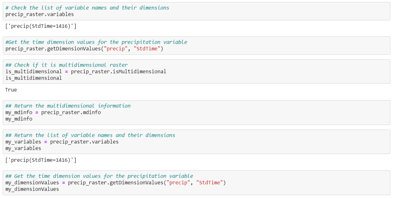
Once you ingest the data, now you can explore the data structure and its variables as shown below.

Working with ArcGIS Notebooks allows you to access external python libraries to extend your analysis, but it also allows you to visualize and manipulate your data using ArcGIS Pro. Data may be displayed in the ArcGIS Notebooks window, but it can also be added to a map in your ArcGIS Pro project where you can work with it as you would in any other project.

Once the precipitation data has been loaded into the new multidimensional raster, you can begin to explore the data and look for trends. This data includes monthly precipitation totals from 1900 to 2017. This means there are 1,404 slices of precipitation data represented here (117 years of monthly data), which gives you enough data points for your trend analysis. To begin, you will need to aggregate your monthly precipitation data into yearly precipitation.
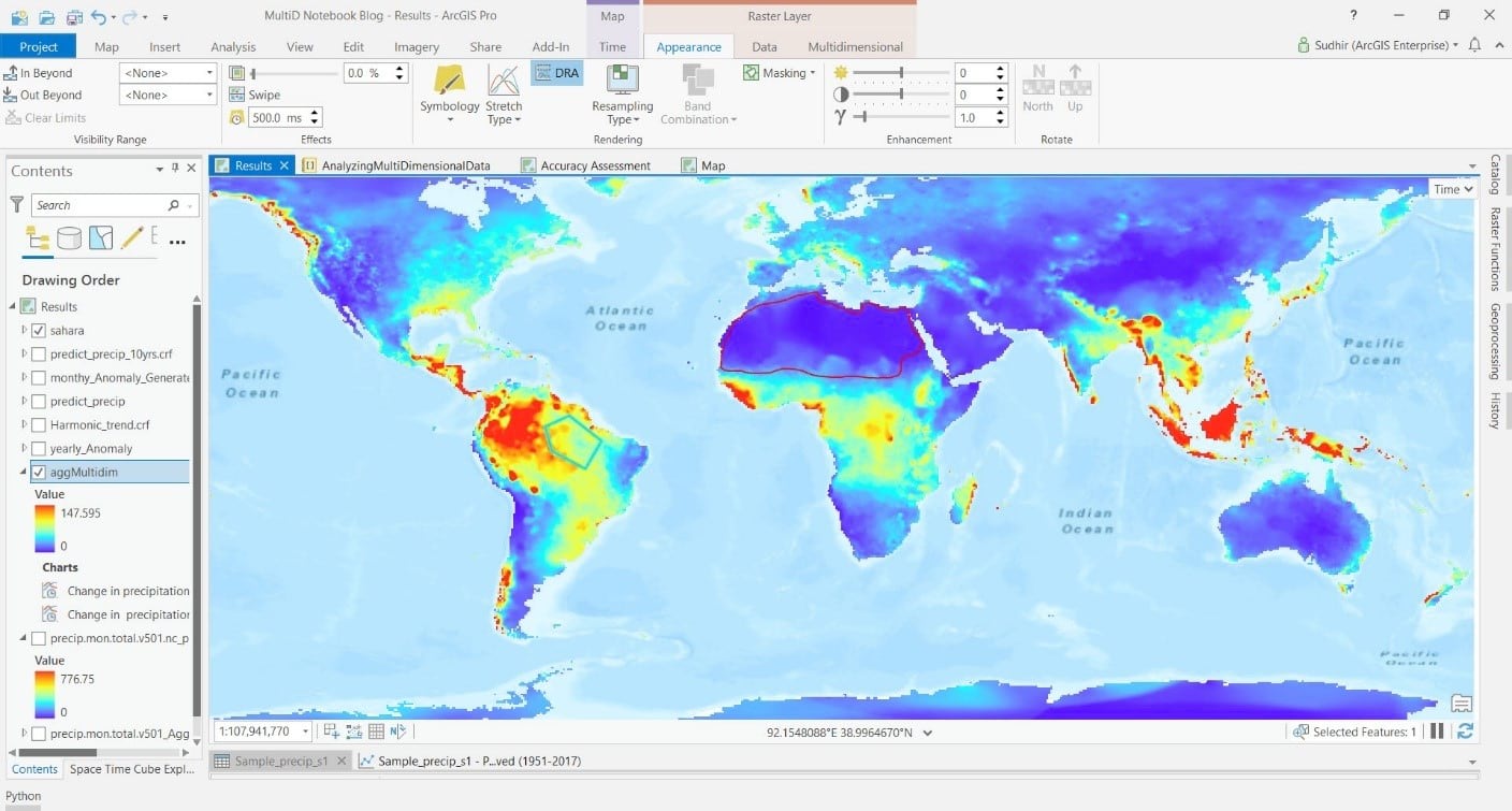
The Aggregate Multidimensional Raster tool will aggregate your existing raster precipitation data by time.

Now that the data has been aggregated to mean annual precipitation, let’s take a look at the Sahara desert and Amazon rainforest regions using the Temporal Profile Charting tool.


The Temporal Profile Charting tool plots the mean annual precipitation on the vertical axis and time on the horizontal axis. It can also be used to generate trend lines, shown here in red. From these trend lines, we can see that the average annual precipitation in the Sahara desert region has decreased over time. Trends in the Amazon rainforest region are less clear, but precipitation appears to have slightly increased in this region over time.
Detecting Precipitation Anomaly
Another way to look at changes in precipitation is by detecting anomalies. The term “anomaly” means a departure from a reference value or long-term average. A positive anomaly value indicates that the observed precipitation was greater than the long-term average precipitation, while a negative anomaly indicates that the observed precipitation was less than the long-term average precipitation. To do this, we will use the Generate Multidimensional Anomaly tool. We will use this tool to compute the anomaly for each time slice in the multidimensional precipitation raster. The anomaly data will let us see how the precipitation deviates from the average at each location over time.

We can use the charting tool to look at the anomaly data through time. Figures 6 and 7 shows how the average annual precipitation compares to the long-term average (the average over all 117 years). Years with positive anomaly values had more precipitation than the long-term average, and years with negative anomaly values had less precipitation than the long-term average.


Using these graphs, we can see the overall trends in the Amazon rainforest region and the Sahara desert region. Over this time period, annual precipitation has steadily declined in the Sahara desert region to the point where it is now consistently below the long-term average. Annual precipitation trends in the Amazon rainforest region are again harder to identify, but it appears they have slowly but steadily increased. Additional data points in upcoming years will help to separate the trend from the noise in this region.
Precipitation Patterns and Trends
Another way to look at this precipitation data is to use a simple regression model to look at the trends and predict future precipitation. To begin, we will use the Generate Trend Raster tool. This tool helps estimate the overall trend for each pixel along a dimension (time in this case). You can calculate the trends for one or more variables in a multidimensional raster. For this analysis, we will use the original monthly precipitation dataset and use a harmonic regression to account for seasonal fluctuations in precipitation. Here is the code block.

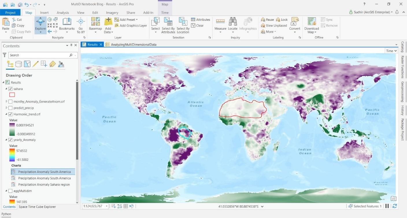
The result is a 3-band dataset, with the slope of the trend as band 1. Positive slope values (purple areas in figure 8) indicate the average precipitation is in an increasing trend over time and negative values (green areas) indicate that precipitation is in a decreasing trend.

As we inspect this trend map, we can see that the Amazon rainforest region is mostly dark purple and is experiencing an overall increase in precipitation. The Sahara desert region is primarily a light green and is experiencing an overall decrease in precipitation.
Predicting Future Precipitation
We can also use this trend raster to do predictive modeling with the Predict Using Trend Raster tool to explore what the precipitation trend might look like in the future. In this case, we will use the trend raster as an input with harmonic regression to predict the precipitation from 2018 to 2027. We will use a harmonic regression to remove the underlying effects of seasonal variation. This will minimize the effect of seasonality in our predictions. The code block to predict precipitation is as shown below.

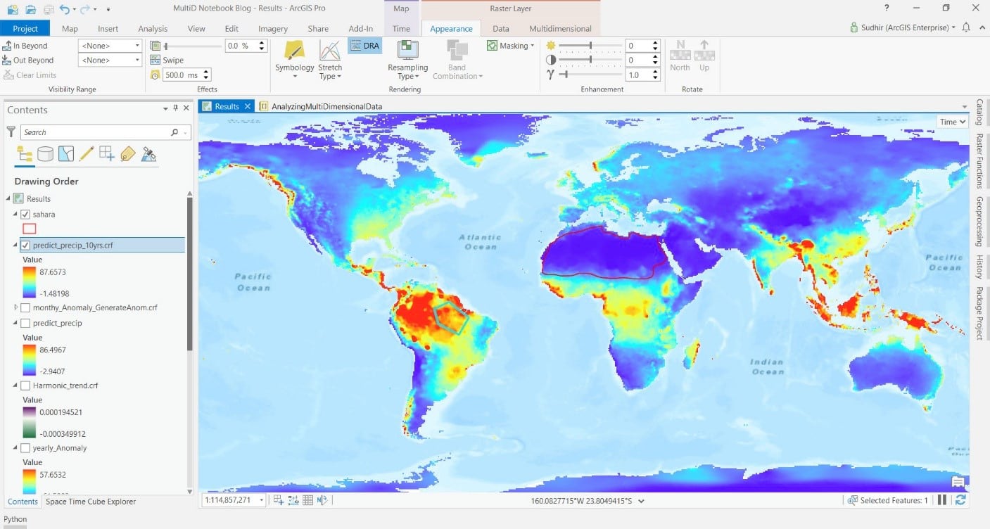
The output from the Predict Using Trend Raster tool is a new multidimensional map showing predicted annual precipitation (figure 9).

This new multidimensional raster contains predicted annual precipitation values for 2018 to 2027, which can be viewed using the chart tool. Our predicted results show a continued increase in precipitation in the Amazon rainforest region (figure 10), and a continued decrease in precipitation in the Sahara desert region (figure 11). The predicted precipitation increase in the Amazon rainforest region is relatively small compared to the current annual precipitation (an increase of 0.2 percent in a region that is receiving almost 18 cm/year of precipitation). However, predictions show an expected 3.9 percent decrease in annual precipitation in the Sahara desert region by 2027. This 3.9 percent decrease in an area which already receives less than 1 cm of precipitation per year will result in continued expansion of the Sahara desert region.


To test the accuracy of our precipitation predictions, we will subset the original dataset to just 1900 to 1950. We will use this subset of the data and the same steps we completed previously to build a model and predict annual precipitation for the period 1951 to 2017. Once our prediction is complete, we can compare the predictions to the observed data for 27 random locations around the world.


This accuracy assessment in figure 13 shows an overall agreement between our predicted precipitation and the observed precipitation for 1951 to 2017. This accuracy assessment indicates our original 2018 to 2027 predictions are within a reasonable level of error and accurately represent future precipitation values.
Summary
With a simple historical precipitation data set and Esri’s multidimensional tools, we were able to visualize and interpret the history of precipitation across the world. We were also able to predict future precipitation and investigate environmentally sensitive regions like the Amazon rainforest and the Sahara desert. These multidimensional tools allow you to work with rich datasets such as the precipitation records used here and easily produce meaningful results to help answer complex questions.
References
Magrin, G.O., J.A. Marengo, J.-P. Boulanger, M.S. Buckeridge, E. Castellanos, G. Poveda, F.R. Scarano, and S. Vicuña, 2014: Central and South America. In: Climate Change 2014: Impacts, Adaptation, and Vulnerability. Part B: Regional Aspects. Contribution of Working Group II to the Fifth Assessment Report of the Intergovernmental Panel on Climate Change [Barros, V.R., C.B. Field, D.J. Dokken, M.D. Mastrandrea, K.J. Mach, T.E. Bilir, M. Chatterjee, K.L. Ebi, Y.O. Estrada, R.C. Genova, B. Girma, E.S. Kissel, A.N. Levy, S. MacCracken, P.R. Mastrandrea, and L.L.White (eds.)]. Cambridge University Press, Cambridge, United Kingdom and New York, NY, USA, pp. 1499-1566
Natalie Thomas, Sumant Nigam. Twentieth-Century Climate Change over Africa: Seasonal Hydroclimate Trends and Sahara Desert Expansion. Journal of Climate, 2018; 31 (9): 3349 DOI: 10.1175/JCLI-D-17-0187.1
Wu, Yutian & Polvani, Lorenzo. (2017). Recent Trends in Extreme Precipitation and Temperature over Southeastern South America: The Dominant Role of Stratospheric Ozone Depletion in CESM Large Ensemble. Journal of Climate. 30. 10.1175/JCLI-D-17-0124.1.
University of Delaware Air Temperature & Precipitation
https://psl.noaa.gov/data/gridded/data.UDel_AirT_Precip.html#detail

Commenting is not enabled for this article.