While puttering in the garden over the weekend, I got to thinking about how climate change will impact plant hardiness zones.
You might be wondering – why were you thinking about that? Just do your gardening. Life’s complicated enough.
You might also be wondering – what are plant hardiness zones, and what do they have to do with climate change?

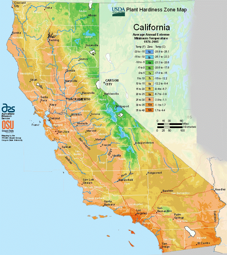
Gardeners and growers know that plant hardiness zones are used by the USDA to help us determine which plants are likely to thrive in a region. The zones are based on the average annual minimum temperature, or the average lowest temperature experienced in a region throughout a year. For example, in Redlands, CA, we are in Zone 9b, which means the minimum temperature is typically between 25-30°F, and it’s a prime location to grow strawberries, citrus fruits, and a lot of vegetables.
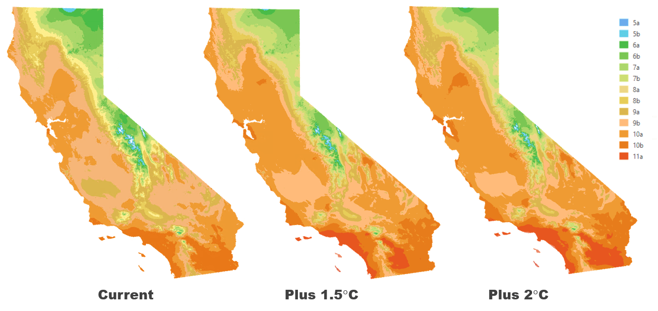
But if the minimum temperatures increase due to climate change, how will hardiness zones change? The IPCC Fifth Assessment report has identified 1.5°C and 2°C as critical temperature increases to prepare for regarding climate change impacts. How would hardiness zones change if the minimum annual temperature increased by these amounts?
To answer this question, we’ll use some of the multidimensional analysis capabilities in ArcGIS Pro with the Image Analyst extension. Many of the steps can be completed using geoprocessing tools or raster functions, but we will complete the steps using the arcPy API in the Python window, because it’s easy and it allows for processing on-the-fly, meaning it doesn’t generate new datasets with each step in the process. Instead, we create temporary variables to process the data and only save it to a new dataset when we’re finished. In this way, it’s an excellent avenue for answering scientific questions.
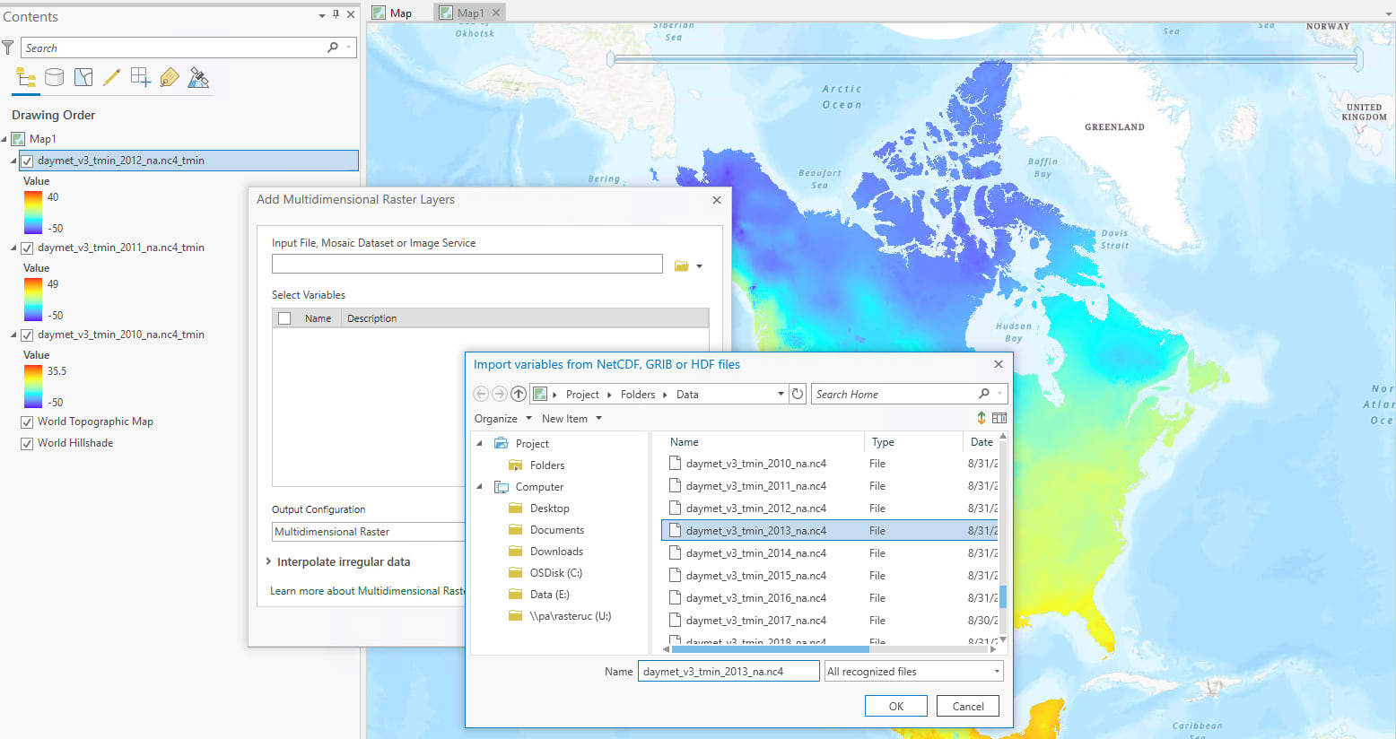
First, we downloaded daily minimum temperature data from the Daymet dataset, from years 2010-2018. Each file contains the daily minimum temperature for each pixel covering North America for a single year, so there are nine separate files.
You can add each multidimensional raster layer to ArcGIS Pro, then use the Merge function to get all nine years into one single multidimensional raster dataset.

Alternatively, you can reference the location of all the files and use the Raster object to generate one multidimensional raster from a list of multidimensional rasters.
Next we cut this down to size: we didn’t need data for all of North America, so we used a boundary feature class for California to clip the multidimensional dataset to the size of California.
Now comes the fun part – multidimensional analysis! At this point, we have a multidimensional dataset containing daily minimum temperature data for the state of California, from 2010 to 2018. We need to get the average annual minimum temperature.
The first step is to get the lowest minimum temperature from each year, using the Aggregate function:
Note: You can check to make sure you are getting the expected outputs by checking out the properties of the rasters you create in each step. For example, try:
print(len(ave_CA_Lowest_tmin.slices))
Next we need to get the average of those lowest temperatures.
We now have the current annual average minimum temperature. Using the Remap function, we can apply the hardiness zones to ranges of values.
Next we use Map Algebra to add 1.5 degrees and 2 degrees to the current annual average minimum temperature dataset.
And we use Remap again to map those zones. Finally, we apply a color scheme using the Symbology tab, and the result is the following:

Notice there are significant changes to the hardiness zones! Zones 5a and 5b are highly diminished, zone 10a grows considerably, and there is even introduction of a new zone – 11a – in the southern regions of the state. In these warmer zones, plant viability is more dependent on heat tolerance instead of cold hardiness, and water resources become a driving factor in crop production. With a 2 degree increase, Redlands would be in zone 11a, and our famous orange groves would likely require a lot more water to survive the warmer temperatures.
This is just one of many ways we can find the answer to scientific questions using multidimensional analysis. In this example, we used arcPy functions to manage our data, then we used map algebra to add values to the pixels in our datasets. Finally, we used the remap arcPy function to classify our data. We could even go further and find the difference in our outputs, to see only those areas that changed.
Stay tuned for more blogs where we answer questions using scientific data!

Commenting is not enabled for this article.