
About the author: Shana Crosson is an Academic Technologist at the University of Minnesota working with faculty to integrate digital content and tools, focusing on Geographic Information Systems and digital humanities.
This post was originally published in February, 2020, and was updated in June, 2021.
_______________
We’ve all become accustomed to having curb cuts in sidewalks. We use them for baby strollers, bikes and generally as a path of least resistance. Curb cuts were designed to make it easier for people who use wheelchairs to get around. Yet, everyone benefits from them.
Making websites accessible is the same! Web content that is designed to allow people with disabilities to access it makes the web a better place for everyone.
How do you know if your audience needs accessible content? Well, you don’t. But chances are you have at least some readers with a permanent disability, like blindness. And you probably have viewers who are temporarily disabled too, like someone who is recovering from eye surgery. Of course, there are also those readers who are just unable to fully access your content at that moment—perhaps someone riding in a car with limited connectivity or someone who forgot their reading glasses (that would be me!)

So, should you make your story accessible? YES! It can be required by law (depending on where you work), but even when it’s not, it is the right thing to do.
Out-of-the-box accessibility
ArcGIS StoryMaps has many important accessibility functions built right in. It’s been designed following common web standards to support readers in each of these general areas of need:
- Those with limited mobility;
- those with impaired vision;
- and those who are non-sighted.
Navigation for limited mobility
For readers with mobility issues—like someone who cannot use a mouse due to a repetitive stress injury—the ability to navigate through a story’s content by keyboard is baked in. In other words, anything that is created within the story that can be clicked with a mouse (a button, card, or express map, for example) can also be accessed using standard keyboard navigation.
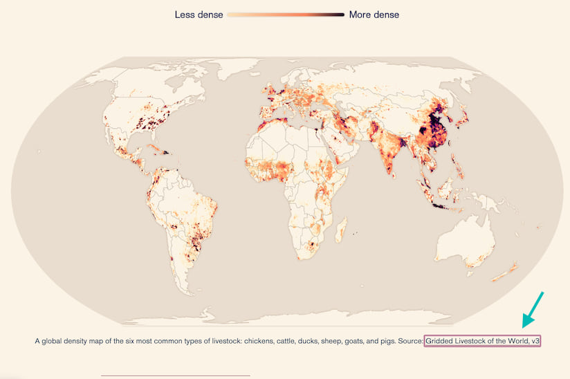
When navigating a story with their keyboard, the reader can see which element is targeted with a colored focus ring. They can then move the focus ring and cycle through all interactive elements on the page using the Tab key. And they can interact with a targeted element by pressing the Return key or Spacebar just like a mouse click. To scroll up and down, they can use the arrow keys.
Non-sighted readers who can’t see a focus ring can still navigate with a keyboard and have the content communicated to them using third-party screen readers like VoiceOver, Jaws, or NVDA. Alternative text is provided for all buttons in the story interface, and the story title, headings, subheadings, links, and Aria landmarks can be read as an outline to communicate the layout of a page for easy navigation.
Currently, keyboard navigation can’t be guaranteed for embedded web content or other apps that were created outside of ArcGIS StoryMaps.
Accessible colors and fonts
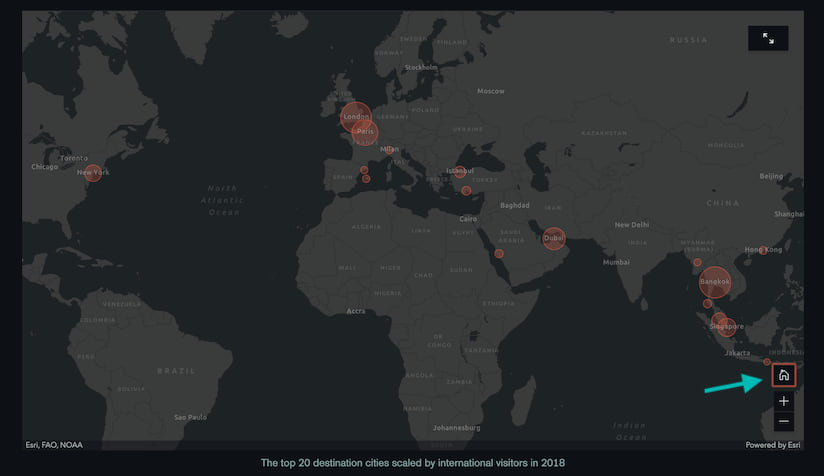
If you build your story using one of the preset themes, you’ve covered your bases in terms of font, color, and color contrast. The pre-designed themes are all evaluated with third-party testing software to ensure that their typography and color schemes maximize visual contrast and are color-blind friendly. Standard ArcGIS StoryMaps components, like buttons, badges, and negative space, are also tested to meet these same standards.
Author-dependent accessibility
As a content creator, you also need to make sure your stories are accessible—some things the builder just can’t take care of for you. But fear not, you have the power to do this without needing to know any fancy coding or technical skills. Here are some easy steps to make sure your content is available to everyone.
Create accessible themes
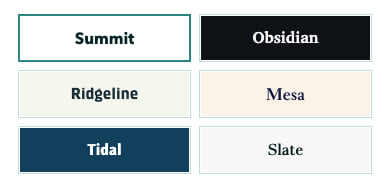
Using ArcGIS StoryMaps’ theme builder, you can design your own theme to match your organization’s brand or the mood of your story. These themes will not automatically meet accessibility guidelines for font, color contrast and color choices, so you’ll want to be very careful in your selections! Follow the suggestions in Getting started with accessible storytelling for guidance on designing accessible themes.
Use meaningful headings
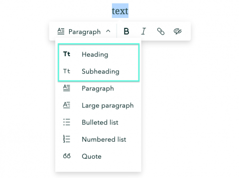
The new story builder has two options for adding structure to your texts: headings and subheadings. For sighted viewers, headings provide visual hierarchy and organization that improves legibility. For non-sighted and low-vision viewers, those headings are especially crucial for scanning the story and navigating from one section to the next.
Think of headings in a story like the topics you block out in an outline of your content. (In fact, if you plan your content knowing you’ll be using headings, it’ll work better for everyone.) Use the headings in order—heading first, then subheading—even if you like the look of the subheading better. It is very disorienting to those using screen readers when the headings aren’t in order.
Write alt text for all visuals
Alternative text, or alt text, provides a stand-in for visuals like images or maps. Non-sighted viewers rely on this alt text to be read to them with a screen reader. The magic of ArcGIS StoryMaps lies in visual communication, so make sure everyone can access the explanatory visuals that make your story come alive! Plus, if someone is reading your content on a poor internet connection, the alt text will appear in place of any media that can’t be loaded.
The new story builder makes it easy to add alternative text. Simply open the Properties panel for a particular media element and the alt text field is right there waiting for you.
Not sure what to type in? Writing good alt text is all about conveying the purpose of your image. Why have you included it? Is it just a beautiful image? Does it add to your story? Does it convey essential information? Think about why you are using the image and what message you want your reader to take away from it—that’s what you write as your alt text.
Here are a few more tips to help you nail your descriptions:
- Remember that the alt text communicates the image to someone who cannot see it. Describe the image, and, if it is a map or infographic, explain the information that’s depicted there.
- Consider the context of the image, map, or other visual. For example, the alt text might change depending on the audience for your story. If the topic of your story is tourism in Minnesota, the alt text for this image might say, “Split Rock Lighthouse high on the cliffs overlooking beautiful Lake Superior. Split Rock State Park, just north of Duluth, is one of Minnesota’s most popular tourist attractions.” If your audience members are experts on lighthouses, the alt text might say, “Split Rock Lighthouse was in operation from 1910 -1969. The Fresnel Lens in the Lighthouse still functions.”

- Don’t use the words, “Image of…” or “Photo of…” The screen reader will add that anyway, and no one likes redundancy.
- Consider using captions on your visuals. This caption text provides extra context and meaning for all your readers, and can take the place of alt text if you incorporate description and context. If you include both a caption and alt text, though, don’t simply use the same text for both (there’s that redundancy concept again).
Break up text
People read differently on screens versus in print; on a screen it is much harder to read big blocks of text. Here are a few tips to make it easier for everyone.
- Break your text into short paragraphs of only a few lines. Test in mobile view to really see how helpful it is to have short paragraphs.
- Don’t forget to use those headings to help break up your text!
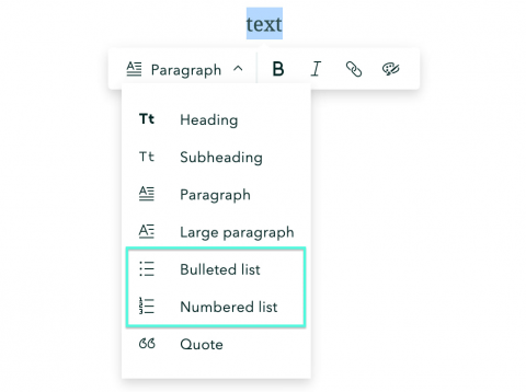
- Use lists whenever it makes sense. Lists add helpful white space and make content skimmable for sighted and low-vision readers, and organize content for those using screen readers.
- Always use the built-in list functions in your digital tool (for numbered or bulleted lists) instead of writing the numbers yourself. The built-in list functions generate code that screen readers use to better relay your content.
Caption videos
Captioned videos are better for everyone: those who can’t hear, non-native speakers, or anyone who might be watching somewhere they can’t have sound on. (I know you’ve watched a video where you shouldn’t be!)
If you are creating videos, adding captions isn’t hard. Did you write a script for your video? Voila! Captions and transcript are ready to go. If not, don’t stress. Common video delivery platforms like YouTube make it easy to add captions, or will even generate them for you (just be sure to edit those auto-generated captions). Then, go to the next level in making your videos accessible by adding transcripts and audio descriptions.
If you are using someone else’s video, make sure it has captions available. Avoid it if it doesn’t—if a video has narration but no captions, it’s simply not accessible.
Don’t rely on color alone
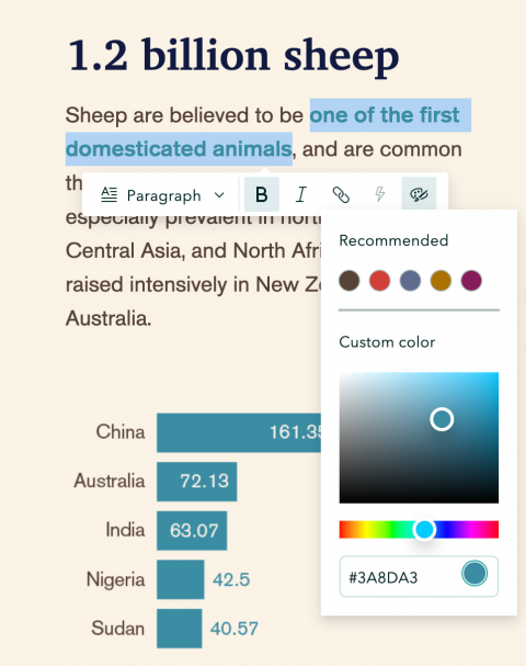
We all love to use different colored text to indicate meaning, but be sure to add an additional indication, like bolded text, to really cover your bases. This is important for any non-sighted viewer and those with color-blindness.
Use readable hyperlinks
One advantage to a digital communication tool like ArcGIS StoryMaps is that you can link to other websites. Do all your readers a favor and make it clear where the link is going. Avoid using words like “Click Here” or “Read More” as links. These words don’t tell the reader what they are going to find when they click on a link, and are just extra words. Screen readers tell readers that they are on a link then read exactly what words are linked. For example,
-
- When you use “Click Here,” a reader using a screen reader hears, “Link: Click Here.” This doesn’t give any indication about what content the person will find after clicking. “Read the full report,” on the other hand, clearly sets expectations about where that link leads.
- If you make the link the entire web address, such as storymaps.arcgis.com/stories, the person using a screen reader will hear, “Link: storymaps dot arcgis dot com slash stories.” Even with a short link like this, it’s kind of annoying, but just imagine what it’s like if you’re linking to web addresses that are long or have random characters!
As another example, instead of writing, “Click here to learn about the exhibits at the Toy Museum,” write “The Toy Museum Exhibits” as a bullet or a phrase.
__________________
This may seem like a daunting list at first, but take heart. The ArcGIS StoryMaps platform has made it quite convenient for you to get started, and I’m confident you’ll master accessible content in no time. Just give these tips a try; your entire audience will thank you!


Article Discussion: