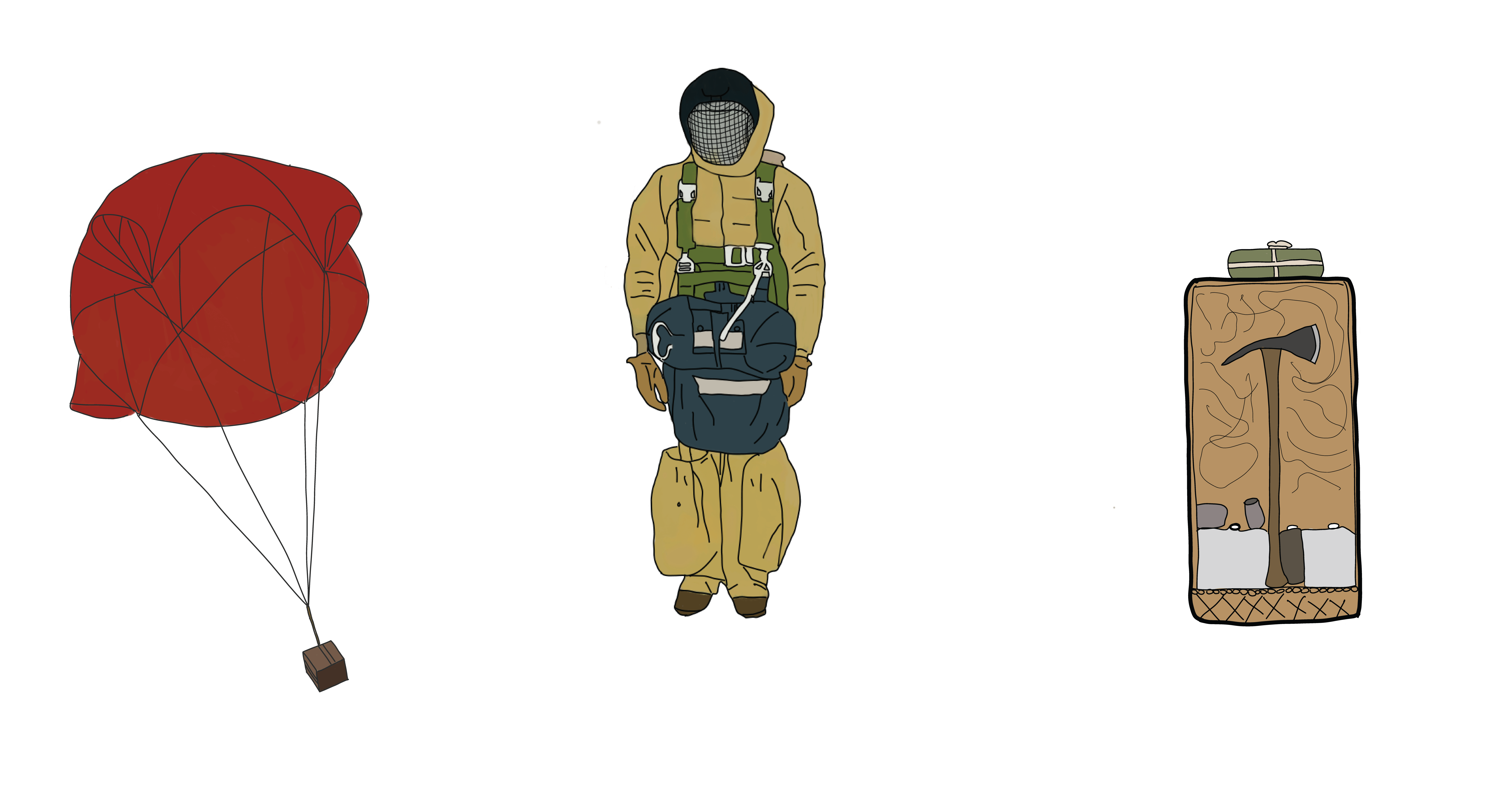
I’m a big fan of stories that use hand-drawn artwork. There’s something organic and approachable about the way they communicate information. These visuals quickly tell a story without relying on pages of text.
I’ve always wanted to create illustrations for a story map, but I can’t draw a straight line to save my life.
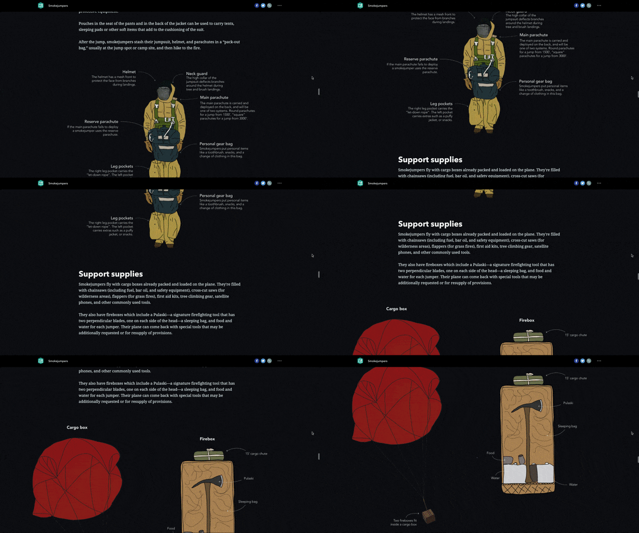
During a recent story map collaboration, I worked with smokejumpers to tell the story of their work. As the story developed, the amount of text about the equipment kept growing in length, and it was filled with technical language.
I knew the equipment used by smokejumpers was really important part of the story. It’s very specialized and critical for their safety. I wondered if illustrations might be useful in communicating this information for the average reader—like you see in a museum exhibit.
With the Smokejumper story map, I got my first chance to create illustrations and build the story map around them.
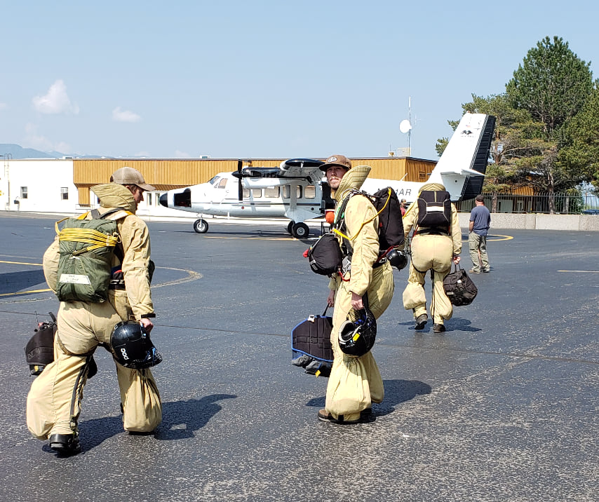
I knew I would never be able to create an illustration using pen and paper (I wish!). Instead, I turned to a stylus and tablet.
While an artist could’ve done a lot better, the illustrations I made have been effective in communicating information to readers.
Here are some of the insights I gained from this process.
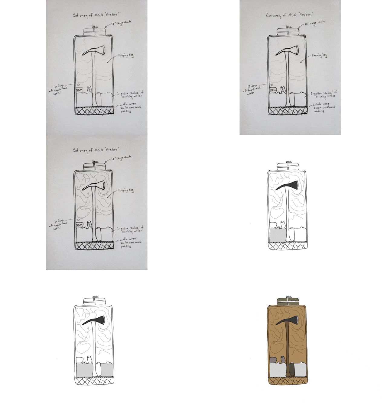
Use firsthand knowledge to develop more interesting and accurate illustrations.
One of the highlights of the project was working directly with real smokejumpers. This meant I could ask very detailed questions for the story.
To my surprise, on of the Missoula smokejumpers was so enthusiastic about the idea of equipment illustrations that he provided images and sketches for inspiration. The finished graphics are so much better because of it!
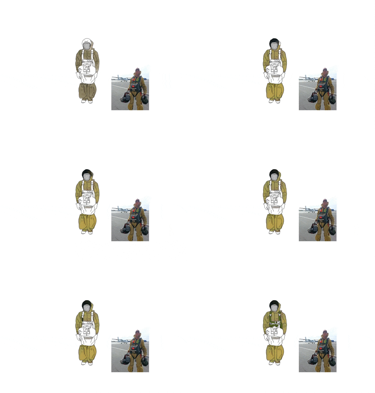
Derive colors for graphics directly from real images.
Illustrations often represent real life objects so, I used photos of smokejumper equipment to develop the color palette for the illustrations. This technique resulted in more accurate illustrations that communicate relevant and more detailed information to readers.
The color palette from the graphics were used throughout the overall design of the story to create a unified look and feel. This ranged from the map data to the color of the links in the story. (Read more about creating a consistent look and feel in the “Using graphics to enhance your storytelling” blog)
Use the tools that works best for you.
For me, the tablet and stylus workflow worked really well. However, that doesn’t mean you should retire pen and paper. Instead, find a medium that fits with your workflow, time, and enables creativity.
Quick tip: Tracing can be a helpful starting point for an illustration. You can then take your tracings and use graphic design tools to create annotations or other graphic elements.
Tracing is considered derivative work, so you need adequate permissions beforehand.
With a clear idea of what you need to communicate and the right tools, you can easily make something that enhances your storytelling. Give it a try
Now that you’ve learned about how illustrations can be helpful in a story map, consider using them in your next project.
We can’t wait to see what you create.
This story map was made in collaboration with Emily Meriam on Esri’s Living Atlas Team.


Article Discussion: