The vision of Oregon’s Office of Emergency Management – supporting safe and resilient communities – is far reaching. Their work includes preparedness, response, recovery, and mitigation. And it takes the right tools and strategies to work collaboratively across agencies in times of need.
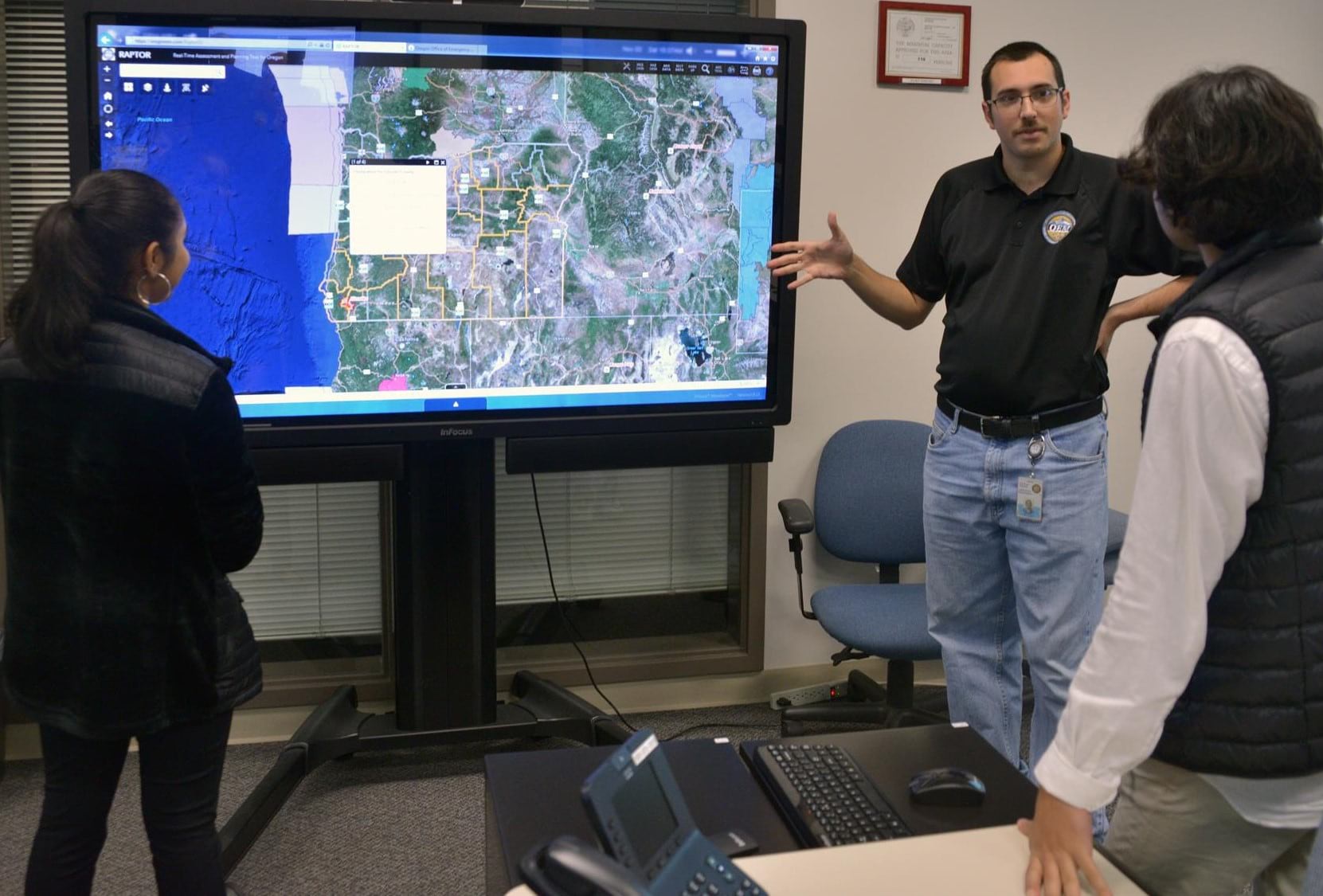
Enter Daniel Stoelb, Geographic Information Systems program manager for the Operations and Preparedness Division in OEM. Daniel maintains the agency’s Real-time Assessment and Planning Tool – known as RAPTOR – and the OpsCenter crisis management application. But beyond data layers and geospatial visualizations, Daniel offers a new and valuable skill to the agency and stakeholders: location-based storytelling.
After earning his degree at Umpqua Community College in 2005, Daniel jump-started his GIS career with the Oregon Department of Forestry where he analyzed urban encroachment on forestland for the Big Outlook Campaign. Daniel continued his career in public service with the Douglas County Planning Department, digitizing land use overlays and maintaining 911 GIS and Master Street Address Guide data. In 2012, Daniel transitioned to OEM and, after review and analysis, deployed 911 GIS data to all 45 Public Safety Addressing Points across Oregon. Daniel was promoted to his current position two years later, and then became co-chair of the National States Geographic Information Council Geospatial Preparedness Committee. His extensive local experience with multiple agencies guided his desire to put emergency management in context, about and for local communities.
Daniel recently shared some great storytelling tips with us – for all storytellers but with disaster management professionals in mind. Check out the highlights below.
Connect directly with Daniel by email at Daniel.stoelb@state.or.us or on social @DanielStoelb Twitter and /DanielStoelb LinkedIn. -Esri’s StoryMaps team

Daniel, can you give us a high-level overview of your current position and how it relates to storytelling?
I’m primarily responsible for maintaining our RAPTOR mapping application. It enables users to visualize current incidents within the state of Oregon and access the data layers needed for emergency management purposes.
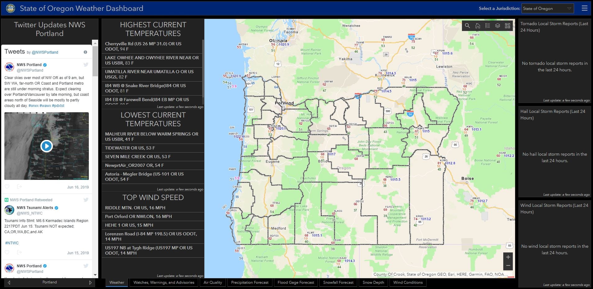
I develop and manage individual GIS applications based on community need, like a weather dashboard that provides county-specific information for the public.
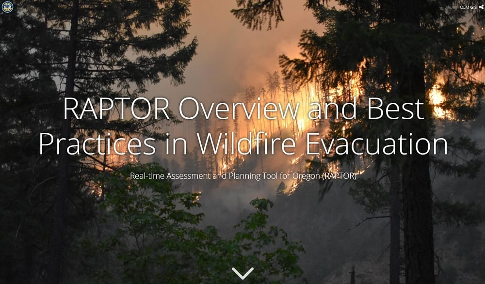
And I support specific events and provide training for the public. During the 2017 eclipse – and time of high wildfire threat – the agency promoted a new statewide fire evacuation layer for the public in RAPTOR.
Rather than use a standard Power Point presentation, I engaged the public with our very first story map, built using the classic Esri Story Maps templates. The story map offered RAPTOR basics and displayed our fire evacuation layer live – the layer even updated during a presentation while I was talking! I have used that template for a variety of different presentations to the Oregon Emergency Management Association, National Geospatial Preparedness Summit, and the National States Geographic Information Council Geospatial Preparedness Committee.

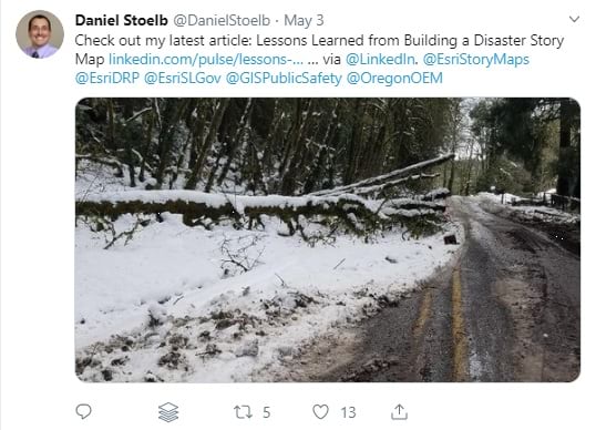
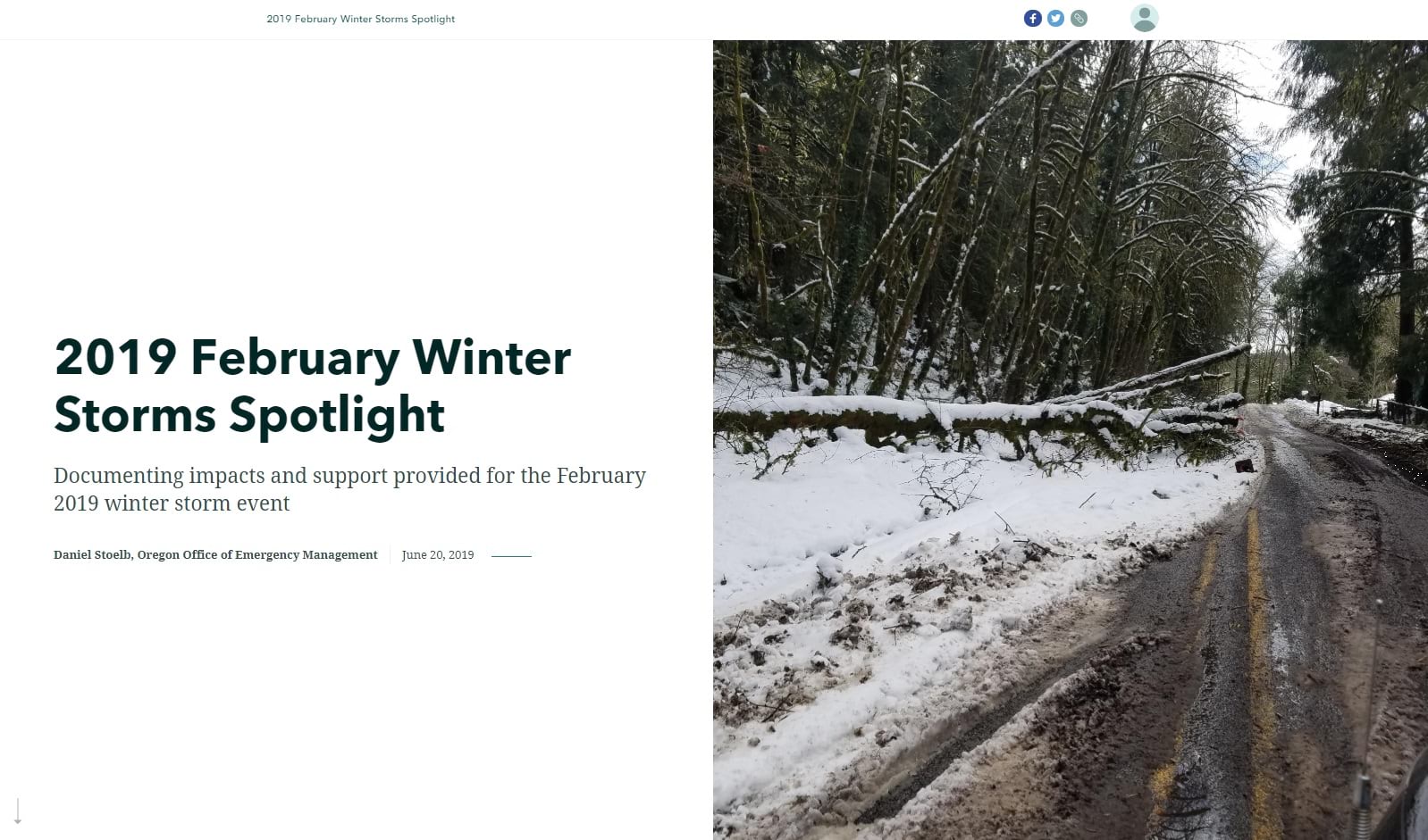
Daniel, the team started following your great work when you @mentioned us in a tweet about your 2019 February Winter Storms Spotlight story map. Can you share the story behind the disaster story map?
After each emergency or disaster, we prepare a public press release and then a disaster report for the Federal Emergency Management Agency. Each report contains descriptions, images, GIS data, and the Governor’s disaster declaration letter for federal assistance.
Previously, we combined the Governor’s disaster declaration letter with snapshots of GIS data and images from the disaster, but without a strong narrative pulling it all together.
This year, we started a new initiative – using the ArcGIS StoryMaps builder for our disaster reports. We worked on both the letter and the story map at the same time to highlight relevant data captured in the field – from preliminary damage assessments and data gathered in the OpsCenter application – to “paint the picture” and “tell the story” of the event. The story with supporting evidence showed the real impacts to our communities and provided context to the damage.
Since we were using new, user-friendly technology, I developed a standard template for the disaster report.

How did the public react to the disaster story map? Was your agency supportive of the change?
It was my goal to create something easy to read and understand and in a format that conveys the true cost of the impacts to our state.
Reactions to the story maps have been overwhelmingly positive – in fact, FEMA expressed an interest in using our story templates to share community impacts with their leadership and the joint field office.
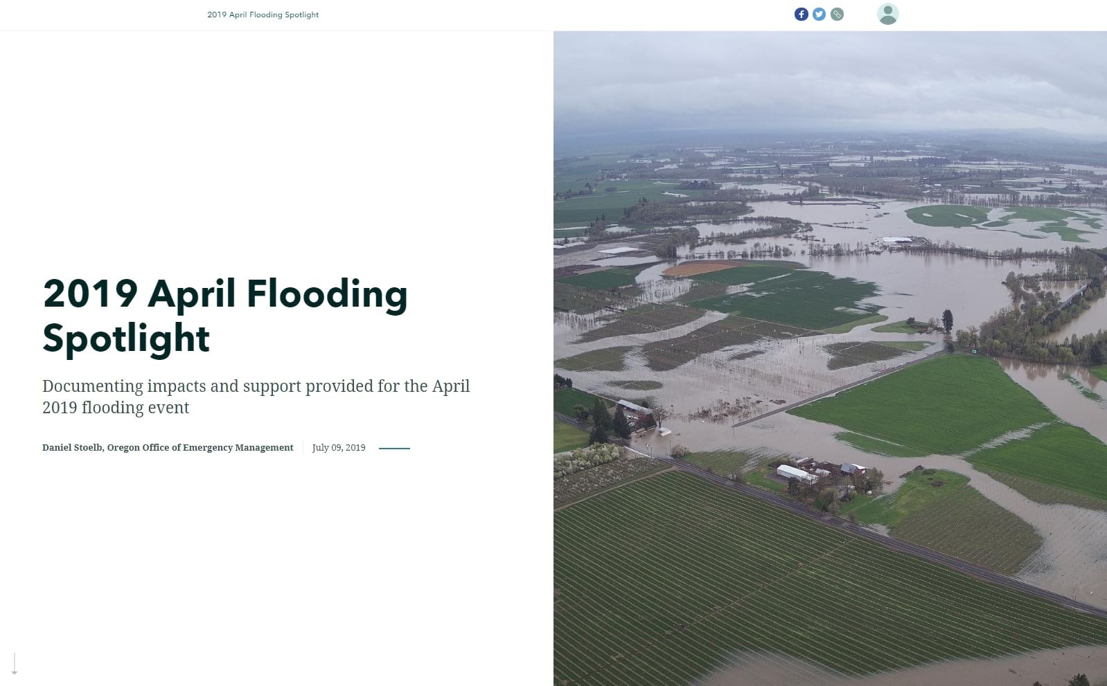
We ended up coordinating with the Governor’s office and communications staff on both disasters this year – the February winter storm and April flooding. We included the story map as part of the press release and disaster declaration request to FEMA. And then when the disaster assistance was approved, I easily added the information to the stories.
The stories – updated regularly – keep the public informed after a disaster or emergency and throughout the disaster assistance request process. To date, each 2019 story has been viewed over 1,500 times.

What advice would you give to colleagues or other storytellers who want to convey factual or official information through story maps?
I know that this sounds really repetitive based on what others have said, but it is really true. The majority of the work involves figuring out how to tell the story.
In our case, we needed to make certain points in our disaster story maps, which followed a logical order:
- Storm setup
- Overview of impacts
- Individual impacts
- State assistance provided
- Cost of disaster
- Disaster declaration information
I coupled the structure with an engaging image – the “wow” factor to draw the audience’s attention – and alternated sidecar content for different sections as visual cues.
I recommend using visuals and media for effect in story maps, but strategically. Drone footage might best illustrate large scale impacts in some areas. 3D mapping might best convey elevation. The media should match the message or desired effect.

You’ve used the same structured approach when building stories with the classic Esri Story Maps templates. Do you have any other great examples for storytellers?
Definitely.
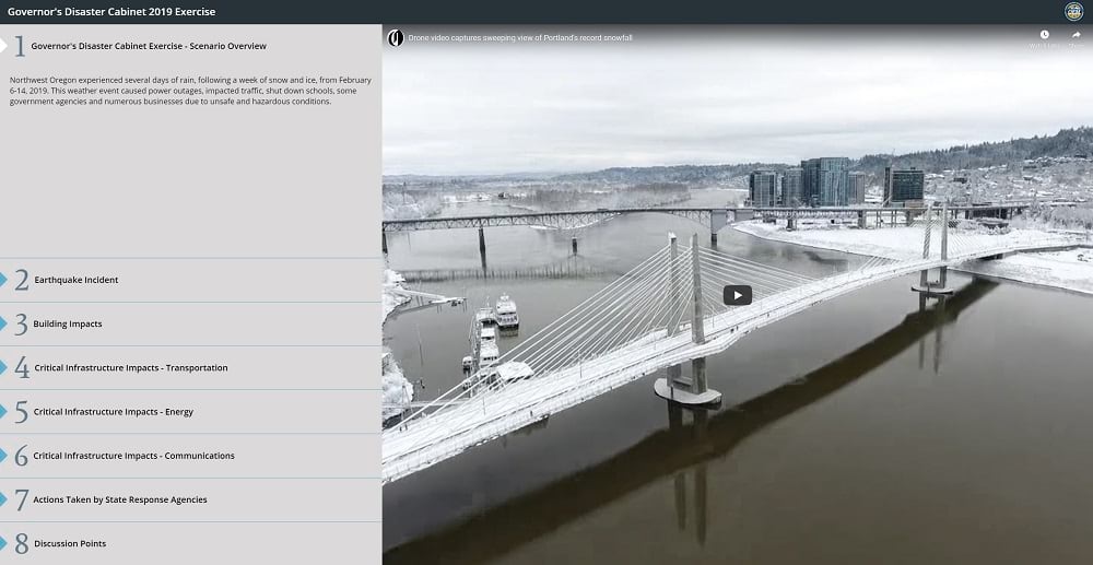
For the Governor’s Disaster Cabinet Exercise story map, I came up with a common structure using the map series template, which again followed a logical order:
- Scenario Overview
- Building Impacts
- Critical Infrastructure Impacts – Transportation
- Critical Infrastructure Impacts – Energy
- Critical Infrastructure Impacts – Communications
- Actions Taken by State Agencies
- Discussion Points
It was our first time using a story map for a disaster exercise or event. We tailored the story map content to the event, without the “stray data layers” in the RAPTOR application. With only simulated discussion points, agencies could really focus and think in the terms of policy vs. response. Attendees really appreciated the approach when we rolled the story map out this year.

What final thoughts or take-aways do you have for storytellers?
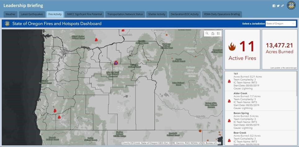
Once you have your structure or main points, you can select the best tool to tell your story. Sometimes, a story map is the best medium. Sometimes, it’s a dashboard. And other times, it’s a combination of the two – like our most recent Leadership Briefing. It uses a classic Esri Story Map template to pull the interactive content most important to our leadership: weather, earthquakes, fire activity and fire potential, transportation network status, shelter activity, declaration activity, and the FEMA daily operations briefing.
Just be flexible and think about which tool will provide the best experience for your readers.



Article Discussion: