I stumbled into GIS after a chance encounter with a cartography module of a university geography course. Creating maps using a computer completely changed the trajectory of my studies and ultimately launched my career. From that point onwards, the analytical half of my brain, fixated on analyzing the world around me, has been permanently fused with the artistic, creative half in pursuing cartographic adventures.
This combination of quantitative analysis and cartographic visualization is what I feel makes GIS so unique. By using spatial analysis, we can explore data and understand phenomena in the world around us. At the same time, cartography gives us the visual tools to represent those observations and share them with others.
But this geographic approach isn’t just for practical problem-solving. It’s a way of thinking and can be applied to nearly any phenomenon, no matter the scale. That is how GIS tools found their way onto the golf course with me this summer. I used several tools to document and quantify every swing, hole, and lost ball as I played through my local golf courses. In documenting my performance, I hoped to use maps and analysis to drive my own improvement and, more importantly, spur some friendly competition among those I played with.
This blog walks through all the steps of this unconventional GIS journey, from data collection and exploration to analysis and visualization.
Data collection
The first step in this endeavor was to collect the data. Since the golf world is still waiting for its GPS-enabled and accelerometer-infused data collection device, akin to those enjoyed by cyclists and runners, I’d have to find another solution.
Fortunately, my GIS skills are far greater than my golf skills, and I devised a plan to use ArcGIS QuickCapture to create the dataset. Each of the clubs in my bag was assigned a button in the QuickCapture project that was used to record the location of a swing using that club.
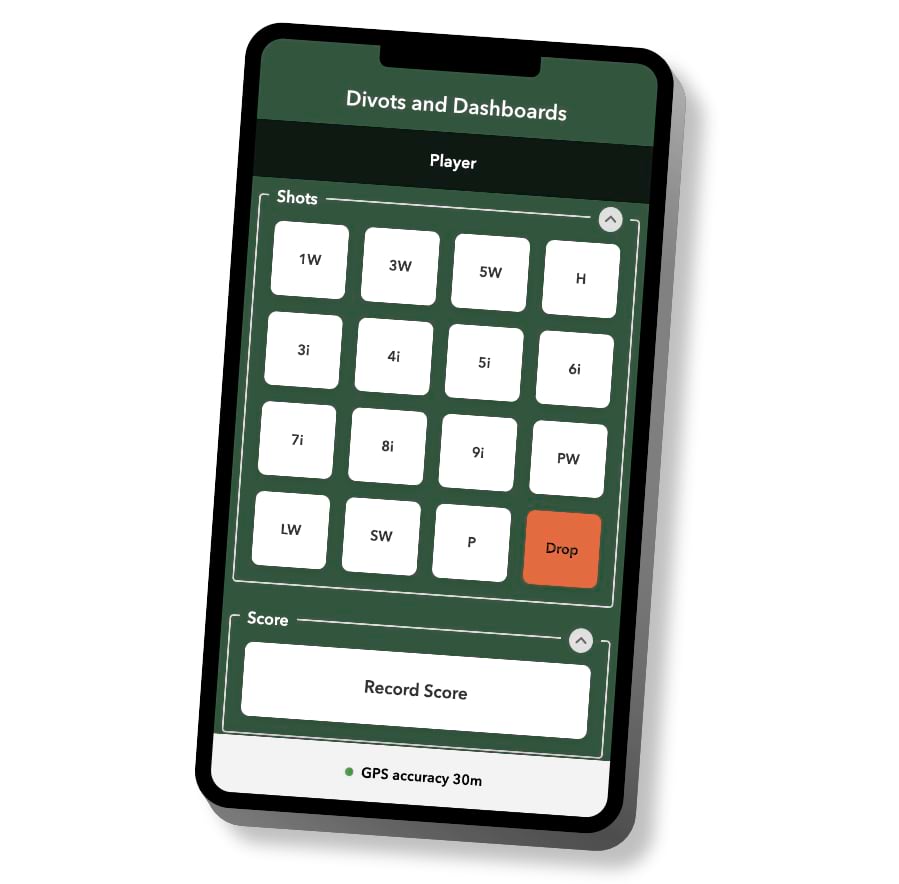
Using this method meant that data collection would be simple and fast to ensure that the pace of play was maintained during a round of golf. In addition, this meant it would be easy to convince those I played with to participate in some friendly competition.
Analysis
The data I collected using the QuickCapture project consisted of simple points marking my swing locations. Therefore, I’d need to process the data to create meaningful analysis and visuals.
My goal for the data processing was to sequence each swing location and join the coordinates of each with those of the subsequent swing. I used these coordinates to create a linear feature spanning where the ball was hit and where it landed. This line provided me with a representation of the trajectory and distance of each shot.
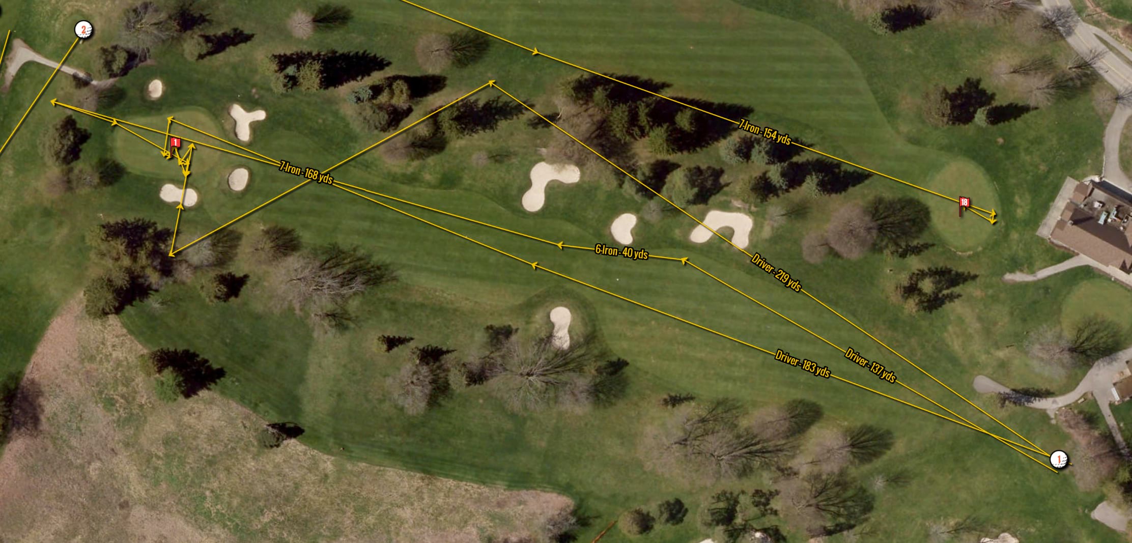
For those shots I hit from the tee (the first shot I made on each hole), I further calculated their direction relative to the center of the target fairway. Quantifying the directional deviation between these points allowed me to analyze the data for patterns based on club choice. For instance, I could see that shots with my irons generally had a more normal distribution, whereas my driver had a more consistent slice to the right.
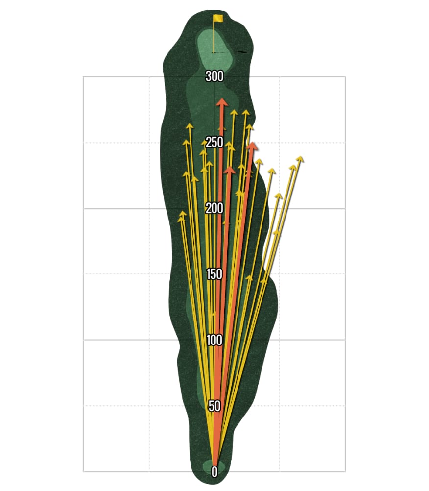
I then organized and aggregated the results into thematic ArcGIS Dashboards reporting several performance measures. Combined with a scorecard visualization and a series of filters, the dashboards provided a complete picture of my mediocre golf skills.
The final step was to wrap these maps and dashboards within a narrative to provide valuable context for readers.
Visualization
In the same way that GIS fused those seemingly disparate halves of my brain, ArcGIS StoryMaps weaves together the geographic approach with storytelling using maps and media. These rich narratives can be used to tell the story of GIS journeys.
In the case of telling the story of mining golf data for performance analytics, I wanted to walk the reader through the process of collecting the data and preparing it for analysis. The sidecar block worked great for this task. By choreographing the maps in each slide to depict various stages of the data, I could demonstrate how the data was converted from points to lines while the narrative panel was used to describe the process.
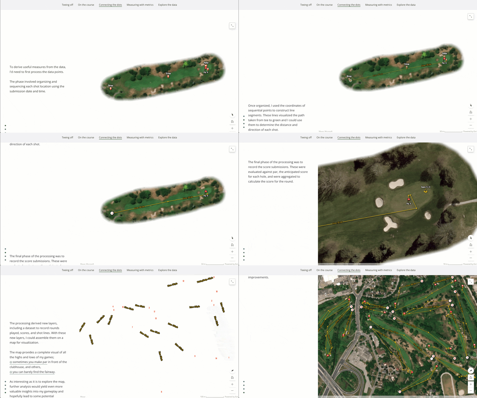
As the story turned towards more analysis, I introduced some simple performance measures and then dove deeper into these measures. For instance, measuring how far the ball travels when hit with each club is a useful statistic, but including the trajectory adds an additional dimension to the story and illustrates how an analysis can be an explorative journey.
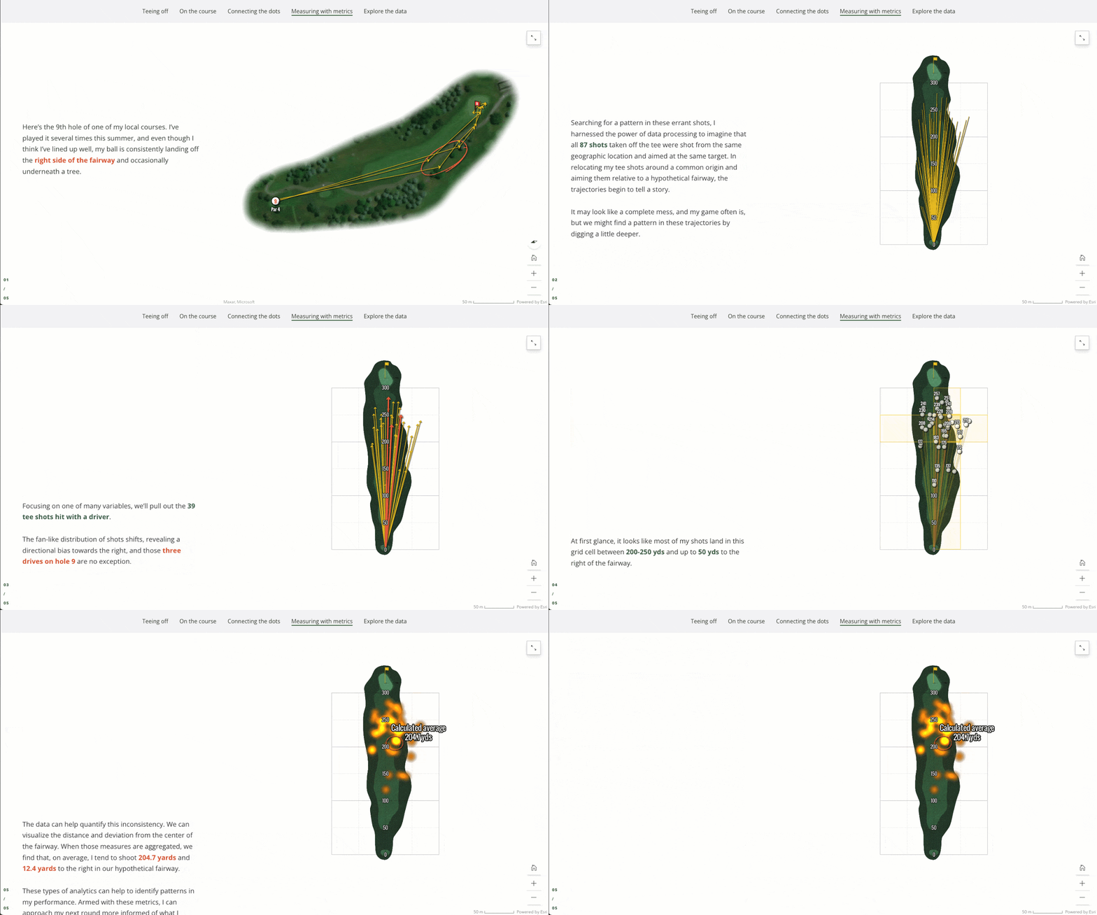
This deep dive into the distance and directionality played out in another sidecar block, exploring individual shots and statistics before culminating in visualizing some informative patterns to consider for my next round of golf.
While the story was playful and hopefully entertaining, it aims to demonstrate that stories can be a powerful medium for sharing GIS journeys. Through illustrative visuals and a well-crafted narrative, the audience can gain valuable context and an understanding of the analysis methodology. So, regardless of the analysis you conduct or the maps you create, stories can be used to share them and make your work more accessible to a broader audience.


Article Discussion: