One of the cool new features in ArcGIS Pro 1.4 is the ability to view the Pro UI in the new dark theme, which also provides high contrast mode support. This post will introduce you to some of the high-level styling considerations and also the new resources which will help you refine your add-ins so they will look great in both light and dark theme.
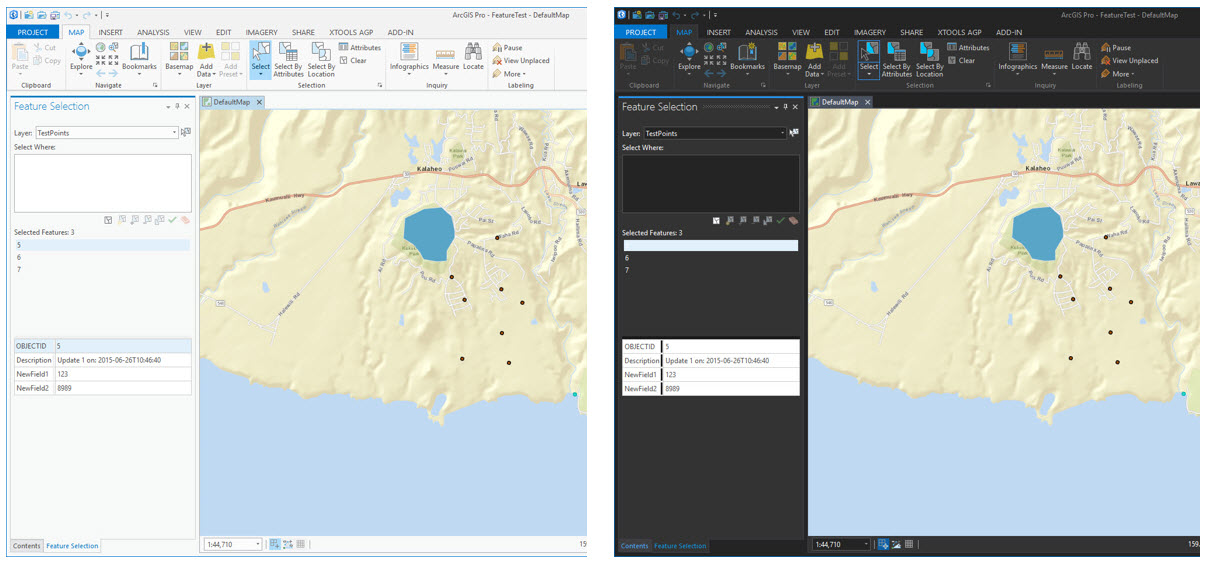
Here is a custom dockpane in Pro as seen in the light and dark themes:
As you get started, the most important point to remember is to use ArcGIS Pro styles on your WPF UI elements to the greatest extent possible. These styles will automatically flip to the correct color scheme whenever the corresponding theme of Pro is changed. In most cases (e.g., WPF checkboxes, radio buttons, combo boxes, list boxes), WPF elements will inherit the correct Pro style without needing to change anything further. The resources listed below provide specifics to consider on the main WPF controls.
Here’s an example of how Esri colors as backgrounds work in both light and dark themes:
There are new styling documents and samples on the Pro SDK documentation wiki, which can be found in the Styling section of the Framework topic. Below are some quick introductions with links to each. In addition, each of the Pro SDK community samples has been updated for 1.4 to support the light and dark themes, and these are always a good place to see how the different Pro and WFP UI controls are handled and work in a solution.
- ProGuide – Style Guide – This ProGuide provides styling considerations for each of the different WPF UI controls. It’s an important guide to refer to for each of the UI controls in your add-in.
- Esri Brushes – This page lists the Esri XAML brushes that can be used in ArcGIS Pro to style the UI elements of your add-ins.
- Esri Colors – This page lists the Esri XAML colors that can be used in ArcGIS Pro to style the UI elements of your add-ins.
In some cases, you may need to apply your own custom styling for light and dark themes, and the following two resources can help you with this.
This ProGuide provides a walk-through of the process of applying custom styling to a custom control to support both light and dark themes. It also provides some background and considerations.
This community sample provides a dockpane with a custom Pro user control which has been styled to support both light and dark themes.
An introductory video is available here with more information on these resources and demonstrations of the UI styling community samples.
We hope you’ll take advantage of these new Pro SDK capabilities when developing your add-ins. As always, if you need additional assistance with your add-in styling, a good place to start is the ArcGIS Pro SDK Group on GeoNet.


Article Discussion: