The ArcGIS blog is a great resource for ArcGIS Pro inspiration and tips. But if you’re taking GIS classes in college, it’s possible you’re still totally in the dark about Esri’s newest desktop GIS.
I make this assumption because I’m an intern at Esri on a team that’s focused entirely on Pro. But a few months ago, I was a college senior who had barely ever heard of Pro, let alone touched it. I lived in an ArcMap bubble that had everything to do with what software was in the computer lab. If you’re in a similar situation, this post is for you.
So, what’s ArcGIS Pro, and what’s the big deal?
ArcGIS Pro was released in 2015 as the newest product in the ArcGIS Desktop line. Today, if you or your institution or organization has a license for ArcMap and its associated applications, you also have a license for Pro. Pro is a 64-bit program – for my less-techy friends, this just means it has more computing power. It also takes a different approach from the tried-and-true ArcMap, which, by the way, is not going anywhere anytime soon. Though Pro is intended to become the Esri’s professional standard, it takes a long time for a whole industry to transition.
This transition from ArcMap to Pro represents a bigger shift that extends beyond Esri. We’re living at a point in history where our technological and computing abilities are exploding at an exponential rate, and the field of GIS is no exception. As Esri’s Product Engineering Director Clint Brown put it, “the future of what people can do with GIS is going to be about how people can think creatively about what’s possible and what’s new,” rather than limitations in computing power or data storage. At this juncture, Esri is working to make GIS more accessible to more people, less technically intimidating, and therefore a more powerful tool that can be used by everyone¸ not just an elite group of experts. ArcGIS Pro was designed with this in mind.
Lots of us learned GIS with the familiar desktop bundle centered around ArcMap, simply because it takes time for institutions to translate all their course materials to a new software. I conducted a quick informal poll of my fellow interns, which indicated that only about 25% of us used Pro in college. If you’ve invested lots of time and energy getting comfortable with ArcMap, making a switch might sound like an unnecessary hassle. Alternatively, if you took a mandatory GIS class and felt like ArcMap didn’t click for you, you might think of GIS as a challenging or frustrating part of your education. Whichever camp you’re in, read on.
7 Reasons students should be using ArcGIS Pro
As a shiny new intern in the Pro division at Esri, one of the first (and arguably most fun) things I had to do was get to know the software. I’ve been doing so armed only with my ArcMap experiences, some handy tutorials and lessons, and my good intentions. Turns out that’s all you need – I can happily report that my adjustment is going much smoother than I could have hoped.
The following come from the very strong first impression I had as a student taught with ArcMap suddenly exposed to the world of Pro.
1. Hmm, this looks oddly familiar.
That’s the first thing you’ll probably think when you open ArcGIS Pro. Déjà vu? Not exactly. The thing that makes you feel like you’ve used Pro before is its ribbon-based user interface (UI), a huge remodel from ArcMap’s toolbar-based system. It’s contextually driven, so relevant functionalities appear or disappear in tabs depending on what you’re doing.
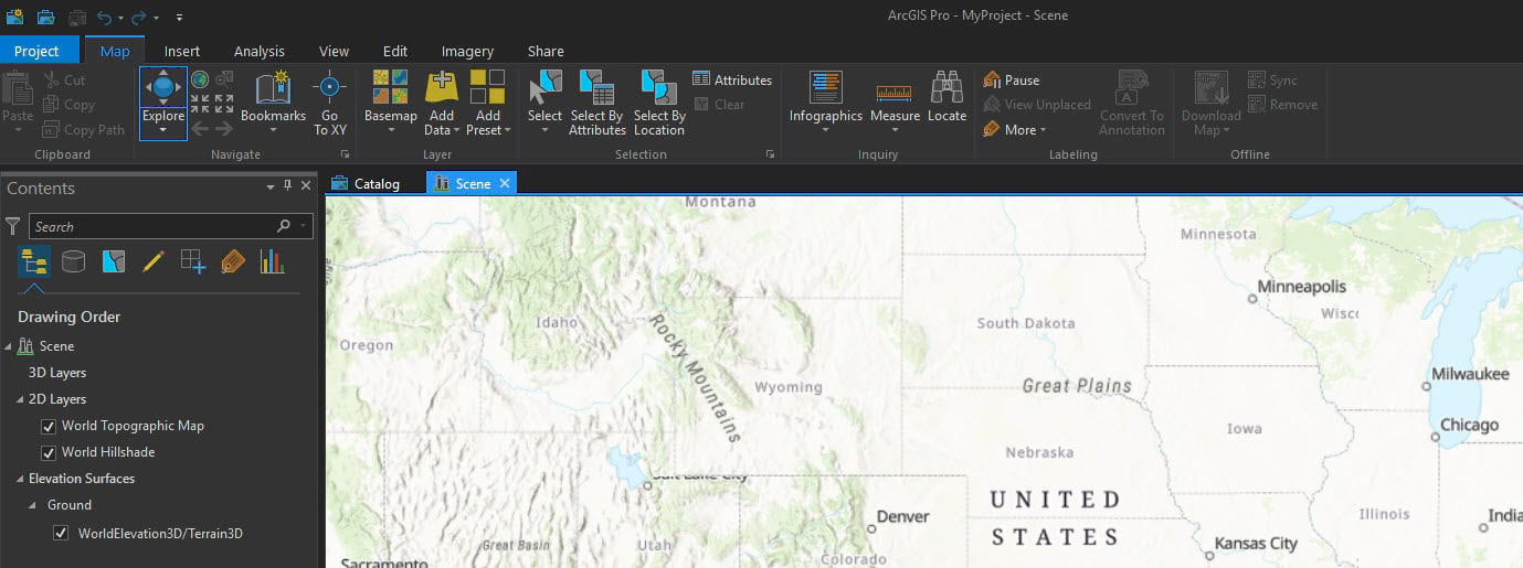
I guarantee you use similar ribbon-based programs almost every day – I’m sure you can spot the similarities. This is by design; when your new program looks and feels like your bread-and-butter word processor, it lets you skip the basics as you dig into the endless learning possibilities of GIS. It grants you easy access to something otherwise complicated.
I can attest to this personally. Like any recent college grad of this generation, I grew up alongside Microsoft, Adobe, and Google. Navigating a UI that follows the latest software trend is practically in my DNA. As I began poking around Pro, I followed my ArcMap instincts. Whenever that led me astray, I simply switched to my deeply imprinted millennial conditioning. More often than not, I found the tool or function I was looking for in no time. If my introductory GIS course had used Pro, I’m sure it would have saved a lot of people a lot of frustration.
Also, the UI is just generally pleasing to look at, which is not to be overlooked, and leads us to number 2…
2. Pro makes creative cartography easier.
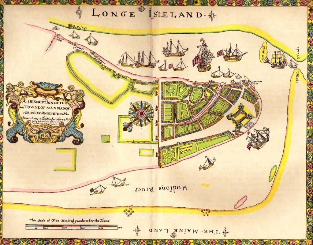
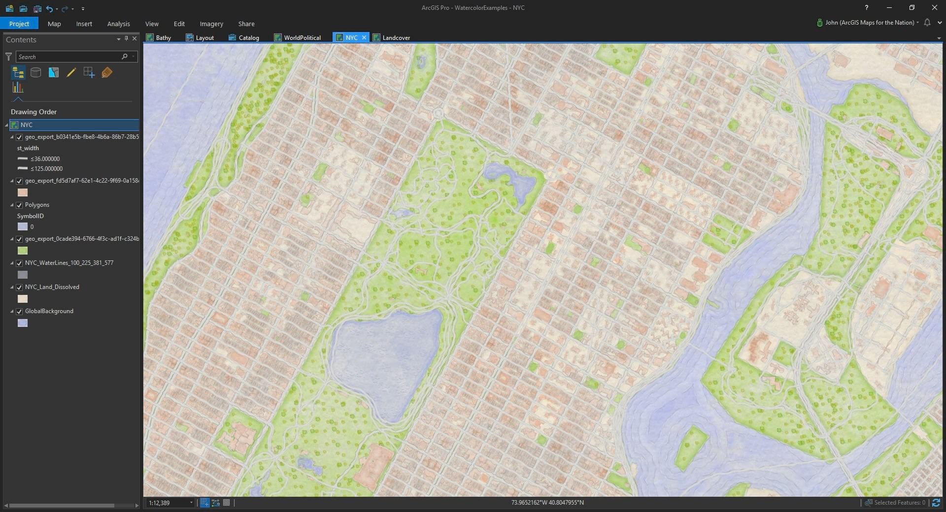
If you’ve seen an old map from the age of exploration, you’ve probably noticed that what they might lack in accuracy they make up for in cartographic design. Mapping new places use to be a big deal, and cartography was an art form. As the world shifted to computer based mapping, the priority became efficiency and analytic power. The computer tools to make beautiful maps weren’t around for a while, and for a while after that, they were hard to find and use.
The deeper I got into spatial analysis in college, the more often I’d find myself ignoring any sort of artistic sensibilities. But once in a while I’d take a breath, step back, and suddenly realize that no one else would ever want to look at my map if I could barely stand to look at it myself.
Being exposed to Pro has inspired me to get back in touch with cartography’s roots and my own creative side. Don’t get me wrong – there’s plenty of opportunity to get creative with cartography in ArcMap. But in Pro, these options are more obvious and accessible, which makes it easier to take advantage of them.
When you open a new global or local scene in Pro, you’re greeted by a simple but well-designed basemap, which you can switch to suit your needs. The basemaps are complemented nicely by the default symbology, so that even as you’re running through a workflow, things don’t have to look totally crazy. When you’re ready to design a layout, the Symbology pane hangs out to the side of your map rather than obscuring it, and updates in real time, so it’s much easier to play around with.
Not to mention, the resident cartographers at Esri are always putting out new downloadable styles and ideas for you to piggyback off of – browse all their posts here.
3. Tools are easy to search for and use.
This was one of the bigger jolts for me – where’s ArcToolbox?
Basically, it’s been replaced by the Analysis tab on the ribbon and the associated geoprocessing pane. The analysis tab is where your most commonly used or personal favorite tools live, as well as the “Tools” button, which opens the Geoprocessing pane. There you can navigate all your toolboxes, search for tools, and fill out parameters to run tools.
Once you work past the change, you realize what’s nice about this interface. Everything happens in the Geoprocessing pane – as you set up a tool, you don’t have to keep track of multiple pop-up windows or lose sight of your attribute table or map. When you’re done with the tool, hitting the back arrow returns you to the toolboxes or search screen. You can also access your geoprocessing history from here, which you can review to build or refine workflows and re-run tools with the same parameters.
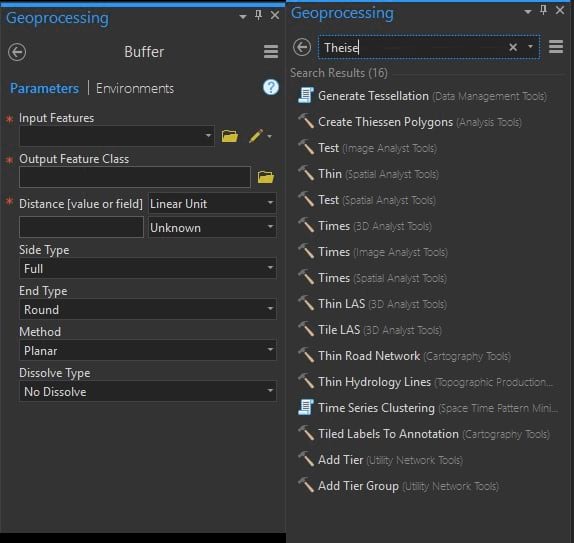
The search screen is my favorite part of the geoprocessing window. Unlike in ArcMap, where you must type in a tool’s name perfectly, hit enter, and then select it, Pro’s search bar works like Google: it autocompletes as you type the tool’s name or a keyword for its function. No more having to memorize the name of every tool you’ve ever used. No more having to remember how to spell “Thiessen Polygon.”
4. Edit sessions aren’t formalized events.
In Pro, you don’t have to start and stop the editor every time you want to edit a table or feature. Essentially you can edit any time you like without doing anything special or interfering with any of the program’s other functions. You’ll still have to remember to save edits in some new places; for example, if you’re working in the Fields tab of a table, but Pro will prompt you if you forget.
5. 3D GIS is easy in Pro.
In case you didn’t get the memo the first time you went to an IMAX movie on a field trip as a kid, everything 3D is automatically cool.
Seriously, though. I won’t get into the kinds of complex analysis you can do with 3D scenes – that’s a whole separate thing. But on a basic level, 3D gives you a sense of place. Being able to show the landscape you’re analyzing for a project is a serious step up from just running a hillshade. And while ArcGlobe and ArcScene can pair with ArcMap for 3D analysis, Pro takes it to the next level.
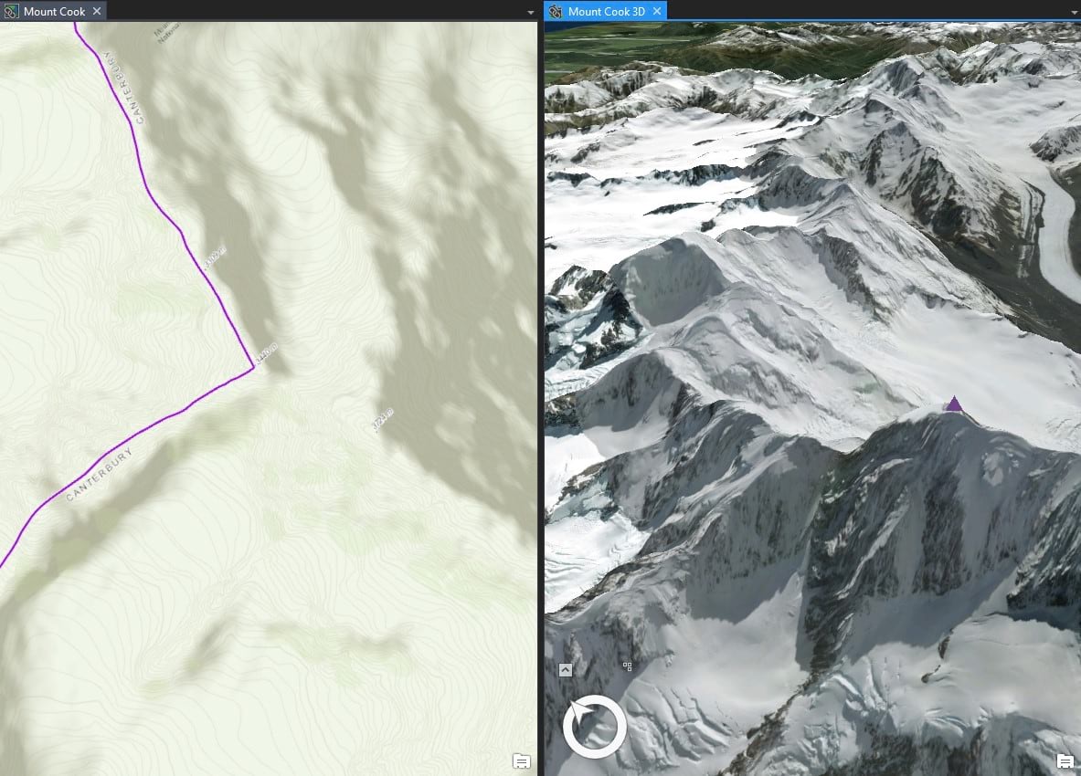
You can convert your map to a 3D scene by just clicking a button – Pro will provide you the elevation data – and browse through 3D symbology for trees, buildings, and more. Corresponding 2D and 3D windows can be set up side by side, and you can link them together as you pan and zoom.
6. Your maps can travel better.
ArcGIS Pro allows you to share you map online with ease – whether you want to create a publicly viewable web map or story map, or you need to collaborate remotely on a project. All this is done through a portal that connects you to ArcGIS online.
Pro is designed for sharing, which goes hand in hand with the rapidly increasing accessibility of GIS I mentioned earlier. Sharing your data in an interactive, attractive format makes it more powerful. Use your shared maps to create impressive presentations or projects for class or work. They’re also a handy tool for explaining to relatives what exactly it is you do all day.
7. It’s easy to make custom charts.
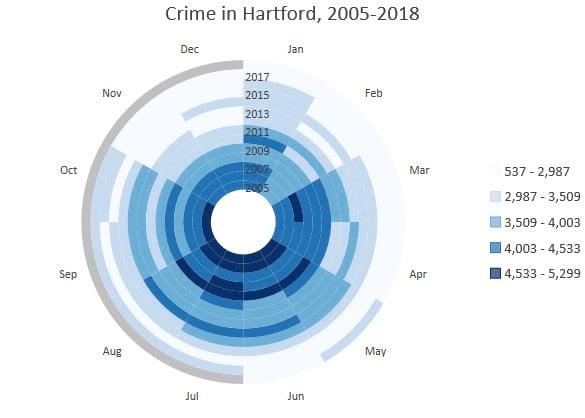
There’s nothing quite like a great chart.
That’s the geekiest thing I’ve said all day, but I can’t be the only one who thinks so. If I was, no one would have bothered making Pro’s chart capabilities as good as they are.
Whether you’re a chart enthusiast or not, there’s one thing we can all agree on here: being able to make attractive charts and graphs straight from your GIS makes your school (or work) projects and presentations a lot easier. You don’t need to wrangle your attribute tables into Excel or R. For all those times when a spatial visualization of your data (i.e. a map) isn’t enough, this capability is huge.
I want to try Pro, but it’s not on my school (or organization) computer. Now what?
If you don’t have access to any ArcGIS products yet, Esri offers discounted licenses for students which can be renewed for about $100 annually as long as you’re enrolled. I know shelling out any cash can be hard for poor college students, but if you think about it as $0.28 a day, that’s a lot cheaper than your daily cup of coffee (which I’m not suggesting you cut out, but still). There’s also a 21-day free trial, so you can get your feet wet over the summer.
Once you have Pro set up, there are plenty of resources for actually getting acclimated, such as the Quickstart Tutorials and other blog posts like this one More advanced lessons are available here.
But don’t forget that if you have access to ArcMap through your university, you should have access to Pro, it’s just a question of whether it’s installed. Most universities have a GIS coordinator who holds the licensing information. You should be able to find this person through the IT support desk (or equivalent), and ask them if it’s possible to get Pro on school computers, or for a copy for personal use. This is how I got my own copy of ArcMap in college, back when I was unaware of Pro. As I mentioned earlier, the big thing keeping Pro out of classrooms is the effort it takes to change written course materials – but your professors probably won’t take issue if you ask to try an assignment in Pro. If you’re lucky, it’ll catch on and you’ll have started your own local GIS revolution.

Commenting is not enabled for this article.