Conventional wisdom has it that the 2020 presidential election will be won by the campaign that does the best job of turning out its base of supporters. In such a highly polarized political environment, the thinking goes, there are few undecided voters to be persuaded to support one candidate over the other.
To assist their get out the vote (GOTV) outreach, the campaigns will want to know how their voters behaved in recent elections in terms of getting to the polls. Knowing whether certain types of counties, or certain regions, had increases or decreases in turnout in the recent past will help the campaigns focus their efforts in 2020. For example, it helps to look at where Democratic voter turnout was up or down from 2012 to 2016, compared to Republican voter turnout.
While ArcGIS Pro has several spatial statistics tools for analyzing relationships between two or more variables, a quick way to start exploring relationships visually is to create a map using the Bivariate Colors symbology option to explore the relationship between the values of two variables. On the map below, counties where there was an increase in Republican voters and a decrease in Democratic voters are shown in pink. Cyan counties show where the opposite trend is true. Dark blue shows counties where the turnout for both parties remained the same or increased in voters from both parties. Counties in light purple saw decreases in voters from both parties.
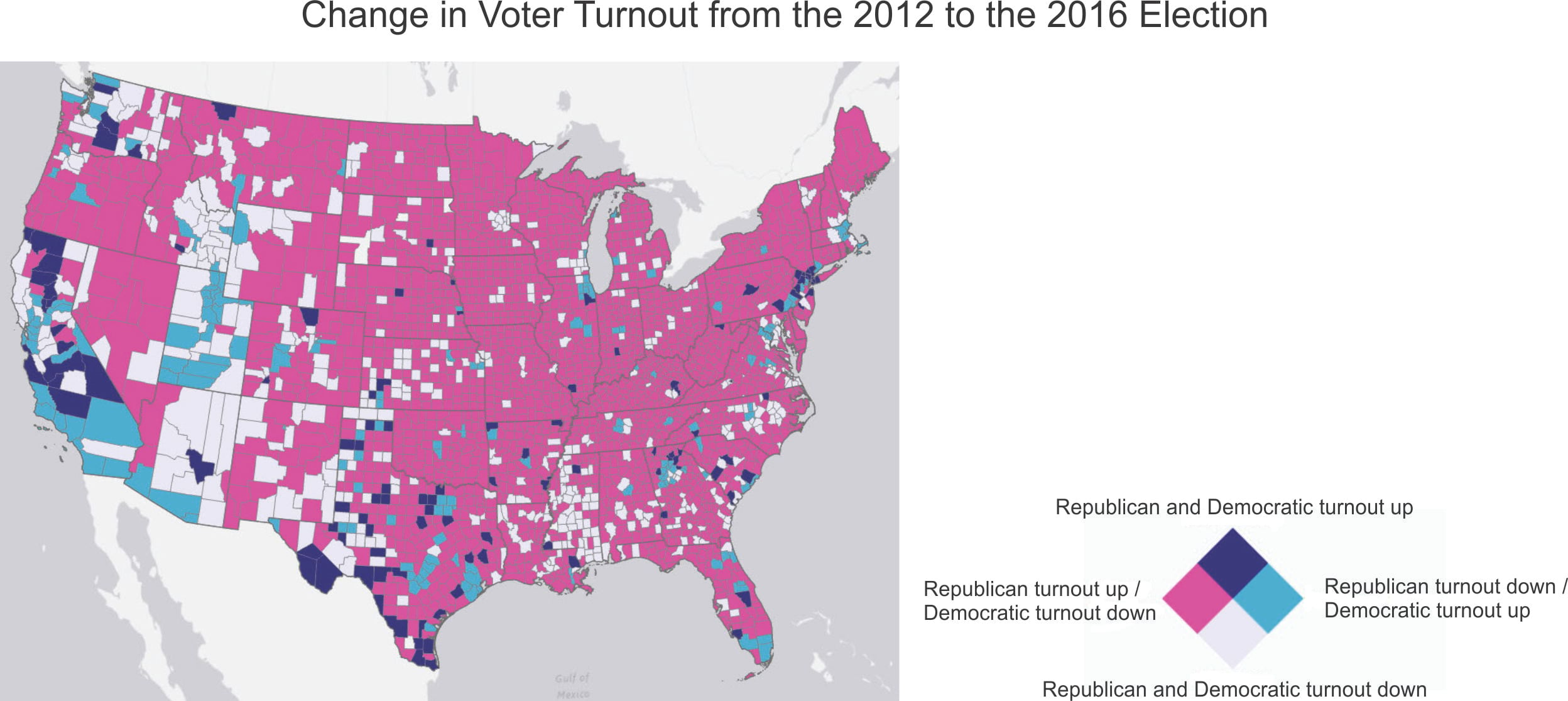
From the map, it’s apparent that in 2016 the vast majority of counties experienced a decrease in Democratic turnout and an increase in Republican turnout (pink).
There are some notable exceptions, such as increases in Democratic turnout (cyan) in Central and Southern California, Western Washington state, and South Florida, as well as counties containing and surrounding some major cities, such as Chicago, Boston, New York, Atlanta, Houston, Dallas, and Washington, DC. Other major cities, such as Minneapolis, Milwaukee, and Portland, Oregon, saw a decrease in both Republican and Democratic turnout (light purple).
To make the map above, data from the MIT Election Data and Science Lab and the US Census Bureau was added to the county layer’s attribute table. The change in the voter turnout for Democrats between 2012 and 2016 was then calculated:
(2016 Clinton vote / 2016 citizens of voting age) – (2012 Obama vote / 2012 citizens of voting age)
Calculating the vote as a percentage of citizens of voting age accounts for changes in population between 2012 and 2016.
The change in Republican turnout was calculated the same way (using the 2016 Trump vote and 2012 Romney vote).
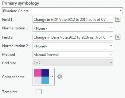
The map was symbolized with the Bivariate Colors option using a 2 x 2 grid and the Pink-Blue-Purple 1 color scheme.
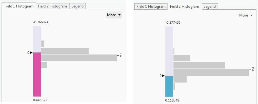
Using options on the subtabs, the class breaks for each of the fields were set to 0 percent, to divide counties into those where turnout increased (a value greater than 0) and those where turnout decreased (a value less than 0). The settings yield the four classes shown on the map.
The High values orientation option on the Legend subtab was used to rotate the legend 45 degrees.
The resulting map paints a broad picture. However, campaign officials may want to dig a little deeper. To get a more detailed and nuanced view of the change in voter turnout, expand the Bivariate Colors grid to 4 x 4.
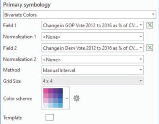
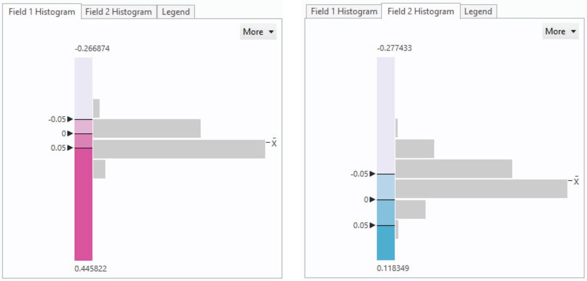
There are now three class breaks. Set them at -5 percent, 0 percent, and 5 percent for the change in Republican voter turnout and the change in Democratic voter turnout.
The resulting map is below. On the previous map, we were looking at four categories—the increase or decrease in turnout for the two parties—so a diamond-style legend worked well to present each combination of values. Here, a square-style legend works best for focusing on the two continuous variables.
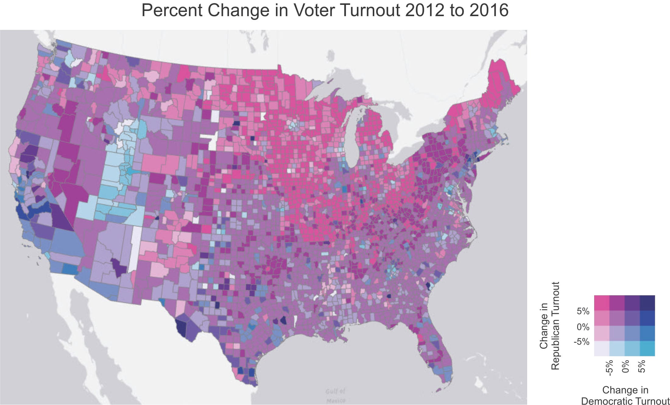
It becomes clear that where the Democrats stumbled in 2016 was in the upper Midwest (the states of Minnesota, Wisconsin, Illinois, Indiana, and Michigan and more marginally North and South Dakota, Iowa, Missouri, and Ohio). Several of these states are considered to be key swing states that will be pivotal in the 2020 election. In the counties shown in dark pink, the Democratic turnout was down over 5 percent while Republican turnout was up over 5 percent. In the medium pink counties, the Republican turnout was up between 0 percent and 5 percent, while the Democratic turnout was still down more than 5 percent.
Of course, not all counties are created equal, population-wise—the campaigns will have a better outcome in each state if they focus on counties that have larger populations and more potential voters.
So far, we’ve mapped the relationship between two similar variables: the change in Republican voter turnout and the change in Democratic voter turnout. Bivariate Colors symbology can also be used to map the relationship between two variables that represent different phenomena. This may also be helpful for the GOTV outreach.
For example, campaigns often tailor their GOTV operations to specific demographic groups. By mapping the change in Democratic voter turnout with, for example, the percentage African American population in each county (added using the Enrich tool in ArcGIS Pro), we can identify counties with a relatively large African American population where Democratic turnout increased or decreased. We can also see if this pattern was consistent across the country.
For this map, it’s important to keep in mind that the data are by county, not by individual voters. Also, although the data describes voting blocs, these units are not in reality homogenous—there is variation within these groups based on age and other factors. Nonetheless, mapping these variables may provide useful insights.
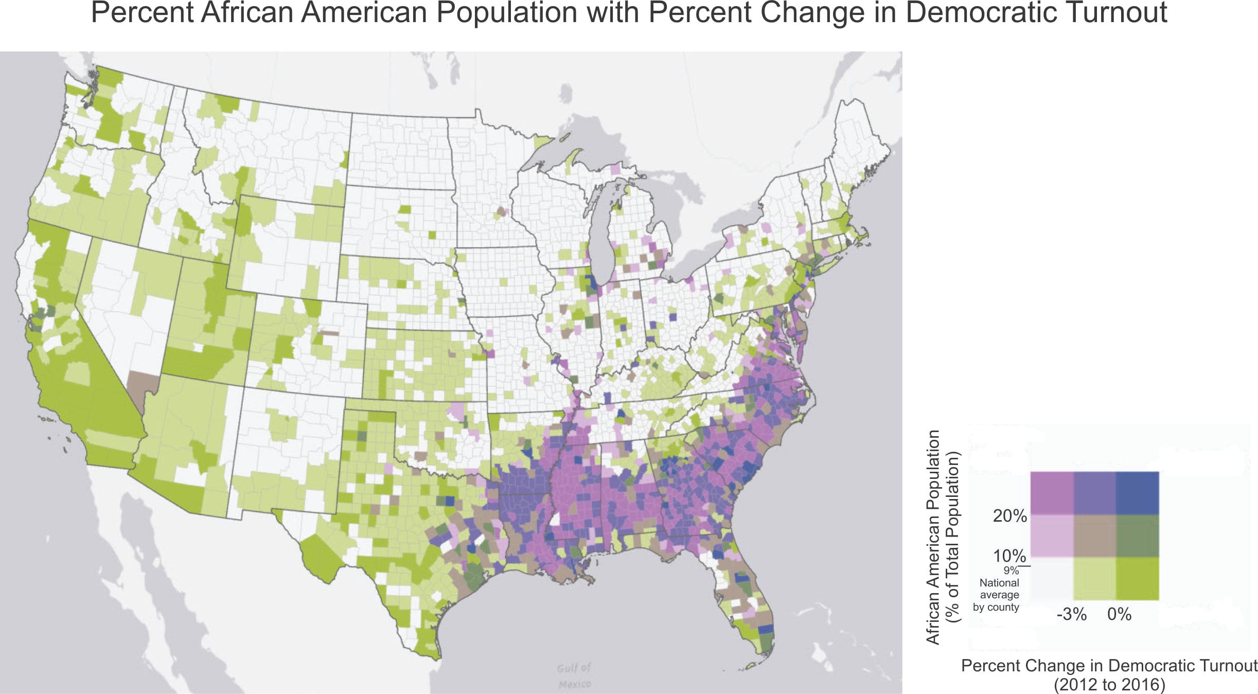
On this map, counties shown in dark pink and purple have a population that is at least 20 percent African American and a decrease in Democratic voter turnout (at least 3 percent and 0 to 3 percent, respectively). The counties in light pink have a population that is 10 to 20 percent African American and a decrease of at least 3 percent in Democratic voter turnout. These three categories of counties are the ones where Democrats will want to focus their GOTV outreach. As you can see, most of these are in the South, including in the battleground state of North Carolina.
A few, though, are in swing states in the upper Midwest. In a close election, turnout in these counties could make the difference. As The Washington Post’s Eugene Robinson pointed out in a recent column, “Hillary Clinton would be running for reelection right now if African American turnout in 2016 had been higher in Philadelphia, Pittsburgh, Detroit and Milwaukee.”
Let’s take a closer look at these last two.
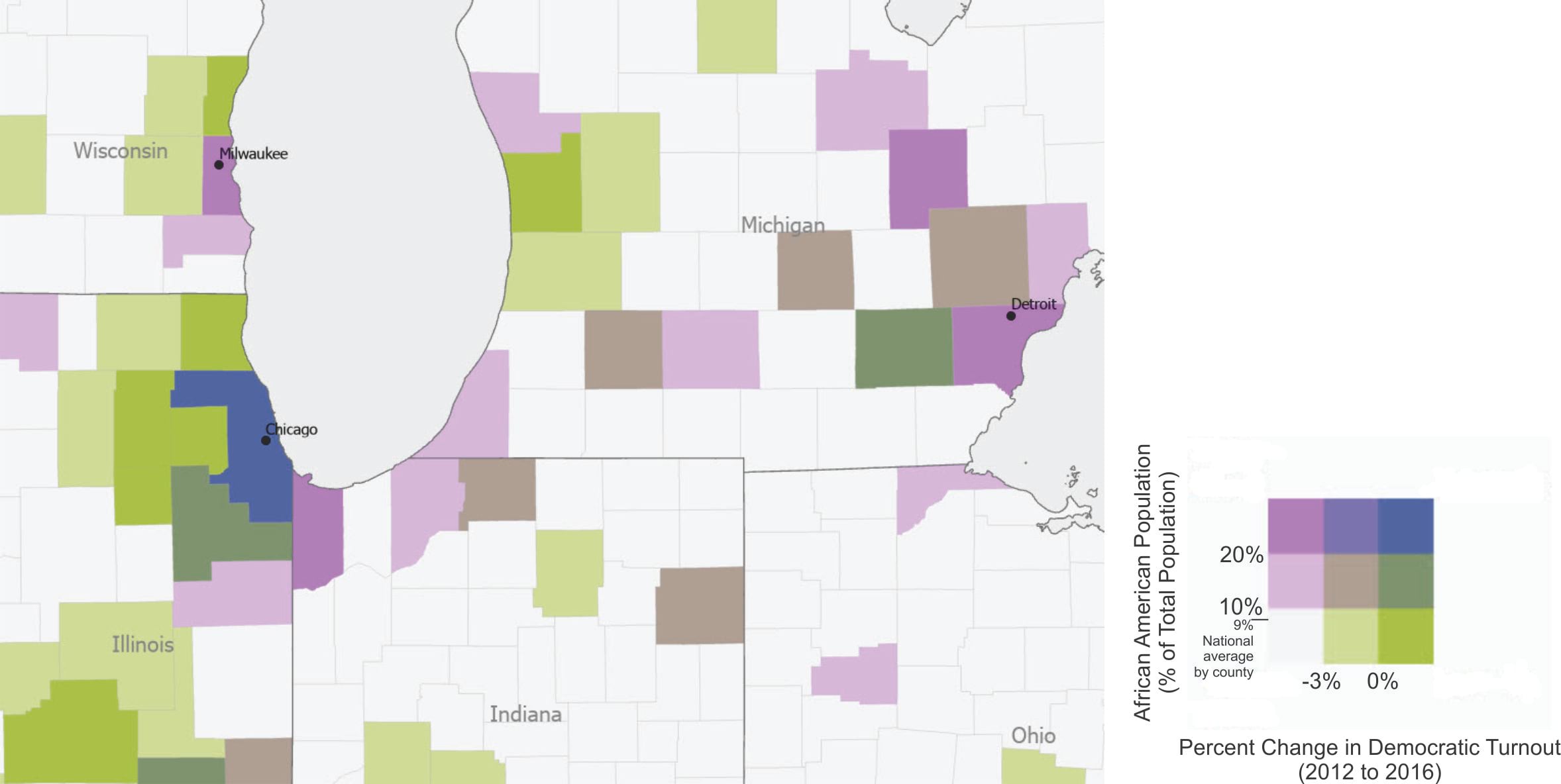
This map shows that the counties where Milwaukee and Detroit are located have a population that is over 20 percent African American, and Democratic turnout in these counties was down over 3 percent. In contrast, Cook County, where Chicago is located, is also at least 20 percent African American, but here Democratic turnout increased between 2012 and 2016. Delving into why these cities and counties had different outcomes could help the Democratic campaign fine-tune its GOTV strategy.
And where might Republicans want to focus their efforts? While Republican turnout generally increased across the country between 2102 and 2016, the party would want to make sure voter turnout stays high in 2020. They would look at variables such as gender and education, consider the relationship to turnout, and perform a similar visual analysis.
In this blog post, Bivariate Colors symbology was used to map the change in election turnout between Democrats and Republicans for the last two elections. It also looked at variables that could be related to variation in the election outcomes, such as race. The same approach could also be used to map the other variables related to election outcomes (age, education, and so on), and for other types of elections (national, state, or local).
More broadly, Bivariate Colors symbology can be used to visually explore the spatial pattern of relationships between two related variables. The Making Bivariate Choropleth Maps with ArcMap blog post, for example, contains links to a map that uses Bivariate Colors symbology to show how the relationship between obesity and diabetes varies across the United States (the US Centers for Disease Control notes that obesity is the leading risk factor for type 2 diabetes).
Credits
MIT Election Data and Science Lab, 2018, “County Presidential Election Returns 2000-2016”, https://doi.org/10.7910/DVN/VOQCHQ, Harvard Dataverse, V6, UNF:6:ZZe1xuZ5H2l4NUiSRcRf8Q== [fileUNF]
US Census Bureau, American Community Survey
Image by chayka1270 from Pixabay
Commenting is not enabled for this article.