I once heard someone say that standard hillshade (one-direction light source) ignores half of the terrain. While this is an exaggeration, it makes a good point. Earth has an atmosphere and light diffuses, bounces, and wraps around a terrain in a manner that a single light direction misses. What’s more, the hues of light behave interestingly in those filtered and ambient instances.
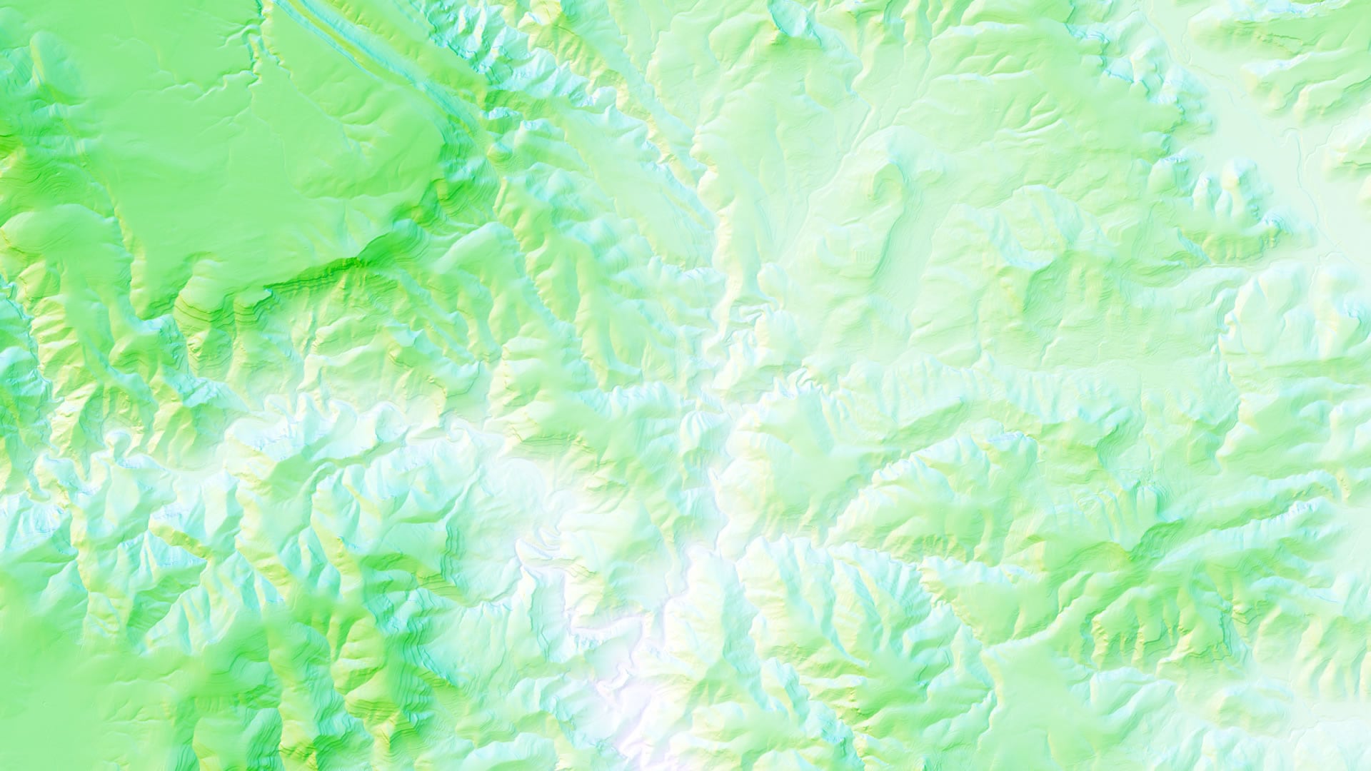
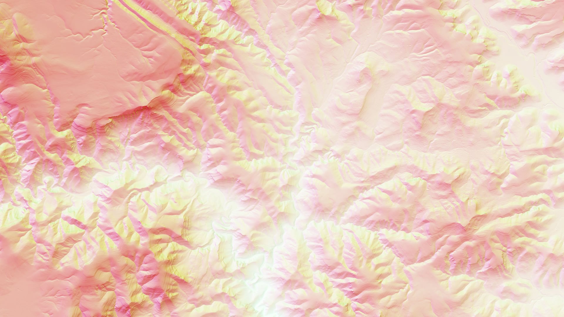
Applying a different hue to each of a handful of hillshade orientations can breathe vibrant life to the texture of a place and reveal more than that of traditional grayscale shade, maybe more than one might suspect. The results can be charming and beautiful, but there are also practical reasons.
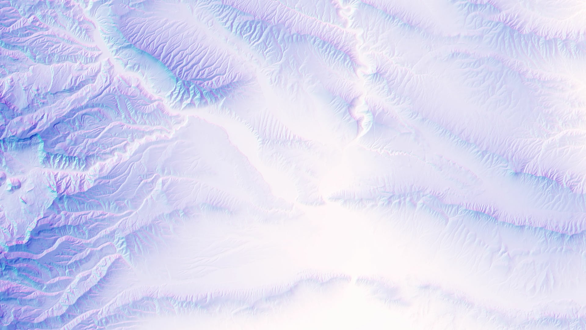
Here is how to make a multidirectional, multi-hue, hillshade in ArcGIS Pro in a couple of minutes, using the beautiful global multi-scale elevation service from Living Atlas.
…
It’s a matter of applying a hillshade renderer from the ever-handy raster functions, three times, each with a different illumination angle. Then giving each hillshade a hue, and blending the results with a multiply blend mode. Lastly, a mist layer is added…because mist is just a really great terrain technique.
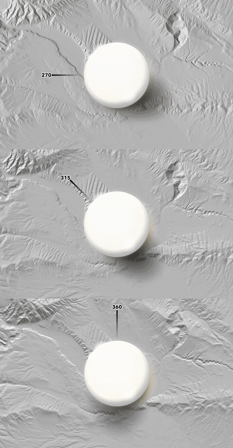
Here is an illustration of the facets of a terrain that different illumination directions reveal…
Giving each of these facets its own hue, and blending them into a single hillshade, informs the eye with more information about the texture, and directionality, of a place’s terrain…
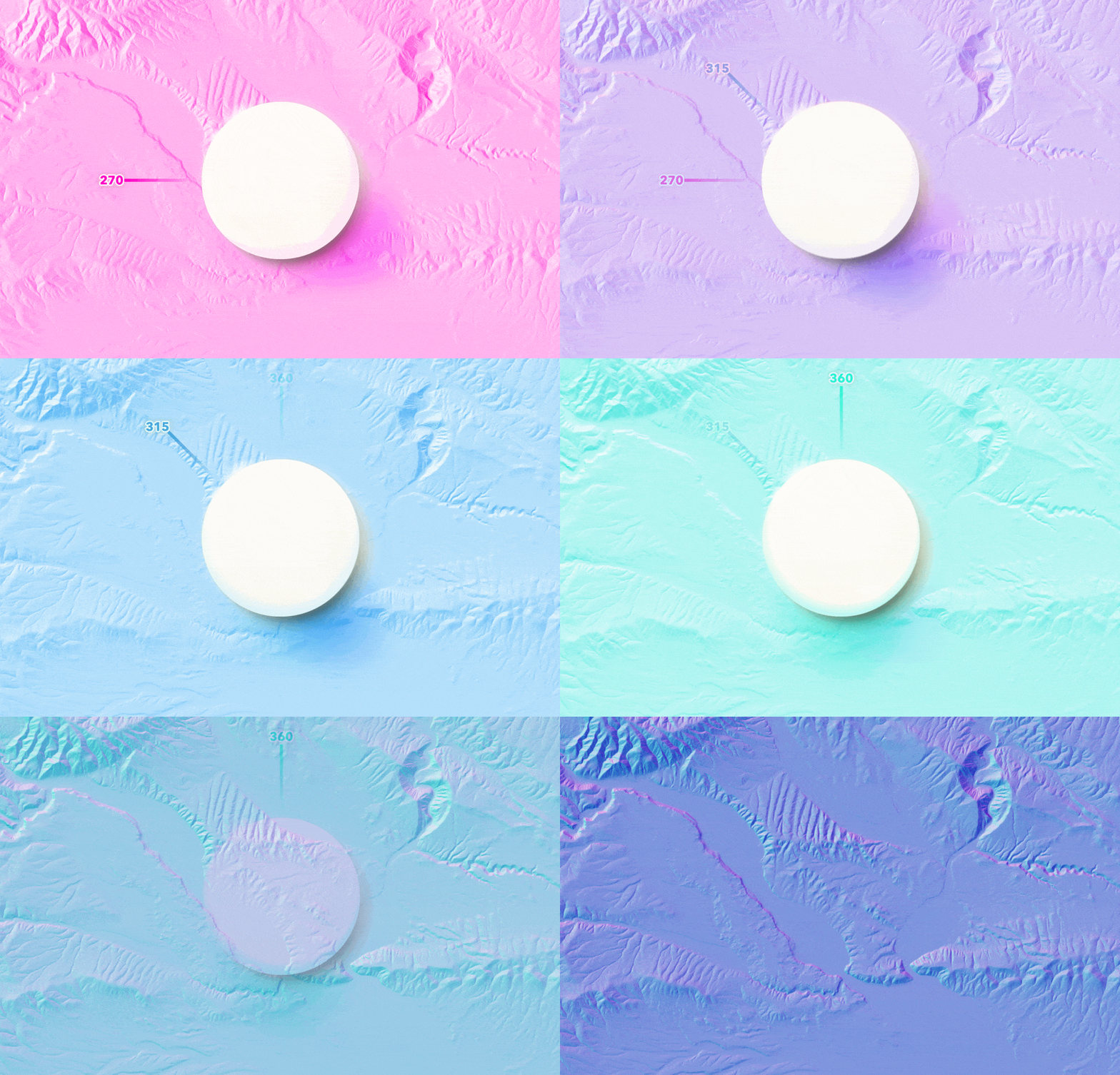
Choosing alternative colors can create a different sense of warmth or seasonality. Choosing colors that are sequential on the color wheel provides the best results.
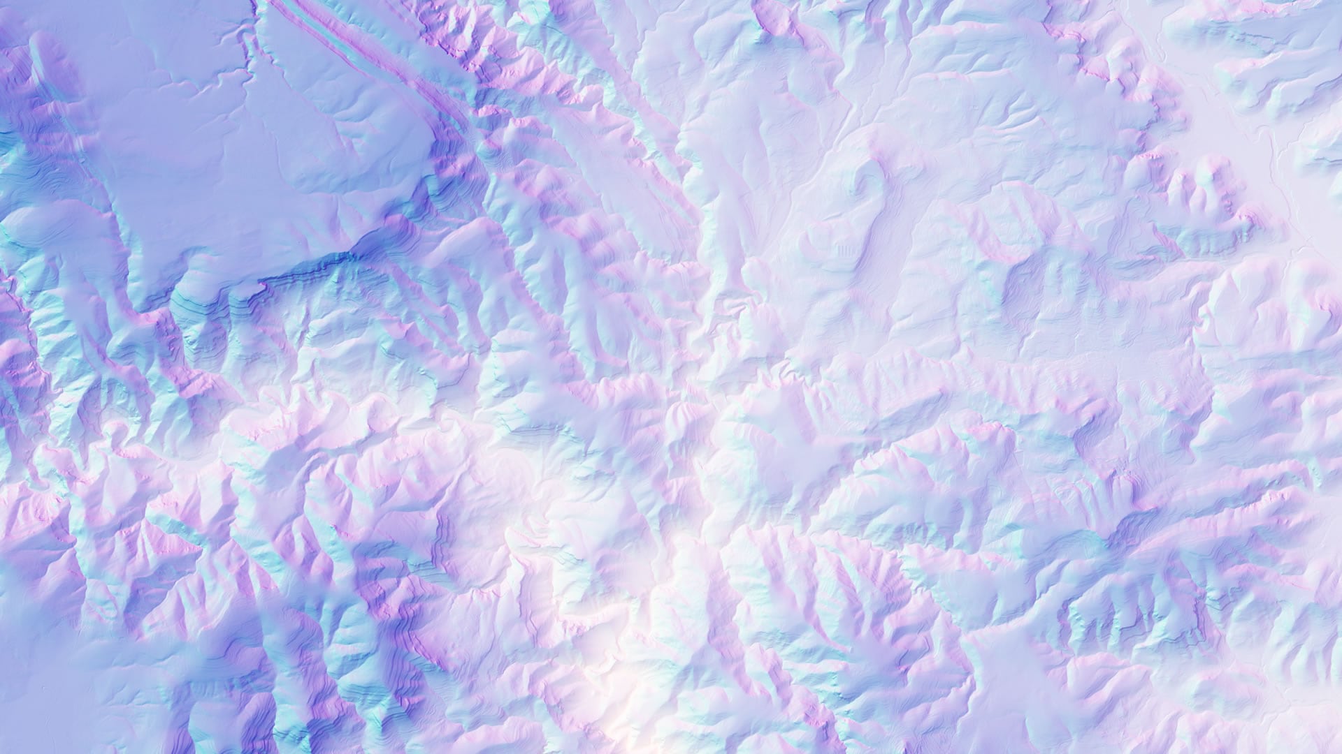
If this content looks familiar, it is a follow-up to a previous post. But the advent of blend modes have made the process so much faster and simpler, plus the addition of a how-to video, begged for a re-visit.
Happy shade-throwing! John

Article Discussion: