“There is no creation without tradition; the ‘new’ is an inflection on a preceding form: novelty is always a variation on the past.”
-Carlos Fuentes, Myself with Others, Farrar, 1988
More often than not I look to past work to inform my cartography. I find it both fulfilling to explore historical maps, and also to take cues from the vast body of great work that has gone before. Quite simply, there’s little point trying to reinvent maps. It’s mostly been done before, and so it’s just a question of finding it, and reinterpreting or reimplementing it in a contemporary way. For many, me included, that means developing modern digital twins to use in ArcGIS Pro to take my maps beyond the defaults.
This blog introduces new ArcGIS Pro styles that mimic the thematic maps of Émile Cheysson. Born in 1836, Cheysson was a French engineer who also published a series of graphical statistical albums for the French Ministry of Public Works. Inspired by another notable French engineer, Charles Minard, who had also produced notable works such as his famous Napoleon’s march flow map, Cheysson produced nearly 400 maps across eighteen “Album de Statistique Graphique” from 1879 to 1906. Here’s just a few extracts of Cheysson’s work:
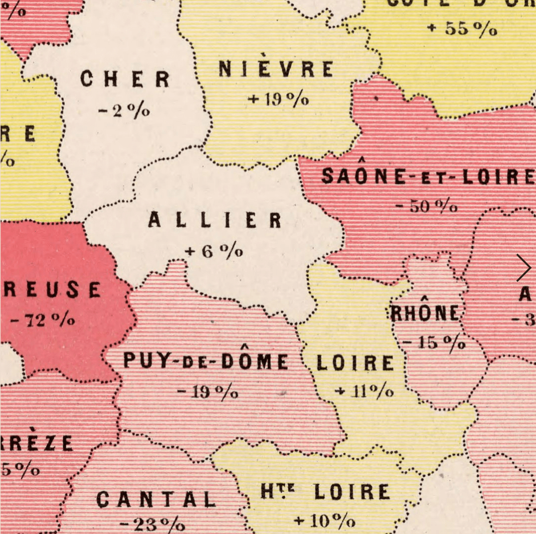
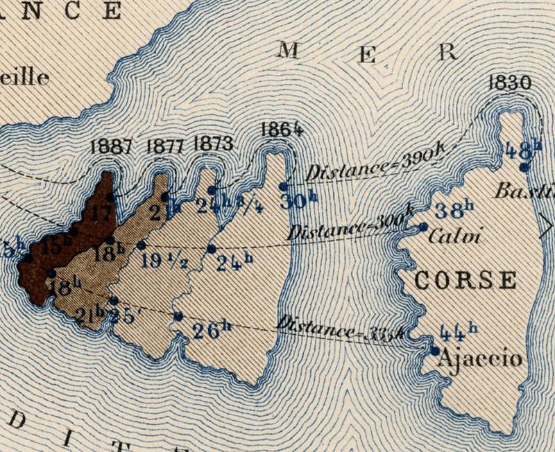
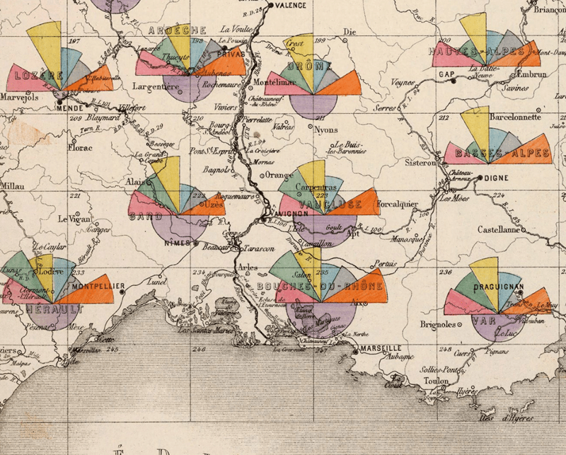
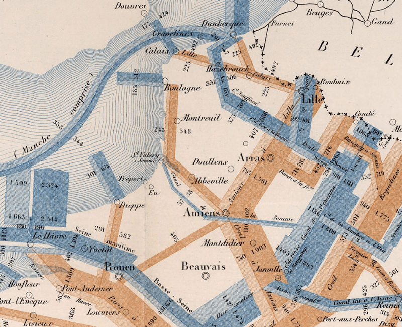
Honestly, I could pore over these maps for hours, and just re-post them all here for your visual delectation but there’s no need because the David Rumsey Map Collection has them all. Obviously not now because you’re keen on continuing reading this post, but some time, maybe not today, maybe not tomorrow, but soon and for the rest of your life you should check out the wealth and beauty of Cheysson’s work in Rumsey’s collection.
Howard Funkhouser noted the quality of Cheysson’s work in 1937:
“The Albums present the finest specimens of French graphic work in the century and considerable pride was taken in them by the French people, statisticians and laymen alike.”
-G. Funkhouser. Historical development of the graphical representation of statistical data, Osiris 3, 1937.
I’ve been an admirer of Cheysson’s work for a while but recently, data storyteller RJ Andrews reignited my interest by recreating a range of coloured and patterned palettes that mimicked 25 of Cheysson’s most iconic maps. Here’s the set that RJ curated:
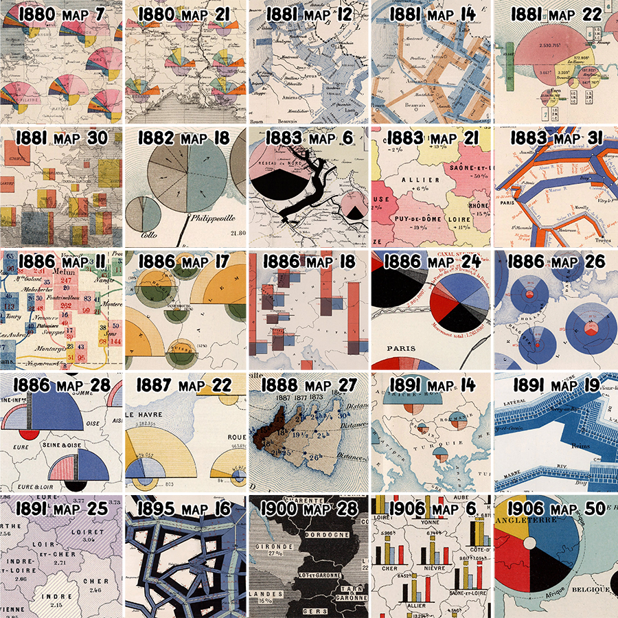
Tom Shanley at Observable also buillt on RJ’s work by replicating the palettes in Observable, and of course many others (e.g. Michael Friendly’s 2008 essay A Brief History of Visualization) have shone a light on the historical maps of Cheysson amongst other classic works. So I figured it was about time we had a Cheysson style for ArcGIS Pro. Let’s go!
You can skip the following description simply by clicking here to go to a download of the ArcGIS Pro style, an ArcGIS Pro project package that organizes them all and includes two maps demonstrating their use, as well as five new fonts that mimic the hand-drawn lettering Cheysson used on his maps, and a couple of posters that replicate two of Cheysson’s maps for your wall.
Or you can read on…
I’ve taken the same 25 maps that RJ Andrews selected and built 135 polygon fill symbols, and 69 colour symbols in a style called Cheysson Modern. These mimic the colours and patterns Cheysson used but with a modern aesthetic using white backgrounds and clean linework. They can be categorized as grouped, categorical, sequential, or diverging depending on Cheysson’s original use, and their primary purpose. Of course, they can be mixed and matched however you want.
Each symbol is named according to the year of the atlas in which it was used, followed by the map number in the order in which it appears, and then the order of the symbol itself. So, for instance, in the first set of symbols below they mimic map 7 from the 1880 atlas (here in the David Rumsey Map Collection). These naming conventions help to group symbols according to their original use.
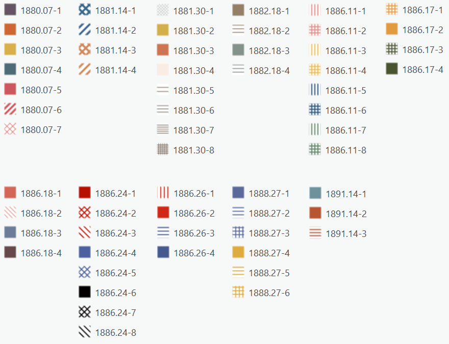
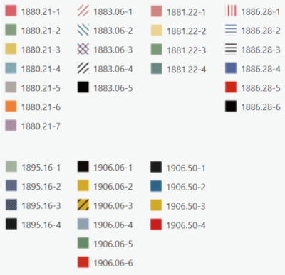
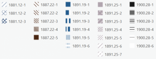
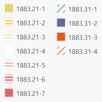
Either check the Cheysson quilt image above, or (to see the full maps) peruse the David Rumsey Map Collection to see the original maps upon which these styles have been based, and to see how Cheysson used them.
Once you’ve downloaded and unzipped the file you’ll see a number of files. First there’s the CheyssonModern.stylx which is described above. You can add this style to any ArcGIS Pro project by opening the Catalog view, then opening the Styles folder, right-click Add, then select Add Style. This adds the Cheysson Modern style to your project and all of the polygon symbols (and associated colour symbols) will now be available to you in the Gallery in the Symbology pane.
But wait. There’s some other files too. What’s Cheysson Antique (CheyssonAntique.stylx) you may ask?
Well, for many, a clean modern look is their map aesthetic of choice, while others may prefer to mimic the historical, hand drawn aesthetic a little more faithfully. So I took Cheysson Modern, and made an antique version of exactly the same symbols.
Here’s a comparison of the Modern and Antique version of one of the diverging schemes.
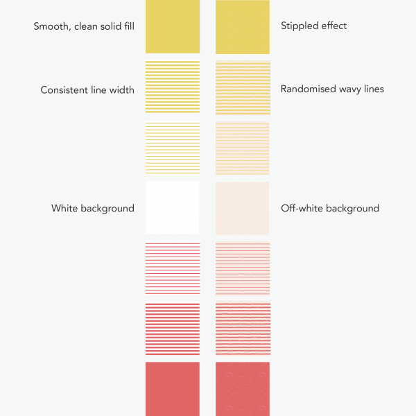
It’s subtle (like, REALLY subtle), but what I’m trying to achieve here is a slight degradation of the clean digital aesthetic, to something that looks a little more hand-drawn. This would be the opposite to Cheysson who was using hand-drawn techniques, yet trying to make them as consistent and uniform as possible. He did a superb job, so let’s try and make our symbols in Cheysson’s hand.
Starting with the Cheysson Modern version of the symbol, I simply used the Format Polygon Fill pane to make some modifications. For every symbol in the set I added a picture fill layer. The picture was a textured paper graphic which I had lying around (likely from some of John Nelson’s work, but don’t tell him, from which I made the background transparent and the small flecks of paper, or stipple I made white in Photoshop). In the Format Symbology pane I applied 50% transparency. It just adds a bit of texture to mimic the uneven look and feel of a piece of paper.
For the patterned fills, there’s a little more work involved to make the lines seem hand-drawn. Rather than a single line set at a consistent width and spacing I wanted some variation. I achieved that by modifying the line symbol to have three separate lines.
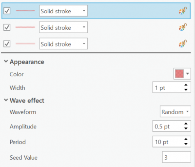
The bottom line symbol is slightly thicker and has a large amount of transparency. The lines become thinner and less transparent as you move up the stack. Each layer also has a wave geometric effect applied. The waveform is random to create well, a random rather than uniform wave variation. By setting a really small amplitude and a larger period the line has just the smallest of jitter, the sort of which is hard to avoid when drawing any straight lines by hand using a fine drawing pen that drags across the rough surface of paper. By changing the seed value of each line you can ensure the random variation applied to each line is offset along the length, adding a further way of making the line look organic.
Finally, each patterned fill symbol had a new background solid fill layer added with the off-white colour used to mimic the sort of look and feel of an old map.
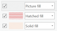
Rinse and repeat for all the symbols in the style and it turns Cheysson Modern into Cheysson Antique. Of course, you could have done this, and the important thing to note is you don’t have to like my version. You can take what I have done and tweak it to your own mind’s eye. Maybe you want more variation in the line symbols in the hatched fill – just change the amplitude of the wave effects. Maybe you want a coarser stipple effect – just change the size of the picture symbol already baked into the symbol, change its transparency, or replace it with your own picture.
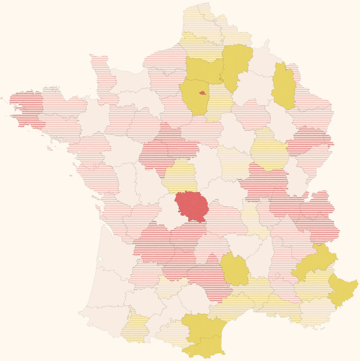
And when all this Cheysson magic is put together we can symbolize a map to make it look like Émile Cheysson himself had a hand in it.
But wait, I hear you. I hear the critics bemoaning the lack of Cheysson’s beautiful hand drawn lettering to set off the style. Maps need labels right? So I’ve built 5 fonts based on sampling his original maps, and created digital twins so that we too can add labels in the style of Cheysson.
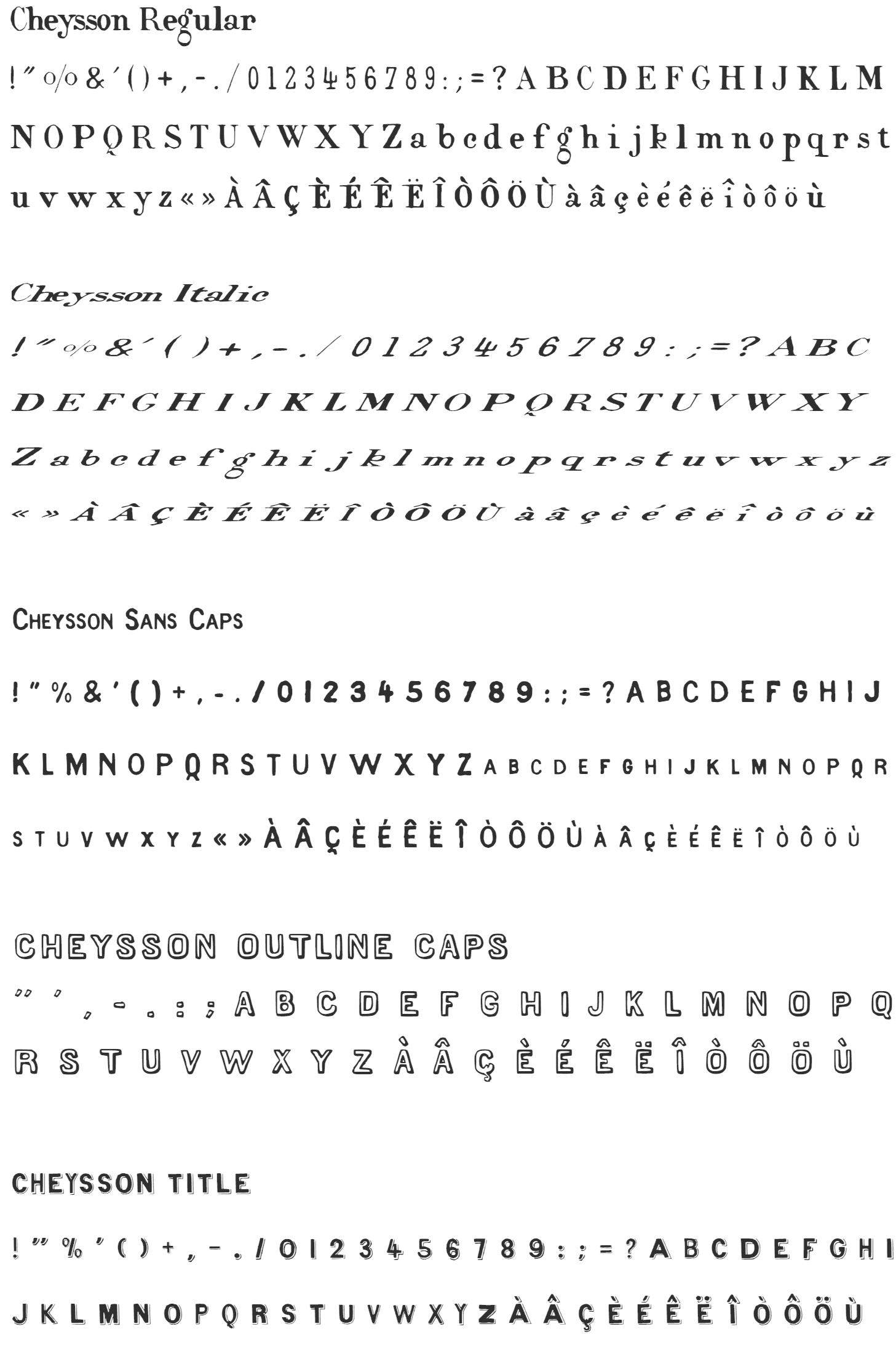
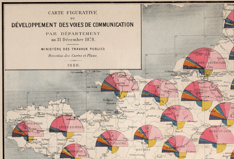
The following extract from the 1878 Album de Statistique Graphique illustrates how Cheysson lettered the maps. Place names were given different treatments based on their relative importance or size with Cheysson Regular, Italic, and Sans Caps providing the digital twins. In other maps, Cheysson Sans Caps was the predominant form of lettering across the map. Cheysson Title was reserved for the title blocks to give prominence to the map’s theme and as was the style of the time, other lettering forms were added to create more ornate title blocks.
The fonts are included in the download. To use them you will have to install them on your computer. Once installed, they will show up in any of your applications in the list of fonts available for use, including ArcGIS Pro.
Finally, the download includes an ArcGIS Pro project package called CheyssonStyle.ppkx. Once unpackaged, open the project. The style is already added, the fonts will be referenced, and there’s two maps of an 1883 choropleth and an 1880 polar area chart covered map, with layouts that recreate the atlas pages to give you an example of how the styles and fonts can be used. Remember, you must install the fonts BEFORE you open the project package. If you don’t install the fonts then the maps won’t really look very Cheysson.
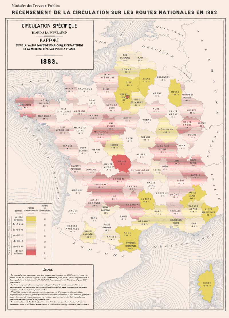
Here’s my version of Map 7 from Cheysson’s 1883 atlas:
And here’s my second effort replicating his combination of polar area charts atop a basemap:
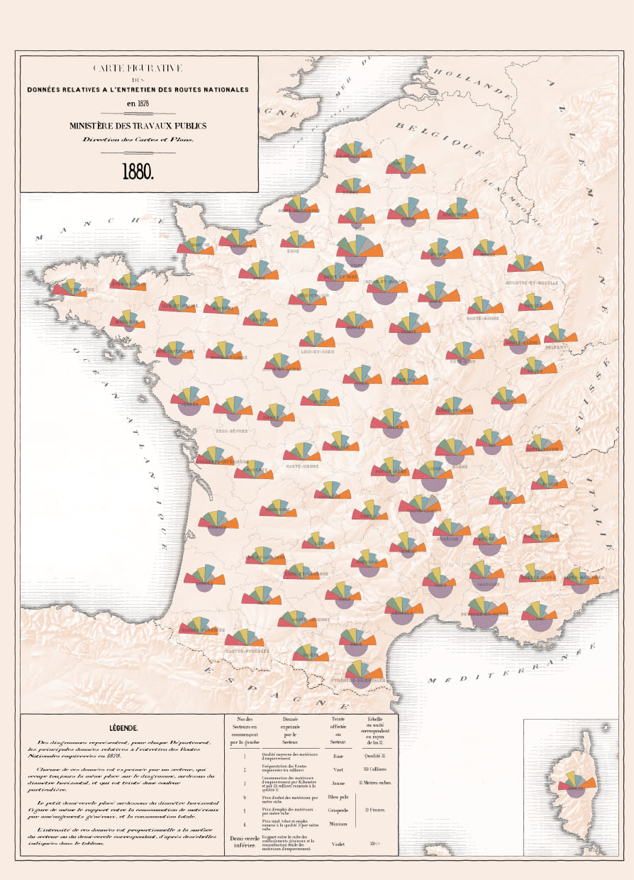
And before you whizz off to weave your own Cheysson magic, a quick word on some of the design elements in these maps. Cheysson was a master at melding graphs, charts and plots within the map. As multivariate symbols, putting graphical content on top of your map provides a rich way of encoding a lot of information onto a single page. There are many options for you in the ArcGIS Pro Chart Symbology renderer but you can also represent data using any 2D symbol. These could be styled as you want (including using the Cheysson styles), and positioned or sized as you want. By using offsets you can easily build some of the more creative examples of Cheysson’s thematic mapping. Maybe we’ll dig into that in a future blog a little more.
For the 1880 map above I used the coxcomb tool which creates polar area charts for point based features. You can read about the coxcomb tool and download it here. It’s a great way of showing not only categorical data, but also proportions thereof.
The 1880 digital twin uses a coastal rake effect to delineate water from land. I had originally used the Multiple Ring Buffer to generate banded polygons around the land which are then filled with hatched symbols. My good friend and colleague John Nelson then offered an alternative approach using offset and donut (doughnut to me) symbol effects instead, and I preferred the result so check out John’s own blog on his coastal rake technique.
There’s also a hillshade on the 1880 map. I could have used the Esri world hillshade layer. In fact, I did at first but it looked just a little too clean, detailed, and modern for the late 19th century aesthetic. But this is where you can get a bit inventive. Tom Patterson’s Shaded Relief web site provides a treasure trove of resources. I discovered this wonderful hand drawn Southwest Europe shaded relief image. Credited as being produced by the CIA, its date is unknown but likely the mid to late 1900s.
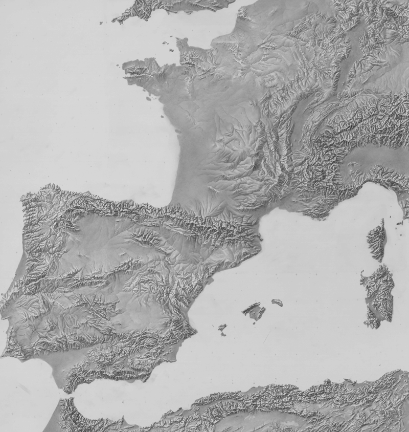
It’s perfect for small scale regional mapping. I positioned it atop the land layers and used an overlay blending mode visual effect to add the subtle hillshade into the mix. Side note – if you aren’t aware of Tom Patterson’s work you need to delve deep into his back catalogue. It’s a rich seam of some of the most well-crafted cartography you could hope to see.
The 1883 digital twin is really just a choropleth with Cheysson inspired fills but the waterlining technique offers an alternative way of delineating land from water (foreground from background). I used the Multiple Ring Buffer tool to generate polygons at increasing increments of distance. Then simply use a stylized stroke layer for the linework and set the polygon fill to transparent. Et voilà.
I made these maps to mimic Cheysson’s paper-based atlases. There’s nothing stopping them being used in designs that are intended to be published as web maps and apps.
Please wreak havoc with this style. Use it as a starting point for your own experiments in late 19th century cartographic mastery. And if you do, give a nod to Monsieur Cheysson for his craft and artistry, and for giving us a foundation to re-make his styles for our contemporary technologies. Oh, and share your experiments using this Cheysson Style. It’d be great to see what you come up with, possibly by sharing with me on Twitter @kennethfield.
Finally, some shout-outs. Without RJ Andrews going to the efforts of recreating some of Cheysson’s palettes I likely wouldn’t have. I’ve also leant on colleagues Edie Punt, and John Nelson while preparing this work. Edie’s our symbols and styles guru and what she doesn’t know about symbols and styles isn’t worth knowing. John – well, ‘Mr Firefly’ is his own force of nature. Thanks for all the help, advice, and critique. It always helps.
Remember, all the files you need to replicate the style of Émile Cheysson in ArcGIS Pro are here.
Happy Cheysson styled mapping!


Commenting is not enabled for this article.