Recently I put together a set of POI symbols (pictograms) for use on a ski resort map. Some I designed myself, some I got from The Noun Project (a great resource for map icons). Here’s a few of them, designed as a set of side-on views which give a sense of familiarity. The art in making meaningful pictograms is to ensure they are as universally understood, and with minimal interpretation effort as possible. Designing them as a consistent set is also important for the map’s overall appearance.

And that should have been the end of the story. Except I was then told that some of the pictograms needed to have directionality built in, and some might even be animated so they move across the map in the direction of travel. Take the snowboarder pictogram above and it’s clear they are pointing left which is no real problem unless part of the pictogram’s purpose is to show direction. If direction is simply left or right then mirroring the pictograms is easy. But what if you need a way of showing direction around a full 360 degrees? You end up with a snowboarder at all angles, none of which really identify a particular direction. The pictogram doesn’t make sense. In fact none of the pictograms make sense.

To be fair I have seen skiers and snowboarders in these positions albeit almost always not intentionally. But I digress. Back to the pictogram design to support the mapping need. I set about redesigning the pictograms to give them a top-down view, meaning that they could be rotated to point in the direction of travel. Here’s the redesigned set.

But despite my best efforts these pictograms are ambiguous. It’s not immediately obvious what they represent because we see people and vehicles in aspect in real life, and not in plan view from above (normally). So what to do?
The answer is actually quite simple. You retain the original, easy to understand pictograms, but add a component that indicates direction. You could design this a number of ways but I settled on giving the pictograms a circular background with a small arrowhead. The background indicates direction, the foreground indicates the feature.

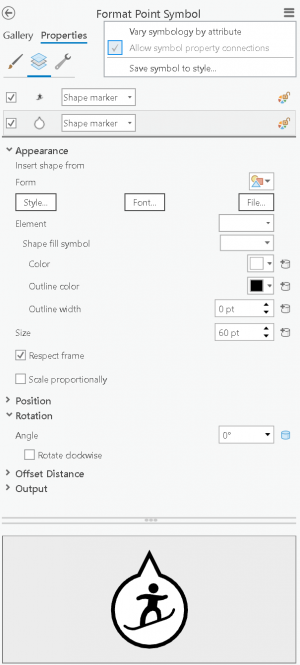
And this is simple to create in ArcGIS Pro by having two shape marker symbol layers stacked on top of one another. The pictogram symbol layer is positioned atop, and always remains constant. The background symbol layer can be rotated independently, and with symbology property connections allowed you can point the rotation parameter to an attribute in the feature’s attribute table to define its rotation angle. Simple solution!

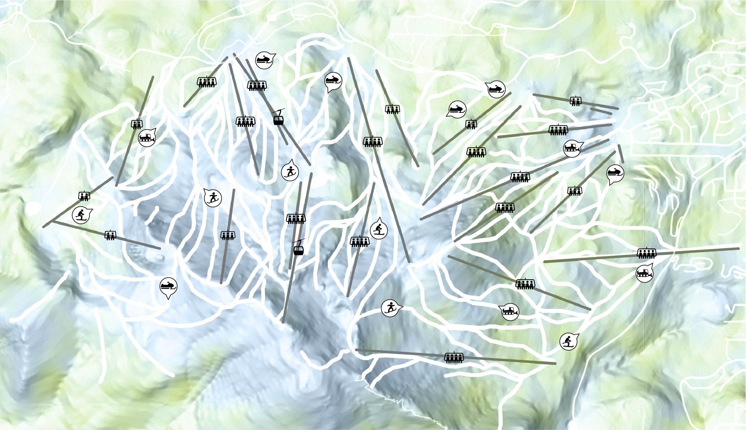
And here’s what the symbols might look like on a portion of a map of Mammoth Mountain, with a suitable snowy basemap from that wizard of textured terrain, John Nelson. Click the image to see it at the intended size (i.e. so you can see the symbols!).

Of course there’s so much more you could do to the symbols such as inverting the black and white colours, or changing the colour of the background directional fill and stroke colours perhaps to differentiate between pictograms of the same shape, but which somehow differ, or they could be resized, to show an additional empirical variable.
Happy Mapping!

Commenting is not enabled for this article.