When symbolizing a point feature layer in ArcMap, you have the option to use “Quantity by category” symbology. This multivariate symbology option is a combination of unique values and graduated symbology – for each unique value present in the field (typically a text field), you can display its symbol with a range of colors or sizes using a numeric field.
Starting with ArcGIS Pro 3.3, you can replicate Quantity by Category symbology by classifying a Size or Color visual variable. The process achieves the same result as those in ArcMap, but it has been integrated with already present symbology options – Color and Size act as the variation by “Color Ramp” or “Symbol Size” options from ArcMap. To achieve this, a point feature layer must have Unique Values symbology as its primary symbology. Follow this link if you need help setting that up.
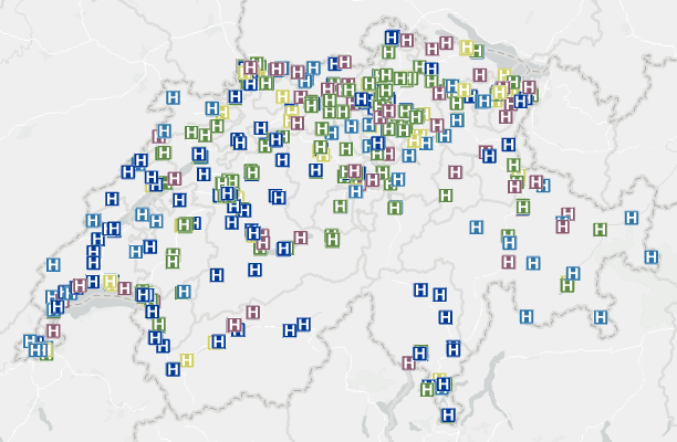
Classifying your size or color variable gives you more control over the variable’s settings for a specified range of values. For example, you can symbolize the estimated number of customers per day at various fast food restaurant chains: you use Unique Values to symbolize the different chains of restaurants, and classify a size variable to show customer volume at each location.
To get started with Quantity By Category symbology in ArcGIS Pro, open the Symbology pane, and navigate to the Vary symbology by attribute tab. This tab contains a list of visual variables that can be applied to your existing symbology to create a multivariate map. Expand either the Color or Size sections (or both!)
(Tip: if you do not see the Color or Size options, or if you see Outline width as an option instead, ensure that you are using a point feature layer symbolized with unique values.)
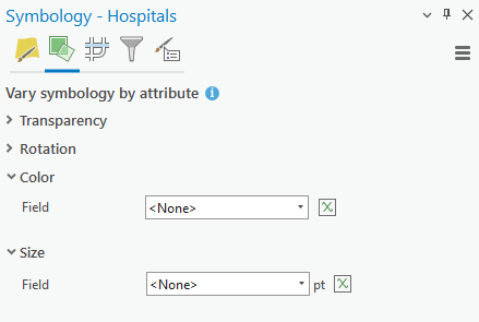
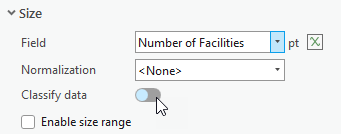
With the Color or Size variables expanded, choose a numerical field from your layer. For demonstrative purposes, I chose Size since it’s easier to discern. After the field is chosen, click the Classify data switch to turn it on.
From here, you can modify the symbology as though it’s comprised of graduated classes. You can employ a minimum and maximum size, choose a classification method, and set the number of classes. You can also change each class’ label, and these changes are reflected in the layer’s legend.
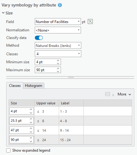
Lastly, underneath the table of classes, you can click Show expanded legend, which will segment your legend into groups and display the Size or Color classes for each unique value. This is a great option for enhancing your legend if the number of unique values is small, but the total number of features is large, but it can complicate discerning what the layer’s symbology shows, so use this option carefully.
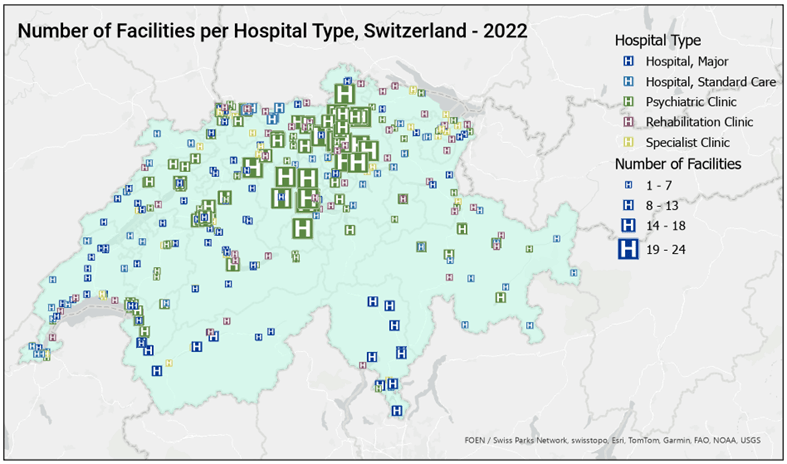
We hope you find this functionality useful when symbolizing your data in ArcGIS Pro. Please let us know if you have any questions, ideas, or concerns by visiting the ArcGIS Pro’s Esri Community forum and leaving a comment.
Data courtesy of Esri Suisse Content Team and The Living Atlas.

Article Discussion: