I can almost hear the seagulls and the squeak of a screen door slapping shut. Some time ago I made a map of the Great Lakes in the style of the little paper craft maps I’d see in the gift shops of every beach community. And I described the arduous process of creating it for yourself. But why do hard things when you can do the same thing easily?
Here is a style for ArcGIS Pro that lets you turn any old stack of polygons into craftily cut and meticulously stacked tourist maps. You will download it and add it to your project. It contains one and only one symbol. A papery shadowy polygon that you can color however you like.
Examples
Here is the obligatory map of Crater Lake’s Wizard Island. All papery and stuff.
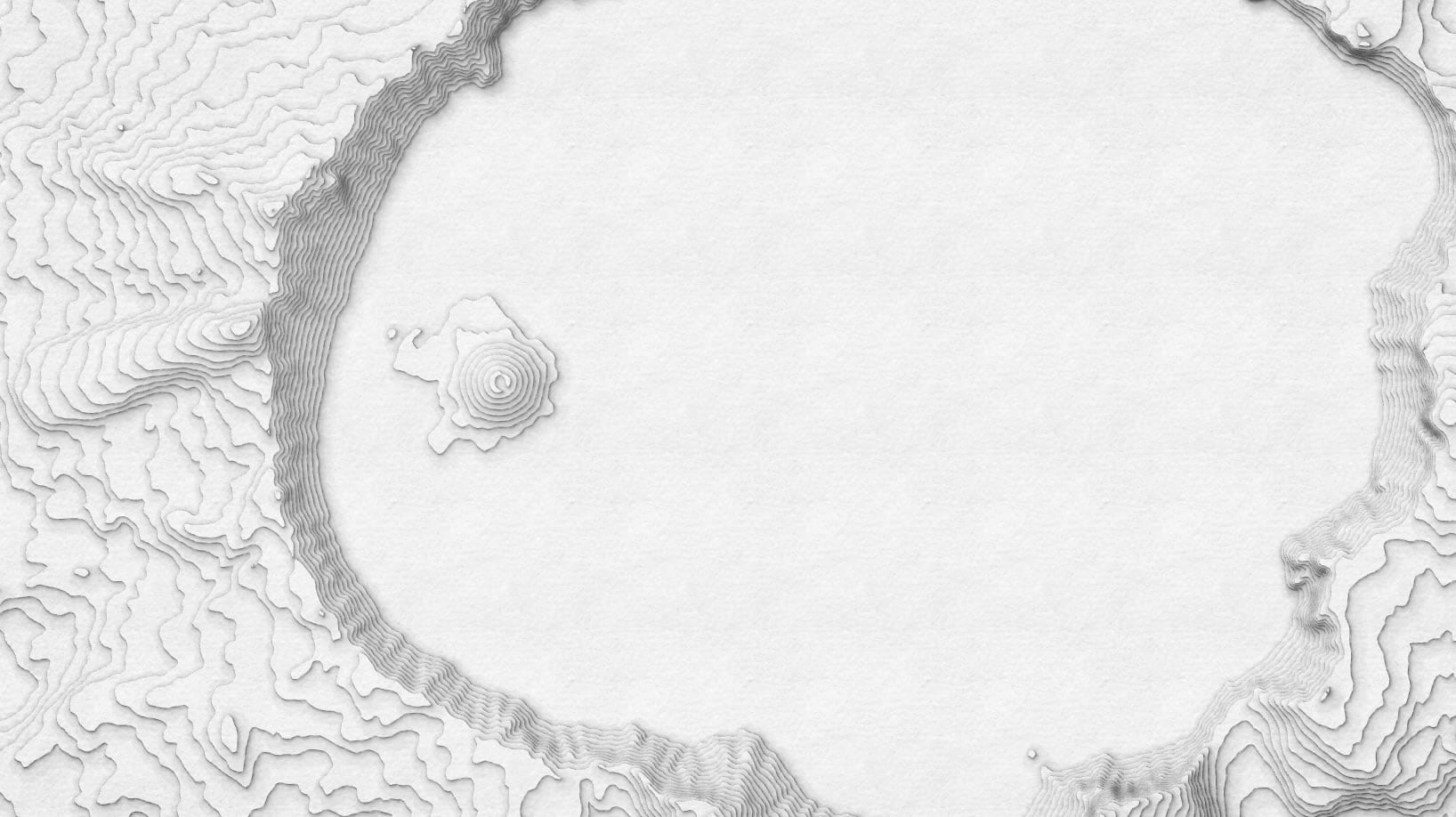
But if you choose to “format all symbols” (in the little “More” dropdown of the symbology panel) as PaperCut (look in the gallery), you can start assembling paper cut maps with colors and gradients. Like this grayscale paper cut map of Mt. Hood.
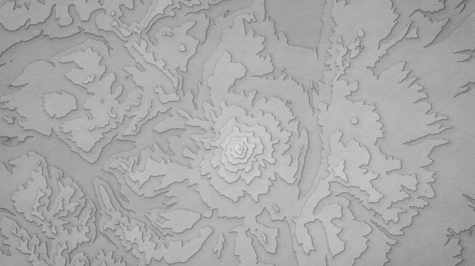
But of course you aren’t stuck with grayscale. Here is nearby Mt. St. Helens in a commonly-seen blue color scheme of these sorts of maps.
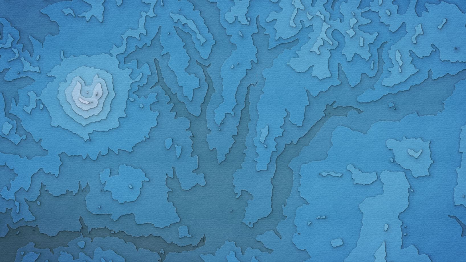
Or this smart green arrangement of lovely Northern Michigan.
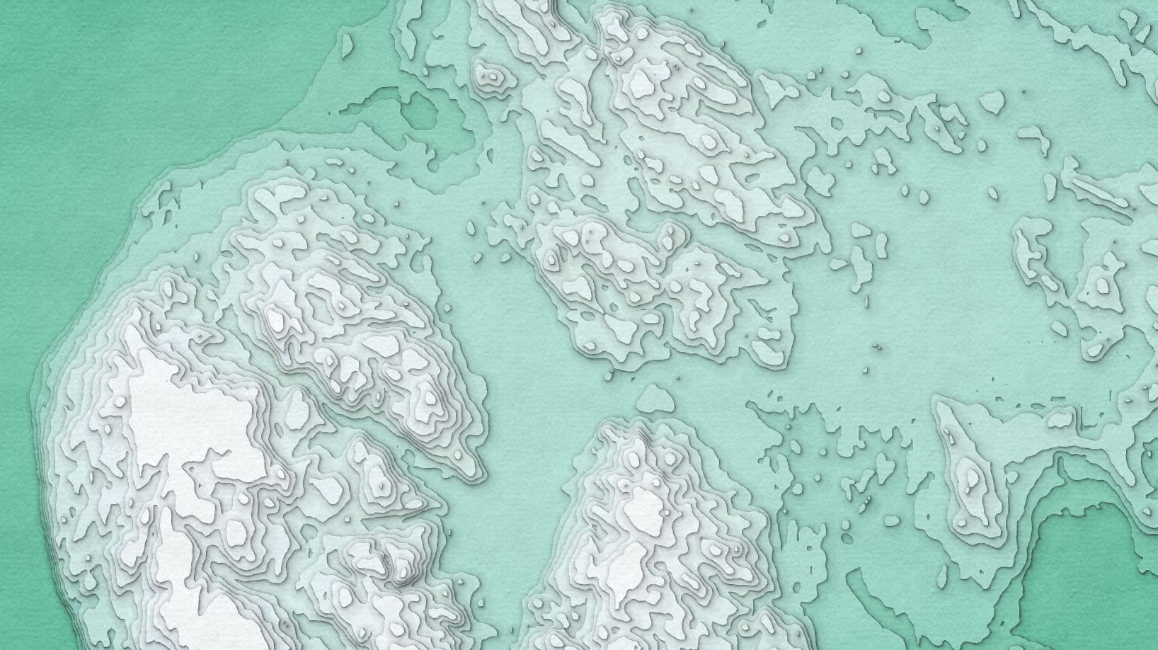
So much monochrome, though. What if we punched these up a bit with some hue? Here’s the eastern peak of trusty old Crater Lake.
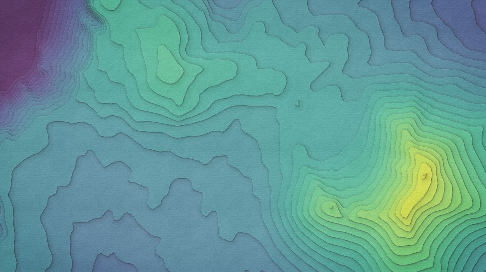
And here is the Grand Canyon appropriately turned up to 11.
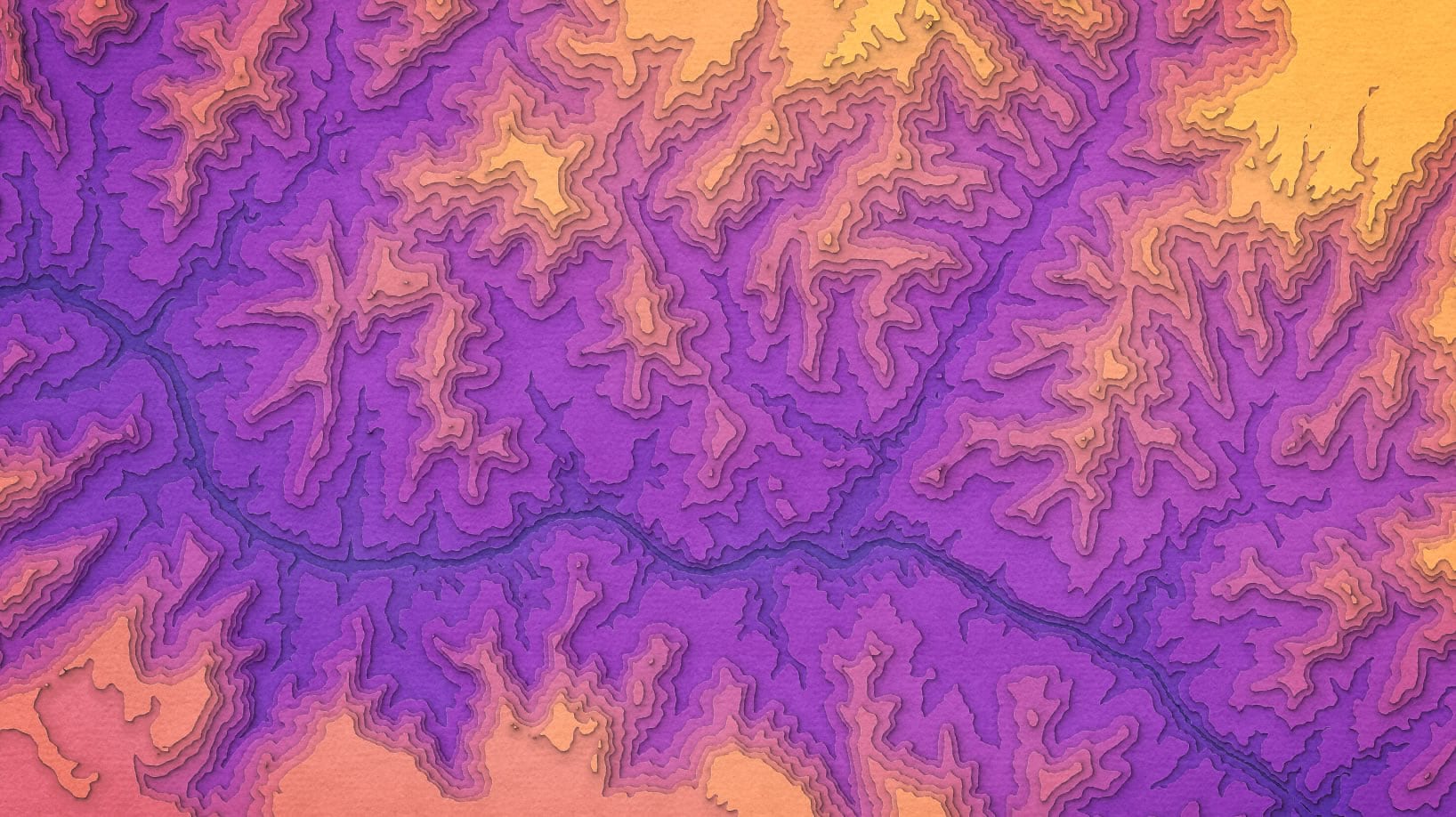
It’s easy! So give it a whirl and start making your own paper cut maps. If you are looking for some topographic or bathymetric contour polygons to try this on, and you have a DEM to work with, you can create them in Pro using the Contour function (smoothed and filled vectors). Another option, if you don’t have access to a DEM of your area of interest, is the Axis Maps contour generator, which creates contour polygons in the browser.
But you can use the paper cut style for all sorts of unforeseen adventures, not just elevation contour polygons. And I hope you share some encouraging snapshots of your creations!
Here’s that link again to the Paper Cut style. And if you’d like to frame your paper cut map, then plop this image into your layout.
Happy Paper Cutting! John

Commenting is not enabled for this article.