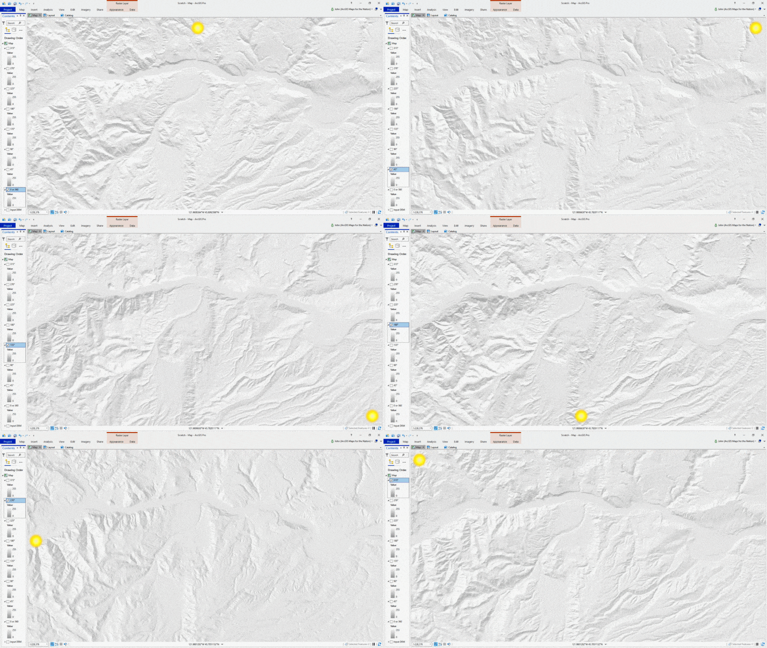
There are loads of hillshade algorithms out there, but the two off-the-shelf options that do the real heavy-lifting for we GIS/Map nerds are “traditional” and “multidirectional.”
Here is a teaser animation to give you a sense of the sort of the topographic thrill-ride you are about to embark upon:

I’ll deconstruct what they are, in my small chilly shed with poor video quality (don’t mind though; I’m best viewed with a strong blur)…
Part 1
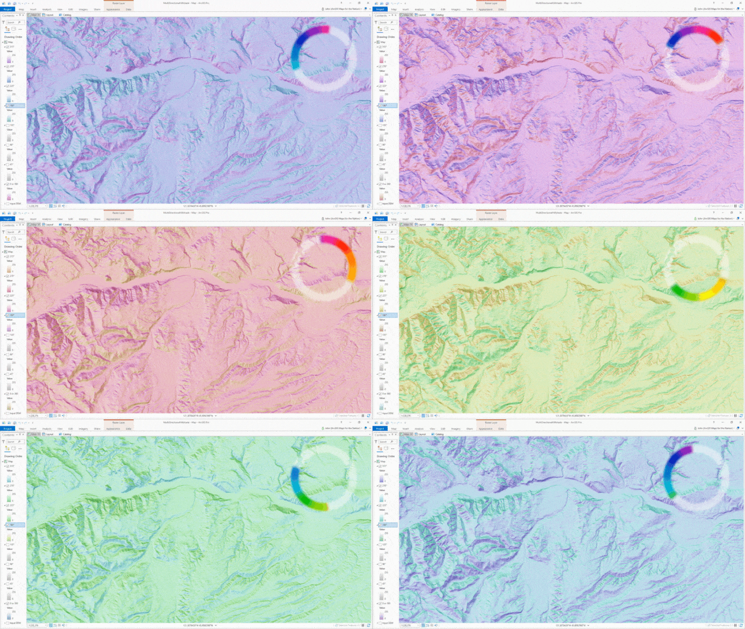
But what happens when you dig into the individual light sources and apply a range of hues? Some sort of ecstatic multichromatic adventure, that’s what.
Part 2

Please, join me for part two. And share in my embarrassment at discovering well-too-late that a Snap filter was active for the video bits. Learn from my mistakes. If a colleague recommends you install Snap filters for your web meetings so you can look like a talking potato and stuff, just don’t do it. Do NOT let my artificially-piercing irises and baby-smooth skin distract you from the hard science of stacking multiple hues for additional topographic communication.
Here is a more detailed walk-through on the multi-colored bit, if you are curious. It’s a lot of fun. And useful. I was told once, by a cartographer who made maps for special forces teams, that including a color channel to communicate aspect is really appreciated by people who rely on maps to navigate rough terrain.
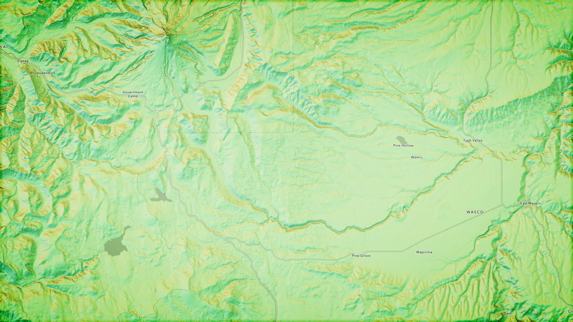
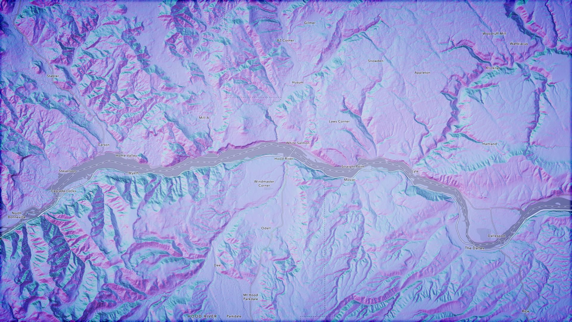
Here are a couple of examples…


Happy multidirectional multi-colored hillshading! John

Article Discussion: