Sometimes a basic solid color for your map’s labels and text just isn’t going to cut it. Here is an ArcGIS Pro style with an assortment of light and dark gradient fills and shadow/glow effects that you can apply to map text via the “Text fill symbol” picker in your label pane. Level up those labels! Make them look touchable. Glassy. Shady. Intriguing.
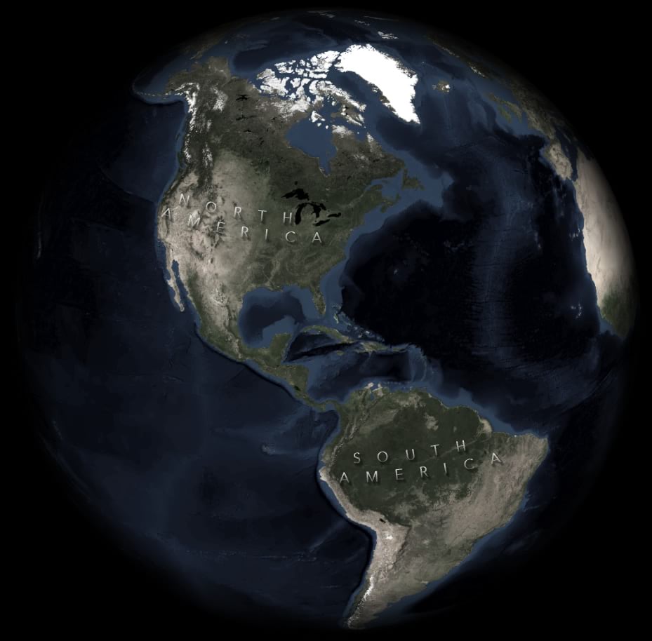
How To
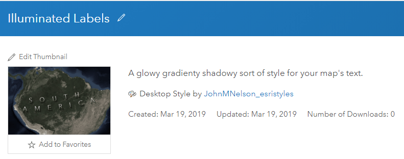
1. Download the IlluminatedLabels.stylx file here. There’s an assortment of options (light/dark, shadows offset to left/middle/right, and no offset, stuff like that).
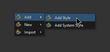
2. In your ArcGIS Pro project’s Catalog (view > catalog), open up the “styles” folder and right-click, then add the IlluminatedLabels.stylx file you downloaded.
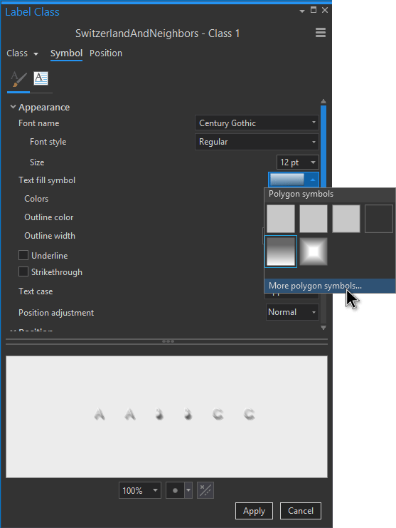
3. Then, for any text, including labels, go to the text fill symbol dropdown and choose “more polygon symbols”. Because fonts are just polygons. Polygons that ushered in an immortal communications mechanism giving rise to society itself!
4. Go bananas.
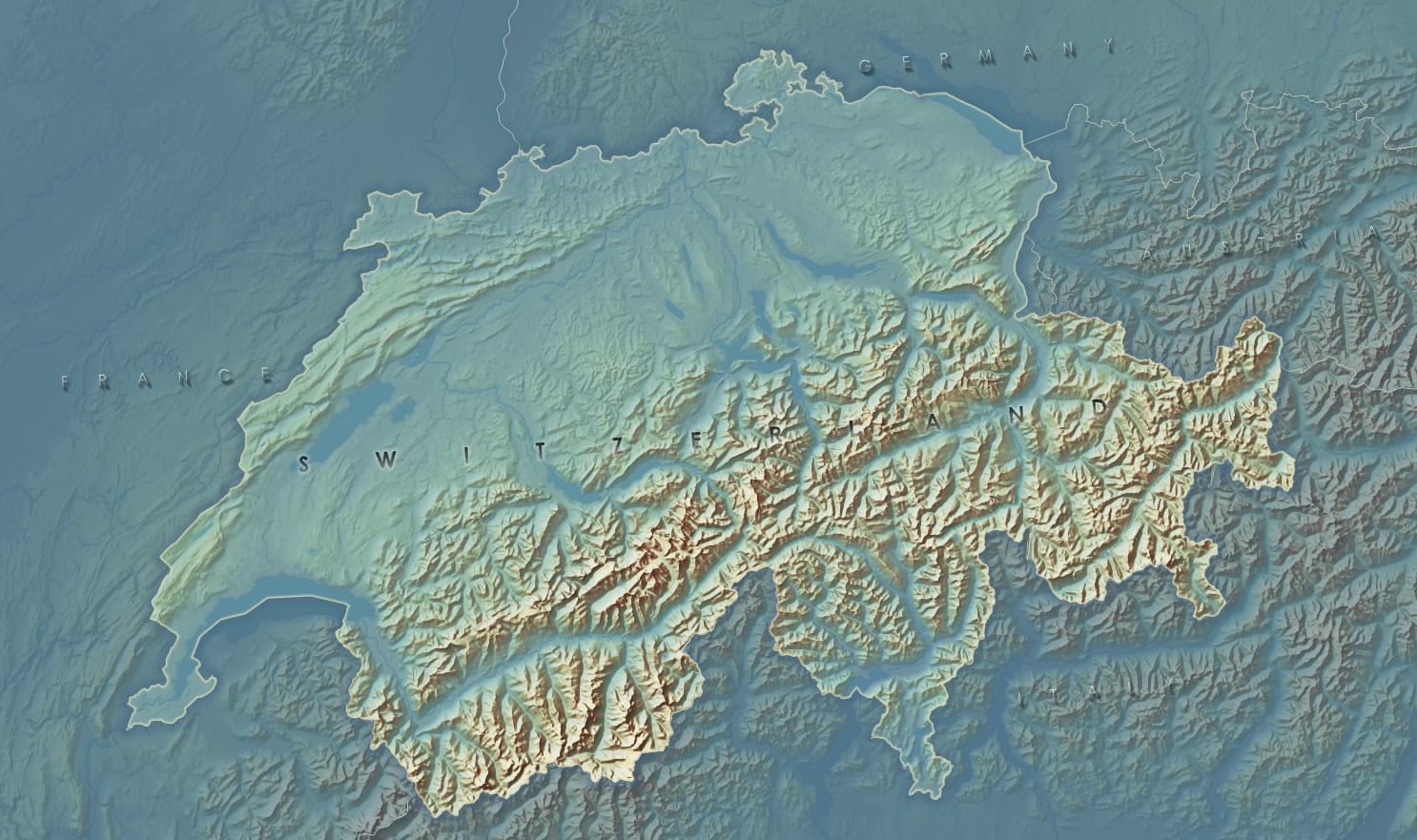
Depending on the context, they have be a pretty subtle presence. I find that sometimes labels do a bit more shouting than they need. Maybe you want a map’s terrain to have a visual prominence, like in this example of Switzerland, and the labels only seem to appear on closer inspection.
Also, you can change the color gradient of the text itself (but not the shadow, that’s why I made light and dark shadow versions). In this example, I have tweaked the semi-transparent white gradient to match the ochre and aqua hues of the map.
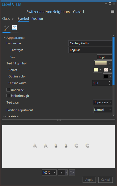
Which looks like this…

Heads up, though. I have noticed that the polygon geometry of some fonts can occasionally cause little hiccups in how they render, like filling the hole of an “e” for example. So if you get a glitchy letter, try adjusting the font size or jump to another font. Overall, the larger the font size the less likely these glitches are. So I recommend using this style for map titles or relatively sparse large-feature labels.
Also, if you are feeling ambitious, you can always crack open the symbols in a style (catalog > styles > choose a style > choose a symbol > properties) and make whatever changes you want. It’s pretty fun.
Anyway, have at it. Maybe it will help you get just the look you need for a project. Or maybe it’s just a cool alternative to play around with.
Happy Mapping! John

Commenting is not enabled for this article.