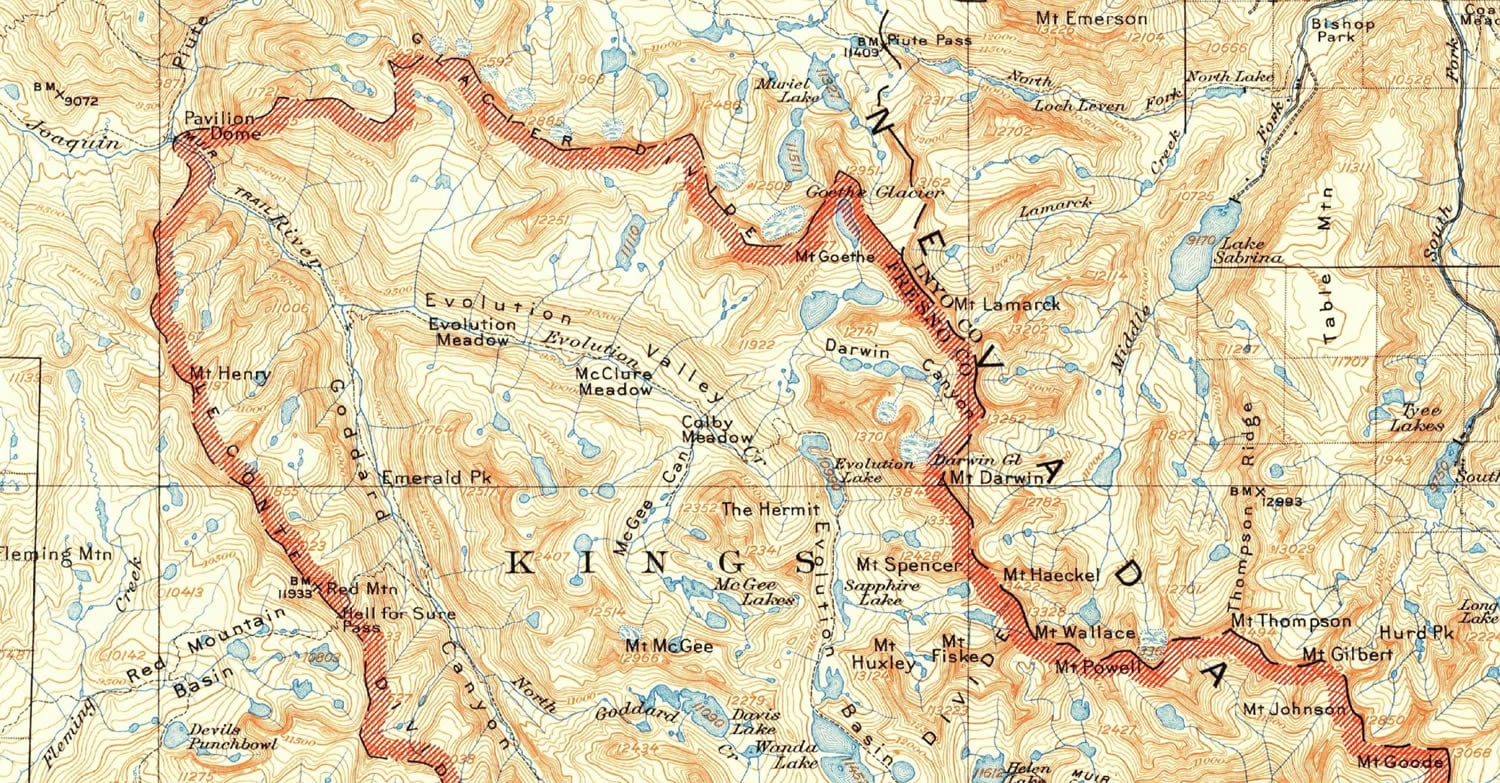
Yesterday in Sarah Bell’s blog post sharing her new custom font, I really liked one of the maps she provided as an inspiration. A USGS topo quad for Mt. Goddard, CA, which included a bit of King’s Canyon National Park. It inspired me too, but what caught my eye was the handsome red hatched area of interest ribbon surrounding the park.
Aside: curious what you call these. Allen Carroll, who was the chief cartographer at National Geographic, told me he always called the colored inner band within a polygon’s perimeter a “ribbon.” Good enough for me.
I wanted to take a closer look at the map so I searched the ArcGIS Living Atlas of the World for the USGS Historic Topographic Map Explorer. After a bit of hunting and pecking around King’s Canyon I found the 1912 topo map in question.
Here’s a close-up of the ribbon that got my attention…

This is what I notice about the area of interest symbol…
- 45° vibrant red hatching
- Inward-facing along perimeter
- Perimeter line is heavy black stroke with a long-dash/medium gap/dot pattern
Totally doable in ArcGIS Pro. So I opened a project and pulled in some National Park polygons. Here’s the process of finding the source map, fetching parks form the Living Atlas, and styling in the same way as the 1912 map…
There you go! Here’s a re-cap…
Accidental lessons:
- Cool new retro font
- Amazing tool for exploring vintage USGS topo maps
- Pulling data from the Living Atlas into Pro
- Using Definition Queries to filter data
Direct lessons:
- Applying a hatched fill pattern
- Using the “Donut” symbol effect to turn a fill into a perimeter ribbon
- Creating a custom dash pattern
Happy Mapping! John

Article Discussion: