The other day on LinkedIn I saw this handsome graphic featuring a charming little globe. I really liked it…
And this one…
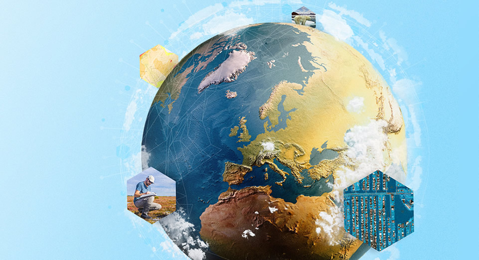
I have laser beam radar eyeballs for globe and map stock art—it is everywhere, especially in this industry. And the secret society of map/globe-producing stock art oligarchs are laughing their way to the bank.
But what if the campaign had a Western Hemisphere focus, or wanted to feature Asia, or the designer preferred a more dramatic angle? Stuck. So I reached out to Dan Gill, an outstanding designer (and wonderful human) here at Esri, and asked him if he’d be interested in an interactive, posable, cousin of this stock art from which he could derive any number of custom graphics. Dan responded with the old school that’s awesome meme and the note, “We can always make use of a sweet globe my friend!”
You know the old saying, ‘Give a designer a stock art globe, they design for a day; give a designer a fully posable globe, they design for a lifetime.’
We map nerds have the capacity to disrupt this world of geography stock art and provide to our graphic designer friends all manner of map/globe graphics. Alternatively, you can become a map/globe-producing stock art oligarch. I would be proud of you either way.
Here is one way to build a living breathing honest to goodness GIS globe thing that you can use as a source for untold millions of stock art globe extracts…
0:00 Just some redundant introductions.
0:12 The reference globe gives Richard Edes Harrison vibes. Check that link to get lost in some fascinating work.
0:23 Tantalizing preview of the result.
0:43 Pepper the Office Dog makes a brief appearance.
0:48 Here’s the CliffsNotes version. If you are feeling dangerous, this 42-second summary might be all you need to get racing.
1:37 Adding Tom Patterson’s glorious “Natural Earth” landcover graphic as our base. This globe owes much to Tom Patterson.
2:18 Tweaking the gamma values of the red, green, and blue color channels individually.
2:54 Converting the 2D map to 3D…with an obnoxious impression of the gravelly-voiced movie trailer guy.
3:06 Boosting the vertical exaggeration to 25X! Pow!
3:26 Adding Tom Patterson’s Prisma shaded relief for that just-right chunky painterly hillshade. Playing with the color scheme and an Overlay blend mode.
4:57 Yet another Tom Patterson hillshade layer. This one is his Manual shaded relief. More color scheme shenanigans and an Overlay blend mode.
5:46 Adding in my favorite map layer of all time, Global Background (find it in Living Atlas or get the shapefile here), to use as a global shadow hack.
7:50 Another copy of that global shadow layer. Chef’s kiss.
7:58 How to tweak the colors of the oceans and land separately? Why with separate ocean and land polygon layers that we tint individually of course.
10:20 Giving this globe a bit of papery texture with some nice subtle tactile paper textures from Living Atlas.
12:00 Dropping this globe doodad into a layout. Here’s a trick for approximating pixel dimensions in a layout that only wants to hear about physical units.
14:18 Giving the background a pleasant blue gradient by drawing a rectangle and dragging it beneath the map frame.
16:18 Duplicating that background rectangle and re-purposing it for a garish overhead lighting effect.
18:32 Luscius examples of stock art extracts from this globe.
…
Here are some sample exports for your graphic design pals…
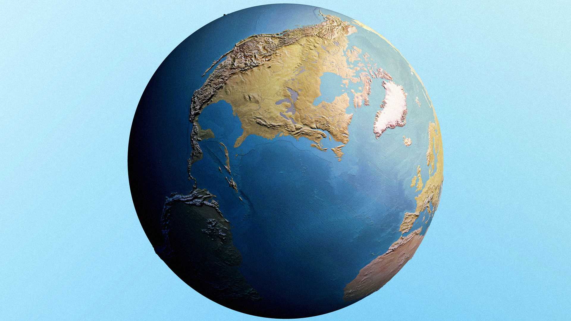
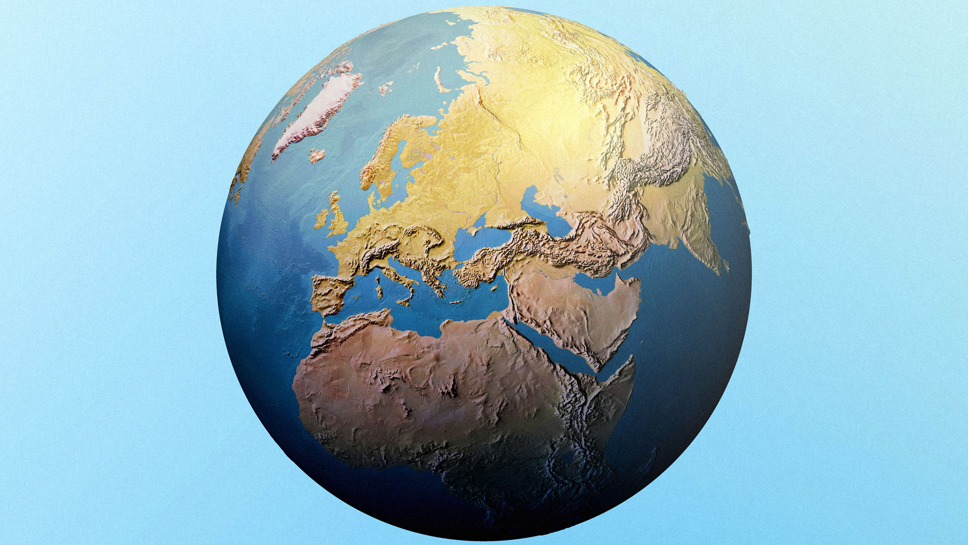
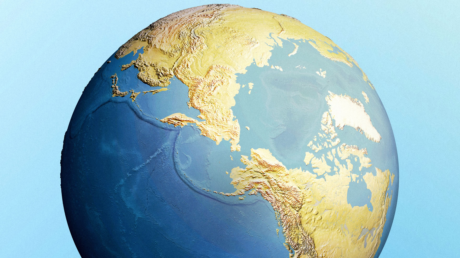
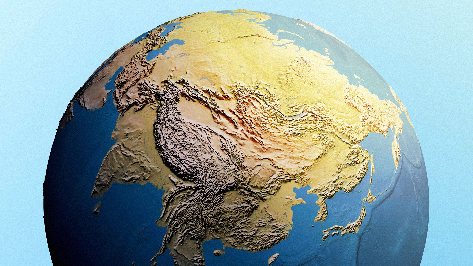
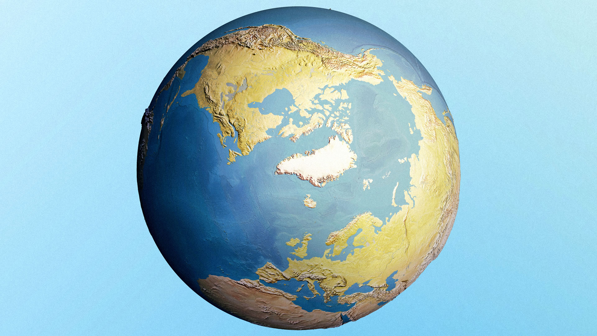
Pro (wink) tip: if you want a Southern-Hemisphere-specific view, then invert the color schemes of the land and water polygons and the global gradients. Then you can flip this thing over and get right back to exporting.

I use to use world from Space as a globe projection but with arcGIS Online I don’t see how to make a globe any longer. Any suggestions would be welcome