Welcome, map friends, to part 2 of guest blogger and production cartographer Spyridon Staridas‘s brilliant hack to make your map look like an actual for-realz folded thing! When I say map friends, I mean it. I know Spyridon only virtually, through his sharing of work and workflows. And I’ve benefitted much from it. He’s an example of the generosity and collaborative spirit I see in our wonderful field. Thank you, Spyridon!
In part 1, Spyridon showed us how to add a grid to our ArcGIS Pro layout and symbolize it to give it a handsome sense of tactile reality. Here in part 2 Spyron doubles-down with 50% more dimension! Είστε έτοιμοι να διπλώσετε μερικούς χάρτες;

…
What first inspired me to start researching all this was the need to photoshoot my maps for the portfolio section of my new website (which is under the “coming soon” state for a very long time, but this is another story).
At first, I was contacting photographers, explaining my needs and asking for their offers and stuff like that. But a lot of things worried me, like whether the outcome would be good for a map portfolio, or what if I change my mind and I want another perspective of that map or the other, etc. I couldn’t decide how to proceed, not to mention a couple of unsuccessful attempts to picture these maps myself with my phone (a complete disaster).
I was thinking there must exist another way. I knew I could find a way to simulate an oblique realistic view of a studio photographed map, like a mockup. I started searching the internet for alternative solutions, mostly by looking for tutorials for Photoshop or Illustrator, which – to my surprise – were a lot out there, all of them showing, more or less, a similar process on how to produce such a mockup. Reading/watching these made me wonder whether I could apply these techniques in ArcGIS Pro.
So after lots of late nights and tens of hours in front of my computer, I managed to simulate the folds, the shades and a realistic oblique view of a real paper map, reaching a satisfactory result (I think). In the following paragraphs I will demonstrate the process that I have adopted so far, which of course is subject to improvement.
Simulate the third dimension
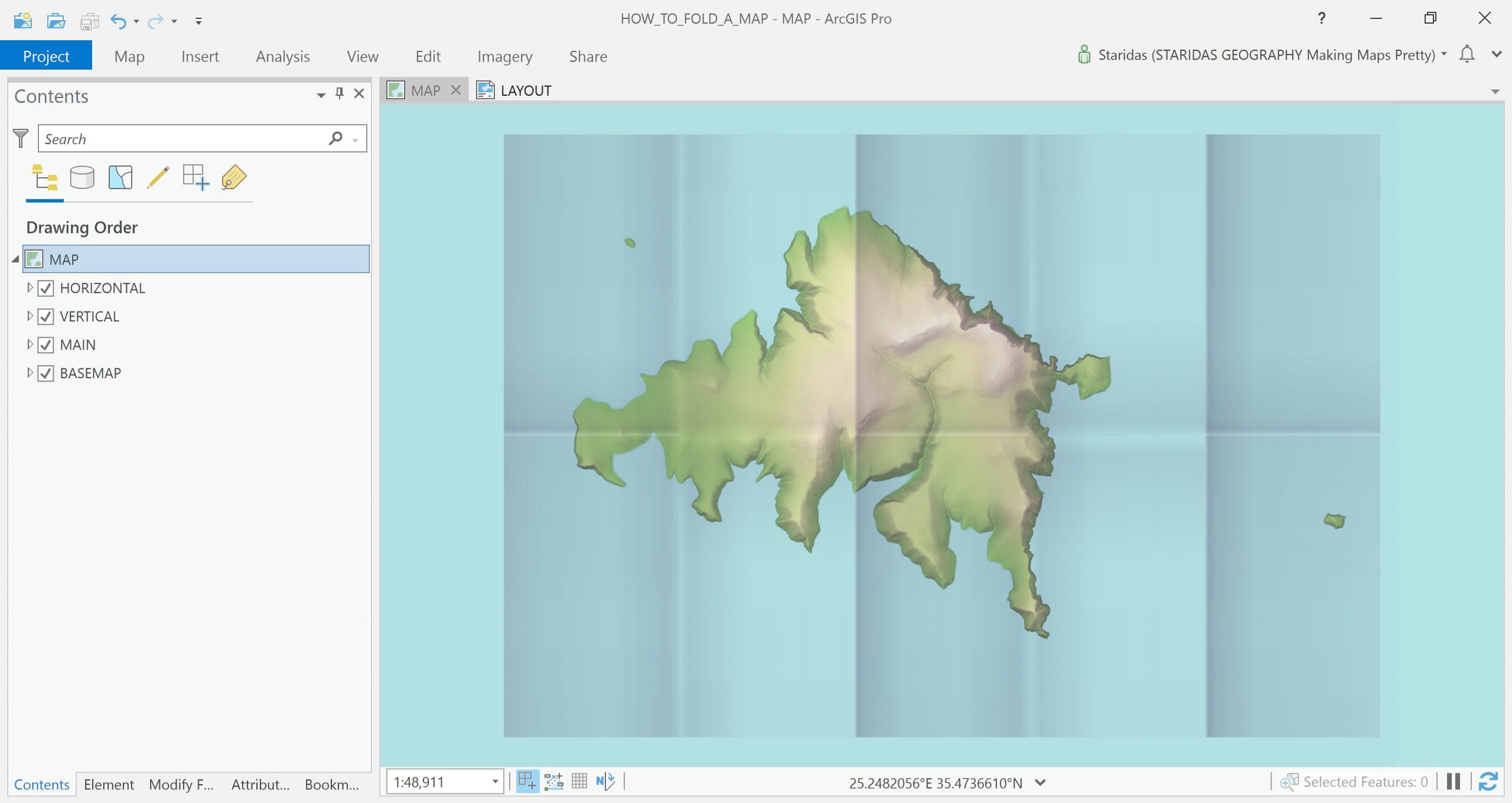
I continue narrating from the point my previous post “Digital map folding” ended. So, I have already created the grid polygon feature layer, which simulates the folds, and I have rendered it with my standard ArcGIS Pro style and I am sitting (un)comfortably staring at my screen.
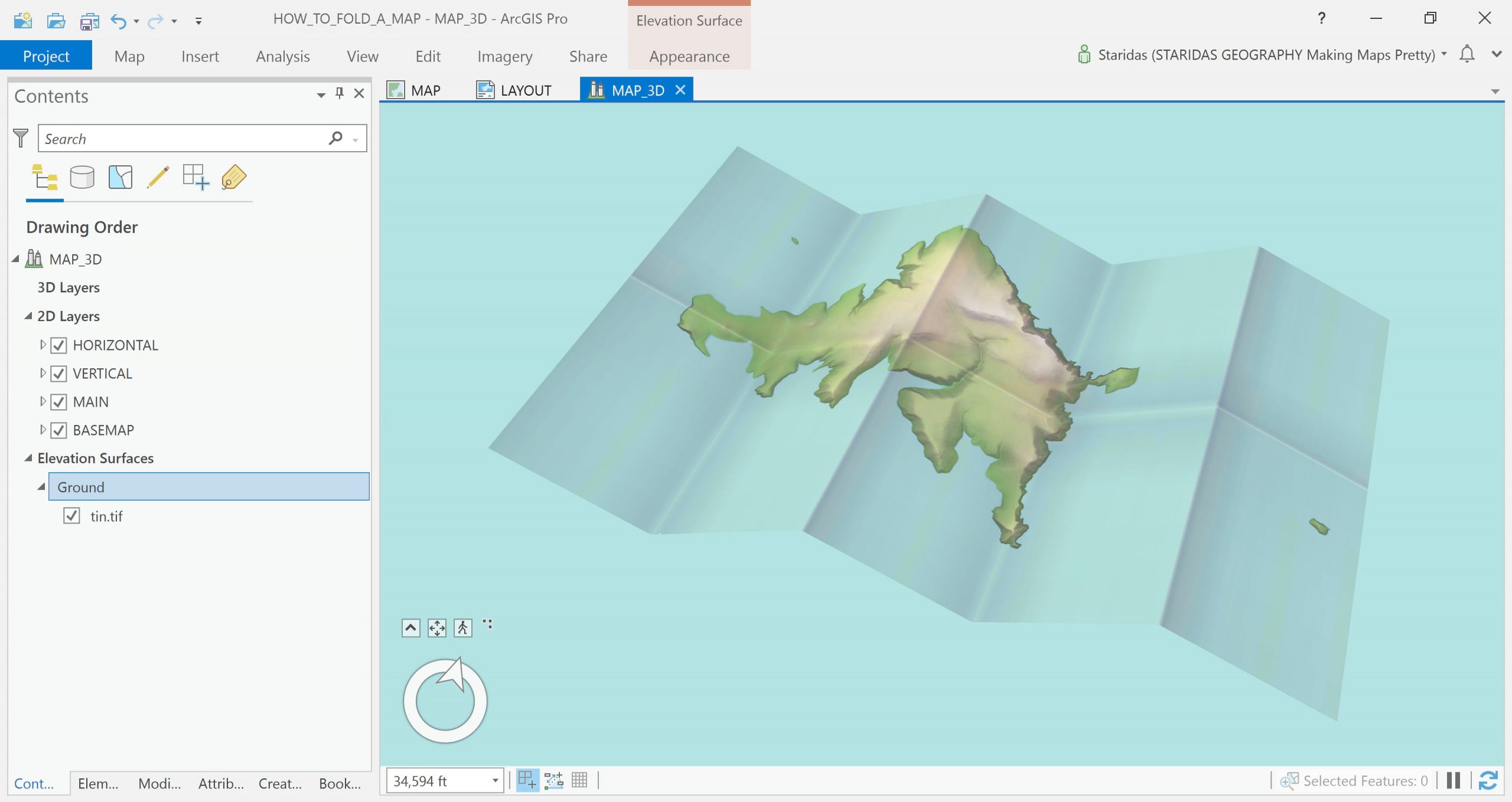
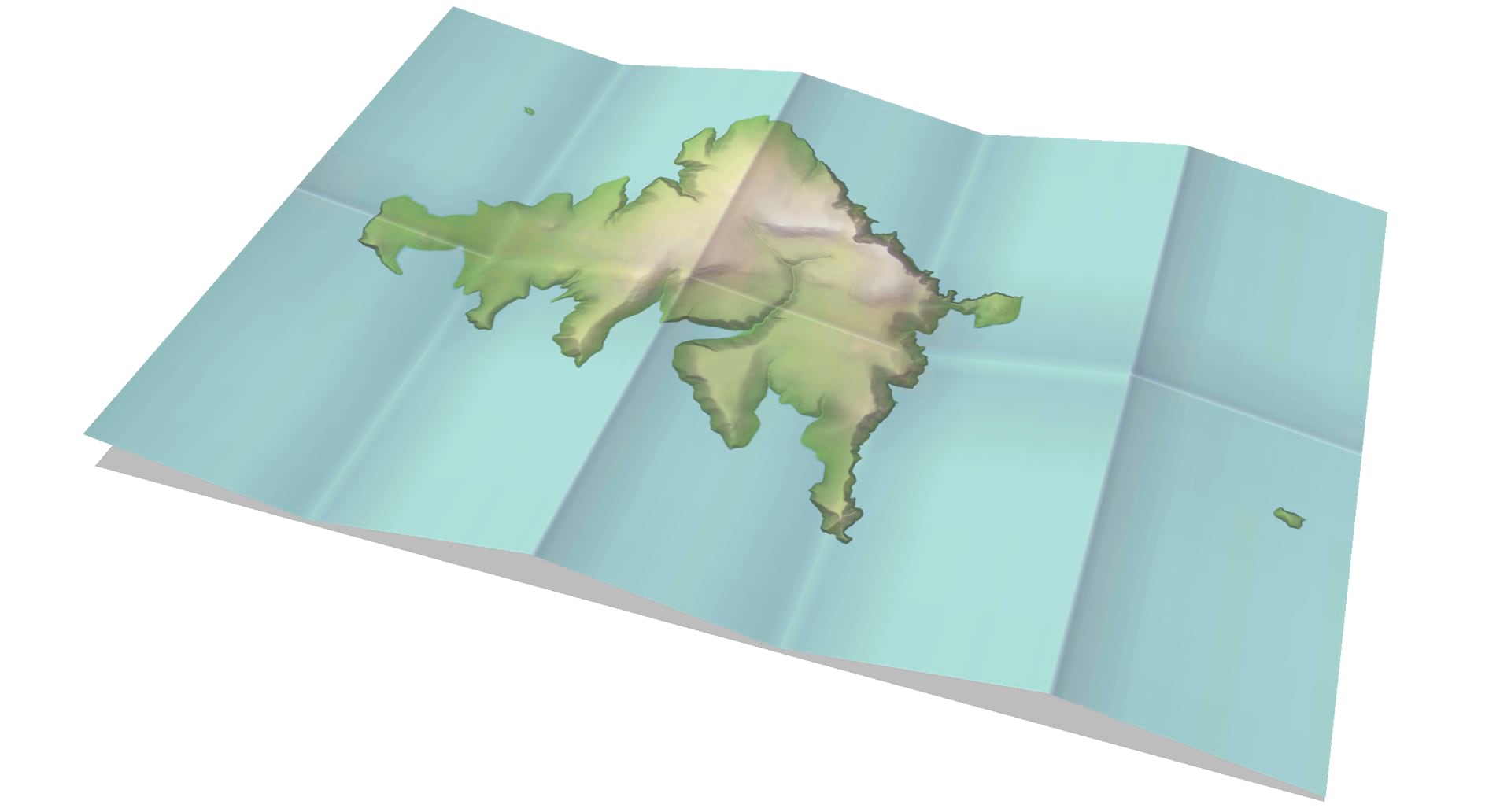
OK, it looks realistic, but why only produce a top view. If I had given a map to a professional photographer, they would take it to their studio and they would probably shoot a number of oblique aspects, not just the top view. I need to find a way to simulate this.
I know that the Scene View in ArcGIS Pro offers an awful lot of possibilities, provided I feed it with the proper elevation surface. But how can I produce such an elevation source?
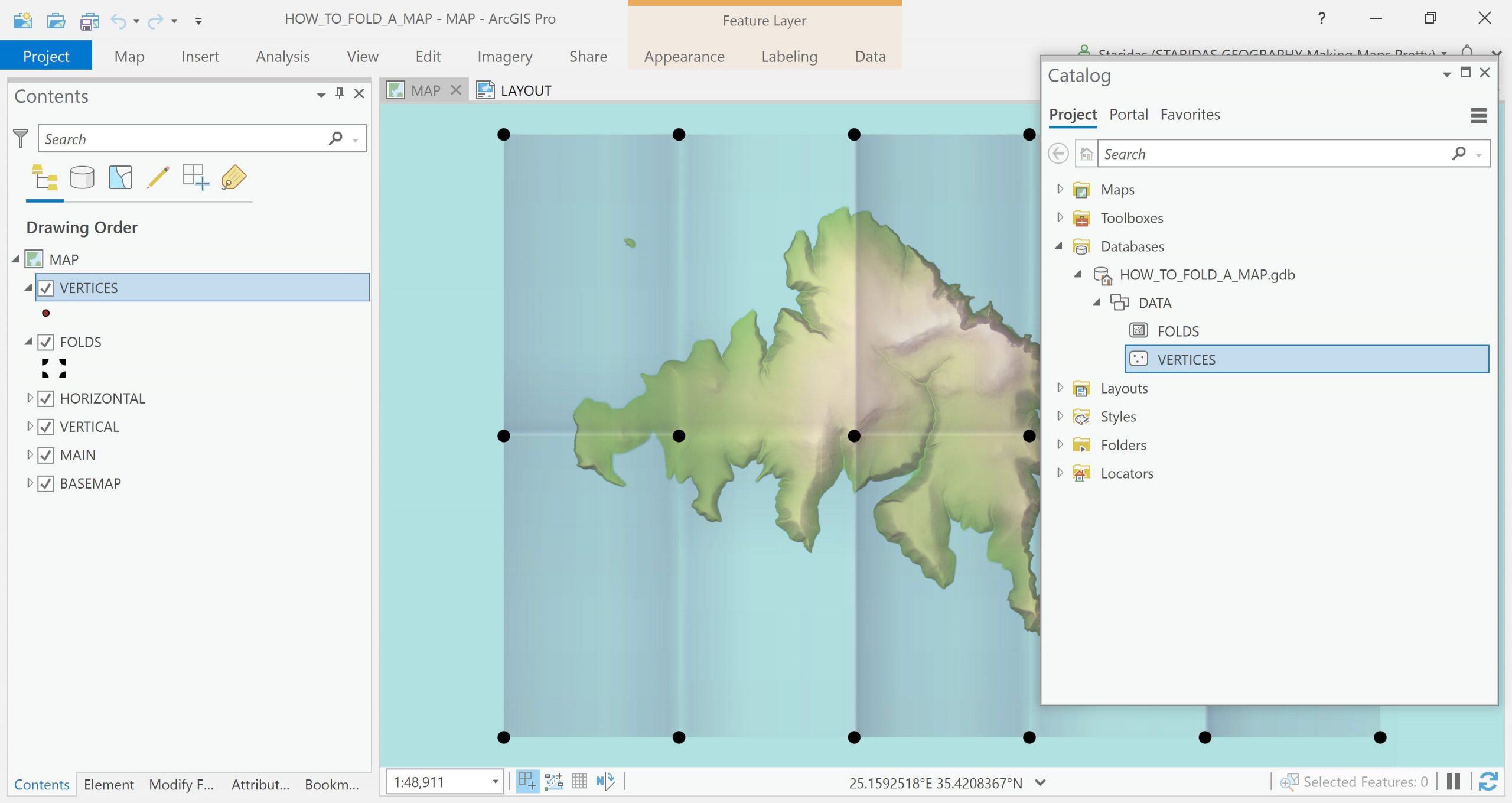
Understanding the folds’ vertices
Let’s dig in. In ArcGIS Pro I open the Map View of the map I have been working so far and I add once again this super handy grid polygon feature layer, which simulates the folds.
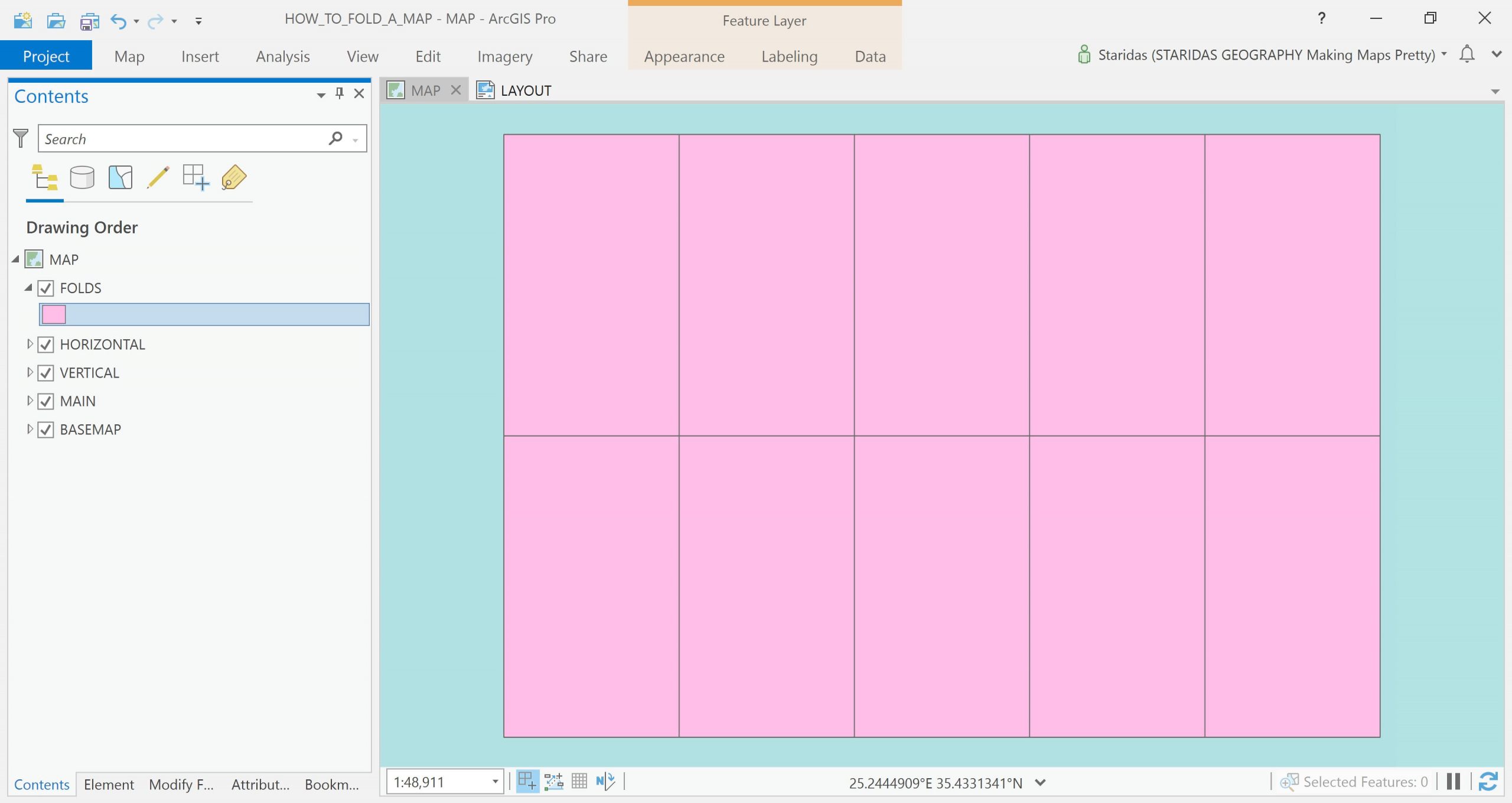
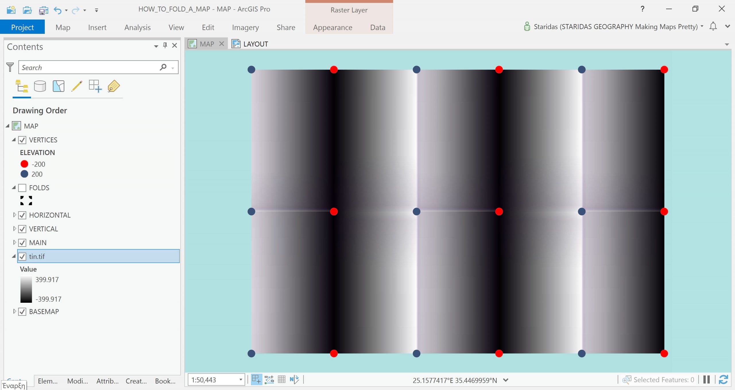
In order to understand the folds’ vertices, I will symbolize this polygon layer with a marker symbol layer, which I give an “On vertices” placement.
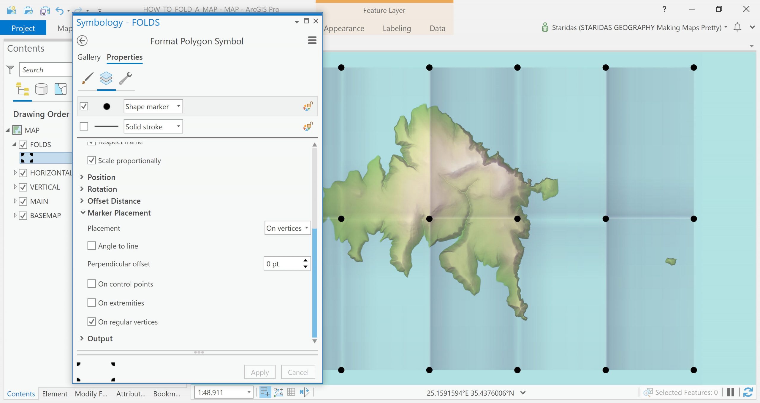
What I observe here is that some vertices look like they pop out of the map, while others look like they dive into the map. A point feature layer with these vertices and some appropriate elevation values could produce an elevation surface for the Scene View.
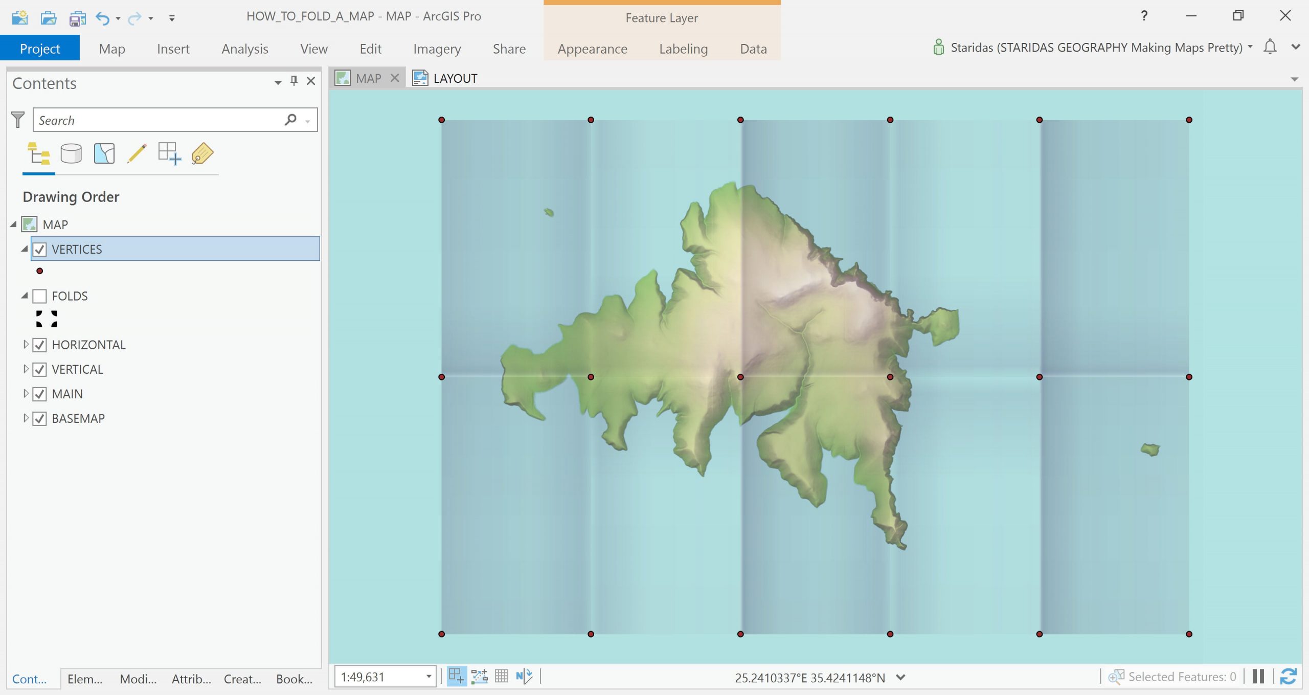
Creating the folds’ vertices
If you happen to possess an Advanced ArcGIS Pro license, then you may use the Feature Vertices To Points tool to create the desired layer. Since I only have a Basic license, I will manually create it. So I create a new point feature layer with the Create Feature Class tool and I create a new attribute field to store the elevation values.
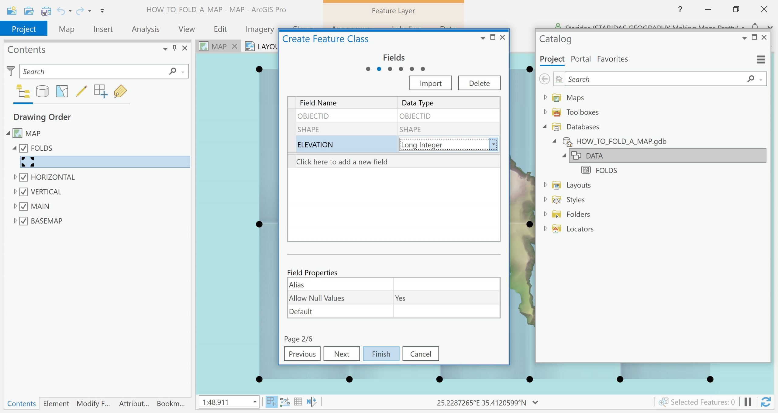
Then I add it in the table of contents.
With edit commands and with the vertex snapping option enabled, I manually create the points.
Assign elevation attributes to vertices
The next step is to group the vertices by those that pop out of the map and to those that dive into the map. I am doing this with a simple selection on canvas and with the Calculate Field command.
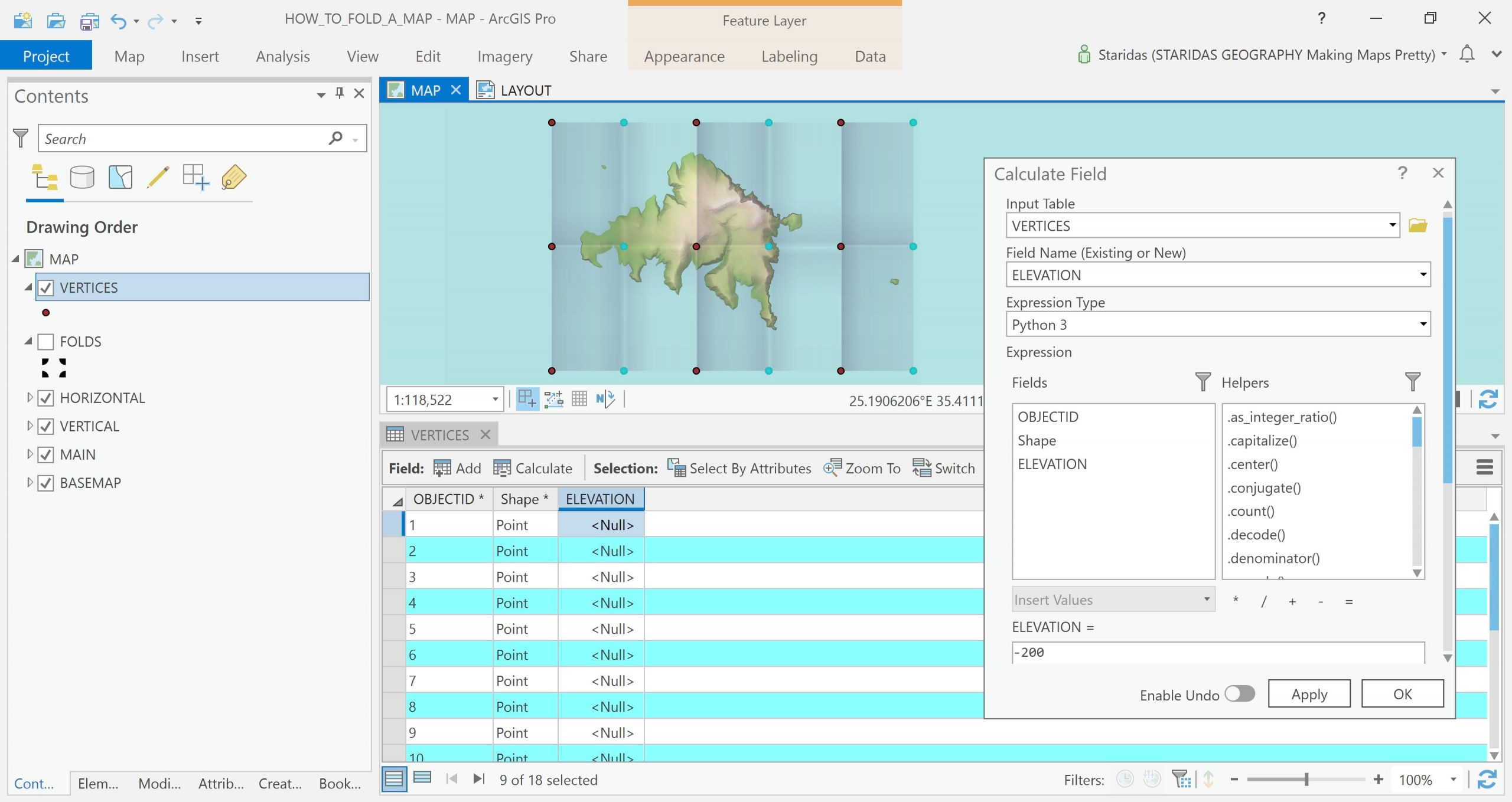
I give a value of 200 to the vertices that pop out of the map and a value of -200 to the vertices that dive into the map.
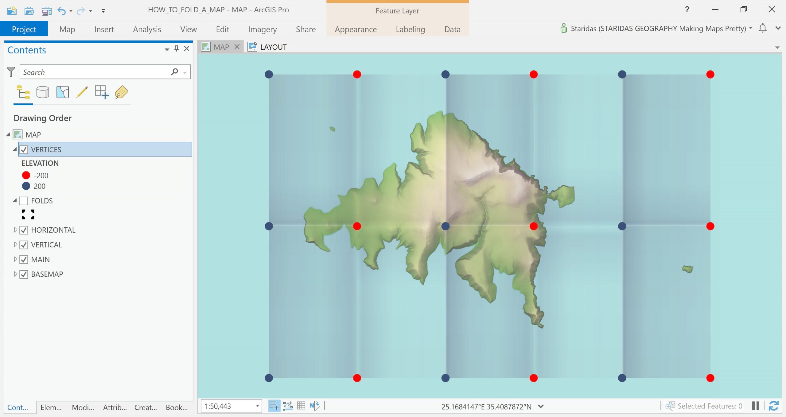
The values -200/200 are subjective. They actually represent the distance of the vertex from the horizontal plane. In other words, if I unfold a paper map and spread it on a table in a way that its entire surface touches the table, these values trend to zero. You might need a little trial and error to find the most suitable values for your own case.
Creating the Elevation Source
ArcGIS Pro Scene View allows a number of different Elevation Sources. So I can produce one by interpolation of the point feature layer, which I created at the previous steps.
Again, there are a number of ways to do this. Provided you have a Spatial Analyst or a 3D Analyst Extension, you may simply create a TIN surface, or interpolate with IDW or Spline or any other method. Each option will produce a different result so you might need to experiment a bit. The outcome elevation raster should be something like the one at the following picture.
Convert to Scene View
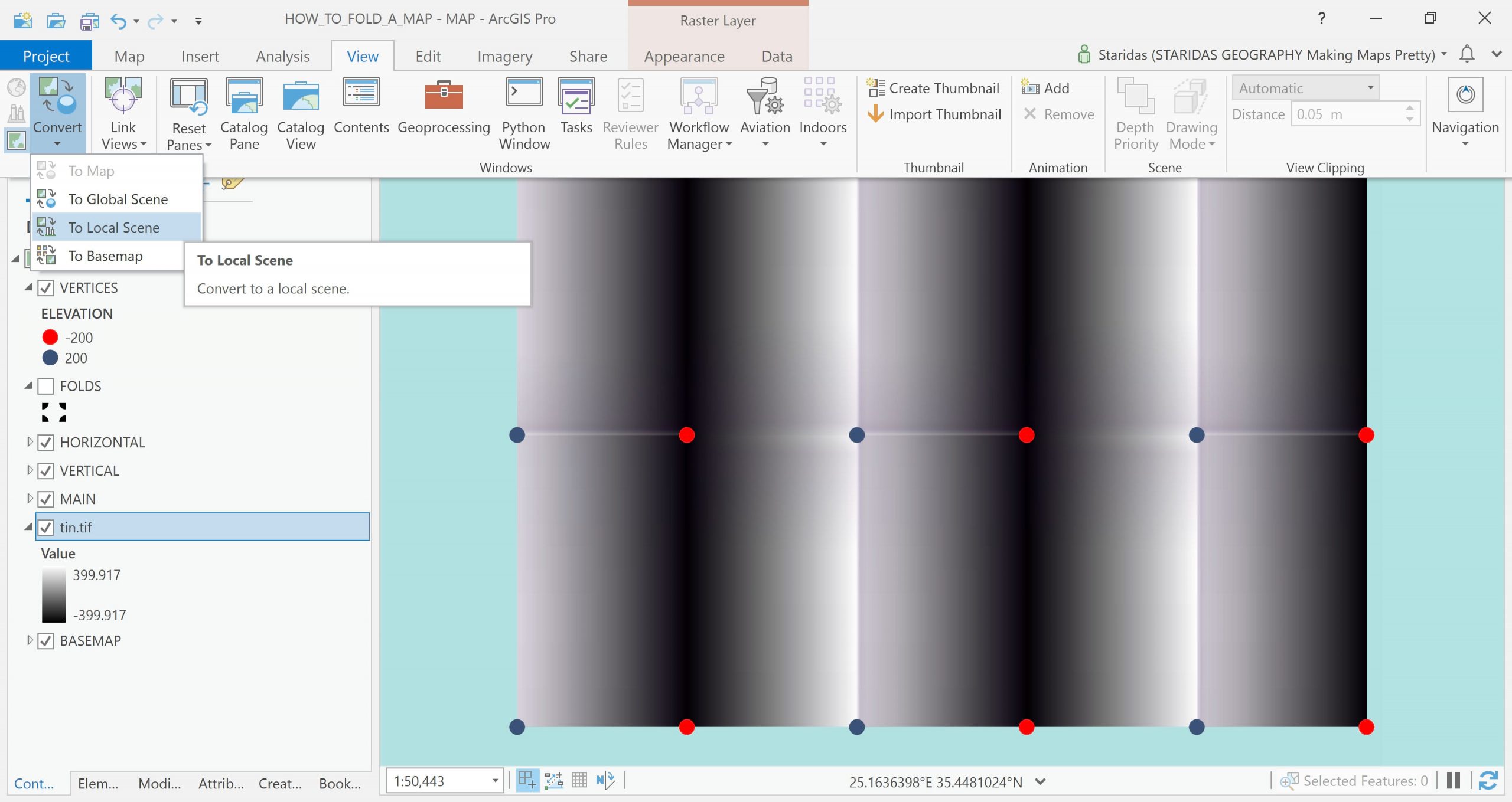
Now that I have set the Elevation Source the real magic starts to happen. I simply convert the map to a Local Scene View.
Then I drag the elevation layer and drop it in the Ground group at the Elevation Surfaces group at the very bottom of the table of contents.
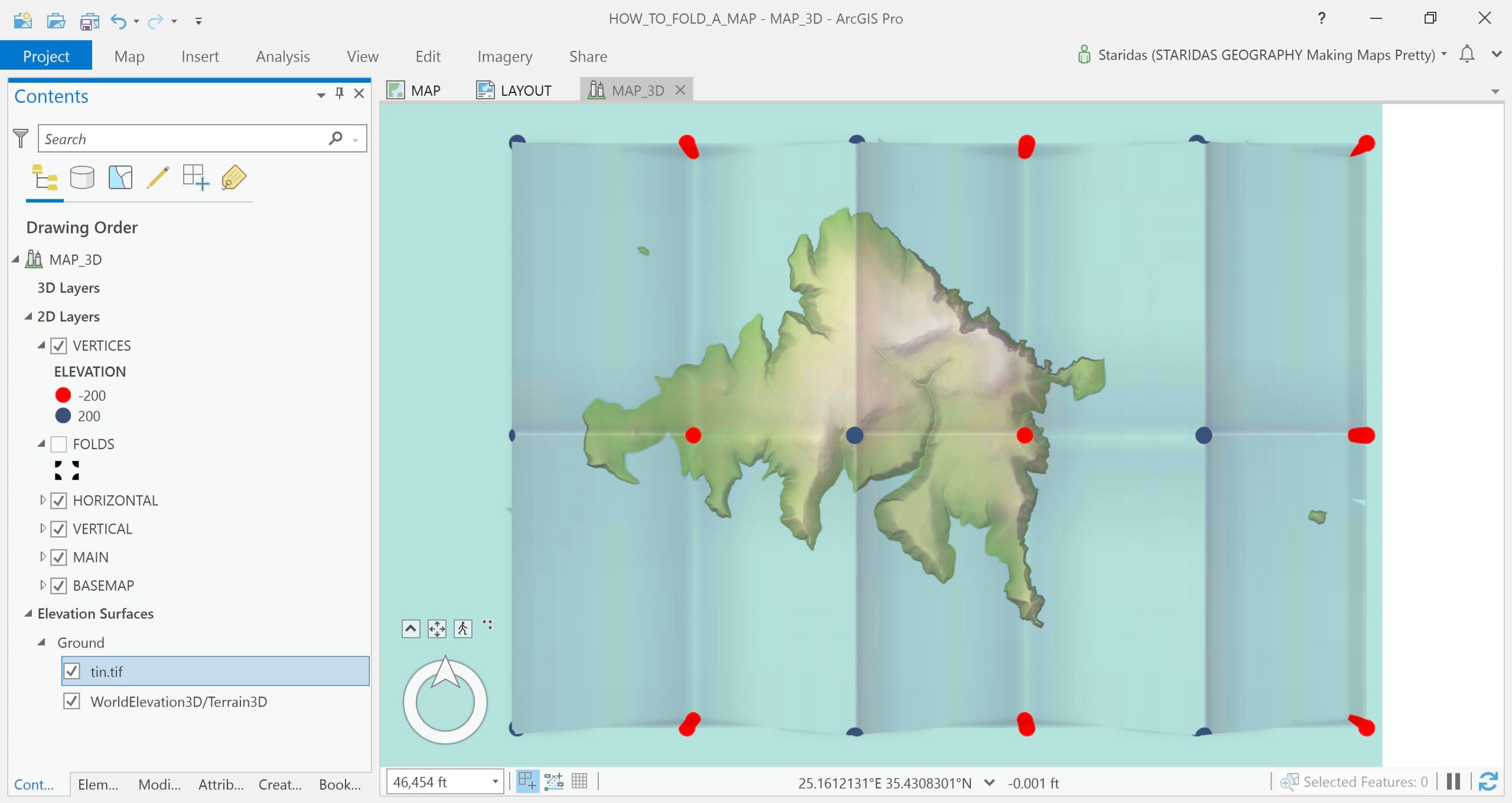
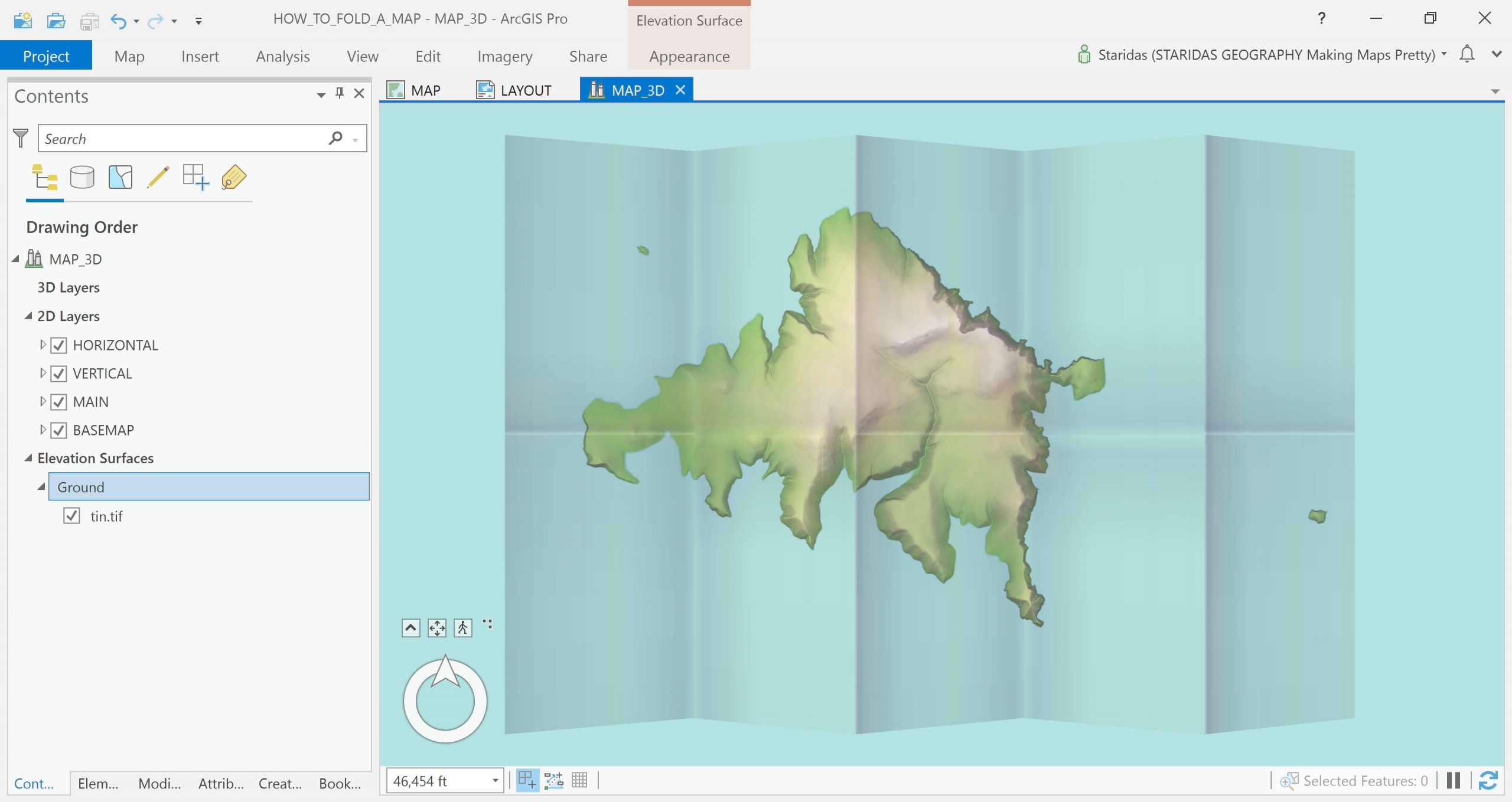
I remove all the layers that I no longer need, like the vectors created in the previous steps, as well as the default WorldElevation3D/Terrain3D at the Elevation Surfaces group. Now I rotate/tilt the view to find a nice aspect!
Refine the Scene View
There are a few more refinements I must make to get this looking realistic. Firstly, I must decrease the vertical exaggeration a little (apparently the -200/200 values were larger than they needed to be), so I go to the vertical exaggeration box and change the value from the default 1.00 to 0.40!
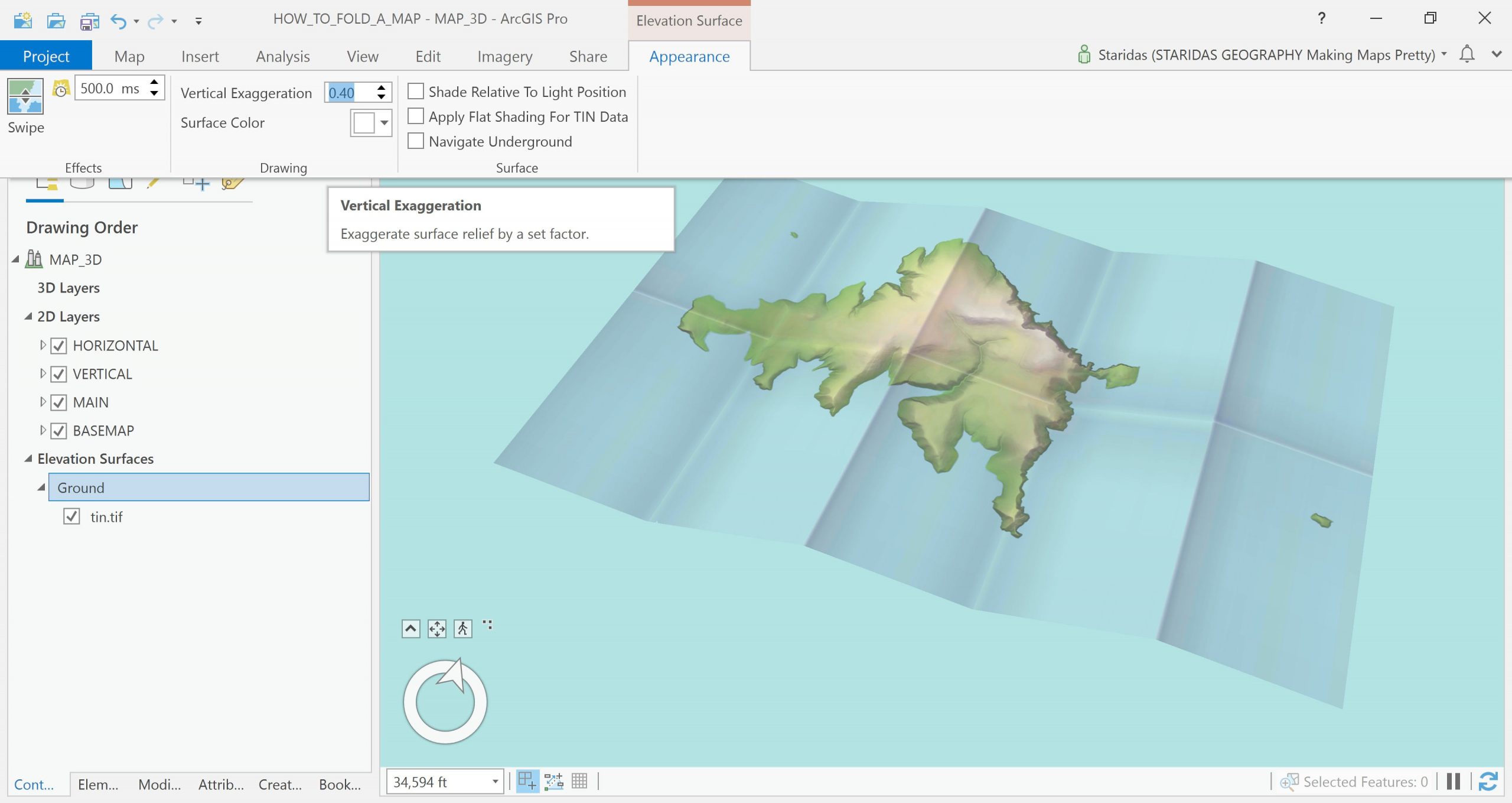
Much better, but it still doesn’t feel perfectly right, because the map looks like it’s floating in space. A subtle cast shadow underneath the map should correct this. I simply load the (what else) grid polygon layer (see part 1), which I know covers exactly the extent of my map, and I drag it to the 3D Layers group at the very top of the table of contents.
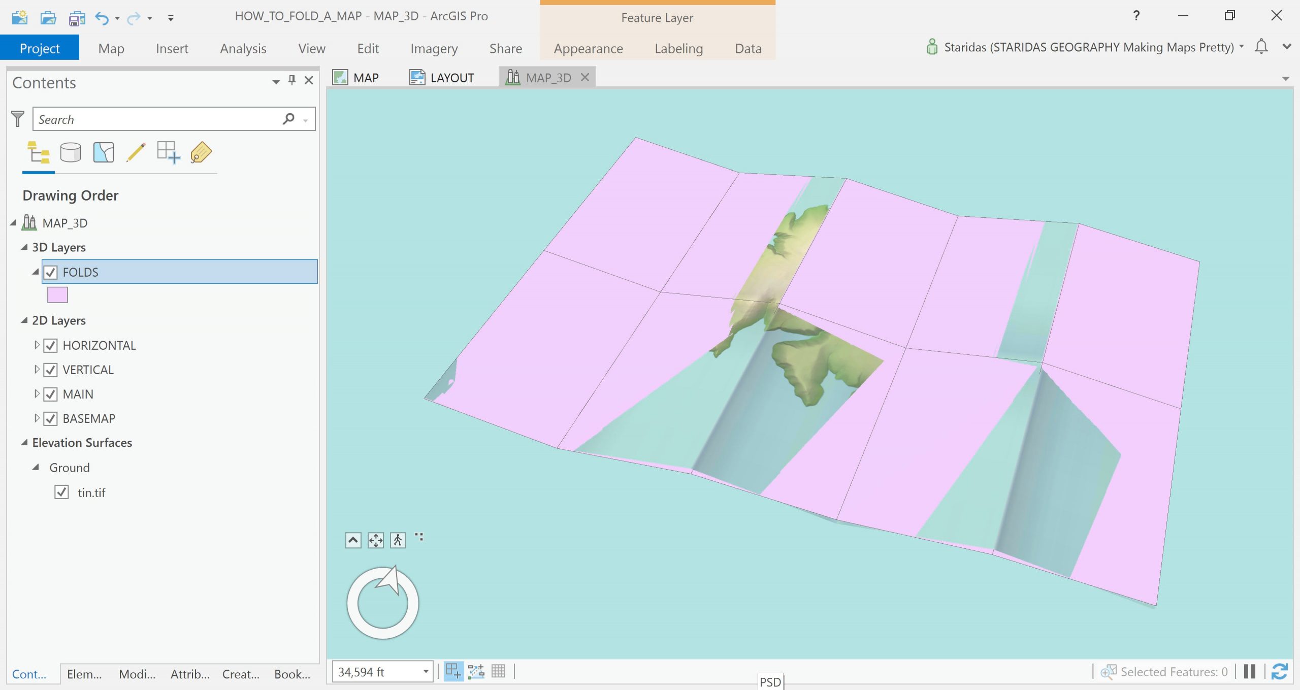
From the Layer Properties panel, at the Elevation tab, I select these features to be “At an absolute height” and I adjust the “Additional feature Elevation using” an expression via the Expression builder. I actually tell Pro to push that layer 200 map units below the map.
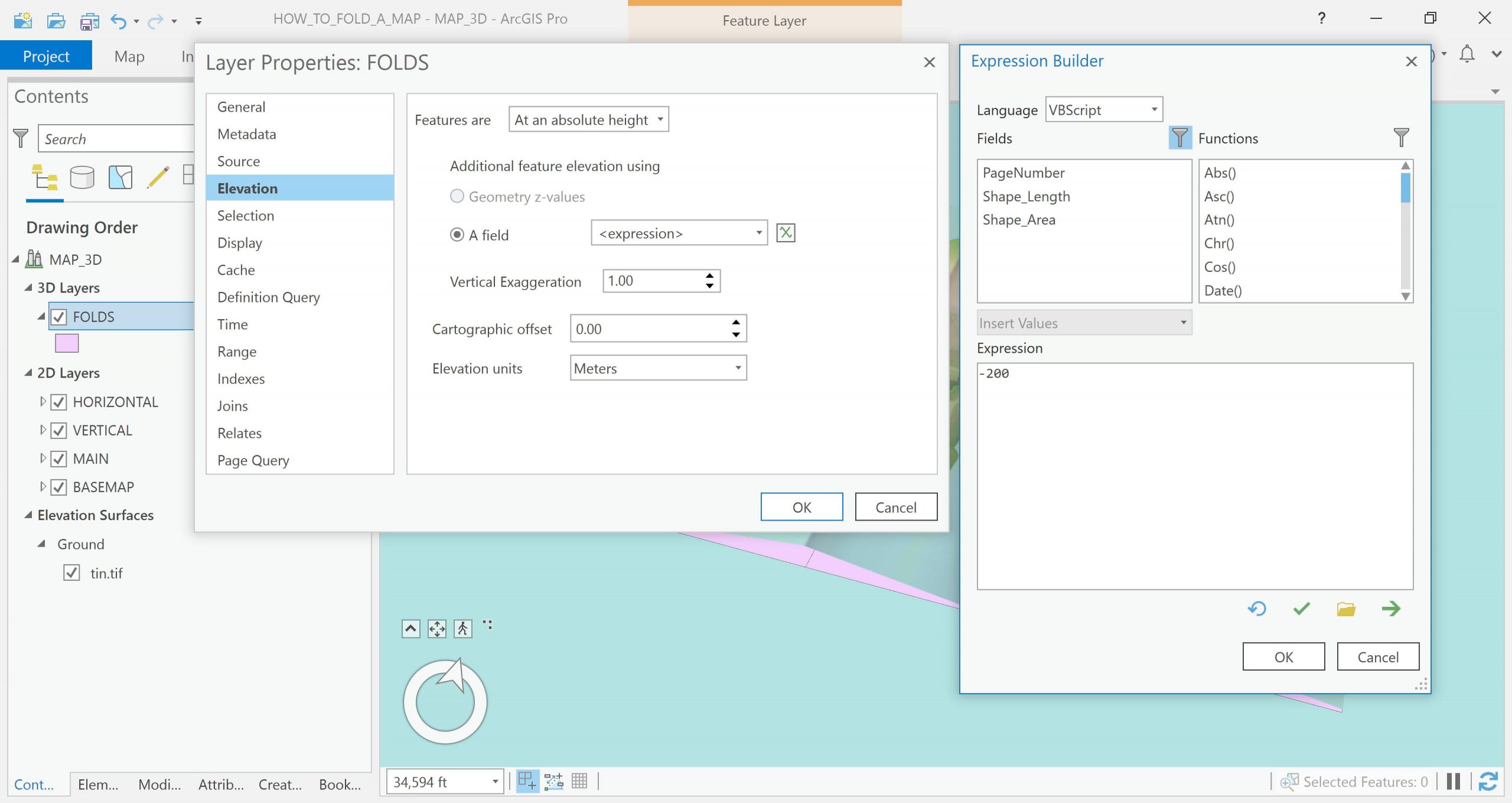
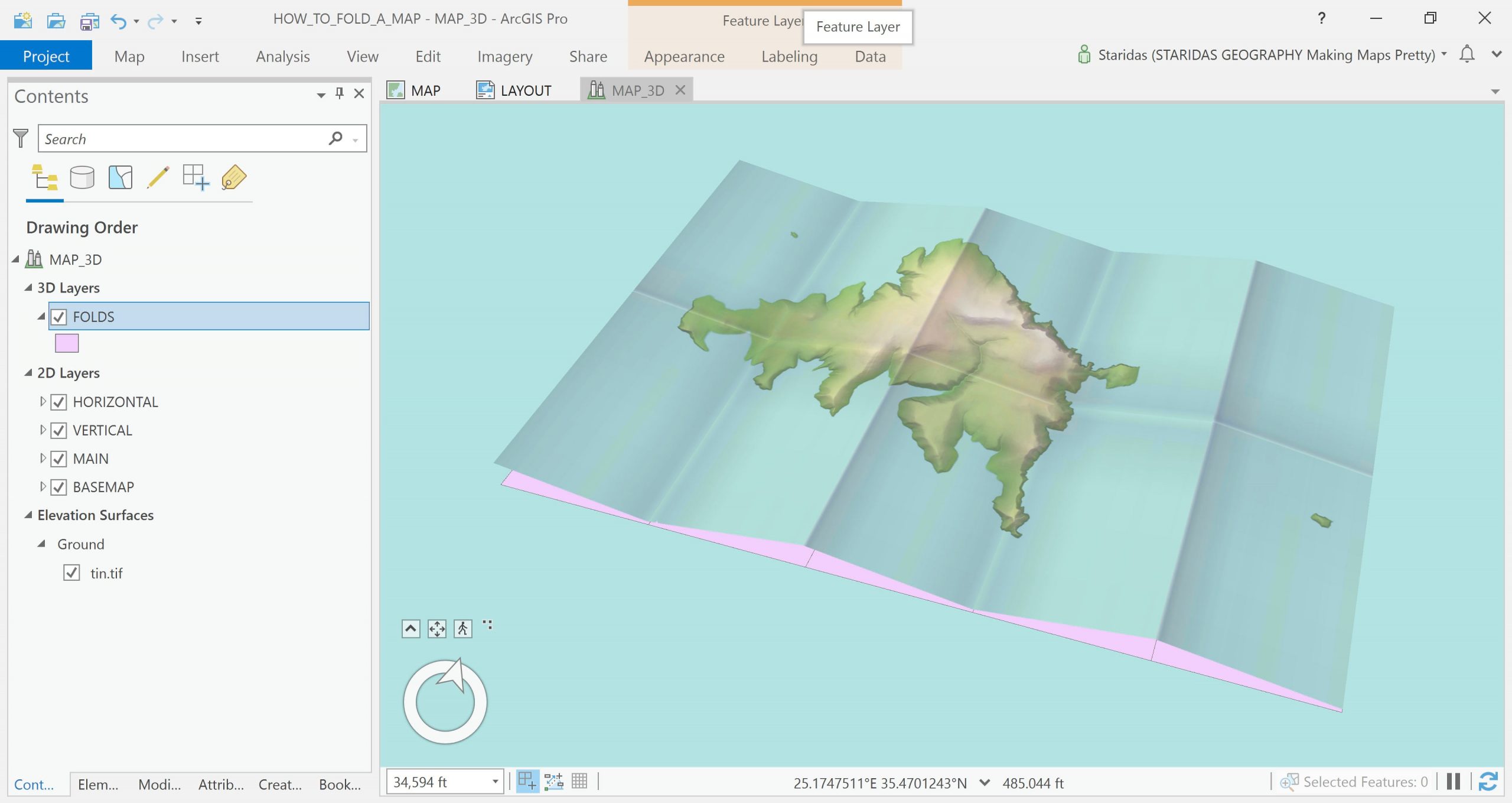
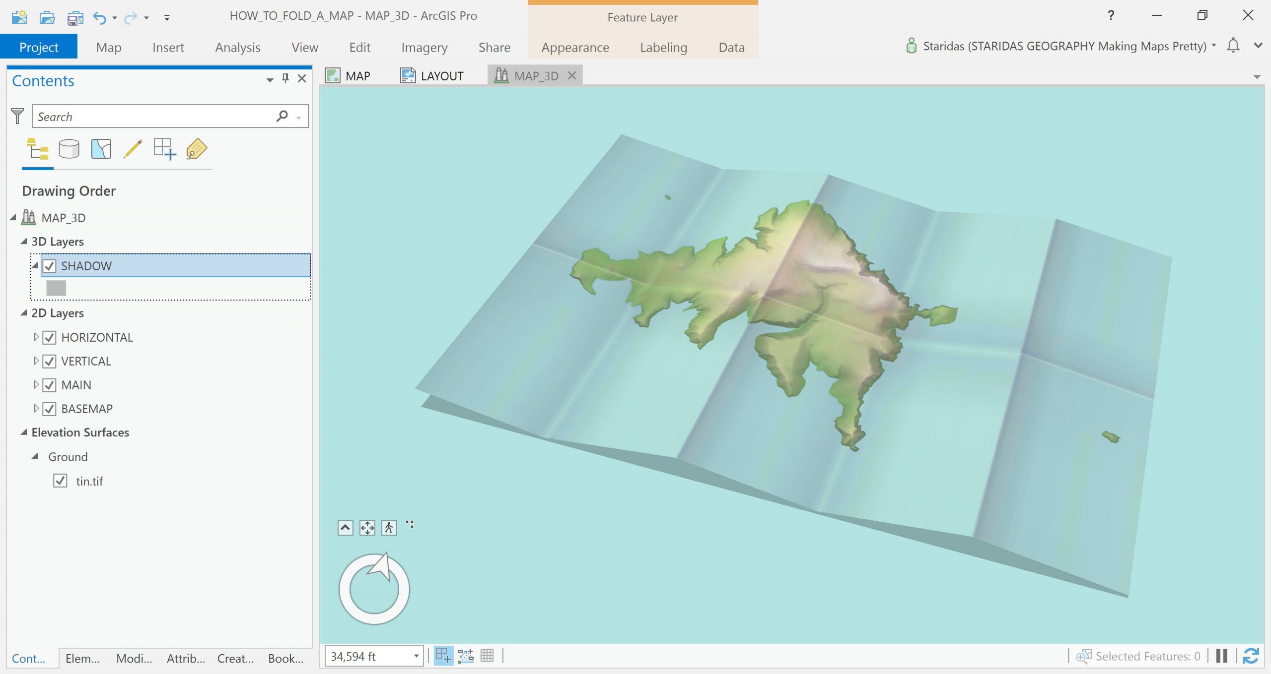
And since it is pretty unlikely to see a pink shadow (unless you are the Pink Panther) anywhere in the physical world, I will change the style of the layer, which I rename to shadow, to something closer to an actual shadow.
Et voilà!
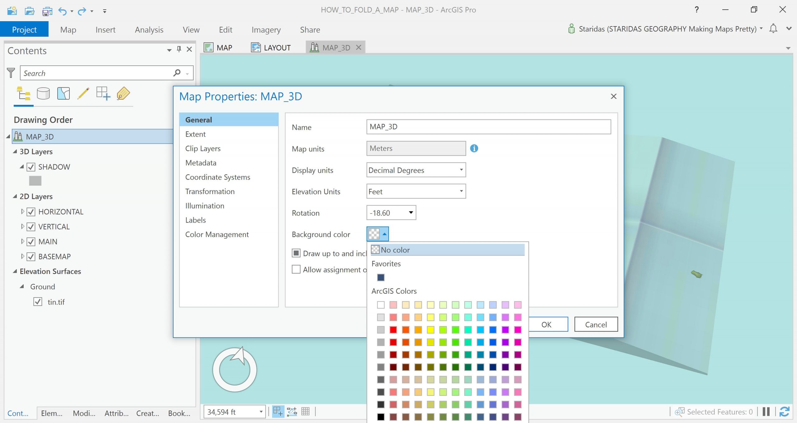
Final touch, the Background color of the map!
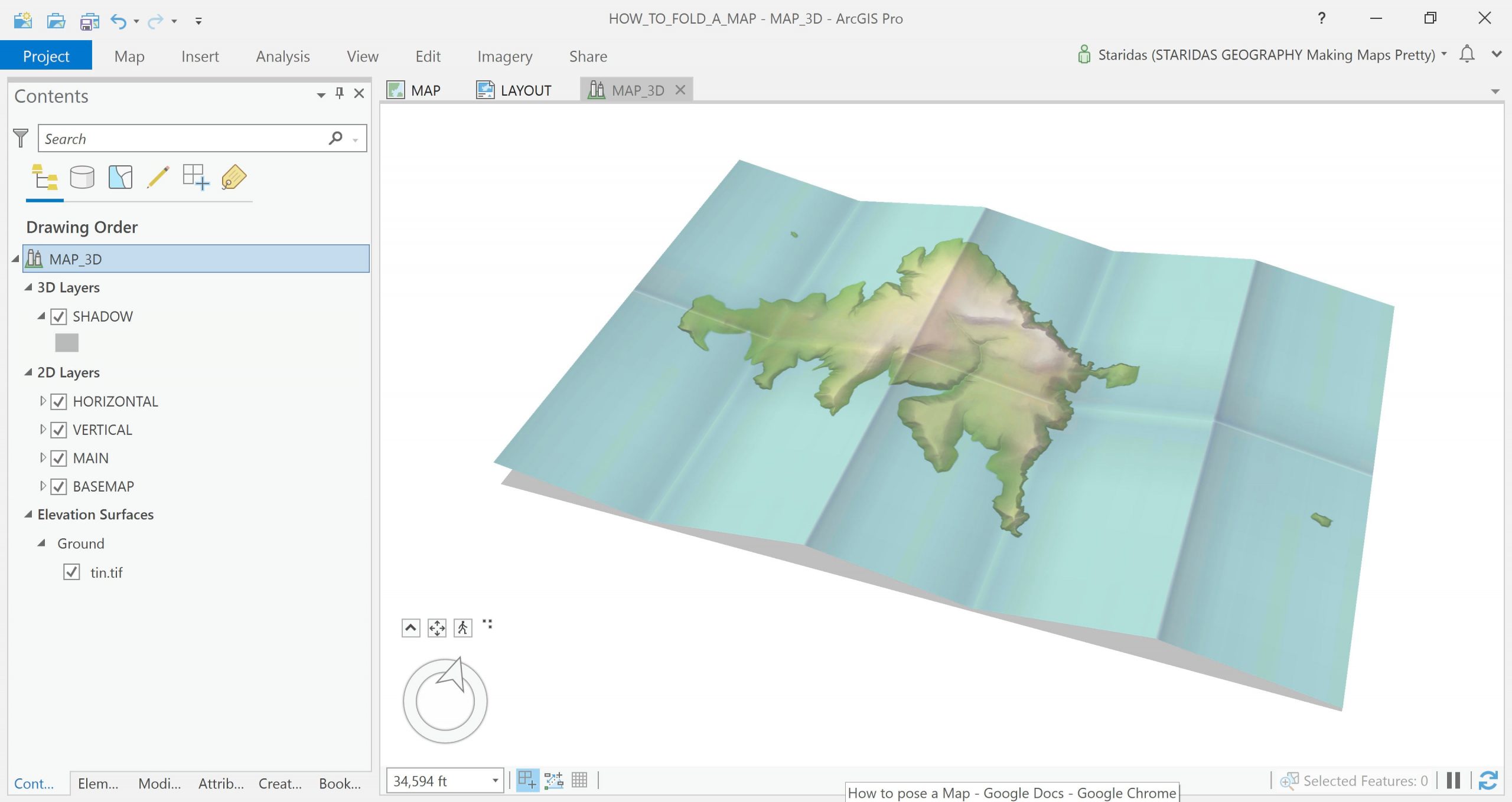
And that’s it!
Thank you so much for reading! I really hope you enjoyed it!
Kindest regards from Crete, Greece
Spiros
…
Many thanks, Spyridon, for sharing this process with us! While some reading this might think this is a purely artistic process, every one of these steps has practical applications for everyday mapping. Spyridon has tricked us into learning pragmatic GIS skills disguised as fun! If you missed part 1, be sure to double-back and check that out. And if you apply these lessons to your own map, we’d love to see them so share the results in the comments!

Article Discussion: