One of the many lavish pleasures of map-making is the opportunity to meet and collaborate with amazing teams doing fascinating work. Occasionally I’m invited to help facilitate a small portion of the team’s vision. I recently had the honor and good fortune to work with the design team at Vizzuality to create two basemaps for a globe application created for the Half-Earth Project.
Firefly Basemap
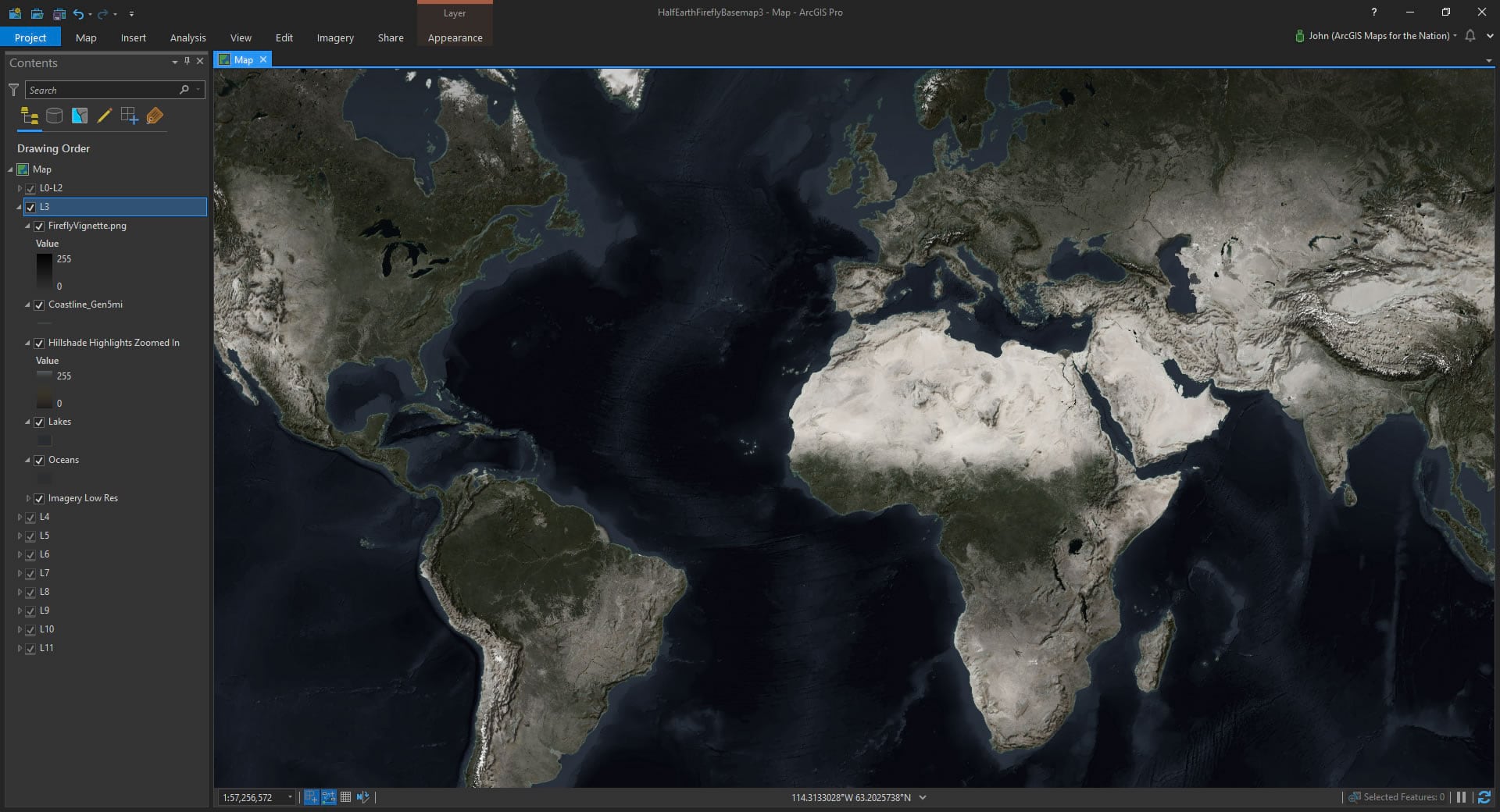
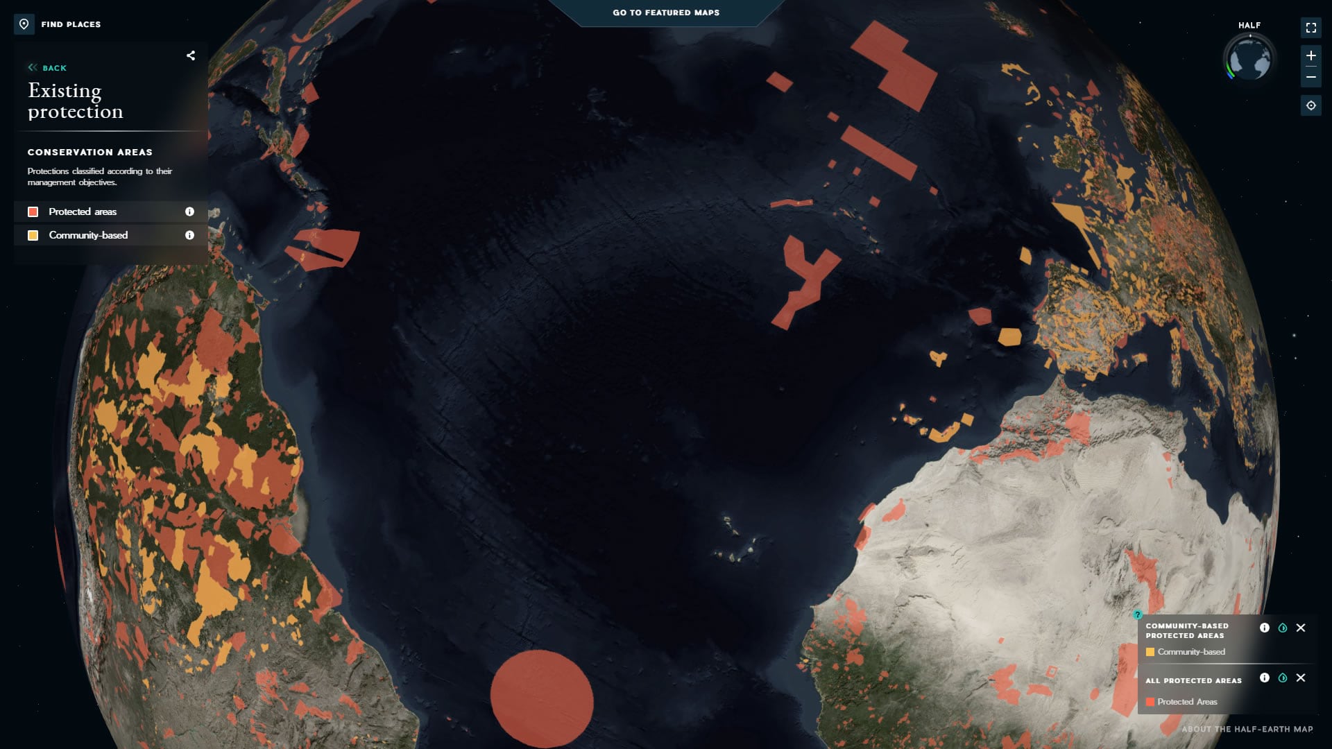
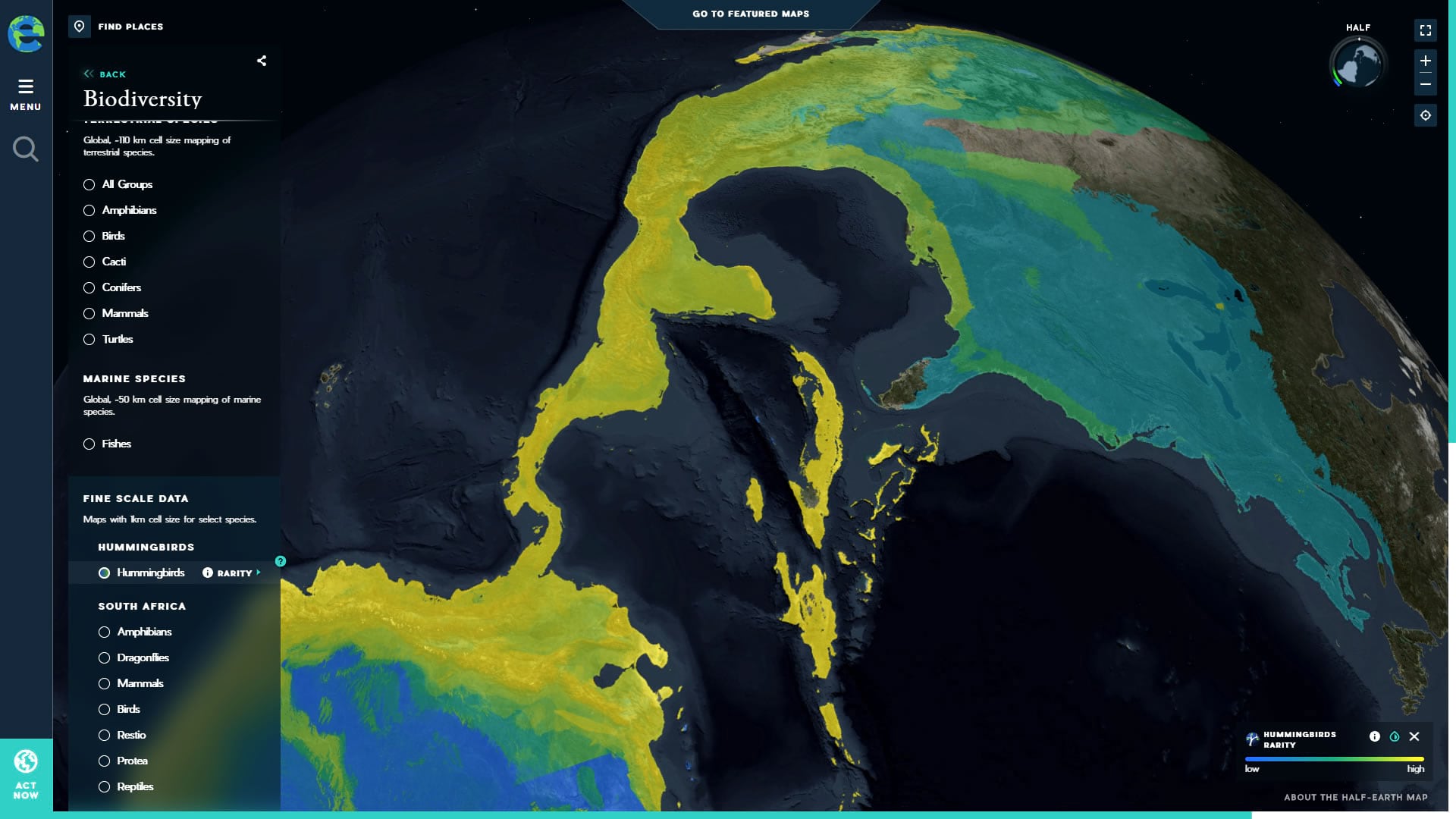
The first basemap was a riff on the Firefly basemap, intended to provide a satellite image base to provide the context of landcover and topography, but darkened and desaturated so data overlay colors would not compete with, or have their visual interpretation degraded by, the full-color of the source imagery. Firefly is a helpful conveyance for data sets that benefit from the context of imagery but have inherent thematic colors. We iterated on the look of this basemap, starting with several more ostentatious early prototypes, as one does, then refining into something that best honors the data that would live atop it.
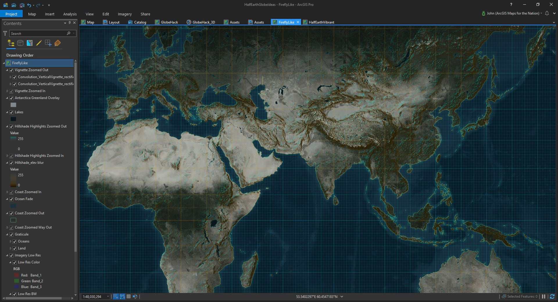
Throughout the process I appreciated the focus of project coordinator Fausto Pérez to best support the data that would eventually live atop the basemap. I think the team landed at just the right level of tone and content.
Vibrant Basemap
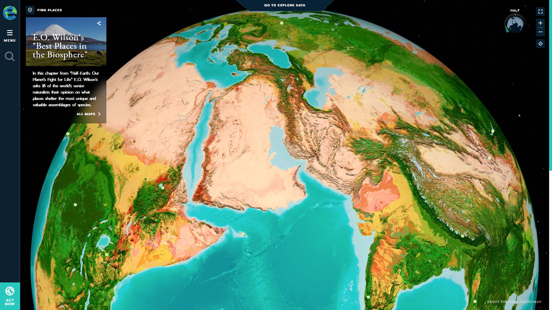
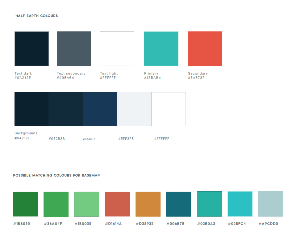
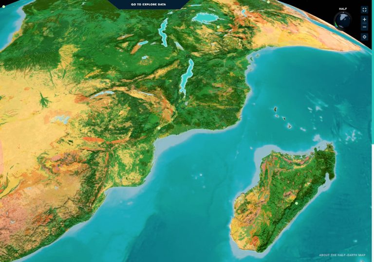
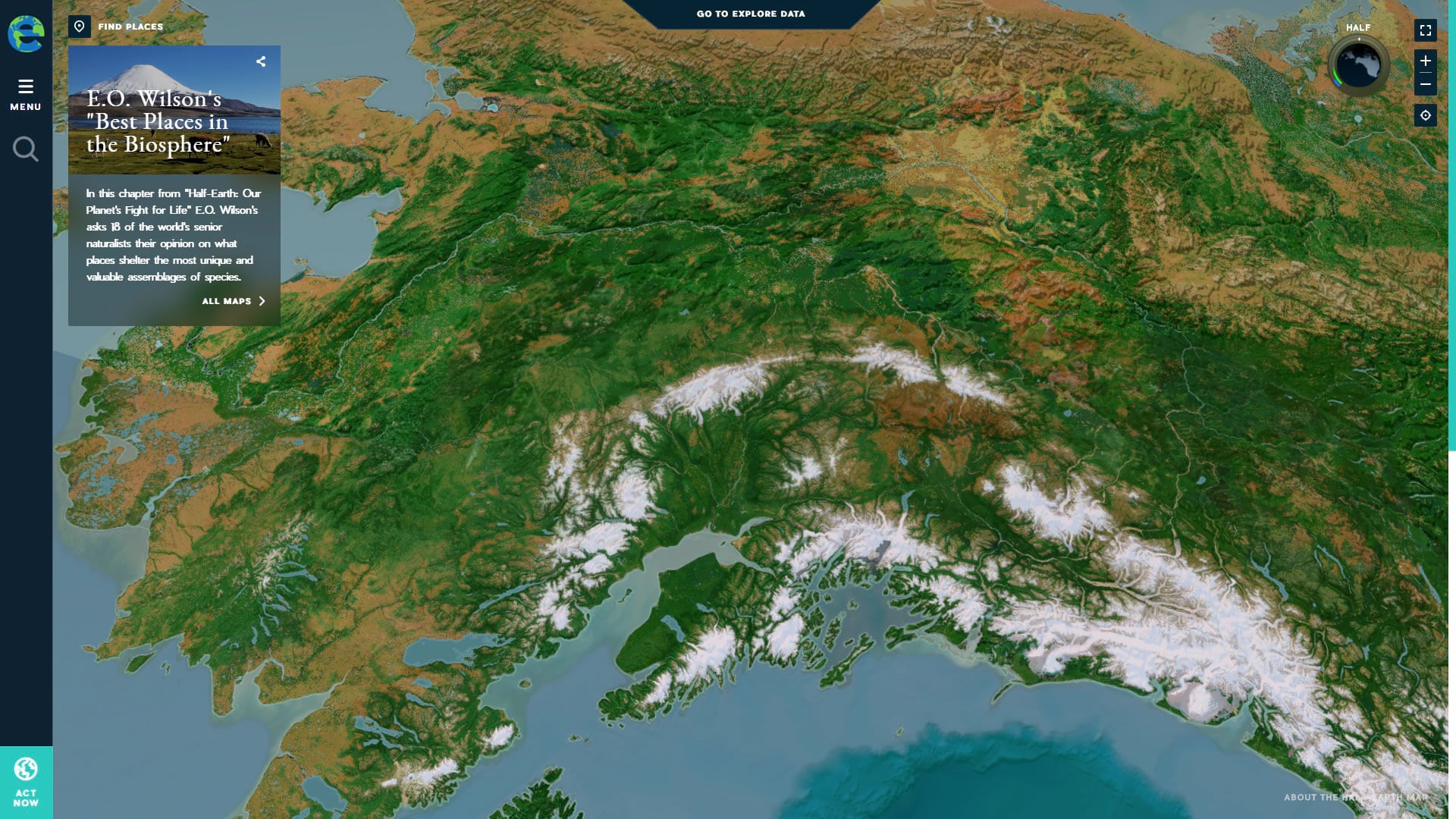
I was most excited, however, at the second basemap project. Estefanía Casal, the creative director of the project, described the goal of this globe as one that “conveys the idea of an evocative, beautiful planet worth protecting.”
Are you kidding? Can you imagine a cooler directive?
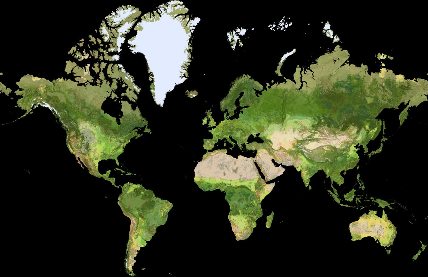
Ecological Land Units
Fortunately, the team at Esri has published a beautiful map of the earth’s Ecological Land Units—this would serve as the foundation for the vibrant basemap.
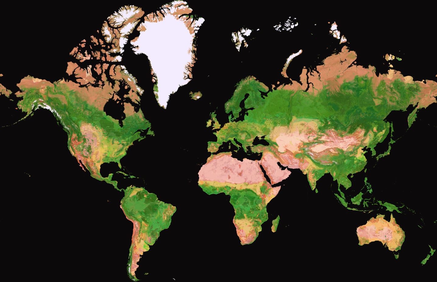
But it needed to be en-vibrant-ized to approach the team’s color specs. Like, a lot.
I opened the four gigabyte (yes, giga) source image in PhotoShop and adjusted the individual red, green, and blue color curves until it lived comfortably in the realm of mega vibrancy.
Transition to Imagery
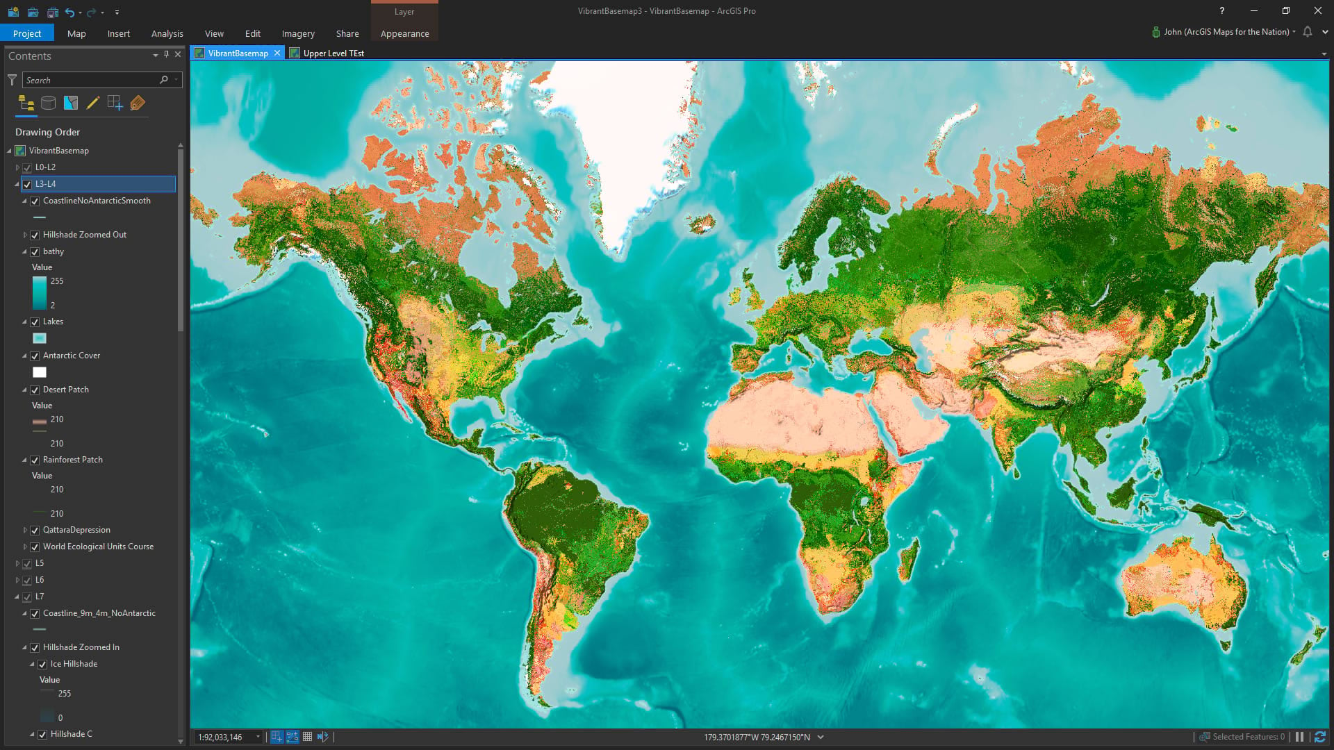
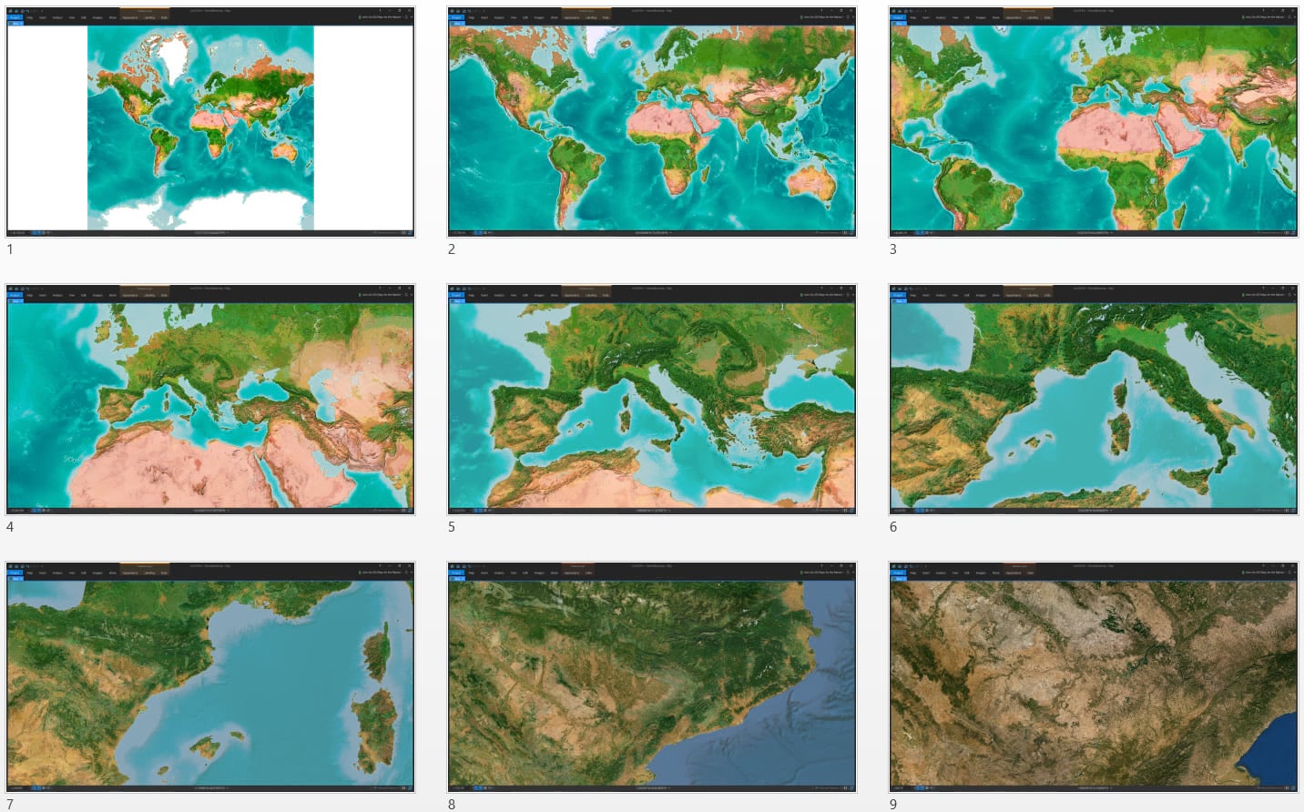
The design of the globe experience required that the vibrant basemap begin at the rich saturated state, then smoothly transition into full standard imagery when zoomed in. I created a layer group in ArcGIS Pro for each of these zoom levels and set each group’s visibility to the range of the web map tile service. Now I could, in addition to other scale-necessary changes on data and symbology, feather in the satellite imagery a bit more with each step down.
Rainforest Patch
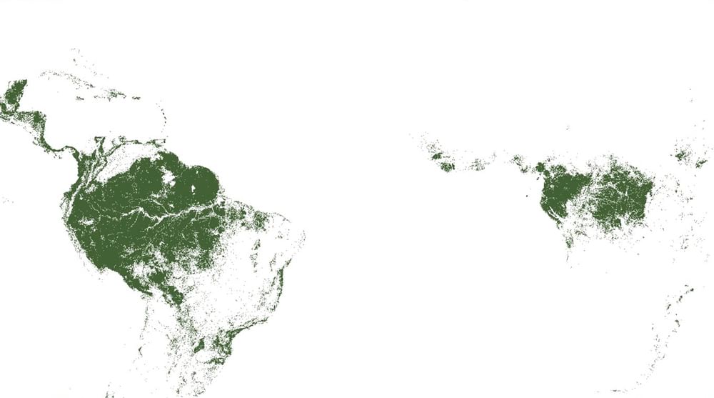
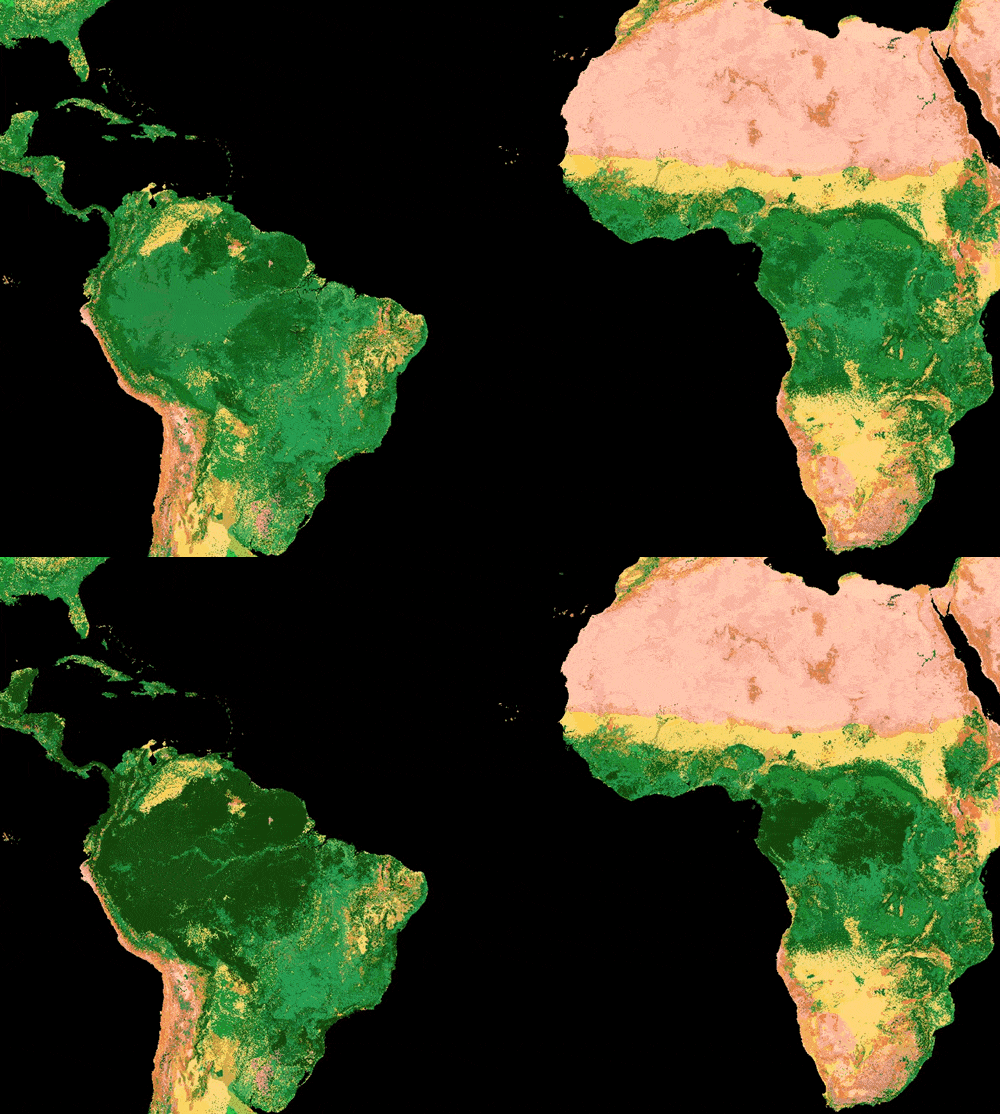
Greta Carrete Vega, a scientist at Vizzuality, noted along the way that areas of dense rainforest weren’t being represented as the darker lush areas that they truly are. While this globe wasn’t intended as a literal example of the earth’s surface, we did want to be true to the overall scale of densely forested areas and hoped to boost their visual impression to our audience. This was an interesting question to tackle because we were working from a pre-existing data layer and imagery. Tweaking the colors of sub-sets of this blend seemed at first a real puzzle. The collaborative chats we had about options and overlays was a real joy, I have to say, and we landed at something that was both visually effective, and straightforward (my favorite combination). By pulling in a global landcover image service, we could isolate the range of landcover that needed boosting, and add that in as a complimentary overlay.
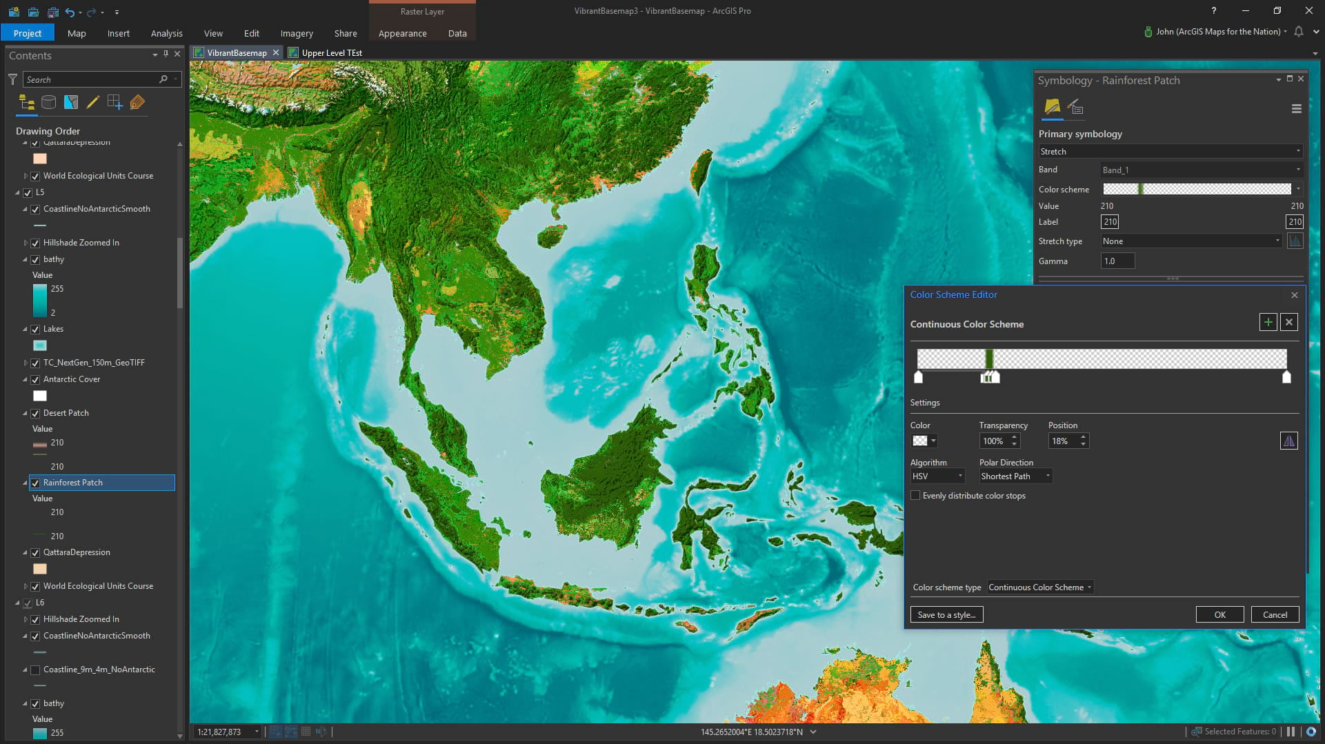
Hillshade
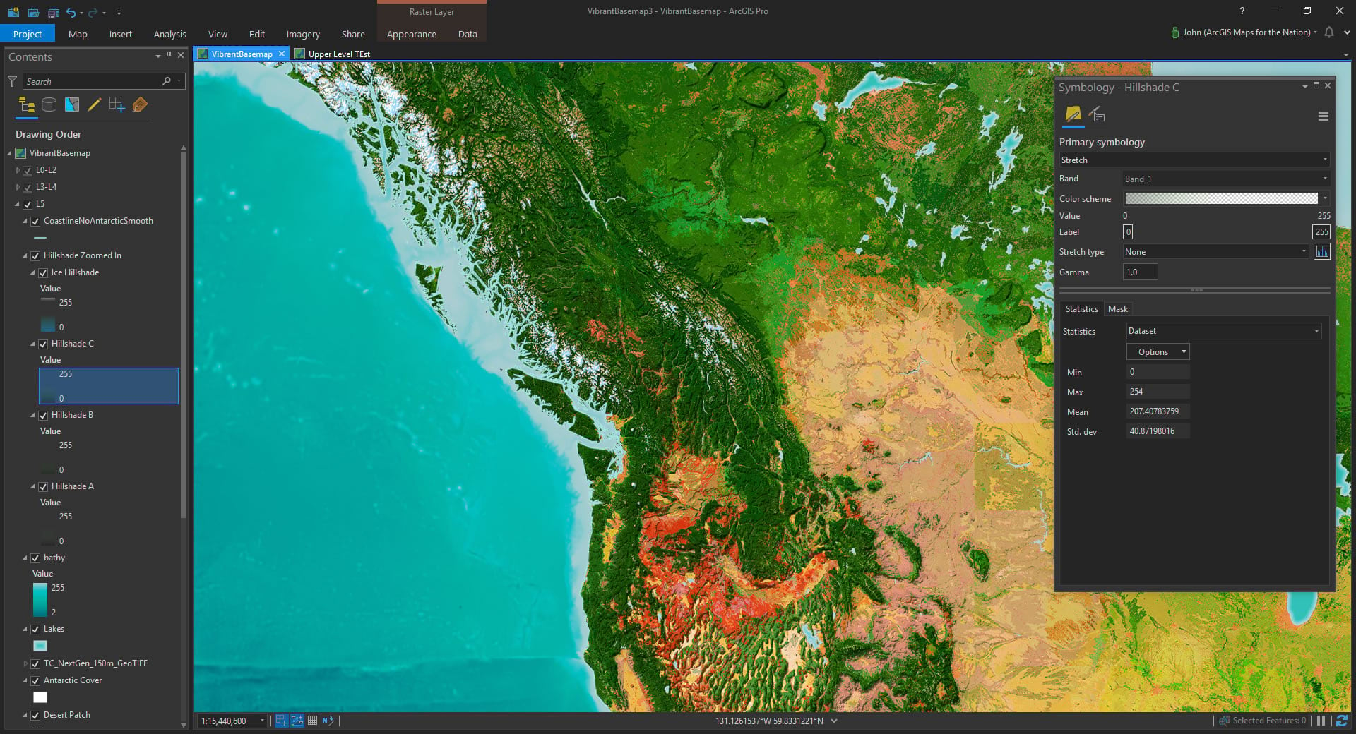
Adding a textural surface to the globe was a big part of the goal of making the globe look like a wonderful and tangible place. I used a bumpified hillshade technique to only paint in areas of shade, so areas not in shadow would retain their bold colors—a big deal for maintaining the vibrant palette of the basemap.
You might notice in the screenshots that I’ve got a few layers of land hillshade. What’s up with that? It’s a sneaky way of creating somewhat softer lighting and color variability in hillshades. Visit out this extravagant how-to, if you are interested giving this a go.
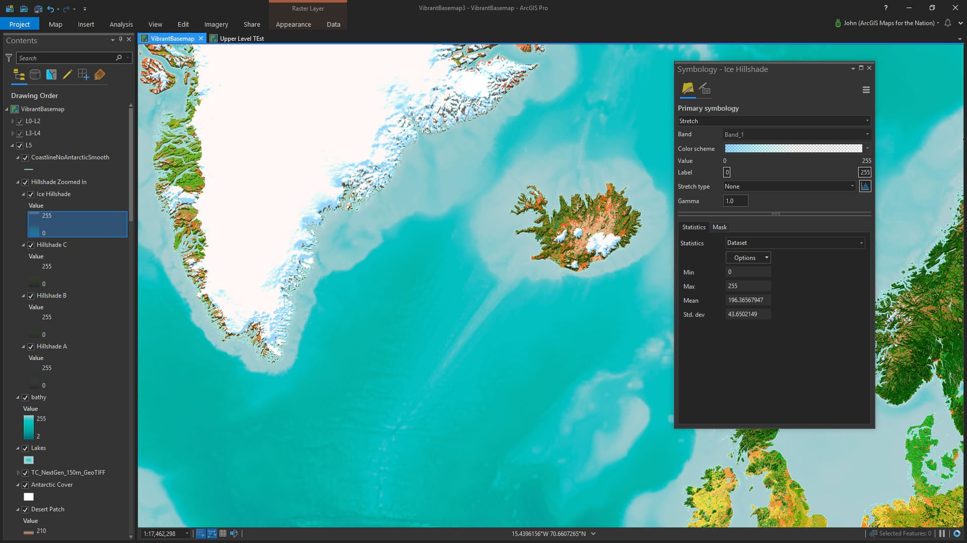
But of course ice has a much different shade palette than its dry-land counterpart. I used masking to selectively show ice hillshade vs land hillshade. Read up on all the glorious instructions here if you’d like to give this a try for yourself.
Water
The bathymetric colors of the oceans is probably the second most important bit of content lending to the overall look of the globe. To retain a smooth look over the seas, I went with straight elevation coloring rather than a hillshade (seamount shade?). This gives an echo of depth but doesn’t result in a textured surface. A nice balance to the land.
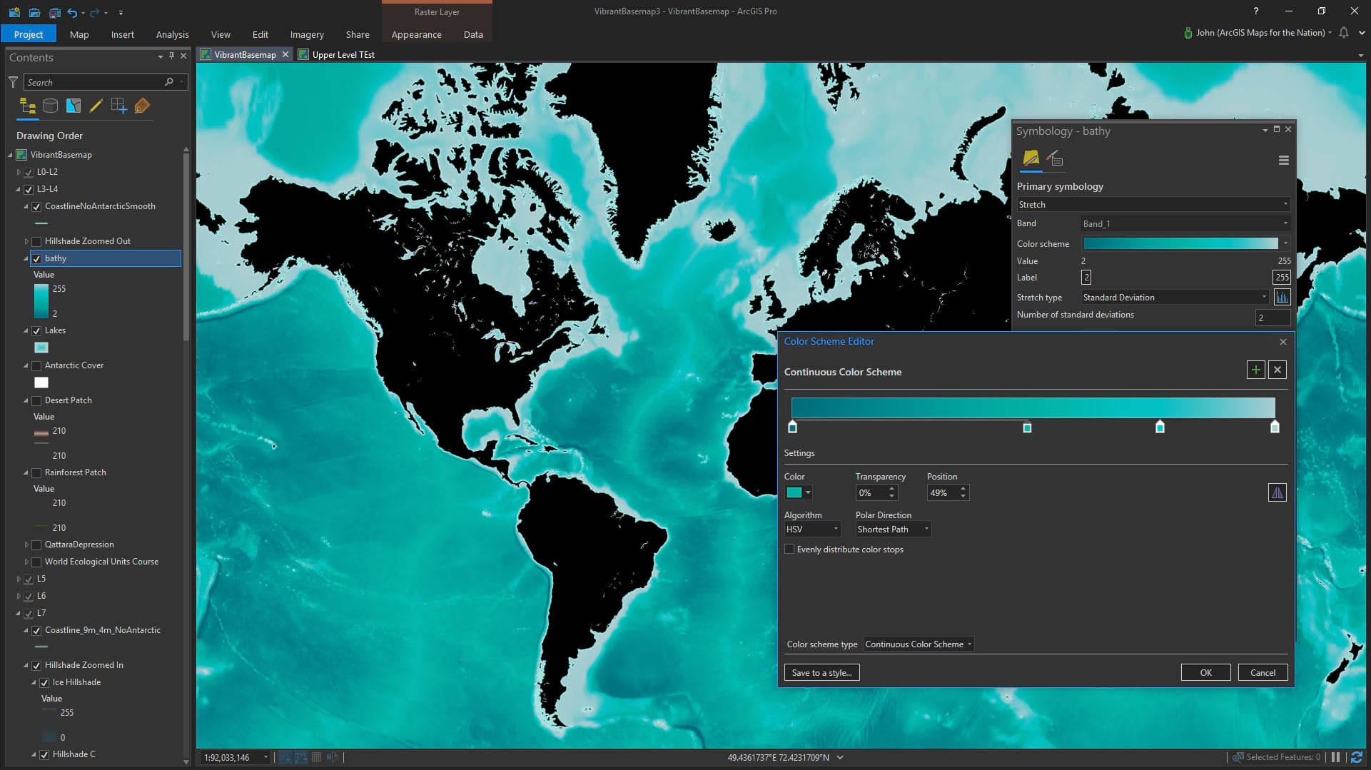
The freshwater lakes have a slight inner gradient and subtle offset shoreline. Check out this how-to post to get a close look at this technique. If you dare!
Results
The result is a rich and textured model of our home with a sense of scale and charm that I hope engages an audience and inspires curiosity.
Collaboration
Thanks to the Half-Earth project and the wonderful team at Vizzuality for the fantastic experience of fun and collaborative cartography. Please do check out their work.
Also, somewhat relatedly, early in the process of creating this basemap I reached out to Esri’s 3D guru, Raluca Nicola, to play with ideas that came up relating to making another fantastical 3D earth that we would want to reach out and touch. So please check out her beautiful globe and how-to, as well, and get the scoop on the tech used to make it. This is the fun of maps and collaboration. Each map, and the ideas it triggers, spawns even more fun and interesting maps. Who’s got it better than geographers??
Happy Mapping! John

Commenting is not enabled for this article.