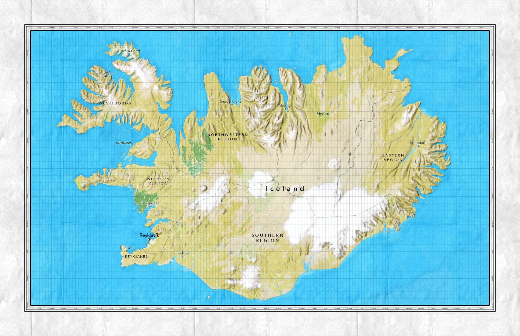
Ah the trusty old neatline. Telling your map where to be and where not to be. Keeping everything in its rectangular place, a vigilant sentinel of order and symmetry.

Who needs them!
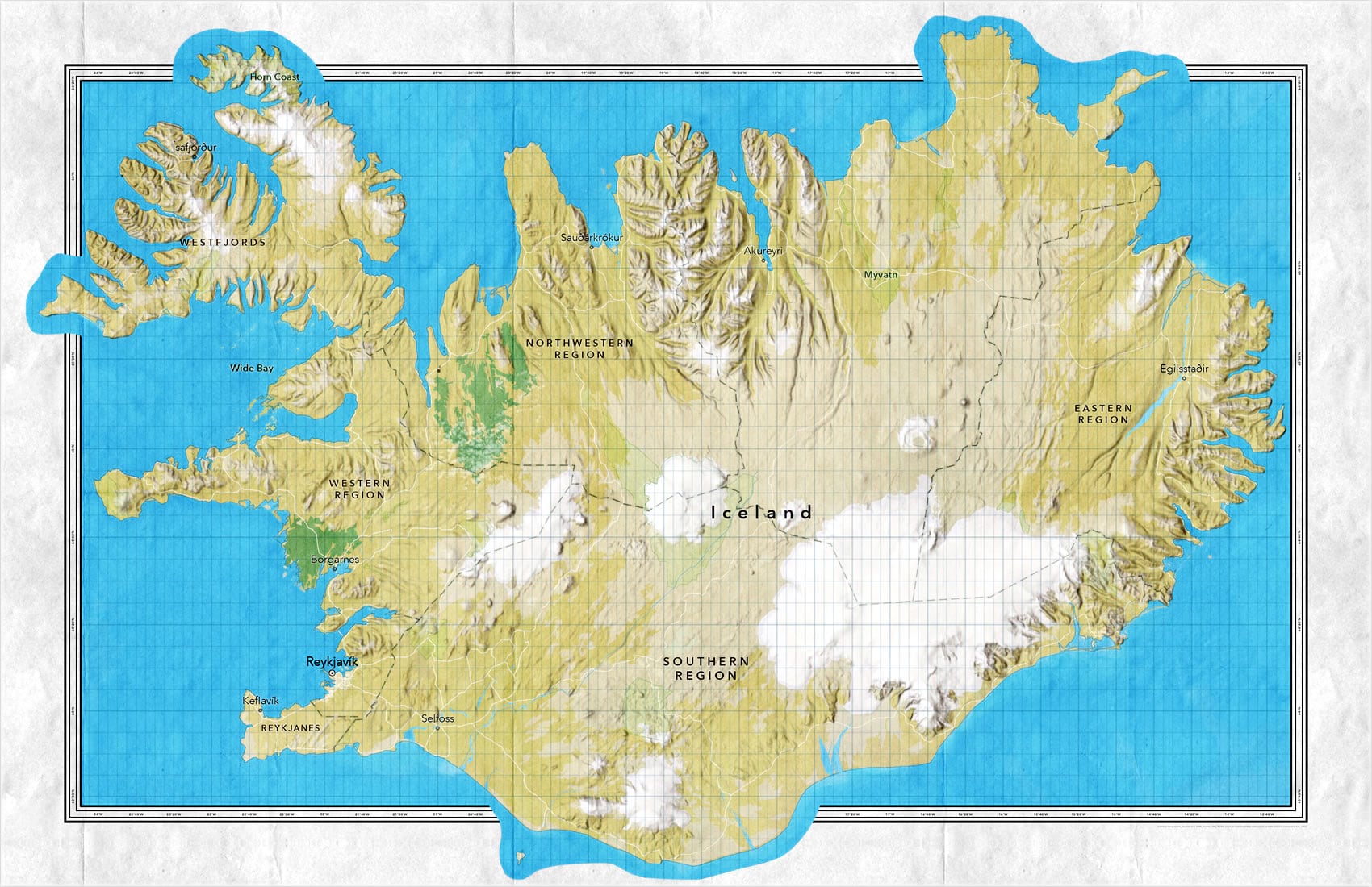
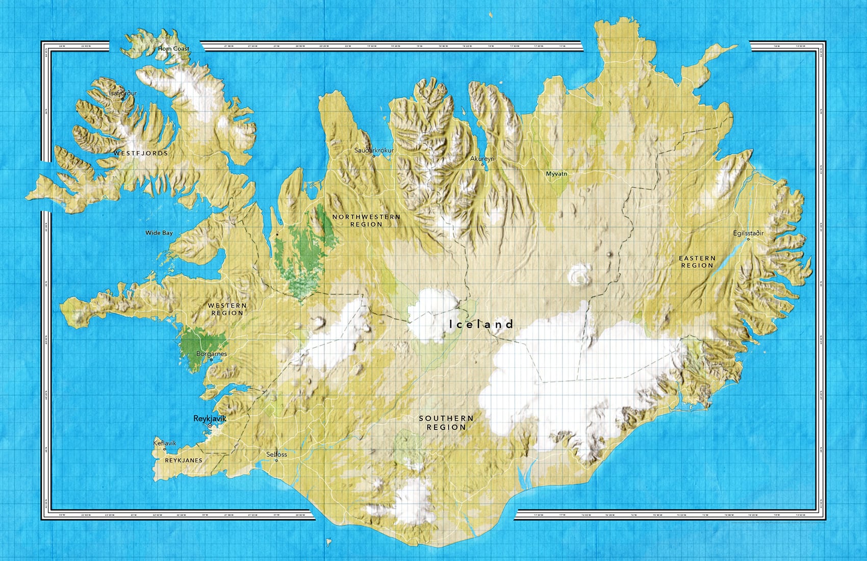
Sorry, I just got worked up there for a second and my emotions got the better of me. You see, I am not a huge fan of neatlines. But I do understand that sometimes there’s a need for a neatline…I suppose. In that case, we can at least make bits of the map spill over that bossy neatline here and there.

Stepping on the neatline has a long and beautiful history. You don’t have to browse the David Rumsey Map Collection long before the glorious examples start piling up. Check out the examples in this video, and how you can do something similar in your current digital maps…
Additionally, if you are feeling even crazier than just stepping on the neatline, you can take it one step further than what is shown in the video and add a full-bleed copy of the map frame behind everything, so the neatline appears to float above the map and get interrupted where needed. My friend Ken Field thought the neatline overlaps would look better with a faded edge, so he gave it a go. Then I followed that up with a slight tweak to make the neatline overlaps cast a little shadow. Good times.

Lots to like about breaking the neatline! I hope you give it a shot on your next map that…if it must…has a neatline.
Happy Mapping! John
P.S. If you are curious about that basemap, you can see how it was made in the video. It’s the lovely new Outdoor map, with World Imagery and World Hillshade blended in for giggles.

Article Discussion: