For any thematic dataset you’re interested in mapping there are some basic questions to ask before diving into your chosen mapping app. The fundamental question is what are you wanting to show? Further, what is the message, or story? Where is higher, or lower? What and where are the outliers? All of these questions of the data can be determined relative to some known or critical aspect of the data. For instance, finding where more of something exists is always relative to where is less. Maybe there’s a known value (an average, or historical value) you’re comparing your new data to. Or maybe you’re making the map so the reader can recover the values themselves. Or even, you just want to make an attention-grabbing map where form takes precedence over function, perhaps for a slide show, or poster. These, and many other reasons for making the map were explored in my book Thematic Mapping where I managed to squeeze 101 different thematic maps from the same dataset to explore the breadth and depth of possible mappable solutions.
But here’s the bad news. No thematic map type is uniquely right, or wrong. Some map types are better at performing some functions, and less useful at others. So keeping an open mind about how to represent your data, and crucially, being aware of the benefits of certain map types over others will help you make a better choice. And so, when the recent UK General Election in July this year took place, another thematic dataset was born and the questions once again arose – which political party won, where, and by how much? The dataset in fact formed part of the Esri User Conference presentation that myself, Sarah Bell and John Nelson delivered where we each took the same data and found different ways to map it. For those that had a registration you can go back and check out the video here. John has also shared his election maps and thought process here. (but don’t go there just yet…).
In the rest of this blog I’ll share what I did with the data, and offer a few ways you can lean into a similar approach for your maps of whatever data you think might be suited to the techniques I’ll share. First, some background. The UK is split into 650 political constituencies. Political parties offer a candidate in each constituency, and the candidate who wins gains a ‘seat’, and becomes an MP (Member of Parliament) in the Houses of Parliament. Crucially, they score ‘one’ which is added to the party totals and the party that gains 326 is first-past-the-post and forms the new government. The leader of the party becomes the new Prime Minister. It’s quite common for many different parties to put forward candidates, and despite the main battle being almost always between the Conservative (right-leaning) and Labour (left-leaning) parties there are always constituencies that are won by other parties or Independent candidates. While the Conservatives are conventionally shown in blue, and Labour in red (the inverse of the typical US colour coding), the final map is often far more colourful than the US equivalent. Here, then is the standard map of the results from the July 4th General Election.
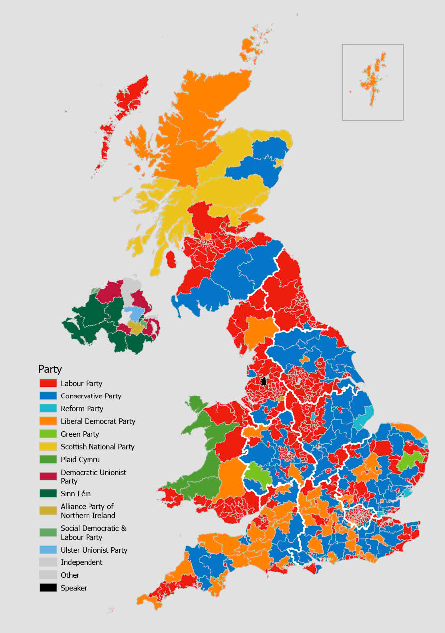
So if who won is the most fundamental question a map of the results of an election can reveal then who won? Without knowing the answer you’d likely stare at the map a while, and possibly determine that either the blue party or the red party won. There seems to be more blue and red on the map than any other colour. And armed with the knowledge that each area counts as ‘one’ and a party needs 326 constituencies to win then surely it’s blue or red. And you’d be correct. But which is it? Unfortunately, while colouring each constituency with the colour of the winning party is an extremely common way to map results, to create a unique values map, it’s also extremely unhelpful for a very simple reason – geography gets in the way.
Each constituency is equal in value in terms of how it contributes to the total. And other than a few exceptions, each contains approximately 75,000 people. But populations are not distributed homogenously across space so the geography of areas means they all vary massively in size. Compare some of the areas in London (the small bounded region in the lower right of the map), to many others. They’re almost imperceptible at this map scale so you cannot easily see them. As with most population geography, urban areas are more populated per square mile than rural areas. And so, visually, rural areas will tend to visually dominate.
In fact, 28% of the map is coloured blue, and 24% is coloured red. Yet Labour (red) won the election with 411 constituencies compared to the Conservatives who won 121. That’s 63% of constituencies to Labour, and 19% to the Conservatives. The map lied to you. Well, technically it didn’t. There’s nothing wrong with it. It’s just that it does not support the search for the question of who won, or for that matter, most questions about the relative success of each party.
One way of overcoming this problem is to equalize the geography altogether by using a gridded cartogram. There’s many different types of cartogram one might consider but gridded cartograms work well when you need to create a perception of relative areal symbology, and to overcome the problems of small areas having low visual priority. Here’s one possible way of tessellating space into a set of 650 equally sized hexagons, each showing the same result as the map above.
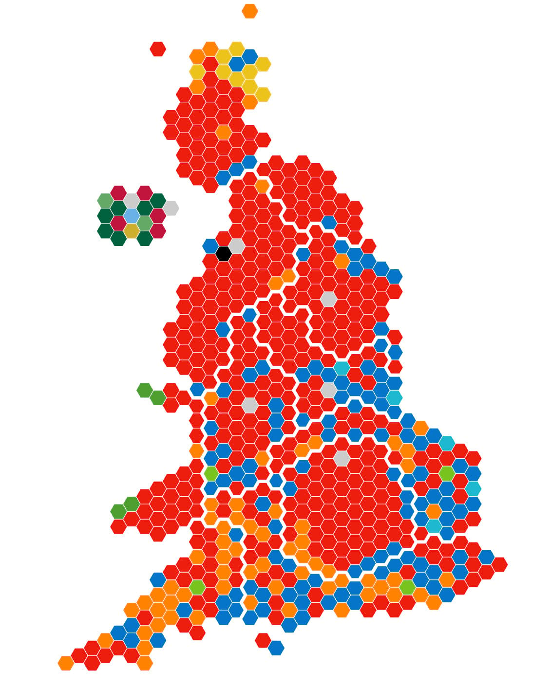
Now it’s easy to see that the red team won! It’s easy to see how those small areas in London voted. It’s easy to see that Scottish constituencies don’t account for as much as the geographical map might suggest. It’s easy to see that the blue team only won a few, rural constituencies. And all that we’ve done is changed the map type.
You can use the Generate Tesselation tool to create a grid of hexagons, and then add some sort of name or ID to hexagons to allow you to build the actual map, and join your data. But you may find others have already doe the work, and this particular version was built by Philip Brown and Alasdair Rae, and made freely available. In fact, they made a range of useful datasets available for the 2024 UK election including a side-by-side geographical, and cartogram map. Well worth a look at their resources.
And with a few minor tweaks you can answer different questions like how did the voting shift between the previous election (in 2019) and this one. For instance, by creating a point feature class for each hexagon using the Point to Feature tool, joining the 2019 election data, using a small hexagon point marker symbol, and changing the colour using attribute driven symbology.
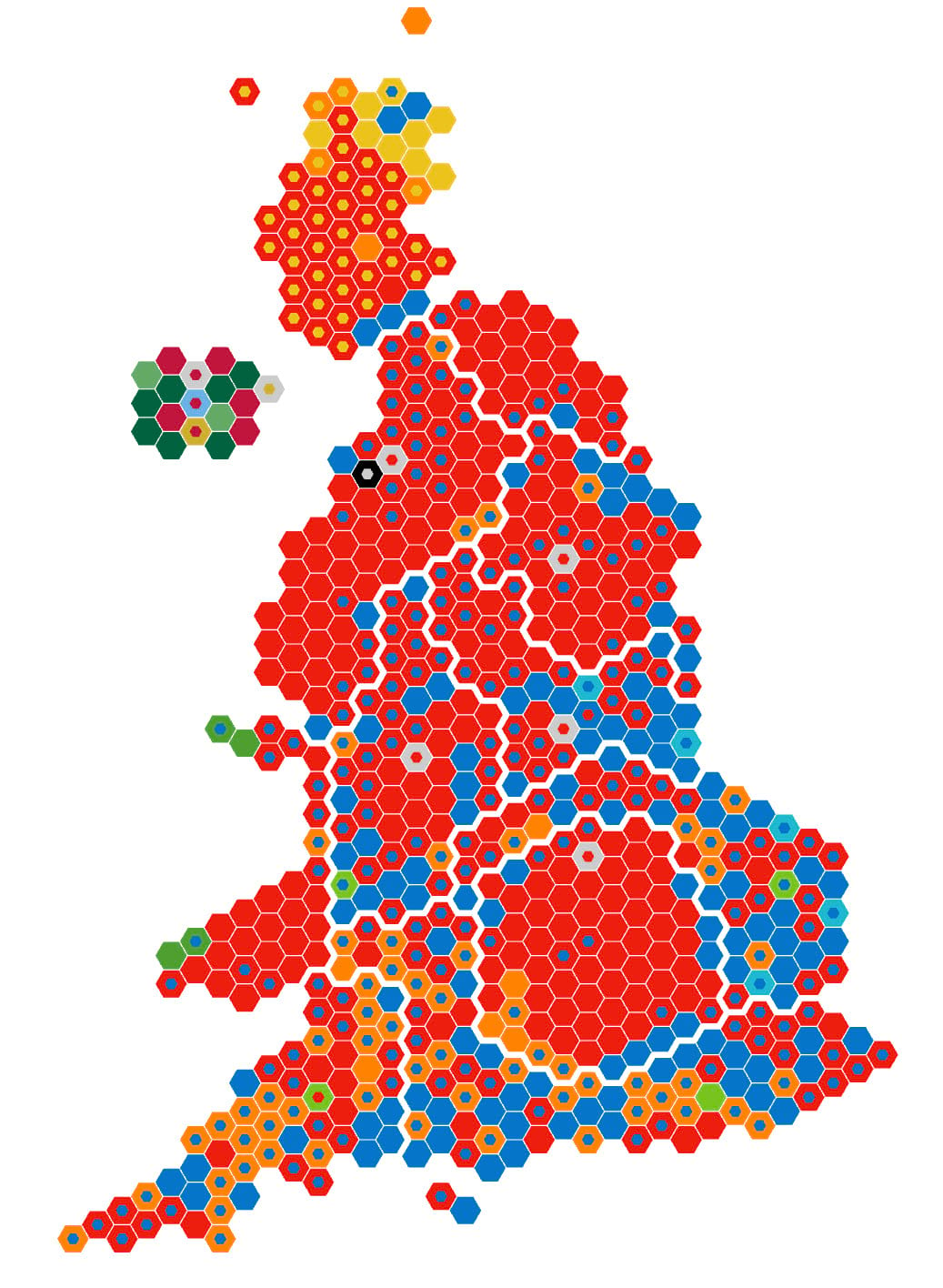
If it appears like there’s no internal mini-hexagon it’s because it’s the same colour and the constituency was won by the same party in both years. A colourful map, but one that helps understand the pattern of change between election cycles.
Alternatively, maybe you’re interested in knowing whether a constituency voted increasingly to the right, or to the left of the political divide. Well, simply replace the internal hexagonal point marker symbol with an arrowhead symbol, make two copies of the feature class and use definition queries on each to select those constituencies where you know the 2024 result was to the right of the 2019 result, and the opposite for the other feature class. Simply rotate the point marker symbol accordingly.
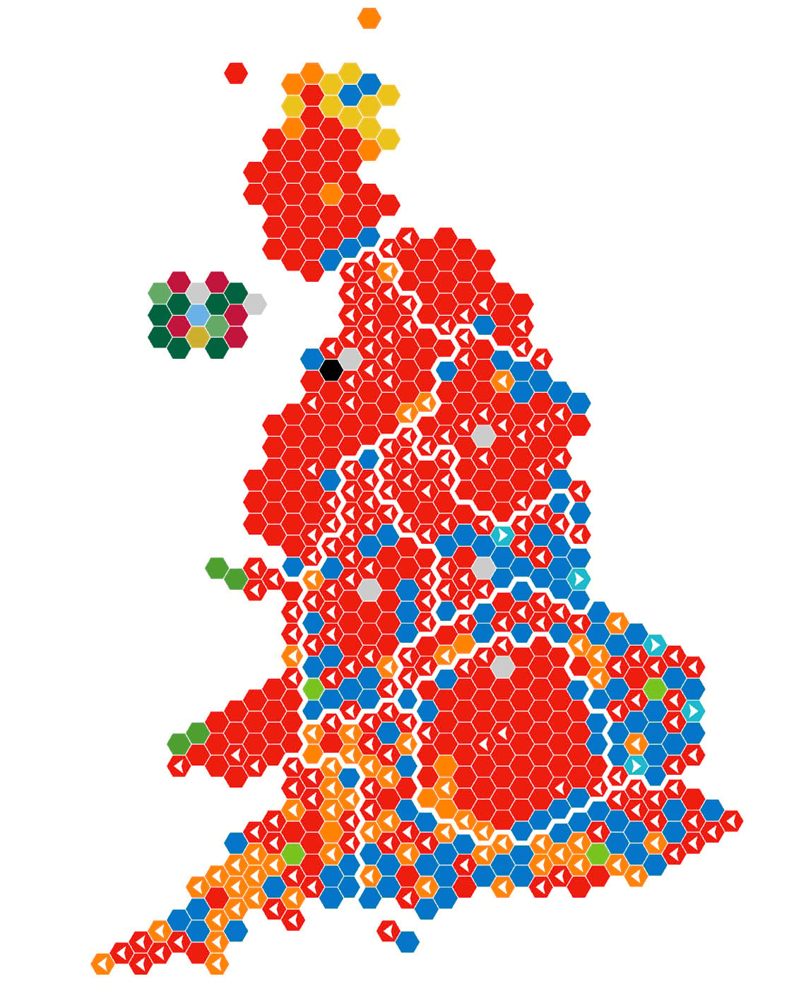
Now the map can answer the question of which constituencies changed, and whether the voting went to the right, or to the left, but not from which party to which other party. Of course, this only scratches the surface. You could make the arrows proportional by share of vote, or margin of victory. Or you could even animate them, you know, if you were going for a contrived ‘ooh, ahh’ moment in front of a large crowd of eager map nerds at a large GIS conference. But I digress.
To this point we’ve done that typical thing of converting numbers into symbology. It’s what we do in cartography. That’s almost always the result of a cartographic process – to turn data into an abstract representation that we hope, through good design, our map readers will be able to decipher, and understand. But we also often use labels to help identify places, and make clear what exists where. And when we’re dealing with thematics, and especially when we’ve already equalized the geographical areas by using a cartogram then there’s a ready made space for a label for each area. And what better use for that space than actually putting the data itself on the map.
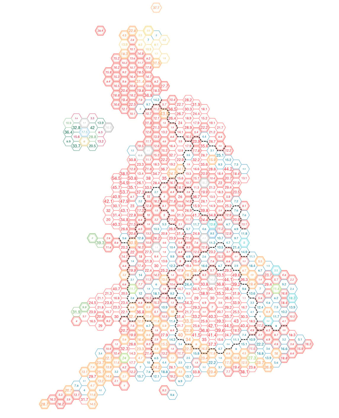
Let’s take a closer look and unpack what’s going on here.
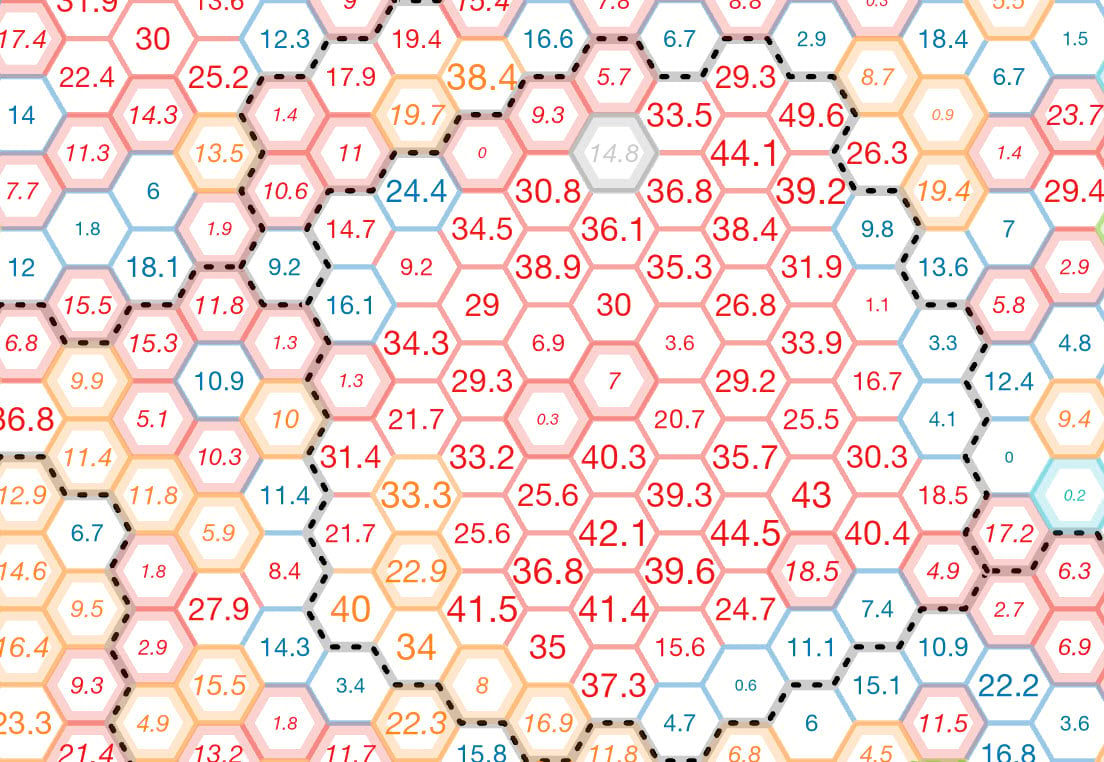
We’ll get to the labels in a moment. But first, the solid colour fill has gone, replaced by using the same Symbology by Attribute workflow to colour the boundary by winning party. There’s also a thicker internal outline created using a copy of the feature class, and a negative offset of the outline stroke (-2pt in this case) for those where change between 2019 and 2024 occurred, and coloured by the 2024 result. The regional boundaries are a pecked line (as opposed to white on the previous maps) because we’ve reserved a lot of white for the internal fill of each hexagon so the labels take centre stage.
OK – labels. You’ll notice they’re not all the same. The basic label is the percentage margin of victory for the winning party. They have different colours to match the winning party in that constituency. They are different sizes with larger labels emphasizing the size of the majority. Finally, some are italicized. These are the constituencies which were gains, where the 2019 winner changed in 2024. All of these labelling characteristics are controlled by text formatting tags, driven by an Arcade Expression in the layer’s labelling properties.
The following code snippet is what’s used to control the labels. It features a function that uses an if-else statement to classify the label size by assigning a label point size based on the total number of majority votes. A second function also uses an if-else statement to identify the winning party from the attribute table, and then specifies the RGB value for the colour of the label. Finally, the attribute table is queried to determine if the constituency is a gain or not. If it is, it’s italicized, else left as normal upright text.
var change = $feature.Change

function FindSize(MajorityVotes){
if (MajorityVotes < 500){
return "6"}
if (MajorityVotes >= 500 && MajorityVotes < 1000){
return "7";}
if (MajorityVotes >= 1000 && MajorityVotes < 2000){
return "8";}
if (MajorityVotes >= 2000 && MajorityVotes < 5000){
return "9";}
if (MajorityVotes >= 5000 && MajorityVotes < 8000){
return "10";}
if (MajorityVotes >= 8000 && MajorityVotes < 11000){
return "11";}
if (MajorityVotes >= 11000 && MajorityVotes < 14000){
return "12";}
if (MajorityVotes >= 14000 && MajorityVotes < 17000){
return "13";}
if (MajorityVotes > 17000){
return "14";}
else{
return "7";}
}

function FindColour(WinnerColour){
if (WinnerColour == "APNI"){
return "red = '205' green = '175' blue = '45'";}
if (WinnerColour == "CON"){
return "red = '5' green = '117' blue = '201'";}
if (WinnerColour == "DUP"){
return "red = '192' green = '21' blue = '61'";}
if (WinnerColour == "GRN"){
return "red = '120' green = '195' blue = '30'";}
if (WinnerColour == "OTH"){
return "red = '150' green = '150' blue = '150'";}
if (WinnerColour == "LAB"){
return "red = '237' green = '30' blue = '14'";}
if (WinnerColour == "LDM"){
return "red = '254' green = '131' blue = '0'";}
if (WinnerColour == "PLC"){
return "red = '78' green = '159' blue = '47'";}
if (WinnerColour == "RFM"){
return "red = '30' green = '184' blue = '208'";}
if (WinnerColour == "SDLP"){
return "red = '101' green = '169' blue = '102'";}
if (WinnerColour == "SF"){
return "red = '0' green = '98' blue = '63'";}
if (WinnerColour == "SNP"){
return "red = '235' green = '195' blue = '28'";}
if (WinnerColour == "SPKR"){
return "red = '150' green = '150' blue = '150'";}
if (WinnerColour == "UUP"){
return "red = '106' green = '177' blue = '230'";}
if (WinnerColour == "OTH"){
return "red = '150' green = '150' blue = '150'";}
else{
return "red = '204' green = '204' blue = '204'";}
}

var label = "<FNT size = '" + FindSize($feature.Majority) + "'>" + "<CLR " + FindColour($feature.Winner2024) + ">" + $feature.Majority_PC + "</CLR></FNT>"

if (change == "GAIN"){
return "<ITA>" + label + "</ITA>"
}
else{
return label
}
The field names are specific to the attribute table of the feature class in this example, but you can easily copy this code, and with minor tweaks apply it to your own data to control the appearance of your labels. It’s an extremely powerful way of controlling labels which also allows for fast modification.
Finally, let’s go from one extreme to the other. In other words, from a map where the data is on the map itself, to a map that’s completely abstract. For the 2015 UK General Election I created a map I described as illustrating the messy nature of elections. I titled the map ‘Election Pollocks’ as a nod to the abstract expressionism of Jackson Pollock. So I’ve simply recreated that map with the 2024 data.
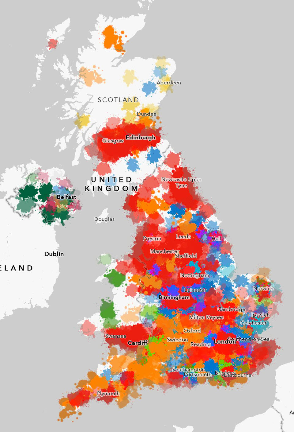
Each constituency is symbolized using a picture marker symbol, with different ‘splat’ symbols used for each of the different parties. Attribute driven symbology is used to modify the size based on the winning number of votes. An expression simply calculates the square root of the value which sets up the correct relative proportions for the area of each symbol compared to one another. A random rotation is applied to give the overall map an organic look and feel. And transparency is varied according to the majority value, with larger majorities being more opaque. This also has the effect of making the overlapping symbols mix to an extent.
The intent is to show a much more fluid political landscape rather than one that is tightly constrained by the constituency boundaries. Yet, curiously, when the amount of different colours are assessed the map exhibits 45% red, and only 4% blue which is at least closer to the actual results than the traditional geographical unique values map we began this post illustrated. So it could be argued, despite its apparent abstract nature, that this map actually gives a better expression of the overall results than a seemingly more traditional map.
And just to round out this small selection of alternative thematic maps, here’s the same abstract expressionist approach taken using the gridded cartogram base.
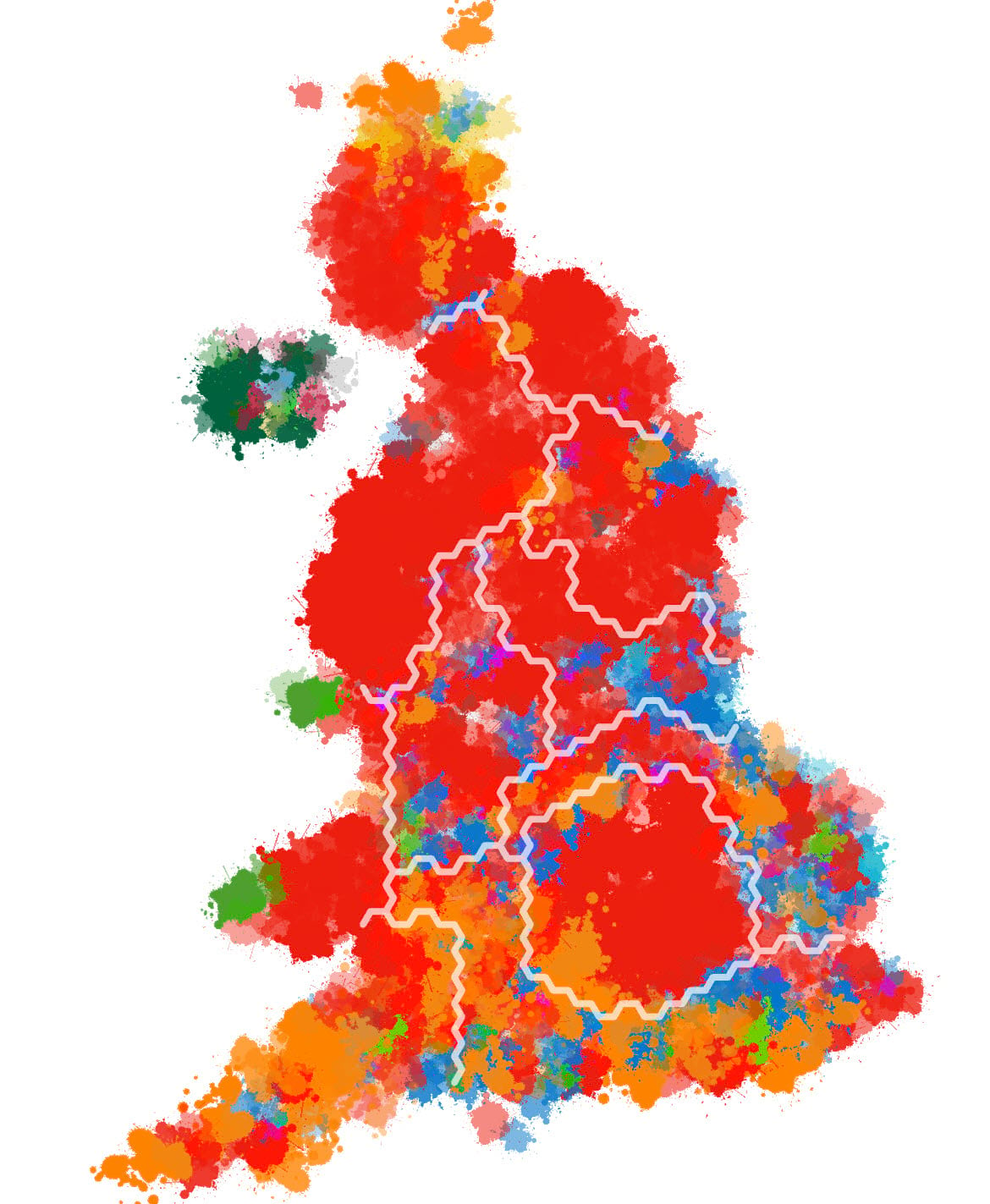
So, I hope you enjoyed seeing a few alternative ways to make thematic maps. Remember, the key to making a great thematic map is first selecting a map type that enables the reader to get the answer to the question they’re asking of the map. It’s unlikely that any one map can support all questions. You may need several maps, and to guide readers by helping them understand what the map can be used for, and what it can’t reveal.
Happy mapping!

Commenting is not enabled for this article.