Sea surface temperature (SST) can have profound impacts on the Earth’s climate; therefore, there is a great need for the analysis of the variations in SST to better understand the global climate and weather patterns.
At the Developer Summit 2022, Hong Xu demonstrated how you can use Principal Component Analysis (PCA) for spatial and temporal pattern analysis of SST data.
Watch the plenary video below, and then read the rest of the blog for a summary of the processes that Hong Xu explored in her demo.
For her demo, Hong Xu used PCA in ArcGIS Notebooks to analyze SST data collected monthly over 39 years from 1981.
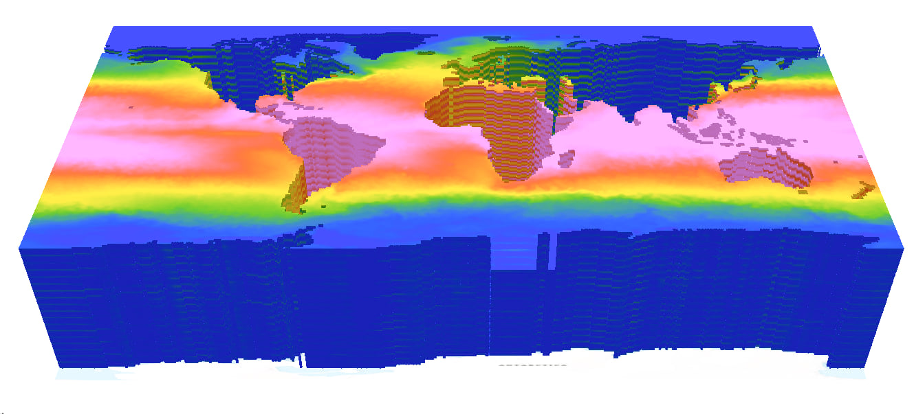
First, she created a multidimensional raster from the SST data stored in Zarr format, a new storage format for storing analysis-ready geospatial data in the cloud, and supported in ArcGIS Pro 2.9.
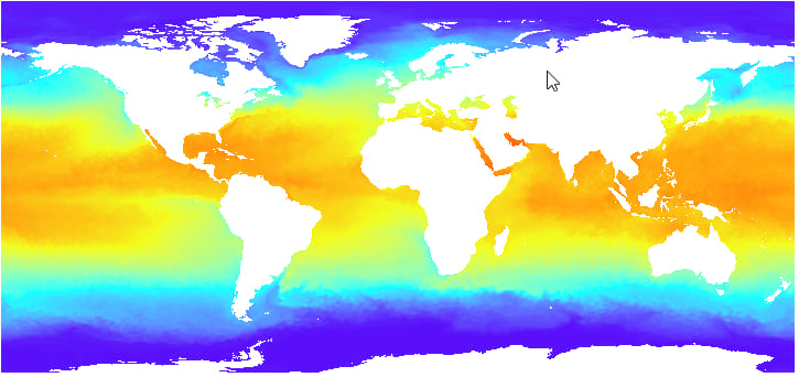
She then used PCA to generate components from the multidimensional raster; and, based on eigenvalues, chose four components that explained over 99% of the variance in the data.
The first component—the first principal component raster band representing the most significant data variance—extracted the SST data’s dominant spatial and temporal patterns. In the map of the first component, brown and green pixels indicate warmer and cooler temperatures, respectively. The separation of the Gulf Stream current by the warm southern and cold northern waters is also discernable in the map.
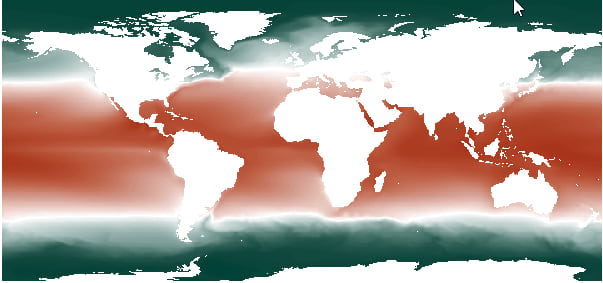
The loading chart of the first component shows a sinusoidal seasonal pattern with a slightly increasing trend.

The map of the second component, which picked up the secondary dominant feature, shows the clear annual north and south oscillation induced by the contrasting seasons in the Northern and Southern Hemispheres.
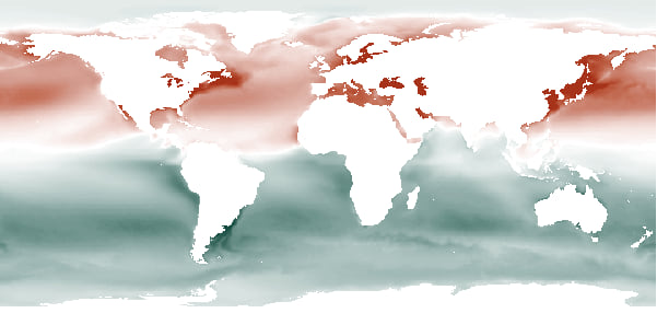
The loading chart of the second component shows a sinusoidal annual pattern with an undulating trend.

The third component was associated with upwelling, a process in which cold and often nutrient-rich water rises from ocean depths to replace the surface waters displaced by strong winds. In the map of the third component, green pixels along the coasts denote coastal upwellings.
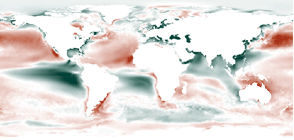
The loading chart of the third component indicates coastal upwellings are pronounced in summer, a season conducive to fishing and biological activity.

The fourth and final component identified El Niño and La Niña events that transpired across the Pacific Ocean. In the map of the fourth component, brown pixels mark the areas where these events occurred.
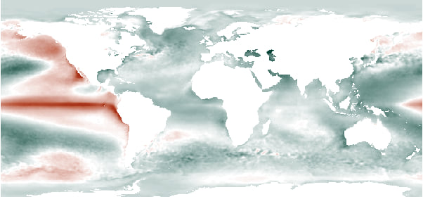
The spikes in the loading chart of the fourth component denote the strongest El Niño events, which took place in 1983, 1987, and 2015.

Learn more
Hong Xu’s demo showed how PCA can be leveraged to uncover hidden patterns and extract valuable information from long-term and large time series imagery. Visit the ArcGIS Pro documentation to learn more about how you can use PCA in your GIS work.


Commenting is not enabled for this article.