Landsat 9 imagery is here! Just begging for you to grab it and start smashing luscious bands of the electromagnetic spectrum together into a glorious full-color pansharpened image. But we aren’t going to fire up any specialty imagery tools or pixel calculators for this, we’ll just employ our brains and some blend modes in ArcGIS Pro. Let’s walk down this glorious path together, shall we?
If you are an impatient geographer (as I am), or can’t abide my pervasive Michigan accent (“you sound like Fargo”), here is the cheat-sheet list for what happens in the bloated video below…
- Grab a fresh Landsat 9 download, hot off the sensor, from the USGS EarthExplorer.
- Add the blue, green, and red bands to Pro, and actually color them that way.
- Use the Screen blend mode (you could also use Linear Dodge) to visually smoosh them into full-color.
- Add the higher-res panchromatic band and use the Luminosity blend mode to sharpen.
- Tweak to taste.
…Chef’s kiss…
0:00 Goodness, what an energetic greeting! Can he maintain this level of energy? Doubtful. Is he willing to clumsily photoshop x-ray style glasses over his face to make a point? He’s not a proud man.
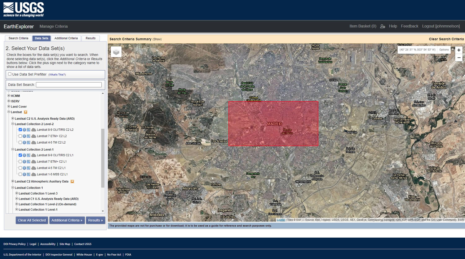
0:34 We’ll grab Landsat 9 data from the generous USGS EarthExplorer, which you can explore for yourself right here. Making sure to expand the “collection 2 level 1” (which includes the higher resolution broad wavelength, though grayscale, panchromatic band) and “collection 2 level 2” (which includes visible bands like red green and blue…and some not-so visible bands like the magical near-infrared), and select the “Landsat 8-9” options. I’ve set the search area to Madrid, Spain, because I’ve been thinking about Madrid and how excellent a city it probably is and how I want to see it someday and eat dinner at like 10 PM and feel warm. Also, I suspected it to be less prone to cloud-cover which turned out to be true.
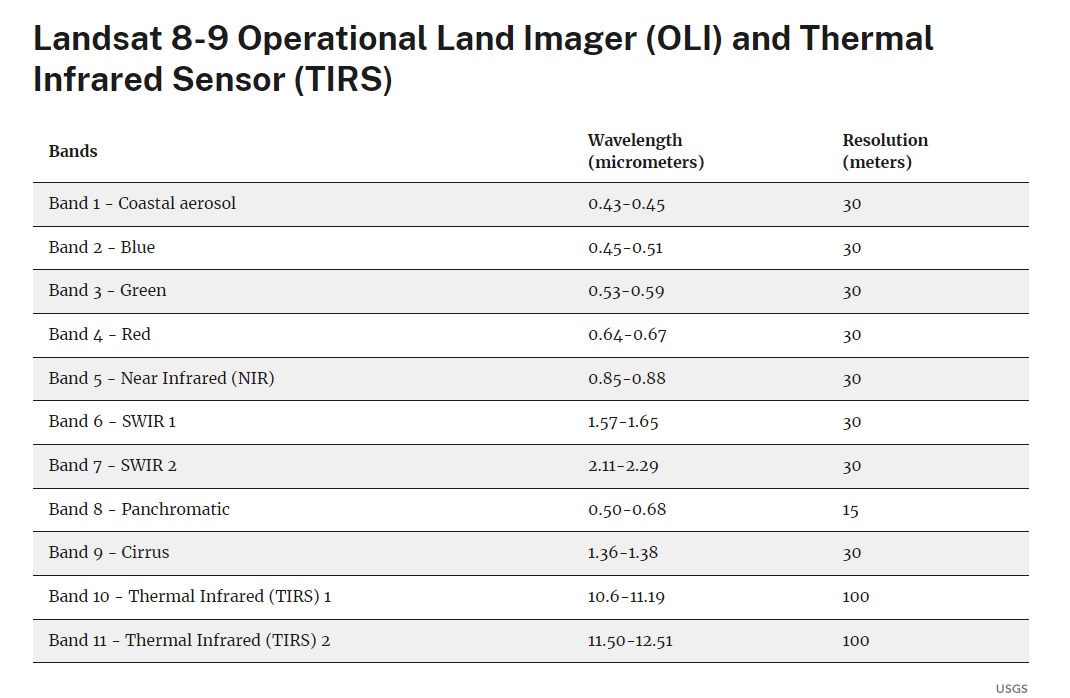
2:07 If you feel a little overwhelmed by the Landsat 9 reference/metadata out there, here is a super handy, and mercifully succinct, USGS resource sent to my by Joshua Stevens, which lists out all of the Landsat bands and their wavelengths. We’ll need Landsat 9’s blue (band 2), green (band 3), and red (band 4). Oh and while we’re at it we’ll also use that delectable, and just achingly out of reach of our human visual systems: near infrared (band 5). And for funzies we’ll also use the panchromatic (band 8) layer which collects light over a wider spectrum so it can capture more detail…but it’s black and white. We’ll just tuck that into our pockets for later.
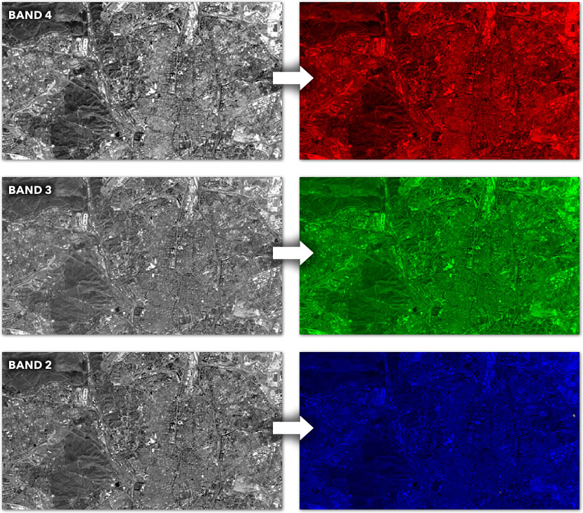
3:14 Time to drop these precious pixels into ArcGIS Pro. Time to turn each of these grayscale layers into a monochrome version of the color it represents. So, for instance, the blue band goes from black to blue, instead of black to white, etc.
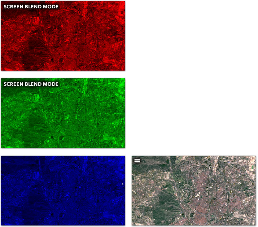
6:51 Then we just, like, use blend modes, man. Applying a Screen blend mode to the two top color layers visually stitches them together into a color composite image. We are now Dorothy, when she opens up her door and sees the full technicolor world of Oz.
7:48 By default Pro will try to optimize the appearance of raster layers. That is certainly something to be aware of if you work with imagery. You can undo these default settings, or just take the wheel and play with these settings yourself. You are the captain of this ship.
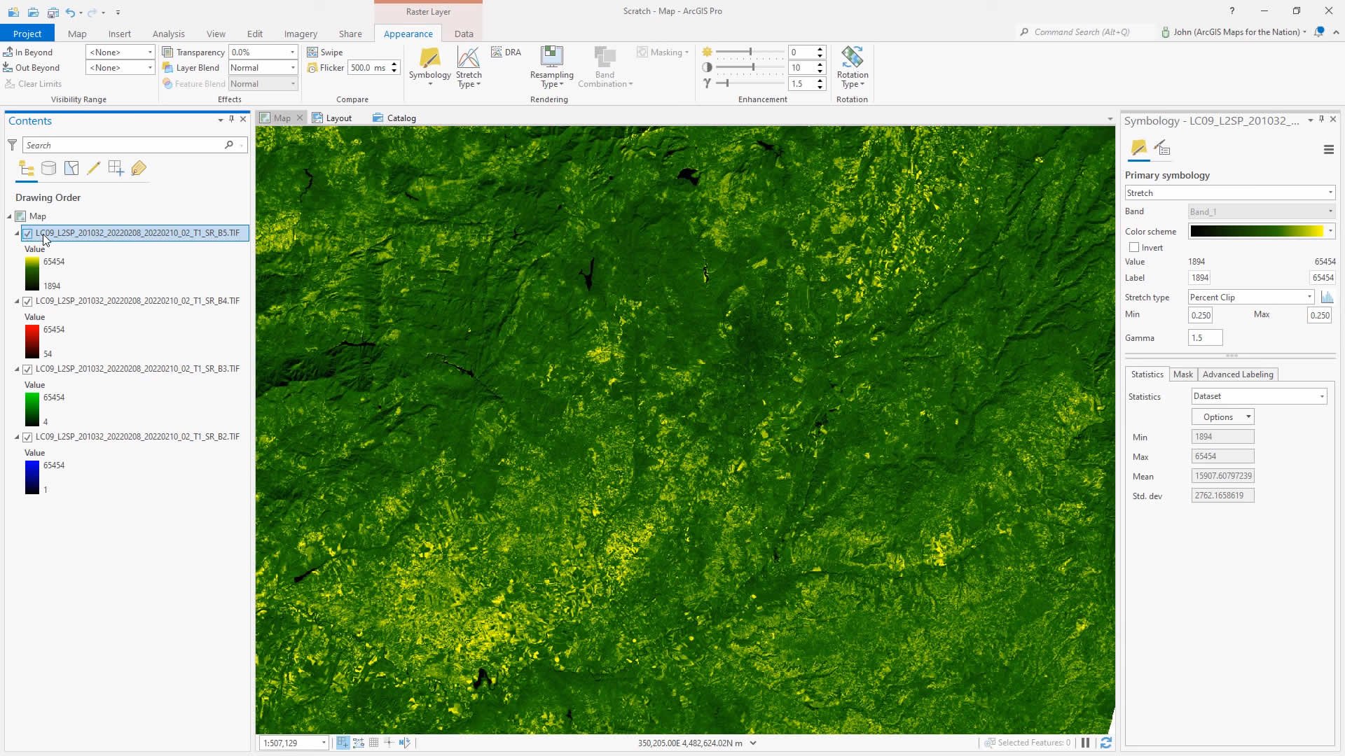
12:00 Ok, it’s time to improve on what our eyes can see by pulling in the near infrared band. Near infrared is a wavelength just red and we can’t see it with our eyes. But the eyes of Landsat sure can. Near infrared tends to reflect really brightly off leafy vegetation. We can sneak in a little bit of this vegemite into our map. We’ll give it a commensurately verdant color and use the screen blend mode to add it in to the charming little color composite we have rolling.
14:30 I remember “pansharpening” being a real mind-melter of a concept when I was in school 78 years ago. For what it’s worth, almost all of remote sensing seemed pretty mind-melting. We’ll take the higher resolution grayscale “panchromatic” band and imbue all of that wondrous texture into the lower resolution colors of the layers below, and we do that using just the Luminosity blend mode. Luminosity. Done.
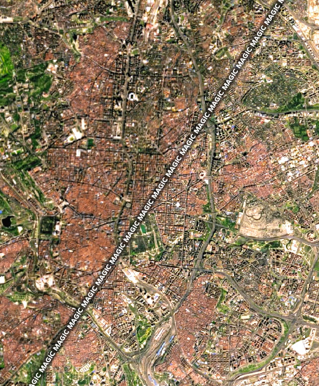
And there you have it, my map friends! What a time to be alive amirite? Robots whizzing around the planet beaming down images in wavelenths of light that we can see and many that we can’t see…getting ahold of it freely from the marvelous folks at USGS…playing with light and shadow in the unfathomably cool darkroom of ArcGIS Pro…sharing the results with our colleagues and researchers and friends and family. It’s almost too much. But nonetheless here we are.
If you would like to take a deeper dive into this realm of using blend modes to create color composites, check out the esteemed Rob Simmon’s blog post, where he takes a closer look at the rendering nuances of band histogram manipulation.
Enjoy this unfettered visual playground! Take some risks and try out interesting bands and combinations. And say thank you to your remote sensing instructors, as I am about to…
Thank you Drs. John Grossa, Sally Westmoreland, and John Althausen!
Love, John


Article Discussion: