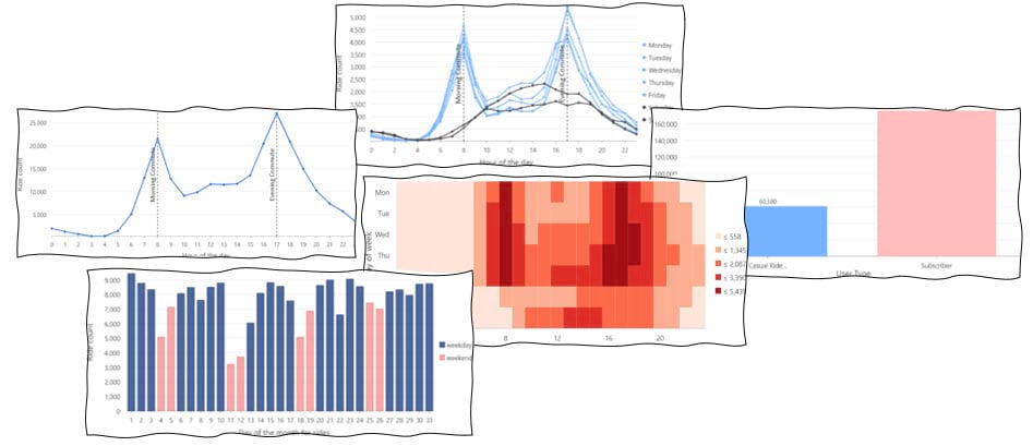
Whether you’re a bike enthusiast, planning a trip to Boston, or just here for your daily dose of viz snack, I’ve got you covered! In this blog article, we will be diving into Bluebikes data, which is a bike share service in the bustling city of Boston and unveil any hidden insights through the power of visualization. By the time you finish reading this blog, you’ll learn to create a variety of charts including the below sneak peek. So, buckle up folks! We have temporal data in our hands and got a whole world of charting possibilities.
We will be looking at all the trips that took place in August of 2018. For each trip, we have a variety of attributes available, including the start time, start location, end time, end location, trip duration, user type, and more. We can explore these attributes through the Data Engineering view.
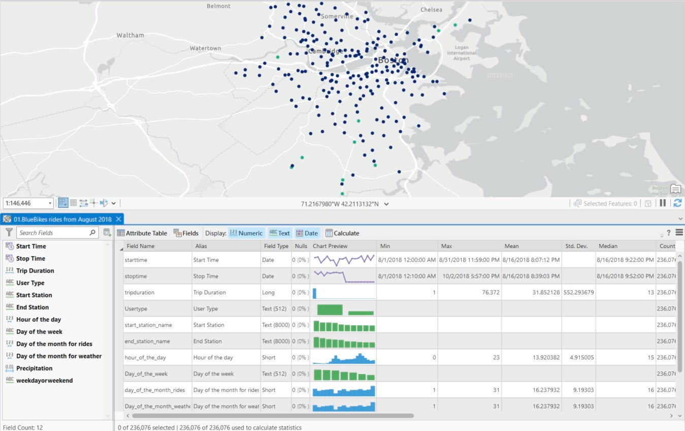
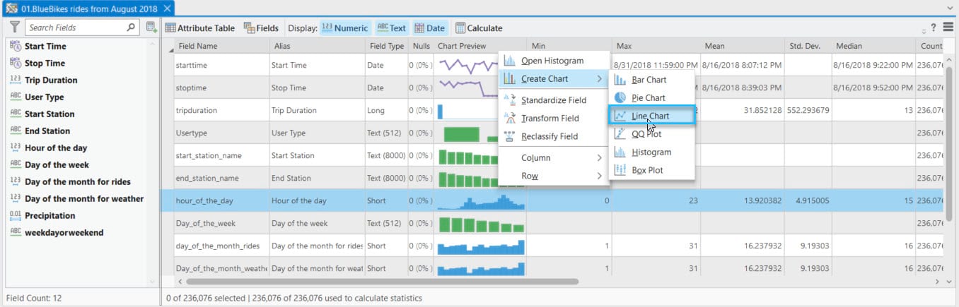
While observing the table, I couldn’t help but notice the intriguing bimodal distribution displayed in the preview chart for the ‘hour of the day’ field. That’s interesting, and I’m really curious to explore it further. This variable is currently stored as an integer, which is why the preview chart is displayed as a histogram. But since this is temporal data, I’d prefer to visualize it as a line chart so that I can visualize patterns over time. To convert this histogram into a line chart, you can simply right click on the preview chart and select ‘Create Chart’. From the list of compatible chart types, choose ‘Line Chart’. This will transform the histogram into a line chart.
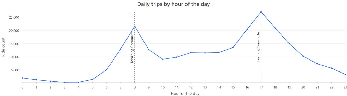
And now, presenting the chart! It provides a summary of the number of trips based on the hour of the day. There is a clear pattern indicating a morning and afternoon rush of people, most likely commuting to work or school using Bluebikes. This seems like an ideal opportunity to make use of guides. Guides are a great way to annotate or call attention to something interesting in a chart. I’d use guides to mark the two rush hour peaks.
These rush hour peaks make sense to me but I’m curious if the rush hour pattern changes by day of the week. To do that, I can split the chart using ‘the day of week’ field so that I’ll get a separate line for each day of the week. Before moving forward, I recommend arranging the days of the week in their natural sequence. Since weekends can have a different pattern, you can make them stand out by using a different color. Both of these can be accomplished within the Series tab.
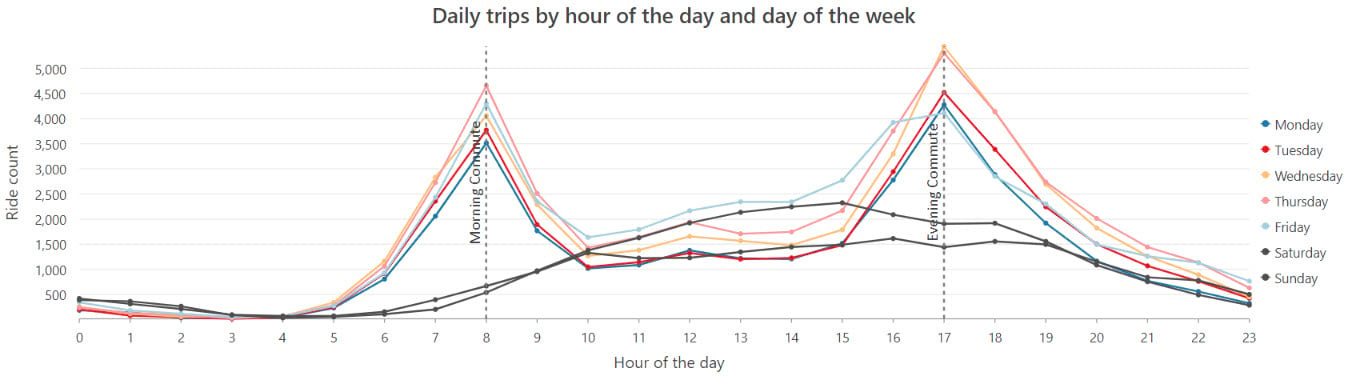
On weekdays, we can see that the commute follows a pretty consistent pattern with peaks at 8 am and 5 pm. But on weekends, I was surprised to not see the same bimodal weekday pattern. Instead, there’s a gradual increase in rides early in the day, which culiminates in a single peak around 3 pm.
So far, we’ve been investigating trends by hour of day and day of week in a line chart. However, another interesting approach to look at this type of trend is through a calendar heat chart. Calendar heat charts summarize temporal data into a grid. When creating this chart, you have two options to choose from: ‘month and day of month’, or ‘day of week and hour of day’. Since we are working with data for only one month, I would recommend summarizing it by day of week and hour of day.
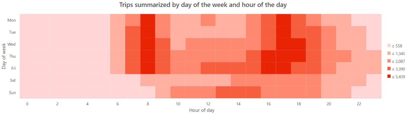
Now, we’re looking at the same information as the line chart, but presented in a different format. We see those same rush hour peaks but in the calendar heat chart it’s a little easier to see the trend for each individual day since they are not overlapping each other. We saw in the line chart that Friday had a wider rush hour peak than other weekdays. We can also see this in the calendar heat chart. It actually looks like Thursday has a wider spread as well. Maybe people are getting an earlier start to their weekend…
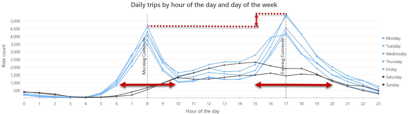
Alright, let’s bring back the multiseries line chart into focus. Along with seeing a different pattern for weekends and weekdays, I also noticed that the evening commute peak has more rides and a wider spread than the morning commute. So, I thought, ‘why would that be?’ Maybe there are more people using bikes to go out to dinner or other activities in the evening, not just riding home from work.
Now, let’s move on to the next discovery. In this dataset, there is a field called ‘user type’ that differentiates between subscribers and causal riders. I have a hunch that people with a subscription are probably more inclined to use the blue bikes for their daily commute, and the spike in the evening commute might be because more casual riders tend to use bike share in the evening. Let’s investigate this by splitting the chart by user type.
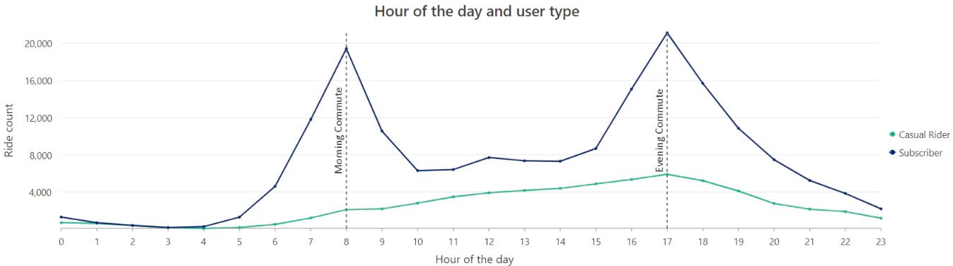
We do in fact see a different pattern for subscribers’ vs casual riders, with more casual riders in the evenings.
Now that we’ve cracked open the user types jar, let’s see if there are any other interesting differences between the two types of users. Since, it’s a categorical variable, a bar chart is a great starting point.
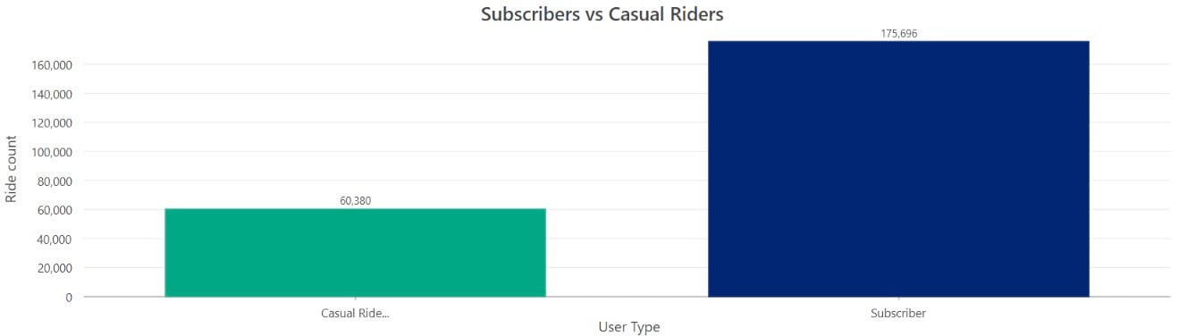
The above chart shows the count of rides taken by each user type. When we count the number of rides in each category, we can see that we have a much higher number of rides from subscribers.
However, we can also use bar charts to summarize a numeric attribute. I’m curious about the trip duration. So, I’ll utilize the duplicate function to make a copy of this chart, and then I’ll tweak the settings to summarize the data by trip duration to calculate the average number of minutes spent by each user type. I think it would be a good idea to compare the differences side by side. You can easily do this by docking the charts next to each other.
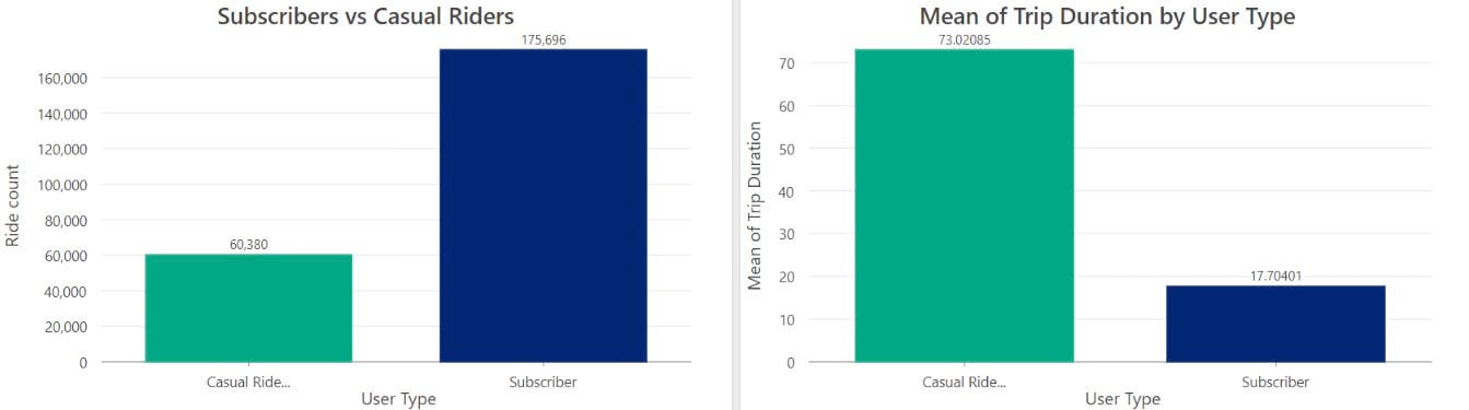
It’s interesting to note that even though there are more rides from subscribers, casual riders tend to take longer trips on average. While doing some research, I came across some valuable information on their website. The pricing for subscribers is $133 per year, with a maximum ride time of 45 minutes. For casual riders, it’s $10 for a maximum ride time of 2 hours. So maybe casual rides are not as incentivized to keep their trips short, or maybe subscribers who use the bikes for commuting know exactly where they are going, and maybe causal riders tend towards exploring more.
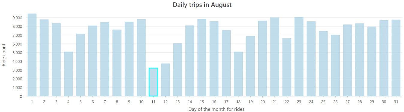
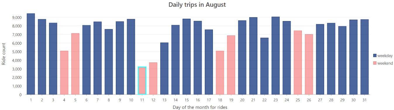
Up until now, we’ve been examining the ride patterns at a week and hour of day scale, now let’s take a look at what happened during each day of the month. When it comes to analyzing temporal patterns, line charts are a popular choice. However, bar charts are also an excellent option for visualizing and understanding these patterns. Following chart shows the ride count for each day. We can observe that the lowest number of rides occurred on August 11th.
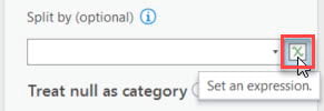
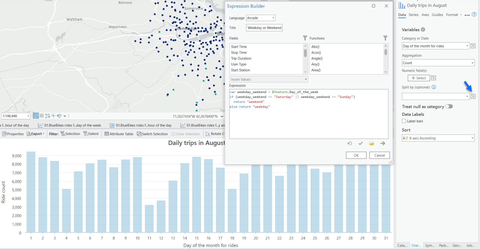
This got me thinking if it could be due to a holiday or a weekend. To address this, I thought it would be valuable to have a way to distinguish between weekdays and weekends in the chart. Unfortunately, I don’t have that field available in my dataset. But don’t worry, I can totally use my Arcade skills to create a new field within the chart authoring pane.
To create a new field, I can simply click on ‘Set an expression’ icon next to the split by dropdown.
This will open an Arcade Expression Builder where I can give my new field a title and write an expression in the box below. The idea is to classify Saturdays and Sundays as weekends, while considering the other days as weekdays. After writing the expression, I will validate it to ensure everything is correct and then click OK to confirm.
The chart is now split by weekdays and weekend and I stacked it to make the weekends stand out. I also tweaked the colors to make the bars really pop. Now I can clearly see that the 11th happened to fall on a weekend.
But there are other weekends in the month as well, and they don’t have such a low ride count!! This got me wondering if there were any weather patterns that could have influenced the number of rides. So, I brought in weather data and joined it with the rides data. After examining the weather data, I discovered that the low number of rides on that day may have been due to the high precipitation. In fact, it was the highest precipitation recorded for the entire month.
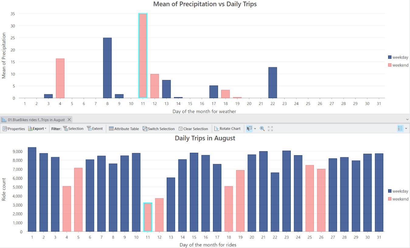
Here’s how I would decode this chart: On August 11th, there was a noticeable drop in the number of rides, and guess what? It perfectly aligns with the highest level of precipitation on that day. It seems like the riders decided to take a rain check due to the not-so-favorable weather conditions.
And with that, we conclude our analysis. If you are also an ArcGIS Online user, you can certainly replicate this workflow in Map Viewer, with the exception of the calender heat chart, as it is not currently supported. I hope this sparks your creativity and gets you excited to create your own workflows 🙂


Article Discussion: